Dot Wave New
Typing-style dots and bars that wave, bounce, fade or pulse like an equaliser.
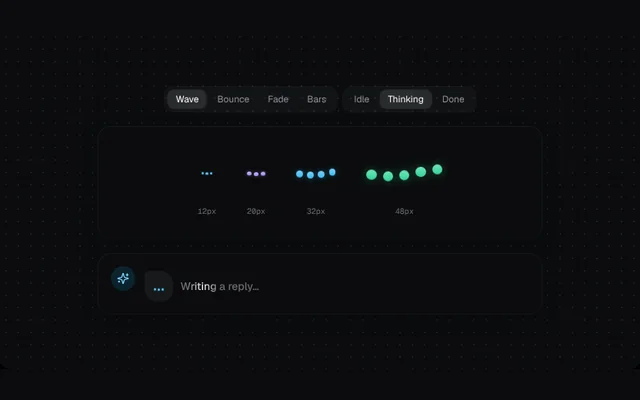
Installation
01
Install with the shadcn CLI. The NiceUI theme comes along the first time.
$ npx shadcn@latest add https://niceui.dev/r/ai-dot-wave.json02
Or copy the source below (2 files). Dependencies: lucide-react.
Source
components/niceui/ai/thinking/DotWave.tsx
import { useState } from 'react';
import { Pills, Showcase, Size, ThinkingLabel, TONES, type ThinkingState, type Tone } from './shared';

export type WaveVariant = 'wave' | 'bounce' | 'fade' | 'bars';

export type DotWaveProps = {
  /** Height in px; width scales with the number of dots. */
  size?: number;
  variant?: WaveVariant;
  dots?: number;
  tone?: Tone;
  state?: ThinkingState;
  className?: string;
};

const KEYFRAMES = `
@keyframes nui-dw-wave { 0%,100% { transform: translateY(35%) } 50% { transform: translateY(-35%) } }
@keyframes nui-dw-bounce { 0%,60%,100% { transform: translateY(30%) scale(1) } 30% { transform: translateY(-45%) scale(1.15) } }
@keyframes nui-dw-fade { 0%,100% { opacity: .2; transform: scale(.75) } 50% { opacity: 1; transform: scale(1) } }
@keyframes nui-dw-bars { 0%,100% { transform: scaleY(.3) } 50% { transform: scaleY(1) } }
@media (prefers-reduced-motion: reduce) { .nui-dw * { animation: none !important } }
`;

export function DotWave({ size = 20, variant = 'wave', dots = 3, tone = 'sky', state = 'thinking', className }: DotWaveProps) {
  const c = TONES[tone];
  const bars = variant === 'bars';
  const d = bars ? Math.max(2, size / 5.5) : Math.max(3, size / 3.6);
  const gap = d * (bars ? 0.7 : 0.6);
  const anim = { wave: 'nui-dw-wave 1s ease-in-out infinite', bounce: 'nui-dw-bounce 1.2s ease-in-out infinite', fade: 'nui-dw-fade 1.1s ease-in-out infinite', bars: 'nui-dw-bars .9s ease-in-out infinite' }[variant];
  const running = state === 'thinking';
  return (
    <span
      role="img"
      aria-label={running ? 'Thinking' : state === 'done' ? 'Done' : 'Idle'}
      className={['nui-dw', className].filter(Boolean).join(' ')}
      style={{ display: 'inline-flex', alignItems: 'center', gap, height: size, flexShrink: 0 }}
    >
      <style>{KEYFRAMES}</style>
      {Array.from({ length: dots }, (_, i) => (
        <span
          key={i}
          style={{
            width: d,
            height: bars ? size : d,
            borderRadius: 999,
            background: state === 'done' ? c.soft : `linear-gradient(180deg, ${c.soft}, ${c.main})`,
            opacity: state === 'idle' ? 0.35 : 1,
            animation: running ? anim : 'none',
            animationDelay: `${(i * (variant === 'bars' ? 0.12 : 0.15)).toFixed(2)}s`,
            transform: !running && bars ? 'scaleY(.45)' : undefined,
            boxShadow: running ? `0 0 ${d}px ${c.main}66` : 'none',
          }}
        />
      ))}
    </span>
  );
}

const VARIANTS = ['wave', 'bounce', 'fade', 'bars'] as const;
const STATES = ['idle', 'thinking', 'done'] as const;

export function DotWaveDemo() {
  const [variant, setVariant] = useState<WaveVariant>('wave');
  const [state, setState] = useState<ThinkingState>('thinking');
  return (
    <Showcase
      controls={
        <>
          <Pills label="Variant" value={variant} options={VARIANTS} onChange={setVariant} />
          <Pills label="State" value={state} options={STATES} onChange={setState} />
        </>
      }
      sizes={
        <>
          <Size px={12}><DotWave size={12} variant={variant} state={state} /></Size>
          <Size px={20}><DotWave size={20} variant={variant} state={state} tone="violet" /></Size>
          <Size px={32}><DotWave size={32} variant={variant} state={state} dots={4} /></Size>
          <Size px={48}><DotWave size={48} variant={variant} state={state} dots={5} tone="emerald" /></Size>
        </>
      }
      chat={
        <div className="flex items-center gap-2.5">
          <span className="rounded-2xl rounded-tl-md bg-white/5 px-3 py-2">
            <DotWave size={10} variant={variant} state={state} />
          </span>
          {state !== 'done' && <ThinkingLabel>Writing a reply…</ThinkingLabel>}
        </div>
      }
    />
  );
}
components/niceui/ai/thinking/shared.tsx
import { useEffect, useState, type ReactNode } from 'react';
import { Sparkles } from 'lucide-react';
import { cn } from '@/lib/cn';

export type ThinkingState = 'idle' | 'thinking' | 'done';

export const TONES = {
  sky: { main: '#38bdf8', soft: '#7dd3fc', deep: '#0284c7' },
  violet: { main: '#a78bfa', soft: '#c4b5fd', deep: '#7c3aed' },
  emerald: { main: '#34d399', soft: '#6ee7b7', deep: '#059669' },
  amber: { main: '#fbbf24', soft: '#fcd34d', deep: '#d97706' },
  white: { main: '#e5e7eb', soft: '#f9fafb', deep: '#9ca3af' },
} as const;
export type Tone = keyof typeof TONES;

export function usePrefersReducedMotion() {
  const [reduce, setReduce] = useState(false);
  useEffect(() => {
    const mq = window.matchMedia('(prefers-reduced-motion: reduce)');
    setReduce(mq.matches);
    const on = () => setReduce(mq.matches);
    mq.addEventListener('change', on);
    return () => mq.removeEventListener('change', on);
  }, []);
  return reduce;
}

/** Ticks a frame counter at `fps` while active. */
export function useTick(active: boolean, fps = 12) {
  const [n, setN] = useState(0);
  useEffect(() => {
    if (!active) return;
    const id = window.setInterval(() => setN((v) => v + 1), 1000 / fps);
    return () => window.clearInterval(id);
  }, [active, fps]);
  return n;
}

export function Pills<T extends string>({ value, options, onChange, label }: { value: T; options: readonly T[]; onChange: (v: T) => void; label: string }) {
  return (
    <div role="radiogroup" aria-label={label} className="flex flex-wrap gap-1 rounded-xl bg-white/[0.03] p-1 ring-1 ring-white/5">
      {options.map((o) => (
        <button
          key={o}
          role="radio"
          aria-checked={value === o}
          onClick={() => onChange(o)}
          className={cn(
            'focus-ring rounded-lg px-2.5 py-1 text-xs capitalize transition-colors',
            value === o ? 'bg-white/10 text-ink-50 shadow-hairline' : 'text-ink-400 hover:text-ink-200',
          )}
        >
          {o}
        </button>
      ))}
    </div>
  );
}

/** Standard showcase: variant pills, a size ladder and an inline chat row. */
export function Showcase({ controls, sizes, chat, footer }: { controls: ReactNode; sizes: ReactNode; chat: ReactNode; footer?: ReactNode }) {
  return (
    <div className="mx-auto flex w-full max-w-xl flex-col gap-5">
      <div className="flex flex-wrap items-center justify-center gap-2">{controls}</div>
      <div className="flex min-h-[112px] flex-wrap items-center justify-center gap-x-10 gap-y-6 rounded-2xl bg-ink-900/80 px-6 py-7 shadow-card">{sizes}</div>
      <div className="flex items-start gap-3 rounded-2xl bg-ink-900 p-4 shadow-card">
        <span className="flex h-8 w-8 shrink-0 items-center justify-center rounded-full bg-brand-500/15 text-brand-300">
          <Sparkles className="h-4 w-4" />
        </span>
        <div className="min-w-0 flex-1 pt-1.5">{chat}</div>
      </div>
      {footer}
    </div>
  );
}

export function Size({ px, children }: { px: number; children: ReactNode }) {
  return (
    <div className="flex flex-col items-center gap-2.5">
      <div className="flex h-16 items-center justify-center">{children}</div>
      <span className="font-mono text-[10px] tabular-nums text-ink-500">{px}px</span>
    </div>
  );
}

export function ThinkingLabel({ children = 'Thinking…' }: { children?: ReactNode }) {
  return <span className="shimmer-text text-sm font-medium">{children}</span>;
}