Sign Up New
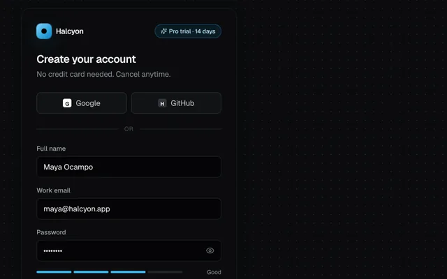
A sign-up card with a live password strength meter, requirement checklist, terms checkbox and plan badge.
Installation
01
Install with the shadcn CLI. The NiceUI theme comes along the first time.
$ npx shadcn@latest add https://niceui.dev/r/application-sign-up.json02
Or copy the source below (2 files). Dependencies: lucide-react.
Source
components/niceui/app/SignUp.tsx
import { useState, type FormEvent } from 'react';
import { ArrowRight, Sparkles } from 'lucide-react';
import { cn } from '@/lib/cn';
import { AuthCard, BrandMark, Divider, Field, PasswordField, PrimaryButton, SsoButtons, StrengthMeter, passwordChecks } from './authUi';

export type SignUpProps = {
  plan?: string;
  onSubmit?: (v: { name: string; email: string; password: string }) => Promise<void>;
  className?: string;
};

export function SignUp({ plan = 'Pro trial · 14 days', onSubmit, className }: SignUpProps) {
  const [name, setName] = useState('Maya Ocampo');
  const [email, setEmail] = useState('maya@halcyon.app');
  const [password, setPassword] = useState('Halcyon2');
  const [terms, setTerms] = useState(false);
  const [tried, setTried] = useState(false);
  const [state, setState] = useState<'idle' | 'loading' | 'done'>('idle');

  const strongEnough = passwordChecks(password).filter((c) => c.ok).length >= 3;
  const errors = {
    name: tried && !name.trim() ? 'Tell us your name.' : '',
    email: tried && !/^[^\s@]+@[^\s@]+\.[^\s@]+$/.test(email) ? 'Enter a valid email address.' : '',
    password: tried && !strongEnough ? 'Meet at least three of the requirements below.' : '',
    terms: tried && !terms ? 'Please accept the terms to continue.' : '',
  };

  const submit = async (e: FormEvent) => {
    e.preventDefault();
    setTried(true);
    if (!name.trim() || errors.email || !strongEnough || !terms) return;
    setState('loading');
    await (onSubmit ?? (() => new Promise<void>((r) => setTimeout(r, 1100))))({ name, email, password });
    setState('done');
  };

  return (
    <AuthCard className={className}>
      <form onSubmit={submit} noValidate>
        <div className="flex items-center justify-between gap-3">
          <BrandMark />
          <span className="inline-flex items-center gap-1 truncate rounded-full border border-brand-400/30 bg-brand-500/10 px-2.5 py-1 text-[11px] font-medium text-brand-200">
            <Sparkles className="h-3 w-3 shrink-0" /> <span className="truncate">{plan}</span>
          </span>
        </div>
        <h2 className="mt-6 text-xl font-semibold tracking-tight text-ink-50">Create your account</h2>
        <p className="mt-1 text-sm text-ink-400">No credit card needed. Cancel anytime.</p>
        <div className="mt-6">
          <SsoButtons />
        </div>
        <Divider />
        <div className="space-y-4">
          <Field label="Full name" autoComplete="name" value={name} onChange={(e) => setName(e.target.value)} error={errors.name} />
          <Field label="Work email" type="email" autoComplete="email" value={email} onChange={(e) => setEmail(e.target.value)} error={errors.email} />
          <div>
            <PasswordField label="Password" autoComplete="new-password" value={password} onChange={(e) => setPassword(e.target.value)} error={errors.password} />
            <div className="mt-3">
              <StrengthMeter password={password} />
            </div>
          </div>
        </div>
        <label className={cn('mt-5 flex cursor-pointer items-start gap-2 text-sm', errors.terms ? 'text-rose-300' : 'text-ink-300')}>
          <input type="checkbox" checked={terms} onChange={(e) => setTerms(e.target.checked)} className="mt-0.5 h-4 w-4 shrink-0 rounded accent-sky-400" />
          <span>
            I agree to the <a href="#terms" onClick={(e) => e.preventDefault()} className="text-brand-300 underline-offset-2 hover:underline">Terms</a> and{' '}
            <a href="#privacy" onClick={(e) => e.preventDefault()} className="text-brand-300 underline-offset-2 hover:underline">Privacy Policy</a>.
          </span>
        </label>
        <PrimaryButton type="submit" className="mt-5" loading={state === 'loading'} done={state === 'done'}>
          {state === 'done' ? 'Account created' : state === 'loading' ? 'Creating account…' : (<>Start free trial <ArrowRight className="h-4 w-4" /></>)}
        </PrimaryButton>
        <p className="mt-5 text-center text-sm text-ink-500">
          Already have an account? <a href="#signin" onClick={(e) => e.preventDefault()} className="text-brand-300 hover:text-brand-200">Sign in</a>
        </p>
      </form>
    </AuthCard>
  );
}

export function SignUpDemo() {
  return <SignUp />;
}
components/niceui/app/authUi.tsx
import { useState, type InputHTMLAttributes, type ReactNode } from 'react';
import { Eye, EyeOff, Check, X } from 'lucide-react';
import { cn } from '@/lib/cn';

/** Shared bits for the auth screens. */
export function AuthCard({ children, className }: { children: ReactNode; className?: string }) {
  return <div className={cn('w-full max-w-[400px] rounded-2xl bg-ink-900 p-6 shadow-card sm:p-7', className)}>{children}</div>;
}

export function BrandMark({ className }: { className?: string }) {
  return (
    <span className={cn('inline-flex items-center gap-2 text-sm font-semibold tracking-tight text-ink-50', className)}>
      <span className="grid h-7 w-7 place-items-center rounded-lg bg-gradient-to-br from-brand-300 to-brand-600 shadow-glow">
        <span className="h-2.5 w-2.5 rounded-full bg-ink-950" />
      </span>
      Halcyon
    </span>
  );
}

type FieldProps = InputHTMLAttributes<HTMLInputElement> & { label: string; error?: string; hint?: ReactNode; trailing?: ReactNode };

export function Field({ label, error, hint, trailing, id, className, ...rest }: FieldProps) {
  const fid = id ?? `f-${label.toLowerCase().replace(/\W+/g, '-')}`;
  return (
    <div className={className}>
      <div className="mb-1.5 flex items-center justify-between">
        <label htmlFor={fid} className="text-xs font-medium text-ink-300">
          {label}
        </label>
        {hint}
      </div>
      <div
        className={cn(
          'flex h-10 items-center rounded-lg border bg-ink-950/60 transition-colors focus-within:ring-2',
          error ? 'border-rose-500/60 focus-within:ring-rose-500/25' : 'border-white/10 focus-within:border-brand-400/60 focus-within:ring-brand-500/20',
        )}
      >
        <input id={fid} aria-invalid={!!error} aria-describedby={error ? `${fid}-err` : undefined} className="h-full min-w-0 flex-1 bg-transparent px-3 text-sm text-ink-50 outline-none placeholder:text-ink-600" {...rest} />
        {trailing}
      </div>
      {error && (
        <p id={`${fid}-err`} className="mt-1.5 text-xs text-rose-300 animate-fade-in">
          {error}
        </p>
      )}
    </div>
  );
}

export function PasswordField(props: Omit<FieldProps, 'type' | 'trailing'>) {
  const [show, setShow] = useState(false);
  return (
    <Field
      {...props}
      type={show ? 'text' : 'password'}
      trailing={
        <button type="button" onClick={() => setShow((s) => !s)} aria-label={show ? 'Hide password' : 'Show password'} className="focus-ring mr-1 grid h-8 w-8 place-items-center rounded-md text-ink-500 hover:text-ink-200">
          {show ? <EyeOff className="h-4 w-4" /> : <Eye className="h-4 w-4" />}
        </button>
      }
    />
  );
}

export function PrimaryButton({ children, loading, done, className, ...rest }: React.ButtonHTMLAttributes<HTMLButtonElement> & { loading?: boolean; done?: boolean }) {
  return (
    <button
      {...rest}
      disabled={rest.disabled || loading}
      className={cn(
        'focus-ring relative flex h-10 w-full items-center justify-center gap-2 rounded-lg text-sm font-medium transition-all active:scale-[0.98] disabled:cursor-not-allowed',
        done ? 'bg-emerald-500 text-ink-950' : 'bg-brand-400 text-ink-950 hover:bg-brand-300 disabled:opacity-70',
        className,
      )}
    >
      {loading ? <span className="h-4 w-4 animate-spin rounded-full border-2 border-ink-950/30 border-t-ink-950" /> : done ? <Check className="h-4 w-4 animate-scale-in" /> : null}
      {children}
    </button>
  );
}

function Glyph({ letter, className }: { letter: string; className: string }) {
  return <span className={cn('grid h-4 w-4 place-items-center rounded-[4px] text-[10px] font-bold', className)}>{letter}</span>;
}

export function SsoButtons() {
  return (
    <div className="grid grid-cols-2 gap-2">
      {[
        ['Google', <Glyph key="g" letter="G" className="bg-white text-ink-950" />],
        ['GitHub', <Glyph key="h" letter="H" className="bg-ink-700 text-ink-50" />],
      ].map(([name, icon]) => (
        <button key={name as string} type="button" className="focus-ring flex h-10 items-center justify-center gap-2 rounded-lg border border-white/10 bg-white/[0.03] text-sm text-ink-200 transition-colors hover:bg-white/[0.06]">
          {icon}
          <span className="truncate">{name as string}</span>
        </button>
      ))}
    </div>
  );
}

export function Divider({ label = 'or' }: { label?: string }) {
  return (
    <div className="my-5 flex items-center gap-3 text-[11px] uppercase tracking-wider text-ink-600">
      <span className="h-px flex-1 bg-white/10" />
      {label}
      <span className="h-px flex-1 bg-white/10" />
    </div>
  );
}

export function passwordChecks(pw: string) {
  return [
    { label: 'At least 8 characters', ok: pw.length >= 8 },
    { label: 'An uppercase letter', ok: /[A-Z]/.test(pw) },
    { label: 'A number', ok: /\d/.test(pw) },
    { label: 'A symbol', ok: /[^A-Za-z0-9]/.test(pw) },
  ];
}

export function StrengthMeter({ password }: { password: string }) {
  const checks = passwordChecks(password);
  const score = checks.filter((c) => c.ok).length;
  const label = ['Too weak', 'Weak', 'Fair', 'Good', 'Strong'][score];
  const color = ['bg-ink-700', 'bg-rose-400', 'bg-amber-400', 'bg-brand-400', 'bg-emerald-400'][score];
  return (
    <div className="space-y-2.5">
      <div className="flex items-center gap-2">
        <div className="flex flex-1 gap-1">
          {[0, 1, 2, 3].map((i) => (
            <span key={i} className={cn('h-1 flex-1 rounded-full transition-colors duration-300', i < score ? color : 'bg-white/10')} />
          ))}
        </div>
        <span className="w-16 text-right text-[11px] text-ink-400" aria-live="polite">
          {password ? label : ''}
        </span>
      </div>
      <ul className="grid grid-cols-2 gap-x-3 gap-y-1">
        {checks.map((c) => (
          <li key={c.label} className={cn('flex items-center gap-1.5 text-[11px] transition-colors', c.ok ? 'text-emerald-300' : 'text-ink-500')}>
            {c.ok ? <Check className="h-3 w-3 shrink-0" /> : <X className="h-3 w-3 shrink-0" />}
            <span className="truncate">{c.label}</span>
          </li>
        ))}
      </ul>
    </div>
  );
}