Card Folder
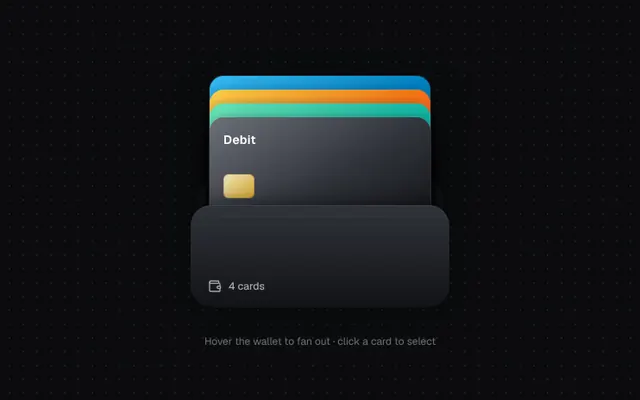
A wallet of payment cards that fans out on hover. Pick one and it rises out of the pocket.
Installation
01
Install with the shadcn CLI. The NiceUI theme comes along the first time.
$ npx shadcn@latest add https://niceui.dev/r/blocks-card-folder.json02
Or copy the source below. Dependencies: lucide-react.
Source
components/niceui/blocks/CardFolder.tsx
import { useState } from 'react';
import { Check, Wallet } from 'lucide-react';
import { cn } from '@/lib/cn';

export type WalletCard = { id: string; brand: string; last4: string; holder: string; gradient: string; balance: string };

const CARDS: WalletCard[] = [
  { id: 'a', brand: 'Visa', last4: '4242', holder: 'Mira Chen', gradient: 'from-brand-400 via-brand-600 to-brand-900', balance: '$4,820.12' },
  { id: 'b', brand: 'Mastercard', last4: '8812', holder: 'Mira Chen', gradient: 'from-amber-300 via-orange-500 to-rose-600', balance: '$1,204.50' },
  { id: 'c', brand: 'Amex', last4: '1005', holder: 'Mira Chen', gradient: 'from-emerald-300 via-teal-500 to-sky-700', balance: '$12,930.00' },
  { id: 'd', brand: 'Debit', last4: '7731', holder: 'Mira Chen', gradient: 'from-ink-500 via-ink-700 to-ink-900', balance: '$389.77' },
];

export type CardFolderProps = { cards?: WalletCard[]; selected: string | null; onSelect: (id: string | null) => void };

export function CardFolder({ cards = CARDS, selected, onSelect }: CardFolderProps) {
  const [hover, setHover] = useState(false);
  const [lift, setLift] = useState<string | null>(null);
  const open = hover && !selected;
  const mid = (cards.length - 1) / 2;

  return (
    <div
      className="relative h-[300px] w-[300px]"
      onPointerEnter={() => setHover(true)}
      onPointerLeave={() => setHover(false)}
    >
      {/* back of wallet */}
      <div className="absolute inset-x-2 bottom-0 h-[150px] rounded-3xl bg-ink-800 shadow-card" />
      {cards.map((c, i) => {
        const isSel = selected === c.id;
        let transform = `translateX(-50%) translateY(${-60 - (cards.length - 1 - i) * 16}px)`;
        if (open) transform = `translateX(-50%) translateY(${lift === c.id ? -112 : -92}px) rotate(${(i - mid) * 11}deg) translateX(${(i - mid) * 6}px)`;
        if (selected) transform = isSel ? 'translateX(-50%) translateY(-138px) scale(1.04)' : `translateX(-50%) translateY(${-24 - (cards.length - 1 - i) * 6}px) scale(0.94)`;
        return (
          <button
            key={c.id}
            onClick={() => onSelect(isSel ? null : c.id)}
            onPointerEnter={() => setLift(c.id)}
            onPointerLeave={() => setLift(null)}
            aria-pressed={isSel}
            className={cn(
              'focus-ring absolute bottom-0 left-1/2 flex h-[160px] w-[256px] origin-bottom flex-col justify-between rounded-2xl bg-gradient-to-br p-4 text-left text-white shadow-pop transition-all duration-500 ease-spring',
              c.gradient,
            )}
            style={{ transform, zIndex: isSel ? 40 : i + 1, transitionDelay: open ? `${i * 30}ms` : '0ms' }}
          >
            <div className="flex items-start justify-between">
              <span className="text-sm font-semibold tracking-wide">{c.brand}</span>
              <span className={cn('flex h-5 w-5 items-center justify-center rounded-full bg-white text-ink-900 transition-all duration-300', isSel ? 'scale-100 opacity-100' : 'scale-50 opacity-0')}>
                <Check className="h-3 w-3" />
              </span>
            </div>
            <div className="h-7 w-9 rounded-md bg-gradient-to-br from-amber-100/90 to-amber-400/80 shadow-[inset_0_0_0_1px_rgba(0,0,0,0.15)]" />
            <div className="flex items-end justify-between">
              <span className="font-mono text-sm tracking-[0.2em]">•••• {c.last4}</span>
              <span className="text-[11px] text-white/70">{c.holder}</span>
            </div>
          </button>
        );
      })}
      {/* front pocket */}
      <div className="pointer-events-none absolute inset-x-0 bottom-0 z-30 h-[118px] rounded-3xl bg-gradient-to-b from-ink-700 to-ink-850 shadow-[inset_0_1px_0_rgba(255,255,255,0.08),0_-8px_24px_-8px_rgba(0,0,0,0.6)]">
        <div className="absolute inset-x-6 top-3 border-t border-dashed border-white/10" />
        <div className="absolute bottom-4 left-5 flex items-center gap-2 text-ink-300">
          <Wallet className="h-4 w-4" />
          <span className="text-xs font-medium">{cards.length} cards</span>
        </div>
      </div>
    </div>
  );
}

export function CardFolderDemo() {
  const [selected, setSelected] = useState<string | null>(null);
  const card = CARDS.find((c) => c.id === selected);
  return (
    <div className="flex flex-col items-center gap-5 pt-4">
      <CardFolder selected={selected} onSelect={setSelected} />
      <div className="h-12 text-center">
        {card ? (
          <div key={card.id} className="animate-fade-up">
            <p className="text-lg font-medium tabular-nums text-ink-50">{card.balance}</p>
            <p className="text-xs text-ink-400">{card.brand} •• {card.last4} · tap again to return</p>
          </div>
        ) : (
          <p className="pt-3 text-xs text-ink-500">Hover the wallet to fan out · click a card to select</p>
        )}
      </div>
    </div>
  );
}