KPI Chart Cards New
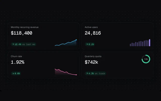
Stat cards with counting values, deltas and a sparkline, mini bars or a progress ring.
Installation
01
Install with the shadcn CLI. The NiceUI theme comes along the first time.
$ npx shadcn@latest add https://niceui.dev/r/charts-chart-cards.json02
Or copy the source below (2 files). Dependencies: lucide-react.
Source
components/niceui/charts/ChartCard.tsx
import { useEffect, useId, useState } from 'react';
import { ArrowDownRight, ArrowUpRight } from 'lucide-react';
import { cn } from '@/lib/cn';
import { reducedMotion, smoothPath, useInView } from './chart-utils';

export function Sparkline({ values, color = '#38bdf8', width = 120, height = 36, play = true }: { values: number[]; color?: string; width?: number; height?: number; play?: boolean }) {
  const id = useId().replace(/:/g, '');
  const min = Math.min(...values);
  const max = Math.max(...values);
  const pts = values.map((v, i) => [(i / (values.length - 1)) * width, height - 3 - ((v - min) / (max - min || 1)) * (height - 6)] as [number, number]);
  const line = smoothPath(pts);
  return (
    <svg width={width} height={height} viewBox={`0 0 ${width} ${height}`} className="block overflow-visible" aria-hidden>
      <defs>
        <linearGradient id={id} x1="0" y1="0" x2="0" y2="1">
          <stop offset="0%" stopColor={color} stopOpacity="0.3" />
          <stop offset="100%" stopColor={color} stopOpacity="0" />
        </linearGradient>
      </defs>
      <path d={`${line} L${width},${height} L0,${height} Z`} fill={`url(#${id})`} style={{ opacity: play ? 1 : 0, transition: 'opacity 0.8s 0.5s' }} />
      <path d={line} fill="none" stroke={color} strokeWidth={1.8} strokeLinecap="round" pathLength={1} strokeDasharray="1" style={{ strokeDashoffset: play ? 0 : 1, transition: 'stroke-dashoffset 1.2s cubic-bezier(0.16,1,0.3,1)' }} />
      <circle cx={pts[pts.length - 1][0]} cy={pts[pts.length - 1][1]} r={2.5} fill={color} style={{ opacity: play ? 1 : 0, transition: 'opacity 0.3s 1.1s' }} />
    </svg>
  );
}

export function MiniBars({ values, color = '#a78bfa', height = 36, play = true }: { values: number[]; color?: string; height?: number; play?: boolean }) {
  const max = Math.max(...values, 1);
  return (
    <div className="flex items-end gap-[3px]" style={{ height }} aria-hidden>
      {values.map((v, i) => (
        <span
          key={i}
          className="w-[6px] rounded-sm"
          style={{
            height: `${(v / max) * 100}%`,
            background: i === values.length - 1 ? color : `${color}55`,
            transform: play ? 'scaleY(1)' : 'scaleY(0)',
            transformOrigin: 'bottom',
            transition: `transform 0.7s cubic-bezier(0.16,1,0.3,1) ${i * 40}ms`,
          }}
        />
      ))}
    </div>
  );
}

export function ProgressRing({ value, color = '#34d399', size = 44, stroke = 5, play = true }: { value: number; color?: string; size?: number; stroke?: number; play?: boolean }) {
  const r = (size - stroke) / 2;
  return (
    <svg width={size} height={size} className="-rotate-90" aria-hidden>
      <circle cx={size / 2} cy={size / 2} r={r} fill="none" stroke="rgba(255,255,255,0.07)" strokeWidth={stroke} />
      <circle cx={size / 2} cy={size / 2} r={r} fill="none" stroke={color} strokeWidth={stroke} strokeLinecap="round" pathLength={100} strokeDasharray={`${play ? value : 0} 100`} style={{ transition: 'stroke-dasharray 1.2s cubic-bezier(0.16,1,0.3,1)' }} />
    </svg>
  );
}

function useCount(target: number, play: boolean, decimals = 0) {
  const [v, setV] = useState(reducedMotion() ? target : 0);
  useEffect(() => {
    if (!play || reducedMotion()) return setV(target);
    let raf = 0;
    const t0 = performance.now();
    const tick = (now: number) => {
      const p = Math.min(1, (now - t0) / 1200);
      setV(target * (1 - Math.pow(1 - p, 4)));
      if (p < 1) raf = requestAnimationFrame(tick);
    };
    raf = requestAnimationFrame(tick);
    return () => cancelAnimationFrame(raf);
  }, [target, play]);
  return v.toLocaleString('en-US', { minimumFractionDigits: decimals, maximumFractionDigits: decimals });
}

export type KpiCardProps = {
  label: string;
  value: number;
  prefix?: string;
  suffix?: string;
  decimals?: number;
  delta: number;
  /** Lower is better (e.g. churn): a negative delta is shown as good. */
  invert?: boolean;
  visual: 'sparkline' | 'bars' | 'ring';
  data?: number[];
  ring?: number;
  color?: string;
  note?: string;
};

export function KpiCard({ label, value, prefix = '', suffix = '', decimals = 0, delta, invert, visual, data = [], ring = 0, color, note }: KpiCardProps) {
  const { ref, seen } = useInView<HTMLDivElement>();
  const shown = useCount(value, seen, decimals);
  const good = invert ? delta < 0 : delta >= 0;
  const Arrow = delta >= 0 ? ArrowUpRight : ArrowDownRight;
  return (
    <div ref={ref} className="group flex min-w-0 flex-col justify-between gap-4 rounded-2xl bg-ink-900 p-4 shadow-card transition-transform duration-300 hover:-translate-y-0.5">
      <div className="flex items-start justify-between gap-3">
        <div className="min-w-0">
          <p className="truncate text-xs text-ink-400">{label}</p>
          <p className="mt-1.5 font-mono text-2xl font-medium tabular-nums tracking-tight text-ink-50">
            {prefix}
            {shown}
            {suffix}
          </p>
        </div>
        {visual === 'ring' && (
          <div className="relative grid place-items-center">
            <ProgressRing value={ring} color={color} play={seen} />
            <span className="absolute font-mono text-[10px] text-ink-300">{ring}%</span>
          </div>
        )}
      </div>
      <div className="flex items-end justify-between gap-3">
        <span className={cn('inline-flex items-center gap-0.5 rounded-full px-1.5 py-0.5 font-mono text-[11px]', good ? 'bg-emerald-500/10 text-emerald-400' : 'bg-rose-500/10 text-rose-400')}>
          <Arrow className="h-3 w-3" />
          {Math.abs(delta).toFixed(1)}%
          {note && <span className="ml-1 text-ink-500">{note}</span>}
        </span>
        {visual === 'sparkline' && <Sparkline values={data} color={color} play={seen} width={110} />}
        {visual === 'bars' && <MiniBars values={data} color={color} play={seen} />}
      </div>
    </div>
  );
}

export function ChartCardDemo() {
  return (
    <div className="grid w-full grid-cols-[minmax(0,1fr)] gap-3 sm:grid-cols-2">
      <KpiCard label="Monthly recurring revenue" value={118400} prefix="$" delta={12.4} visual="sparkline" color="#38bdf8" data={[62, 66, 64, 71, 75, 73, 80, 86, 84, 92, 97, 104]} note="vs last mo" />
      <KpiCard label="Active users" value={24816} delta={8.1} visual="bars" color="#a78bfa" data={[30, 42, 38, 51, 47, 58, 62, 55, 68, 72, 70, 84]} />
      <KpiCard label="Churn rate" value={1.92} suffix="%" decimals={2} delta={-0.6} invert visual="sparkline" color="#f472b6" data={[3.1, 2.9, 3, 2.7, 2.6, 2.4, 2.5, 2.2, 2.1, 2, 1.95, 1.92]} />
      <KpiCard label="Quarterly quota" value={742} prefix="$" suffix="k" delta={4.3} visual="ring" ring={74} color="#34d399" note="on track" />
    </div>
  );
}
components/niceui/charts/chart-utils.tsx
import { useEffect, useRef, useState, type ReactNode } from 'react';
import { cn } from '@/lib/cn';

export const SERIES_COLORS = ['#38bdf8', '#a78bfa', '#34d399', '#fbbf24', '#f472b6'];

export const reducedMotion = () => typeof window !== 'undefined' && window.matchMedia('(prefers-reduced-motion: reduce)').matches;

/** Becomes true once the element scrolls into view (or immediately under reduced motion). */
export function useInView<T extends Element>(threshold = 0.25) {
  const ref = useRef<T>(null);
  const [seen, setSeen] = useState(false);
  useEffect(() => {
    if (reducedMotion()) return setSeen(true);
    const el = ref.current;
    if (!el) return;
    const io = new IntersectionObserver(([e]) => e.isIntersecting && (setSeen(true), io.disconnect()), { threshold });
    io.observe(el);
    return () => io.disconnect();
  }, [threshold]);
  return { ref, seen };
}

/** Tracks the rendered width of an element so SVG charts can draw at true pixel size. */
export function useWidth<T extends Element>(fallback = 600) {
  const ref = useRef<T>(null);
  const [w, setW] = useState(fallback);
  useEffect(() => {
    const el = ref.current;
    if (!el) return;
    const ro = new ResizeObserver(([e]) => setW(Math.max(200, Math.round(e.contentRect.width))));
    ro.observe(el);
    return () => ro.disconnect();
  }, []);
  return { ref, w };
}

export const scale = (d0: number, d1: number, r0: number, r1: number) => (v: number) => r0 + ((v - d0) / (d1 - d0 || 1)) * (r1 - r0);

/** Nice upper bound for an axis. */
export function niceMax(v: number) {
  if (v <= 0) return 1;
  const p = Math.pow(10, Math.floor(Math.log10(v)));
  const n = v / p;
  return (n <= 1 ? 1 : n <= 2 ? 2 : n <= 2.5 ? 2.5 : n <= 5 ? 5 : 10) * p;
}

/** Smooth monotone-ish path through points (Catmull-Rom → Bézier, tension 0.5). */
export function smoothPath(pts: [number, number][]) {
  if (pts.length < 2) return '';
  let d = `M${pts[0][0]},${pts[0][1]}`;
  for (let i = 0; i < pts.length - 1; i++) {
    const p0 = pts[i - 1] ?? pts[i];
    const p1 = pts[i];
    const p2 = pts[i + 1];
    const p3 = pts[i + 2] ?? p2;
    const c1x = p1[0] + (p2[0] - p0[0]) / 6;
    const c1y = p1[1] + (p2[1] - p0[1]) / 6;
    const c2x = p2[0] - (p3[0] - p1[0]) / 6;
    const c2y = p2[1] - (p3[1] - p1[1]) / 6;
    d += ` C${c1x},${c1y} ${c2x},${c2y} ${p2[0]},${p2[1]}`;
  }
  return d;
}

export const fmt = (v: number, prefix = '') => prefix + (Math.abs(v) >= 1000 ? (v / 1000).toFixed(v >= 10000 ? 0 : 1) + 'k' : String(Math.round(v)));

export function Legend({ items, hidden, onToggle }: { items: { name: string; color: string }[]; hidden: Set<string>; onToggle: (name: string) => void }) {
  return (
    <div className="flex flex-wrap gap-1.5">
      {items.map((s) => {
        const off = hidden.has(s.name);
        return (
          <button
            key={s.name}
            onClick={() => onToggle(s.name)}
            aria-pressed={!off}
            className={cn('focus-ring flex items-center gap-1.5 rounded-full border px-2.5 py-1 text-xs transition-all', off ? 'border-white/5 text-ink-500' : 'border-white/10 bg-white/[0.03] text-ink-200 hover:bg-white/[0.06]')}
          >
            <span className="h-2 w-2 rounded-full transition-opacity" style={{ background: s.color, opacity: off ? 0.3 : 1 }} />
            {s.name}
          </button>
        );
      })}
    </div>
  );
}

export function useToggleSet() {
  const [hidden, setHidden] = useState<Set<string>>(new Set());
  const toggle = (k: string) =>
    setHidden((h) => {
      const n = new Set(h);
      if (n.has(k)) n.delete(k);
      else n.add(k);
      return n;
    });
  return { hidden, toggle };
}

export function Tooltip({ x, y, w, children }: { x: number; y: number; w: number; children: ReactNode }) {
  const left = Math.min(Math.max(x, 70), w - 70);
  return (
    <div className="pointer-events-none absolute z-10 -translate-x-1/2 -translate-y-full rounded-xl border border-white/10 bg-ink-850/95 px-3 py-2 text-xs shadow-pop backdrop-blur" style={{ left, top: y - 10 }}>
      {children}
    </div>
  );
}

export function Segmented<T extends string>({ value, options, onChange }: { value: T; options: T[]; onChange: (v: T) => void }) {
  return (
    <div className="flex rounded-lg bg-white/[0.04] p-0.5 ring-1 ring-white/5">
      {options.map((o) => (
        <button key={o} onClick={() => onChange(o)} className={cn('focus-ring rounded-md px-2.5 py-1 text-xs font-medium transition-all', value === o ? 'bg-ink-800 text-ink-50 shadow-hairline' : 'text-ink-400 hover:text-ink-200')}>
          {o}
        </button>
      ))}
    </div>
  );
}

export function ChartFrame({ title, sub, right, children, className }: { title: string; sub?: ReactNode; right?: ReactNode; children: ReactNode; className?: string }) {
  return (
    <div className={cn('w-full rounded-2xl bg-ink-900 p-4 shadow-card sm:p-5', className)}>
      <div className="mb-4 flex flex-wrap items-start justify-between gap-3">
        <div className="min-w-0">
          <p className="text-sm font-medium text-ink-100">{title}</p>
          {sub && <div className="mt-0.5 text-xs text-ink-500">{sub}</div>}
        </div>
        {right}
      </div>
      {children}
    </div>
  );
}