Animated Sidebar
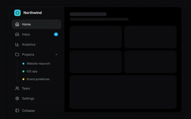
An app sidebar that collapses between 72px and 240px with fading labels and nested groups.
Installation
01
Install with the shadcn CLI. The NiceUI theme comes along the first time.
$ npx shadcn@latest add https://niceui.dev/r/components-animated-sidebar.json02
Or copy the source below. Dependencies: lucide-react.
Source
components/niceui/ui/motion/AnimatedSidebar.tsx
import { useState, type ComponentType } from 'react';
import { BarChart3, ChevronDown, Folder, Hexagon, Home, Inbox, LogOut, PanelLeft, Settings, Users } from 'lucide-react';
import { cn } from '@/lib/cn';

export type SidebarNode = {
  id: string;
  label: string;
  icon: ComponentType<{ className?: string }>;
  badge?: number;
  children?: { id: string; label: string; color: string }[];
};

export type AnimatedSidebarProps = {
  items: SidebarNode[];
  defaultCollapsed?: boolean;
  collapsedWidth?: number;
  expandedWidth?: number;
};

export function AnimatedSidebar({ items, defaultCollapsed = false, collapsedWidth = 72, expandedWidth = 240 }: AnimatedSidebarProps) {
  const [collapsed, setCollapsed] = useState(defaultCollapsed);
  const [active, setActive] = useState('home');
  const [groups, setGroups] = useState<string[]>(['projects']);

  const label = cn('whitespace-nowrap transition-all duration-300', collapsed ? 'pointer-events-none -translate-x-2 opacity-0' : 'translate-x-0 opacity-100 delay-100');
  const row = (on: boolean) =>
    cn(
      'focus-ring group relative flex h-10 w-full items-center gap-3 rounded-xl px-[14px] text-sm transition-colors duration-200',
      on ? 'bg-white/[0.07] text-ink-50 shadow-hairline' : 'text-ink-400 hover:bg-white/[0.04] hover:text-ink-100',
    );

  return (
    <aside
      style={{ width: collapsed ? collapsedWidth : expandedWidth }}
      className="flex h-full shrink-0 flex-col overflow-hidden border-r border-white/5 bg-ink-900 p-3 transition-[width] duration-500 ease-[cubic-bezier(0.32,0.72,0,1)]"
    >
      <div className="mb-4 flex h-10 items-center gap-3 px-[10px]">
        <span className="flex h-7 w-7 shrink-0 items-center justify-center rounded-lg bg-gradient-to-br from-brand-400 to-teal-400 text-ink-950">
          <Hexagon className="h-4 w-4" />
        </span>
        <span className={cn(label, 'font-semibold text-ink-50')}>Northwind</span>
      </div>
      <nav className="flex flex-1 flex-col gap-1">
        {items.map((item) => {
          const isGroup = !!item.children;
          const open = groups.includes(item.id) && !collapsed;
          const childActive = item.children?.some((c) => c.id === active);
          return (
            <div key={item.id}>
              <button
                title={collapsed ? item.label : undefined}
                onClick={() => {
                  if (!isGroup) return setActive(item.id);
                  if (collapsed) {
                    setCollapsed(false);
                    setGroups((g) => (g.includes(item.id) ? g : [...g, item.id]));
                  } else setGroups((g) => (g.includes(item.id) ? g.filter((x) => x !== item.id) : [...g, item.id]));
                }}
                className={row(active === item.id || (!!childActive && collapsed))}
              >
                <item.icon className="h-[18px] w-[18px] shrink-0" />
                <span className={cn(label, 'flex-1 text-left')}>{item.label}</span>
                {item.badge && (
                  <span
                    className={cn(
                      'rounded-full bg-brand-500 px-1.5 text-[10px] font-semibold leading-4 text-white transition-all duration-300',
                      collapsed ? 'absolute right-2.5 top-1.5 scale-75' : 'scale-100',
                    )}
                  >
                    {item.badge}
                  </span>
                )}
                {isGroup && <ChevronDown className={cn(label, 'h-3.5 w-3.5 transition-transform duration-300', open ? 'rotate-0' : '-rotate-90')} />}
              </button>
              {item.children && (
                <div className={cn('grid transition-[grid-template-rows] duration-500 ease-smooth', open ? 'grid-rows-[1fr]' : 'grid-rows-[0fr]')}>
                  <div className="min-h-0 overflow-hidden">
                    <div className="relative ml-[23px] mt-1 space-y-0.5 border-l border-white/10 pl-3">
                      {item.children.map((c, i) => (
                        <button
                          key={c.id}
                          onClick={() => setActive(c.id)}
                          style={{ transitionDelay: open ? `${i * 40}ms` : '0ms' }}
                          className={cn(
                            'flex h-8 w-full items-center gap-2.5 whitespace-nowrap rounded-lg px-2.5 text-[13px] transition-all duration-300',
                            open ? 'translate-x-0 opacity-100' : '-translate-x-2 opacity-0',
                            active === c.id ? 'bg-white/[0.06] text-ink-50' : 'text-ink-400 hover:text-ink-100',
                          )}
                        >
                          <span className={cn('h-2 w-2 shrink-0 rounded-[3px]', c.color)} />
                          {c.label}
                        </button>
                      ))}
                    </div>
                  </div>
                </div>
              )}
            </div>
          );
        })}
      </nav>
      <div className="space-y-1 border-t border-white/5 pt-3">
        <button onClick={() => setCollapsed((c) => !c)} className={row(false)} aria-label="Toggle sidebar">
          <PanelLeft className={cn('h-[18px] w-[18px] shrink-0 transition-transform duration-500', collapsed && 'rotate-180')} />
          <span className={label}>Collapse</span>
        </button>
        <div className="flex h-11 items-center gap-3 rounded-xl px-[9px]">
          <span className="flex h-7 w-7 shrink-0 items-center justify-center rounded-full bg-ink-700 text-[11px] font-semibold text-ink-100">JL</span>
          <span className={cn(label, 'min-w-0 flex-1')}>
            <span className="block text-sm font-medium text-ink-100">Jamie Lin</span>
            <span className="block text-xs text-ink-500">jamie@northwind.io</span>
          </span>
          <LogOut className={cn(label, 'h-4 w-4 text-ink-500')} />
        </div>
      </div>
    </aside>
  );
}

const NAV: SidebarNode[] = [
  { id: 'home', label: 'Home', icon: Home },
  { id: 'inbox', label: 'Inbox', icon: Inbox, badge: 4 },
  { id: 'analytics', label: 'Analytics', icon: BarChart3 },
  {
    id: 'projects',
    label: 'Projects',
    icon: Folder,
    children: [
      { id: 'p-web', label: 'Website relaunch', color: 'bg-brand-400' },
      { id: 'p-ios', label: 'iOS app', color: 'bg-emerald-400' },
      { id: 'p-brand', label: 'Brand guidelines', color: 'bg-amber-400' },
    ],
  },
  { id: 'team', label: 'Team', icon: Users },
  { id: 'settings', label: 'Settings', icon: Settings },
];

export function AnimatedSidebarDemo() {
  return (
    <div className="mx-auto flex h-[460px] w-full max-w-3xl overflow-hidden rounded-2xl bg-ink-950 shadow-card">
      <AnimatedSidebar items={NAV} />
      <main className="min-w-0 flex-1 p-6">
        <div className="h-4 w-40 rounded-md bg-ink-800" />
        <div className="mt-2 h-3 w-64 max-w-full rounded-md bg-ink-850" />
        <div className="mt-6 grid grid-cols-2 gap-3">
          {[0, 1, 2, 3].map((i) => (
            <div key={i} className="h-24 rounded-xl bg-ink-900 shadow-hairline" />
          ))}
        </div>
        <div className="mt-3 h-36 rounded-xl bg-ink-900 shadow-hairline" />
      </main>
    </div>
  );
}