Bouncy Accordion
An accordion with spring-eased panels, a rotating plus icon and single or multiple open modes.
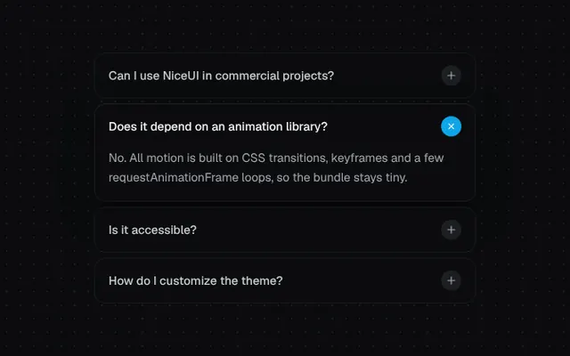
Installation
01
Install with the shadcn CLI. The NiceUI theme comes along the first time.
$ npx shadcn@latest add https://niceui.dev/r/components-bouncy-accordion.json02
Or copy the source below. Dependencies: lucide-react.
Source
components/niceui/ui/motion/BouncyAccordion.tsx
import { useState, type ReactNode } from 'react';
import { Plus } from 'lucide-react';
import { cn } from '@/lib/cn';

export type AccordionItem = { id: string; title: string; content: ReactNode };

export type BouncyAccordionProps = {
  items: AccordionItem[];
  type?: 'single' | 'multiple';
  defaultOpen?: string[];
  className?: string;
};

export function BouncyAccordion({ items, type = 'single', defaultOpen = [], className }: BouncyAccordionProps) {
  const [open, setOpen] = useState<string[]>(defaultOpen);

  const toggle = (id: string) =>
    setOpen((prev) => {
      if (prev.includes(id)) return prev.filter((p) => p !== id);
      return type === 'single' ? [id] : [...prev, id];
    });

  return (
    <div className={cn('flex flex-col gap-2', className)}>
      {items.map((item, i) => {
        const isOpen = open.includes(item.id);
        return (
          <div
            key={item.id}
            style={{ animationDelay: `${i * 60}ms` }}
            className={cn(
              'animate-fade-up overflow-hidden rounded-xl bg-ink-900 transition-all duration-500 ease-spring',
              isOpen ? 'shadow-pop' : 'shadow-hairline hover:bg-ink-850',
            )}
          >
            <button
              onClick={() => toggle(item.id)}
              aria-expanded={isOpen}
              className="focus-ring flex w-full items-center justify-between gap-4 rounded-xl px-4 py-3.5 text-left"
            >
              <span className={cn('text-sm font-medium transition-colors', isOpen ? 'text-ink-50' : 'text-ink-200')}>
                {item.title}
              </span>
              <span
                className={cn(
                  'flex h-6 w-6 shrink-0 items-center justify-center rounded-full transition-all duration-500 ease-spring',
                  isOpen ? 'rotate-[135deg] bg-brand-500 text-white' : 'bg-ink-800 text-ink-300',
                )}
              >
                <Plus className="h-3.5 w-3.5" />
              </span>
            </button>
            <div
              className={cn(
                'grid transition-[grid-template-rows] ease-spring',
                isOpen ? 'grid-rows-[1fr] duration-[650ms]' : 'grid-rows-[0fr] duration-300',
              )}
            >
              <div className="min-h-0 overflow-hidden">
                <div
                  className={cn(
                    'px-4 pb-4 text-sm leading-relaxed text-ink-300 transition-all ease-spring',
                    isOpen ? 'translate-y-0 scale-100 opacity-100 duration-500 delay-75' : '-translate-y-3 scale-[0.98] opacity-0 duration-200',
                  )}
                >
                  {item.content}
                </div>
              </div>
            </div>
          </div>
        );
      })}
    </div>
  );
}

const FAQ: AccordionItem[] = [
  {
    id: 'license',
    title: 'Can I use NiceUI in commercial projects?',
    content: 'Yes. Every component is MIT licensed — ship it in client work, SaaS products and internal tools without attribution.',
  },
  {
    id: 'deps',
    title: 'Does it depend on an animation library?',
    content: 'No. All motion is built on CSS transitions, keyframes and a few requestAnimationFrame loops, so the bundle stays tiny.',
  },
  {
    id: 'a11y',
    title: 'Is it accessible?',
    content: 'Components ship with keyboard support, ARIA attributes and respect prefers-reduced-motion out of the box.',
  },
  {
    id: 'theme',
    title: 'How do I customize the theme?',
    content: 'Override the ink and brand scales in tailwind.config.js. Every component reads from those tokens.',
  },
];

export function BouncyAccordionDemo() {
  return (
    <div className="mx-auto w-full max-w-md">
      <BouncyAccordion items={FAQ} defaultOpen={['deps']} />
    </div>
  );
}

export function BouncyAccordionMultipleDemo() {
  return (
    <div className="mx-auto w-full max-w-md">
      <BouncyAccordion items={FAQ.slice(0, 3)} type="multiple" defaultOpen={['license', 'a11y']} />
    </div>
  );
}