Color Picker New
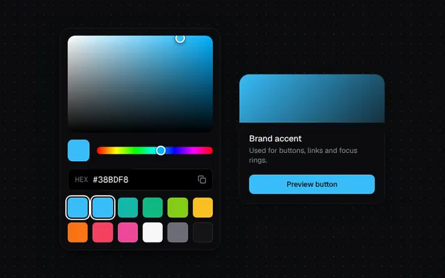
Saturation/value square, hue slider, hex input with copy and preset swatches, all draggable with the pointer.
Installation
01
Install with the shadcn CLI. The NiceUI theme comes along the first time.
$ npx shadcn@latest add https://niceui.dev/r/components-color-picker.json02
Or copy the source below (2 files). Dependencies: lucide-react.
Source
components/niceui/ui/core/ColorPicker.tsx
import { useEffect, useRef, useState, type PointerEvent } from 'react';
import { Check, Copy } from 'lucide-react';
import { cn } from '@/lib/cn';
import { clamp } from './utils';

type HSV = { h: number; s: number; v: number };

export function hsvToHex({ h, s, v }: HSV) {
  const f = (n: number) => {
    const k = (n + h / 60) % 6;
    const c = v - v * s * Math.max(0, Math.min(k, 4 - k, 1));
    return Math.round(c * 255).toString(16).padStart(2, '0');
  };
  return `#${f(5)}${f(3)}${f(1)}`;
}

export function hexToHsv(hex: string): HSV | null {
  const m = /^#?([0-9a-f]{6}|[0-9a-f]{3})$/i.exec(hex.trim());
  if (!m) return null;
  const full = m[1].length === 3 ? m[1].replace(/./g, (c) => c + c) : m[1];
  const [r, g, b] = [0, 2, 4].map((i) => parseInt(full.slice(i, i + 2), 16) / 255);
  const max = Math.max(r, g, b);
  const d = max - Math.min(r, g, b);
  let h = 0;
  if (d) {
    if (max === r) h = ((g - b) / d) % 6;
    else if (max === g) h = (b - r) / d + 2;
    else h = (r - g) / d + 4;
    h = (h * 60 + 360) % 360;
  }
  return { h, s: max ? d / max : 0, v: max };
}

function useDrag(onPos: (x: number, y: number) => void) {
  const ref = useRef<HTMLDivElement>(null);
  const [active, setActive] = useState(false);
  const handle = (e: PointerEvent) => {
    const r = ref.current!.getBoundingClientRect();
    onPos(clamp((e.clientX - r.left) / r.width, 0, 1), clamp((e.clientY - r.top) / r.height, 0, 1));
  };
  return {
    ref,
    active,
    bind: {
      onPointerDown: (e: PointerEvent<HTMLDivElement>) => {
        e.currentTarget.setPointerCapture(e.pointerId);
        setActive(true);
        handle(e);
      },
      onPointerMove: (e: PointerEvent<HTMLDivElement>) => active && handle(e),
      onPointerUp: () => setActive(false),
      onPointerCancel: () => setActive(false),
    },
  };
}

const SWATCHES = ['#38bdf8', '#38bdf8', '#14b8a6', '#10b981', '#84cc16', '#fbbf24', '#f97316', '#f43f5e', '#ec4899', '#f7f7f8', '#6b6b77', '#131316'];

export type ColorPickerProps = { value: string; onChange: (hex: string) => void; swatches?: string[] };

export function ColorPicker({ value, onChange, swatches = SWATCHES }: ColorPickerProps) {
  const [hsv, setHsv] = useState<HSV>(() => hexToHsv(value) ?? { h: 210, s: 0.8, v: 1 });
  const [draft, setDraft] = useState(value);
  const [copied, setCopied] = useState(false);

  const set = (next: HSV) => {
    setHsv(next);
    const hex = hsvToHex(next);
    setDraft(hex);
    onChange(hex);
  };

  useEffect(() => {
    if (value.toLowerCase() !== hsvToHex(hsv).toLowerCase()) {
      const parsed = hexToHsv(value);
      if (parsed) setHsv(parsed);
      setDraft(value);
    }
    // eslint-disable-next-line react-hooks/exhaustive-deps
  }, [value]);

  const sv = useDrag((x, y) => set({ ...hsv, s: x, v: 1 - y }));
  const hue = useDrag((x) => set({ ...hsv, h: x * 360 }));
  const hueColor = hsvToHex({ h: hsv.h, s: 1, v: 1 });
  const hex = hsvToHex(hsv);

  const copy = () => {
    navigator.clipboard?.writeText(hex).catch(() => undefined);
    setCopied(true);
    window.setTimeout(() => setCopied(false), 1400);
  };

  return (
    <div className="w-[264px] rounded-2xl bg-ink-900 p-3 shadow-pop">
      <div
        ref={sv.ref}
        {...sv.bind}
        className="relative h-40 cursor-crosshair touch-none overflow-hidden rounded-xl"
        style={{ background: `linear-gradient(to top, #000, transparent), linear-gradient(to right, #fff, ${hueColor})` }}
      >
        <span
          className={cn(
            'pointer-events-none absolute h-4 w-4 -translate-x-1/2 -translate-y-1/2 rounded-full border-2 border-white shadow-[0_0_0_1px_rgba(0,0,0,0.3),0_2px_6px_rgba(0,0,0,0.5)] transition-transform duration-200 ease-spring',
            sv.active && 'scale-125',
          )}
          style={{ left: `${hsv.s * 100}%`, top: `${(1 - hsv.v) * 100}%`, background: hex }}
        />
      </div>
      <div className="mt-3 flex items-center gap-3">
        <div
          className="h-9 w-9 shrink-0 rounded-lg shadow-[inset_0_0_0_1px_rgba(255,255,255,0.12)] transition-colors duration-150"
          style={{ background: hex }}
        />
        <div
          ref={hue.ref}
          {...hue.bind}
          className="relative h-3 flex-1 cursor-pointer touch-none rounded-full"
          style={{ background: 'linear-gradient(90deg,#f00,#ff0,#0f0,#0ff,#00f,#f0f,#f00)' }}
        >
          <span
            className={cn(
              'pointer-events-none absolute top-1/2 h-4 w-4 -translate-x-1/2 -translate-y-1/2 rounded-full border-2 border-white shadow-[0_0_0_1px_rgba(0,0,0,0.3),0_2px_6px_rgba(0,0,0,0.5)] transition-transform duration-200 ease-spring',
              hue.active && 'scale-125',
            )}
            style={{ left: `${(hsv.h / 360) * 100}%`, background: hueColor }}
          />
        </div>
      </div>
      <div className="mt-3 flex h-9 items-center rounded-lg bg-ink-950 ring-1 ring-inset ring-white/10 focus-within:ring-brand-500">
        <span className="pl-3 font-mono text-xs text-ink-500">HEX</span>
        <input
          value={draft.toUpperCase()}
          aria-label="Hex color"
          spellCheck={false}
          onChange={(e) => {
            const v = e.target.value.startsWith('#') ? e.target.value : `#${e.target.value}`;
            setDraft(v);
            const parsed = /^#[0-9a-f]{6}$/i.test(v) ? hexToHsv(v) : null;
            if (parsed) {
              setHsv(parsed);
              onChange(v.toLowerCase());
            }
          }}
          onBlur={() => setDraft(hex)}
          maxLength={7}
          className="h-full min-w-0 flex-1 bg-transparent px-2 font-mono text-sm text-ink-50 outline-none"
        />
        <button
          onClick={copy}
          aria-label="Copy hex"
          className="focus-ring relative mr-1 flex h-7 w-7 items-center justify-center rounded-md text-ink-400 transition hover:bg-white/5 hover:text-ink-50 active:scale-90"
        >
          <Copy className={cn('absolute h-3.5 w-3.5 transition-all duration-300', copied ? 'scale-50 opacity-0' : 'opacity-100')} />
          <Check className={cn('absolute h-3.5 w-3.5 text-emerald-400 transition-all duration-300 ease-spring', copied ? 'scale-100 opacity-100' : 'scale-50 opacity-0')} />
        </button>
      </div>
      <div className="mt-3 grid grid-cols-6 gap-2">
        {swatches.map((s) => (
          <button
            key={s}
            aria-label={s}
            onClick={() => set(hexToHsv(s)!)}
            className={cn(
              'focus-ring aspect-square rounded-md shadow-[inset_0_0_0_1px_rgba(255,255,255,0.1)] transition-transform duration-200 ease-spring hover:scale-110 active:scale-95',
              s.toLowerCase() === hex.toLowerCase() && 'ring-2 ring-white ring-offset-2 ring-offset-ink-900',
            )}
            style={{ background: s }}
          />
        ))}
      </div>
    </div>
  );
}

function luminance(hex: string) {
  const n = parseInt(hex.replace('#', '').padEnd(6, '0'), 16);
  return (0.299 * ((n >> 16) & 255) + 0.587 * ((n >> 8) & 255) + 0.114 * (n & 255)) / 255;
}

export function ColorPickerDemo() {
  const [color, setColor] = useState('#38bdf8');
  return (
    <div className="mx-auto flex w-full max-w-2xl flex-col items-center justify-center gap-8 md:flex-row">
      <ColorPicker value={color} onChange={setColor} />
      <div className="w-full max-w-[240px] overflow-hidden rounded-2xl bg-ink-900 shadow-card">
        <div className="h-20 transition-colors duration-200" style={{ background: `linear-gradient(135deg, ${color}, ${color}33)` }} />
        <div className="p-4">
          <p className="text-sm font-medium text-ink-50">Brand accent</p>
          <p className="mt-0.5 text-xs text-ink-400">Used for buttons, links and focus rings.</p>
          <button
            className="mt-4 h-8 w-full rounded-lg text-xs font-medium shadow-[inset_0_1px_0_rgba(255,255,255,0.2)] transition-colors active:scale-[0.97]"
            style={{ background: color, color: luminance(color) > 0.55 ? '#0a0a0c' : '#fff' }}
          >
            Preview button
          </button>
        </div>
      </div>
    </div>
  );
}
components/niceui/ui/core/utils.ts
/**
 * Plays a Web Animation the first time an element mounts. Safe to call from
 * inline ref callbacks (which React re-invokes on every render).
 */
export function animateOnce(el: HTMLElement | null, keyframes: Keyframe[], options: KeyframeAnimationOptions) {
  if (!el || el.dataset.played) return;
  el.dataset.played = '1';
  el.animate(keyframes, options);
}

export const clamp = (v: number, min: number, max: number) => Math.min(max, Math.max(min, v));