Date Range Picker
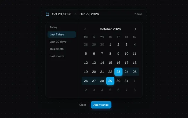
Month grid with start/end selection, hover preview, quick presets and sliding month navigation.
Installation
01
Install with the shadcn CLI. The NiceUI theme comes along the first time.
$ npx shadcn@latest add https://niceui.dev/r/components-date-range-picker.json02
Or copy the source below (3 files). Dependencies: lucide-react.
Source
components/niceui/ui/core/DateRangePicker.tsx
import { useState } from 'react';
import { Calendar, ChevronLeft, ChevronRight } from 'lucide-react';
import { cn } from '@/lib/cn';
import { Button } from './Button';
import { animateOnce } from './utils';

export type DateRange = { start: Date | null; end: Date | null };

const DAYS = ['Mo', 'Tu', 'We', 'Th', 'Fr', 'Sa', 'Su'];
const startOfDay = (d: Date) => new Date(d.getFullYear(), d.getMonth(), d.getDate());
const addDays = (d: Date, n: number) => new Date(d.getFullYear(), d.getMonth(), d.getDate() + n);
const same = (a: Date | null, b: Date | null) => !!a && !!b && a.getTime() === b.getTime();
const fmt = (d: Date | null) => (d ? d.toLocaleDateString('en-US', { month: 'short', day: 'numeric', year: 'numeric' }) : '—');

function monthGrid(year: number, month: number) {
  const first = new Date(year, month, 1);
  const offset = (first.getDay() + 6) % 7;
  return Array.from({ length: 42 }, (_, i) => new Date(year, month, 1 - offset + i));
}

export type DateRangePickerProps = { value: DateRange; onChange: (range: DateRange) => void };

export function DateRangePicker({ value, onChange }: DateRangePickerProps) {
  const today = startOfDay(new Date());
  const [view, setView] = useState(() => {
    const d = value.end ?? value.start ?? today;
    return { y: d.getFullYear(), m: d.getMonth(), dir: 0 };
  });
  const [hover, setHover] = useState<Date | null>(null);

  const presets: Array<[string, () => DateRange]> = [
    ['Today', () => ({ start: today, end: today })],
    ['Last 7 days', () => ({ start: addDays(today, -6), end: today })],
    ['Last 30 days', () => ({ start: addDays(today, -29), end: today })],
    ['This month', () => ({ start: new Date(today.getFullYear(), today.getMonth(), 1), end: today })],
    ['Last month', () => ({ start: new Date(today.getFullYear(), today.getMonth() - 1, 1), end: new Date(today.getFullYear(), today.getMonth(), 0) })],
  ];

  const shift = (n: number) => setView((v) => {
    const d = new Date(v.y, v.m + n, 1);
    return { y: d.getFullYear(), m: d.getMonth(), dir: n };
  });

  const applyPreset = (r: DateRange) => {
    onChange(r);
    const d = r.end!;
    setView((v) => ({ y: d.getFullYear(), m: d.getMonth(), dir: d.getFullYear() * 12 + d.getMonth() >= v.y * 12 + v.m ? 1 : -1 }));
  };

  const pick = (d: Date) => {
    if (!value.start || value.end) onChange({ start: d, end: null });
    else if (d < value.start) onChange({ start: d, end: value.start });
    else onChange({ start: value.start, end: d });
  };

  const end = value.end ?? (value.start && hover ? hover : null);
  const [lo, hi] = value.start && end ? (end < value.start ? [end, value.start] : [value.start, end]) : [value.start, value.start];
  const days = monthGrid(view.y, view.m);
  const title = new Date(view.y, view.m, 1).toLocaleDateString('en-US', { month: 'long', year: 'numeric' });

  return (
    <div className="flex flex-col overflow-hidden rounded-2xl bg-ink-900 shadow-pop sm:flex-row">
      <div className="flex gap-1 overflow-x-auto border-b border-white/5 p-2 sm:w-36 sm:flex-col sm:border-b-0 sm:border-r">
        {presets.map(([label, get]) => {
          const r = get();
          const on = same(r.start, value.start) && same(r.end, value.end);
          return (
            <button
              key={label}
              onClick={() => applyPreset(r)}
              className={cn(
                'focus-ring whitespace-nowrap rounded-lg px-2.5 py-1.5 text-left text-xs font-medium transition-all active:scale-[0.97]',
                on ? 'bg-brand-500/15 text-brand-200' : 'text-ink-400 hover:bg-white/5 hover:text-ink-100',
              )}
            >
              {label}
            </button>
          );
        })}
      </div>
      <div className="p-4">
        <div className="mb-3 flex items-center justify-between">
          <button aria-label="Previous month" onClick={() => shift(-1)} className="focus-ring flex h-7 w-7 items-center justify-center rounded-md text-ink-400 transition hover:bg-white/5 hover:text-ink-50 active:scale-90">
            <ChevronLeft className="h-4 w-4" />
          </button>
          <span className="overflow-hidden text-sm font-medium text-ink-50">
            <span key={title} className="block" ref={(el) => animateOnce(el, [{ opacity: 0, transform: `translateY(${view.dir * 8}px)` }, { opacity: 1, transform: 'none' }], { duration: 300, easing: 'ease-out' })}>
              {title}
            </span>
          </span>
          <button aria-label="Next month" onClick={() => shift(1)} className="focus-ring flex h-7 w-7 items-center justify-center rounded-md text-ink-400 transition hover:bg-white/5 hover:text-ink-50 active:scale-90">
            <ChevronRight className="h-4 w-4" />
          </button>
        </div>
        <div className="grid grid-cols-7 text-center text-[11px] font-medium text-ink-500">
          {DAYS.map((d) => (
            <span key={d} className="pb-2">{d}</span>
          ))}
        </div>
        <div className="overflow-hidden">
          <div
            key={`${view.y}-${view.m}`}
            className="grid grid-cols-7 gap-y-1"
            onPointerLeave={() => setHover(null)}
            ref={(el) =>
              animateOnce(el, [{ opacity: 0, transform: `translateX(${view.dir * 36}px)` }, { opacity: 1, transform: 'none' }], {
                duration: 380,
                easing: 'cubic-bezier(0.16,1,0.3,1)',
              })
            }
          >
            {days.map((d) => {
              const outside = d.getMonth() !== view.m;
              const isStart = same(d, lo);
              const isEnd = same(d, hi);
              const inRange = !!lo && !!hi && d > lo && d < hi;
              const edge = isStart || isEnd;
              return (
                <div
                  key={d.getTime()}
                  className={cn(
                    'relative h-9',
                    inRange && 'bg-brand-500/10',
                    isStart && hi && !same(lo, hi) && 'bg-[linear-gradient(90deg,transparent_50%,rgba(56,189,248,0.1)_50%)]',
                    isEnd && lo && !same(lo, hi) && 'bg-[linear-gradient(90deg,rgba(56,189,248,0.1)_50%,transparent_50%)]',
                  )}
                >
                  <button
                    onClick={() => pick(d)}
                    onPointerEnter={() => setHover(d)}
                    className={cn(
                      'focus-ring relative mx-auto flex h-9 w-9 items-center justify-center rounded-lg text-sm tabular-nums transition-all duration-200 active:scale-90',
                      edge
                        ? 'bg-brand-500 font-medium text-white shadow-[0_4px_12px_-4px_rgba(56,189,248,0.8)]'
                        : outside
                          ? 'text-ink-600 hover:bg-white/5'
                          : inRange
                            ? 'text-brand-100 hover:bg-brand-500/20'
                            : 'text-ink-200 hover:bg-white/5 hover:text-ink-50',
                    )}
                  >
                    {d.getDate()}
                    {same(d, today) && !edge && <span className="absolute bottom-1 h-1 w-1 rounded-full bg-brand-400" />}
                  </button>
                </div>
              );
            })}
          </div>
        </div>
      </div>
    </div>
  );
}

export function DateRangePickerDemo() {
  const today = startOfDay(new Date());
  const [range, setRange] = useState<DateRange>({ start: addDays(today, -6), end: today });
  const nights = range.start && range.end ? Math.round((range.end.getTime() - range.start.getTime()) / 864e5) + 1 : 0;

  return (
    <div className="mx-auto flex w-full max-w-xl flex-col items-center gap-4">
      <div className="flex w-full max-w-[460px] items-center gap-3 rounded-xl bg-ink-900 px-4 py-2.5 text-sm shadow-card">
        <Calendar className="h-4 w-4 text-brand-300" />
        <span className="text-ink-100">{fmt(range.start)}</span>
        <span className="text-ink-600">→</span>
        <span className={range.end ? 'text-ink-100' : 'text-ink-500'}>{range.end ? fmt(range.end) : 'Pick end date'}</span>
        <span className="ml-auto text-xs tabular-nums text-ink-400">{nights ? `${nights} days` : ''}</span>
      </div>
      <DateRangePicker value={range} onChange={setRange} />
      <div className="flex gap-2">
        <Button size="sm" variant="ghost" onClick={() => setRange({ start: null, end: null })}>
          Clear
        </Button>
        <Button size="sm" disabled={!range.end}>
          Apply range
        </Button>
      </div>
    </div>
  );
}
components/niceui/ui/core/Button.tsx
import { useState, type ButtonHTMLAttributes, type PointerEvent, type ReactNode } from 'react';
import { ArrowRight, Check, Download, Loader2, Plus, Rocket, Trash2 } from 'lucide-react';
import { cn } from '@/lib/cn';

export type ButtonVariant = 'primary' | 'secondary' | 'ghost' | 'outline' | 'danger';
export type ButtonSize = 'sm' | 'md' | 'lg';

export type ButtonProps = ButtonHTMLAttributes<HTMLButtonElement> & {
  variant?: ButtonVariant;
  size?: ButtonSize;
  loading?: boolean;
  leftIcon?: ReactNode;
  rightIcon?: ReactNode;
};

const VARIANTS: Record<ButtonVariant, string> = {
  primary:
    'bg-brand-600 text-white shadow-[inset_0_1px_0_rgba(255,255,255,0.18),0_1px_2px_rgba(0,0,0,0.4),0_4px_14px_-4px_rgba(27,119,245,0.6)] hover:bg-brand-500',
  secondary: 'bg-ink-800 text-ink-50 shadow-hairline hover:bg-ink-700',
  ghost: 'text-ink-300 hover:bg-white/5 hover:text-ink-50',
  outline: 'text-ink-100 ring-1 ring-inset ring-white/10 hover:bg-white/[0.03] hover:ring-white/20',
  danger: 'bg-rose-500/10 text-rose-300 ring-1 ring-inset ring-rose-500/25 hover:bg-rose-500/15 hover:text-rose-200',
};

const SIZES: Record<ButtonSize, string> = {
  sm: 'h-8 gap-1.5 rounded-lg px-3 text-xs [&_svg]:h-3.5 [&_svg]:w-3.5',
  md: 'h-9 gap-2 rounded-lg px-4 text-sm [&_svg]:h-4 [&_svg]:w-4',
  lg: 'h-11 gap-2 rounded-xl px-5 text-sm [&_svg]:h-4 [&_svg]:w-4',
};

type Ripple = { id: number; x: number; y: number; size: number };

export function Button({
  variant = 'primary',
  size = 'md',
  loading = false,
  leftIcon,
  rightIcon,
  className,
  children,
  disabled,
  onPointerDown,
  type = 'button',
  ...rest
}: ButtonProps) {
  const [ripples, setRipples] = useState<Ripple[]>([]);

  const handlePointerDown = (e: PointerEvent<HTMLButtonElement>) => {
    onPointerDown?.(e);
    const rect = e.currentTarget.getBoundingClientRect();
    const size = Math.max(rect.width, rect.height) * 2.2;
    const id = Date.now() + Math.random();
    setRipples((r) => [...r, { id, x: e.clientX - rect.left, y: e.clientY - rect.top, size }]);
    window.setTimeout(() => setRipples((r) => r.filter((x) => x.id !== id)), 650);
  };

  return (
    <button
      type={type}
      disabled={disabled || loading}
      aria-busy={loading || undefined}
      onPointerDown={handlePointerDown}
      className={cn(
        'focus-ring relative inline-flex select-none items-center justify-center overflow-hidden whitespace-nowrap font-medium transition-all duration-200 ease-smooth active:scale-[0.97] disabled:pointer-events-none disabled:opacity-50',
        VARIANTS[variant],
        SIZES[size],
        className,
      )}
      {...rest}
    >
      {ripples.map((r) => (
        <span
          key={r.id}
          aria-hidden
          ref={(el) => {
            if (el && !el.dataset.played) {
              el.dataset.played = '1';
              el.animate(
                [
                  { transform: 'translate(-50%,-50%) scale(0)', opacity: 0.35 },
                  { transform: 'translate(-50%,-50%) scale(1)', opacity: 0 },
                ],
                { duration: 600, easing: 'cubic-bezier(0.16,1,0.3,1)', fill: 'forwards' },
              );
            }
          }}
          className={cn('pointer-events-none absolute rounded-full', variant === 'primary' ? 'bg-white/40' : 'bg-white/20')}
          style={{ left: r.x, top: r.y, width: r.size, height: r.size, transform: 'translate(-50%,-50%) scale(0)' }}
        />
      ))}
      {loading ? <Loader2 className="animate-spin" /> : leftIcon}
      {children && <span className="relative">{children}</span>}
      {rightIcon && !loading && <span className="relative inline-flex">{rightIcon}</span>}
    </button>
  );
}

function Row({ label, children }: { label: string; children: ReactNode }) {
  return (
    <div className="flex flex-col gap-3 sm:flex-row sm:items-center">
      <span className="w-20 shrink-0 text-xs font-medium uppercase tracking-wider text-ink-500">{label}</span>
      <div className="flex flex-wrap items-center gap-2.5">{children}</div>
    </div>
  );
}

export function ButtonDemo() {
  const [state, setState] = useState<'idle' | 'loading' | 'done'>('idle');

  const deploy = () => {
    if (state !== 'idle') return;
    setState('loading');
    window.setTimeout(() => setState('done'), 1600);
    window.setTimeout(() => setState('idle'), 3400);
  };

  return (
    <div className="mx-auto flex w-full max-w-xl flex-col gap-6">
      <Row label="Variants">
        <Button>Primary</Button>
        <Button variant="secondary">Secondary</Button>
        <Button variant="outline">Outline</Button>
        <Button variant="ghost">Ghost</Button>
        <Button variant="danger">Danger</Button>
      </Row>
      <Row label="Sizes">
        <Button size="sm">Small</Button>
        <Button size="md">Medium</Button>
        <Button size="lg">Large</Button>
      </Row>
      <Row label="Icons">
        <Button variant="secondary" leftIcon={<Plus />}>New project</Button>
        <Button variant="outline" leftIcon={<Download />}>Export</Button>
        <Button variant="ghost" rightIcon={<ArrowRight />}>Continue</Button>
        <Button variant="danger" leftIcon={<Trash2 />} aria-label="Delete" />
      </Row>
      <Row label="Loading">
        <Button
          onClick={deploy}
          loading={state === 'loading'}
          leftIcon={state === 'done' ? <Check className="animate-scale-in" /> : <Rocket />}
          className={cn('min-w-[148px]', state === 'done' && '!bg-emerald-600')}
        >
          {state === 'loading' ? 'Deploying…' : state === 'done' ? 'Deployed' : 'Deploy to prod'}
        </Button>
        <Button variant="secondary" loading>
          Saving
        </Button>
      </Row>
    </div>
  );
}
components/niceui/ui/core/utils.ts
/**
 * Plays a Web Animation the first time an element mounts. Safe to call from
 * inline ref callbacks (which React re-invokes on every render).
 */
export function animateOnce(el: HTMLElement | null, keyframes: Keyframe[], options: KeyframeAnimationOptions) {
  if (!el || el.dataset.played) return;
  el.dataset.played = '1';
  el.animate(keyframes, options);
}

export const clamp = (v: number, min: number, max: number) => Math.min(max, Math.max(min, v));