Input
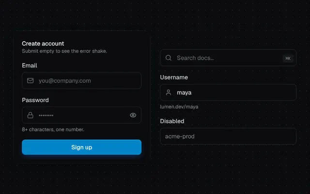
Text field with label, hint, icon slot, password visibility toggle, focus glow and an error shake.
Installation
01
Install with the shadcn CLI. The NiceUI theme comes along the first time.
$ npx shadcn@latest add https://niceui.dev/r/components-input.json02
Or copy the source below (2 files). Dependencies: lucide-react.
Source
components/niceui/ui/core/Input.tsx
import { useEffect, useId, useRef, useState, type FormEvent, type InputHTMLAttributes, type ReactNode } from 'react';
import { AlertCircle, Eye, EyeOff, Lock, Mail, Search, User } from 'lucide-react';
import { cn } from '@/lib/cn';
import { Button } from './Button';

export type InputProps = InputHTMLAttributes<HTMLInputElement> & {
  label?: string;
  hint?: string;
  error?: string;
  leftIcon?: ReactNode;
  /** Element rendered inside the field on the right (e.g. a shortcut). */
  rightSlot?: ReactNode;
};

export function Input({ label, hint, error, leftIcon, rightSlot, className, type = 'text', id, ...rest }: InputProps) {
  const autoId = useId();
  const inputId = id ?? autoId;
  const [show, setShow] = useState(false);
  const [shake, setShake] = useState(0);
  const fieldRef = useRef<HTMLDivElement>(null);
  const isPassword = type === 'password';

  useEffect(() => {
    if (error) setShake((n) => n + 1);
  }, [error]);

  useEffect(() => {
    if (!shake || !fieldRef.current) return;
    fieldRef.current.animate(
      [0, -6, 6, -4, 4, -2, 0].map((x) => ({ transform: `translateX(${x}px)` })),
      { duration: 420, easing: 'ease-out' },
    );
  }, [shake]);

  const describedBy = error ? `${inputId}-error` : hint ? `${inputId}-hint` : undefined;

  return (
    <div className={cn('w-full', className)}>
      {label && (
        <label htmlFor={inputId} className="mb-1.5 block text-sm font-medium text-ink-200">
          {label}
        </label>
      )}
      <div
        ref={fieldRef}
        className={cn(
          'group relative flex h-10 items-center rounded-lg bg-ink-900 ring-1 ring-inset transition-all duration-200',
          error
            ? 'ring-rose-500/60 focus-within:ring-rose-400 focus-within:shadow-[0_0_0_4px_rgba(244,63,94,0.15)]'
            : 'ring-white/10 hover:ring-white/20 focus-within:ring-brand-500 focus-within:shadow-[0_0_0_4px_rgba(56,189,248,0.15)]',
        )}
      >
        {leftIcon && (
          <span
            className={cn(
              'pointer-events-none pl-3 transition-colors [&_svg]:h-4 [&_svg]:w-4',
              error ? 'text-rose-400' : 'text-ink-500 group-focus-within:text-brand-300',
            )}
          >
            {leftIcon}
          </span>
        )}
        <input
          id={inputId}
          type={isPassword && show ? 'text' : type}
          aria-invalid={!!error || undefined}
          aria-describedby={describedBy}
          className="h-full w-full min-w-0 bg-transparent px-3 text-sm text-ink-50 outline-none placeholder:text-ink-500 disabled:cursor-not-allowed disabled:opacity-50"
          {...rest}
        />
        {isPassword && (
          <button
            type="button"
            onClick={() => setShow((s) => !s)}
            aria-label={show ? 'Hide password' : 'Show password'}
            className="focus-ring relative mr-1.5 flex h-7 w-7 shrink-0 items-center justify-center rounded-md text-ink-400 transition hover:bg-white/5 hover:text-ink-100 active:scale-90"
          >
            <Eye className={cn('absolute h-4 w-4 transition-all duration-300 ease-spring', show ? 'rotate-90 scale-50 opacity-0' : 'opacity-100')} />
            <EyeOff className={cn('absolute h-4 w-4 transition-all duration-300 ease-spring', show ? 'opacity-100' : '-rotate-90 scale-50 opacity-0')} />
          </button>
        )}
        {rightSlot && <span className="mr-2 shrink-0">{rightSlot}</span>}
      </div>
      {error ? (
        <p id={`${inputId}-error`} key={error} className="mt-1.5 flex animate-fade-down items-center gap-1.5 text-xs text-rose-300">
          <AlertCircle className="h-3.5 w-3.5" /> {error}
        </p>
      ) : (
        hint && (
          <p id={`${inputId}-hint`} className="mt-1.5 text-xs text-ink-400">
            {hint}
          </p>
        )
      )}
    </div>
  );
}

export function InputDemo() {
  const [email, setEmail] = useState('');
  const [password, setPassword] = useState('');
  const [errors, setErrors] = useState<{ email?: string; password?: string }>({});
  const [done, setDone] = useState(false);

  const submit = (e: FormEvent) => {
    e.preventDefault();
    const next: typeof errors = {};
    if (!/^[^\s@]+@[^\s@]+\.[^\s@]+$/.test(email)) next.email = 'Enter a valid email address';
    if (password.length < 8) next.password = 'Use at least 8 characters';
    setErrors({});
    requestAnimationFrame(() => setErrors(next));
    setDone(Object.keys(next).length === 0);
  };

  return (
    <div className="mx-auto grid w-full max-w-2xl gap-6 md:grid-cols-[1fr_1fr]">
      <form onSubmit={submit} noValidate className="space-y-4 rounded-2xl bg-ink-900 p-5 shadow-card">
        <div>
          <p className="text-sm font-medium text-ink-50">Create account</p>
          <p className="text-xs text-ink-400">Submit empty to see the error shake.</p>
        </div>
        <Input
          label="Email"
          type="email"
          placeholder="you@company.com"
          leftIcon={<Mail />}
          value={email}
          error={errors.email}
          onChange={(e) => {
            setEmail(e.target.value);
            setErrors((s) => ({ ...s, email: undefined }));
          }}
        />
        <Input
          label="Password"
          type="password"
          placeholder="••••••••"
          leftIcon={<Lock />}
          hint="8+ characters, one number."
          value={password}
          error={errors.password}
          onChange={(e) => {
            setPassword(e.target.value);
            setErrors((s) => ({ ...s, password: undefined }));
          }}
        />
        <Button type="submit" className={cn('w-full', done && '!bg-emerald-600')}>
          {done ? 'Account created' : 'Sign up'}
        </Button>
      </form>
      <div className="flex flex-col justify-center gap-4">
        <Input
          placeholder="Search docs…"
          leftIcon={<Search />}
          aria-label="Search"
          rightSlot={<kbd className="rounded bg-white/5 px-1.5 py-0.5 font-mono text-[10px] text-ink-400 shadow-hairline">⌘K</kbd>}
        />
        <Input label="Username" defaultValue="maya" leftIcon={<User />} hint="lumen.dev/maya" />
        <Input label="Disabled" defaultValue="acme-prod" disabled />
      </div>
    </div>
  );
}
components/niceui/ui/core/Button.tsx
import { useState, type ButtonHTMLAttributes, type PointerEvent, type ReactNode } from 'react';
import { ArrowRight, Check, Download, Loader2, Plus, Rocket, Trash2 } from 'lucide-react';
import { cn } from '@/lib/cn';

export type ButtonVariant = 'primary' | 'secondary' | 'ghost' | 'outline' | 'danger';
export type ButtonSize = 'sm' | 'md' | 'lg';

export type ButtonProps = ButtonHTMLAttributes<HTMLButtonElement> & {
  variant?: ButtonVariant;
  size?: ButtonSize;
  loading?: boolean;
  leftIcon?: ReactNode;
  rightIcon?: ReactNode;
};

const VARIANTS: Record<ButtonVariant, string> = {
  primary:
    'bg-brand-600 text-white shadow-[inset_0_1px_0_rgba(255,255,255,0.18),0_1px_2px_rgba(0,0,0,0.4),0_4px_14px_-4px_rgba(27,119,245,0.6)] hover:bg-brand-500',
  secondary: 'bg-ink-800 text-ink-50 shadow-hairline hover:bg-ink-700',
  ghost: 'text-ink-300 hover:bg-white/5 hover:text-ink-50',
  outline: 'text-ink-100 ring-1 ring-inset ring-white/10 hover:bg-white/[0.03] hover:ring-white/20',
  danger: 'bg-rose-500/10 text-rose-300 ring-1 ring-inset ring-rose-500/25 hover:bg-rose-500/15 hover:text-rose-200',
};

const SIZES: Record<ButtonSize, string> = {
  sm: 'h-8 gap-1.5 rounded-lg px-3 text-xs [&_svg]:h-3.5 [&_svg]:w-3.5',
  md: 'h-9 gap-2 rounded-lg px-4 text-sm [&_svg]:h-4 [&_svg]:w-4',
  lg: 'h-11 gap-2 rounded-xl px-5 text-sm [&_svg]:h-4 [&_svg]:w-4',
};

type Ripple = { id: number; x: number; y: number; size: number };

export function Button({
  variant = 'primary',
  size = 'md',
  loading = false,
  leftIcon,
  rightIcon,
  className,
  children,
  disabled,
  onPointerDown,
  type = 'button',
  ...rest
}: ButtonProps) {
  const [ripples, setRipples] = useState<Ripple[]>([]);

  const handlePointerDown = (e: PointerEvent<HTMLButtonElement>) => {
    onPointerDown?.(e);
    const rect = e.currentTarget.getBoundingClientRect();
    const size = Math.max(rect.width, rect.height) * 2.2;
    const id = Date.now() + Math.random();
    setRipples((r) => [...r, { id, x: e.clientX - rect.left, y: e.clientY - rect.top, size }]);
    window.setTimeout(() => setRipples((r) => r.filter((x) => x.id !== id)), 650);
  };

  return (
    <button
      type={type}
      disabled={disabled || loading}
      aria-busy={loading || undefined}
      onPointerDown={handlePointerDown}
      className={cn(
        'focus-ring relative inline-flex select-none items-center justify-center overflow-hidden whitespace-nowrap font-medium transition-all duration-200 ease-smooth active:scale-[0.97] disabled:pointer-events-none disabled:opacity-50',
        VARIANTS[variant],
        SIZES[size],
        className,
      )}
      {...rest}
    >
      {ripples.map((r) => (
        <span
          key={r.id}
          aria-hidden
          ref={(el) => {
            if (el && !el.dataset.played) {
              el.dataset.played = '1';
              el.animate(
                [
                  { transform: 'translate(-50%,-50%) scale(0)', opacity: 0.35 },
                  { transform: 'translate(-50%,-50%) scale(1)', opacity: 0 },
                ],
                { duration: 600, easing: 'cubic-bezier(0.16,1,0.3,1)', fill: 'forwards' },
              );
            }
          }}
          className={cn('pointer-events-none absolute rounded-full', variant === 'primary' ? 'bg-white/40' : 'bg-white/20')}
          style={{ left: r.x, top: r.y, width: r.size, height: r.size, transform: 'translate(-50%,-50%) scale(0)' }}
        />
      ))}
      {loading ? <Loader2 className="animate-spin" /> : leftIcon}
      {children && <span className="relative">{children}</span>}
      {rightIcon && !loading && <span className="relative inline-flex">{rightIcon}</span>}
    </button>
  );
}

function Row({ label, children }: { label: string; children: ReactNode }) {
  return (
    <div className="flex flex-col gap-3 sm:flex-row sm:items-center">
      <span className="w-20 shrink-0 text-xs font-medium uppercase tracking-wider text-ink-500">{label}</span>
      <div className="flex flex-wrap items-center gap-2.5">{children}</div>
    </div>
  );
}

export function ButtonDemo() {
  const [state, setState] = useState<'idle' | 'loading' | 'done'>('idle');

  const deploy = () => {
    if (state !== 'idle') return;
    setState('loading');
    window.setTimeout(() => setState('done'), 1600);
    window.setTimeout(() => setState('idle'), 3400);
  };

  return (
    <div className="mx-auto flex w-full max-w-xl flex-col gap-6">
      <Row label="Variants">
        <Button>Primary</Button>
        <Button variant="secondary">Secondary</Button>
        <Button variant="outline">Outline</Button>
        <Button variant="ghost">Ghost</Button>
        <Button variant="danger">Danger</Button>
      </Row>
      <Row label="Sizes">
        <Button size="sm">Small</Button>
        <Button size="md">Medium</Button>
        <Button size="lg">Large</Button>
      </Row>
      <Row label="Icons">
        <Button variant="secondary" leftIcon={<Plus />}>New project</Button>
        <Button variant="outline" leftIcon={<Download />}>Export</Button>
        <Button variant="ghost" rightIcon={<ArrowRight />}>Continue</Button>
        <Button variant="danger" leftIcon={<Trash2 />} aria-label="Delete" />
      </Row>
      <Row label="Loading">
        <Button
          onClick={deploy}
          loading={state === 'loading'}
          leftIcon={state === 'done' ? <Check className="animate-scale-in" /> : <Rocket />}
          className={cn('min-w-[148px]', state === 'done' && '!bg-emerald-600')}
        >
          {state === 'loading' ? 'Deploying…' : state === 'done' ? 'Deployed' : 'Deploy to prod'}
        </Button>
        <Button variant="secondary" loading>
          Saving
        </Button>
      </Row>
    </div>
  );
}