Table
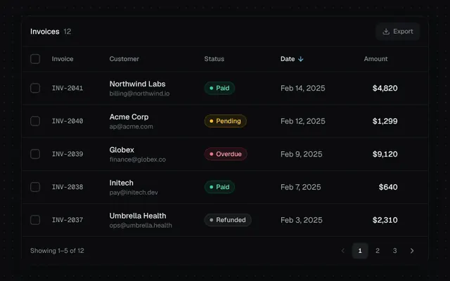
A data table with sortable columns, row selection, status badges, hover actions and pagination.
Installation
01
Install with the shadcn CLI. The NiceUI theme comes along the first time.
$ npx shadcn@latest add https://niceui.dev/r/components-table.json02
Or copy the source below (4 files). Dependencies: lucide-react.
Source
components/niceui/ui/core/Table.tsx
import { useMemo, useState } from 'react';
import { ArrowDown, ArrowUp, ArrowUpDown, ChevronLeft, ChevronRight, Download, MoreHorizontal } from 'lucide-react';
import { cn } from '@/lib/cn';
import { Badge, type BadgeTone } from './Badge';
import { Checkbox } from './Checkbox';
import { Button } from './Button';

type Status = 'Paid' | 'Pending' | 'Overdue' | 'Refunded';
type Invoice = { id: string; customer: string; email: string; amount: number; status: Status; date: string };

const TONE: Record<Status, BadgeTone> = { Paid: 'success', Pending: 'warning', Overdue: 'error', Refunded: 'neutral' };

const INVOICES: Invoice[] = [
  { id: 'INV-2041', customer: 'Northwind Labs', email: 'billing@northwind.io', amount: 4820, status: 'Paid', date: '2025-02-14' },
  { id: 'INV-2040', customer: 'Acme Corp', email: 'ap@acme.com', amount: 1299, status: 'Pending', date: '2025-02-12' },
  { id: 'INV-2039', customer: 'Globex', email: 'finance@globex.co', amount: 9120, status: 'Overdue', date: '2025-02-09' },
  { id: 'INV-2038', customer: 'Initech', email: 'pay@initech.dev', amount: 640, status: 'Paid', date: '2025-02-07' },
  { id: 'INV-2037', customer: 'Umbrella Health', email: 'ops@umbrella.health', amount: 2310, status: 'Refunded', date: '2025-02-03' },
  { id: 'INV-2036', customer: 'Hooli', email: 'invoices@hooli.xyz', amount: 15400, status: 'Paid', date: '2025-01-30' },
  { id: 'INV-2035', customer: 'Stark Industries', email: 'ar@stark.com', amount: 7850, status: 'Pending', date: '2025-01-27' },
  { id: 'INV-2034', customer: 'Wayne Logistics', email: 'billing@wayne.co', amount: 3200, status: 'Paid', date: '2025-01-22' },
  { id: 'INV-2033', customer: 'Soylent', email: 'accounts@soylent.io', amount: 980, status: 'Overdue', date: '2025-01-18' },
  { id: 'INV-2032', customer: 'Vandelay Imports', email: 'art@vandelay.com', amount: 5600, status: 'Paid', date: '2025-01-15' },
  { id: 'INV-2031', customer: 'Cyberdyne', email: 'ap@cyberdyne.ai', amount: 12750, status: 'Pending', date: '2025-01-11' },
  { id: 'INV-2030', customer: 'Tyrell Systems', email: 'fin@tyrell.systems', amount: 2045, status: 'Paid', date: '2025-01-06' },
];

type Key = 'customer' | 'amount' | 'status' | 'date';
const PAGE = 5;
const money = (n: number) => n.toLocaleString('en-US', { style: 'currency', currency: 'USD', maximumFractionDigits: 0 });
const day = (d: string) => new Date(d).toLocaleDateString('en-US', { month: 'short', day: 'numeric', year: 'numeric' });

function SortHeader({ label, k, sort, onSort, align }: { label: string; k: Key; sort: { key: Key; dir: 1 | -1 }; onSort: (k: Key) => void; align?: 'right' }) {
  const active = sort.key === k;
  const Icon = !active ? ArrowUpDown : sort.dir === 1 ? ArrowUp : ArrowDown;
  return (
    <th className={cn('px-4 py-3 font-medium', align === 'right' && 'text-right')} aria-sort={active ? (sort.dir === 1 ? 'ascending' : 'descending') : 'none'}>
      <button
        onClick={() => onSort(k)}
        className={cn('focus-ring group inline-flex items-center gap-1 rounded transition-colors', active ? 'text-ink-100' : 'hover:text-ink-200')}
      >
        {label}
        <Icon className={cn('h-3.5 w-3.5 transition-all duration-300', active ? 'text-brand-300' : 'opacity-0 group-hover:opacity-100')} />
      </button>
    </th>
  );
}

export function TableDemo() {
  const [sort, setSort] = useState<{ key: Key; dir: 1 | -1 }>({ key: 'date', dir: -1 });
  const [page, setPage] = useState(0);
  const [sel, setSel] = useState<string[]>([]);

  const rows = useMemo(
    () =>
      [...INVOICES].sort((a, b) => {
        const x = a[sort.key];
        const y = b[sort.key];
        return (x < y ? -1 : x > y ? 1 : 0) * sort.dir;
      }),
    [sort],
  );
  const pages = Math.ceil(rows.length / PAGE);
  const view = rows.slice(page * PAGE, page * PAGE + PAGE);
  const allOnPage = view.every((r) => sel.includes(r.id));
  const someOnPage = view.some((r) => sel.includes(r.id));
  const selTotal = INVOICES.filter((r) => sel.includes(r.id)).reduce((s, r) => s + r.amount, 0);

  const onSort = (key: Key) => setSort((s) => ({ key, dir: s.key === key ? (s.dir === 1 ? -1 : 1) : key === 'amount' || key === 'date' ? -1 : 1 }));
  const toggleAll = () =>
    setSel((s) => (allOnPage ? s.filter((id) => !view.some((r) => r.id === id)) : [...new Set([...s, ...view.map((r) => r.id)])]));

  return (
    <div className="mx-auto w-full max-w-3xl overflow-hidden rounded-2xl bg-ink-900 shadow-card">
      <div className="flex h-14 items-center justify-between border-b border-white/5 px-4">
        <div className="relative h-5 flex-1 overflow-hidden text-sm">
          <p className={cn('absolute inset-0 font-medium text-ink-50 transition-all duration-300 ease-smooth', sel.length > 0 && '-translate-y-full opacity-0')}>
            Invoices <span className="ml-1 text-ink-500">{INVOICES.length}</span>
          </p>
          <p className={cn('absolute inset-0 text-ink-200 transition-all duration-300 ease-smooth', !sel.length && 'translate-y-full opacity-0')}>
            <span className="font-medium text-ink-50">{sel.length} selected</span> · {money(selTotal)}
          </p>
        </div>
        <Button size="sm" variant="secondary" leftIcon={<Download />} disabled={!sel.length}>
          Export
        </Button>
      </div>
      <div className="overflow-x-auto">
        <table className="w-full min-w-[640px] text-left text-sm">
          <thead className="text-xs text-ink-400">
            <tr className="border-b border-white/5">
              <th className="w-10 py-3 pl-4">
                <Checkbox checked={allOnPage} indeterminate={!allOnPage && someOnPage} onChange={toggleAll} />
              </th>
              <th className="px-4 py-3 font-medium">Invoice</th>
              <SortHeader label="Customer" k="customer" sort={sort} onSort={onSort} />
              <SortHeader label="Status" k="status" sort={sort} onSort={onSort} />
              <SortHeader label="Date" k="date" sort={sort} onSort={onSort} />
              <SortHeader label="Amount" k="amount" sort={sort} onSort={onSort} align="right" />
              <th className="w-10" />
            </tr>
          </thead>
          <tbody key={`${page}-${sort.key}-${sort.dir}`}>
            {view.map((r, i) => {
              const on = sel.includes(r.id);
              return (
                <tr
                  key={r.id}
                  className={cn(
                    'group animate-fade-in border-b border-white/5 transition-colors last:border-0',
                    on ? 'bg-brand-500/[0.06]' : 'hover:bg-white/[0.025]',
                  )}
                  style={{ animationDelay: `${i * 35}ms` }}
                >
                  <td className="py-3 pl-4">
                    <Checkbox checked={on} onChange={(c) => setSel((s) => (c ? [...s, r.id] : s.filter((x) => x !== r.id)))} />
                  </td>
                  <td className="px-4 py-3 font-mono text-xs text-ink-300">{r.id}</td>
                  <td className="px-4 py-3">
                    <p className="font-medium text-ink-100">{r.customer}</p>
                    <p className="text-xs text-ink-500">{r.email}</p>
                  </td>
                  <td className="px-4 py-3">
                    <Badge tone={TONE[r.status]} dot>
                      {r.status}
                    </Badge>
                  </td>
                  <td className="whitespace-nowrap px-4 py-3 text-ink-300">{day(r.date)}</td>
                  <td className="px-4 py-3 text-right font-medium tabular-nums text-ink-50">{money(r.amount)}</td>
                  <td className="pr-3">
                    <button
                      aria-label="Row actions"
                      className="focus-ring flex h-7 w-7 items-center justify-center rounded-md text-ink-400 opacity-0 transition hover:bg-white/5 hover:text-ink-100 focus-visible:opacity-100 group-hover:opacity-100"
                    >
                      <MoreHorizontal className="h-4 w-4" />
                    </button>
                  </td>
                </tr>
              );
            })}
          </tbody>
        </table>
      </div>
      <div className="flex items-center justify-between border-t border-white/5 px-4 py-3 text-xs text-ink-400">
        <span>
          Showing {page * PAGE + 1}–{Math.min((page + 1) * PAGE, rows.length)} of {rows.length}
        </span>
        <div className="flex items-center gap-1">
          <button
            aria-label="Previous page"
            disabled={page === 0}
            onClick={() => setPage((p) => p - 1)}
            className="focus-ring flex h-7 w-7 items-center justify-center rounded-md transition hover:bg-white/5 hover:text-ink-100 active:scale-90 disabled:pointer-events-none disabled:opacity-30"
          >
            <ChevronLeft className="h-4 w-4" />
          </button>
          {Array.from({ length: pages }, (_, i) => (
            <button
              key={i}
              onClick={() => setPage(i)}
              className={cn(
                'focus-ring h-7 min-w-[28px] rounded-md tabular-nums transition-all',
                i === page ? 'bg-ink-800 font-medium text-ink-50 shadow-hairline' : 'hover:bg-white/5 hover:text-ink-100',
              )}
            >
              {i + 1}
            </button>
          ))}
          <button
            aria-label="Next page"
            disabled={page === pages - 1}
            onClick={() => setPage((p) => p + 1)}
            className="focus-ring flex h-7 w-7 items-center justify-center rounded-md transition hover:bg-white/5 hover:text-ink-100 active:scale-90 disabled:pointer-events-none disabled:opacity-30"
          >
            <ChevronRight className="h-4 w-4" />
          </button>
        </div>
      </div>
    </div>
  );
}
components/niceui/ui/core/Badge.tsx
import { useLayoutEffect, useRef, useState, type ReactNode } from 'react';
import { Bell, Minus, Plus, Sparkles } from 'lucide-react';
import { cn } from '@/lib/cn';

export type BadgeTone = 'neutral' | 'brand' | 'success' | 'warning' | 'error';

const TONES: Record<BadgeTone, { badge: string; dot: string }> = {
  neutral: { badge: 'bg-white/5 text-ink-200 ring-white/10', dot: 'bg-ink-400' },
  brand: { badge: 'bg-brand-500/10 text-brand-300 ring-brand-500/25', dot: 'bg-brand-400' },
  success: { badge: 'bg-emerald-500/10 text-emerald-300 ring-emerald-500/25', dot: 'bg-emerald-400' },
  warning: { badge: 'bg-amber-500/10 text-amber-300 ring-amber-500/25', dot: 'bg-amber-400' },
  error: { badge: 'bg-rose-500/10 text-rose-300 ring-rose-500/25', dot: 'bg-rose-400' },
};

export type BadgeProps = {
  children: ReactNode;
  tone?: BadgeTone;
  dot?: boolean;
  pulse?: boolean;
  className?: string;
};

export function Badge({ children, tone = 'neutral', dot = false, pulse = false, className }: BadgeProps) {
  const t = TONES[tone];
  return (
    <span
      className={cn(
        'inline-flex h-6 items-center gap-1.5 whitespace-nowrap rounded-full px-2.5 text-xs font-medium ring-1 ring-inset',
        t.badge,
        className,
      )}
    >
      {(dot || pulse) && (
        <span className="relative flex h-1.5 w-1.5">
          {pulse && <span className={cn('absolute inset-0 animate-pulse-ring rounded-full', t.dot)} />}
          <span className={cn('relative h-1.5 w-1.5 rounded-full', t.dot)} />
        </span>
      )}
      {children}
    </span>
  );
}

function once(el: HTMLElement | null) {
  if (!el || el.dataset.played) return null;
  el.dataset.played = '1';
  return el;
}

/** Numeric badge that rolls the digits vertically when the count changes. */
export function CountBadge({ count, max = 99, className }: { count: number; max?: number; className?: string }) {
  const prev = useRef(count);
  const [anim, setAnim] = useState<{ from: number; dir: 1 | -1; key: number } | null>(null);

  useLayoutEffect(() => {
    if (prev.current === count) return;
    setAnim({ from: prev.current, dir: count > prev.current ? 1 : -1, key: Date.now() });
    prev.current = count;
    const t = window.setTimeout(() => setAnim(null), 400);
    return () => window.clearTimeout(t);
  }, [count]);

  const fmt = (n: number) => (n > max ? `${max}+` : String(n));
  if (count <= 0) return null;

  return (
    <span
      className={cn(
        'relative inline-flex h-5 min-w-[20px] animate-scale-in items-center justify-center overflow-hidden rounded-full bg-rose-500 px-1.5 text-[11px] font-semibold tabular-nums text-white shadow-[0_0_0_2px_#131316]',
        className,
      )}
    >
      {anim && (
        <span
          key={`o${anim.key}`}
          className="absolute"
          ref={(el) =>
            once(el)?.animate([{ transform: 'translateY(0)', opacity: 1 }, { transform: `translateY(${-anim.dir * 100}%)`, opacity: 0 }], {
              duration: 320,
              easing: 'cubic-bezier(0.16,1,0.3,1)',
              fill: 'forwards',
            })
          }
        >
          {fmt(anim.from)}
        </span>
      )}
      <span
        key={`n${anim?.key ?? 0}`}
        ref={(el) =>
          anim &&
          once(el)?.animate([{ transform: `translateY(${anim.dir * 100}%)`, opacity: 0 }, { transform: 'translateY(0)', opacity: 1 }], {
            duration: 380,
            easing: 'cubic-bezier(0.34,1.56,0.64,1)',
          })
        }
      >
        {fmt(count)}
      </span>
    </span>
  );
}

export function ShimmerBadge({ children = 'New', className }: { children?: ReactNode; className?: string }) {
  return (
    <span
      className={cn(
        'relative inline-flex h-6 items-center gap-1 overflow-hidden rounded-full bg-brand-500/10 px-2.5 text-xs font-medium text-brand-200 ring-1 ring-inset ring-brand-400/30',
        className,
      )}
    >
      <Sparkles className="h-3 w-3" />
      {children}
      <span
        aria-hidden
        className="absolute inset-0 animate-shimmer bg-[linear-gradient(110deg,transparent_35%,rgba(255,255,255,0.22)_50%,transparent_65%)] bg-[length:200%_100%]"
      />
    </span>
  );
}

export function AnimatedBadgeDemo() {
  const [count, setCount] = useState(3);
  const tones: BadgeTone[] = ['neutral', 'brand', 'success', 'warning', 'error'];
  const labels = ['Draft', 'In review', 'Deployed', 'Degraded', 'Failed'];

  return (
    <div className="mx-auto flex w-full max-w-lg flex-col items-center gap-8">
      <div className="flex flex-wrap justify-center gap-2">
        {tones.map((tone, i) => (
          <span key={tone} className="animate-fade-up" style={{ animationDelay: `${i * 50}ms` }}>
            <Badge tone={tone} dot>
              {labels[i]}
            </Badge>
          </span>
        ))}
      </div>
      <div className="flex flex-wrap items-center justify-center gap-2">
        <Badge tone="success" pulse>
          All systems operational
        </Badge>
        <Badge tone="error" pulse>
          Live
        </Badge>
        <ShimmerBadge />
      </div>
      <div className="flex items-center gap-4 rounded-2xl bg-ink-900 p-3 pr-4 shadow-card">
        <div className="relative flex h-10 w-10 items-center justify-center rounded-xl bg-ink-850 text-ink-200 shadow-hairline">
          <Bell className="h-4 w-4" />
          <CountBadge count={count} className="absolute -right-1.5 -top-1.5" />
        </div>
        <div className="text-sm">
          <p className="font-medium text-ink-100">Notifications</p>
          <p className="text-xs text-ink-400">{count === 0 ? 'You’re all caught up' : `${count} unread`}</p>
        </div>
        <div className="ml-4 flex gap-1">
          {[
            { icon: Minus, fn: () => setCount((c) => Math.max(0, c - 1)), label: 'Decrease' },
            { icon: Plus, fn: () => setCount((c) => c + 1), label: 'Increase' },
          ].map(({ icon: Icon, fn, label }) => (
            <button
              key={label}
              onClick={fn}
              aria-label={label}
              className="focus-ring flex h-8 w-8 items-center justify-center rounded-lg text-ink-300 transition hover:bg-white/5 hover:text-ink-50 active:scale-90"
            >
              <Icon className="h-4 w-4" />
            </button>
          ))}
        </div>
      </div>
    </div>
  );
}
components/niceui/ui/core/Checkbox.tsx
import { useId, useState, type ReactNode } from 'react';
import { cn } from '@/lib/cn';

export type CheckboxProps = {
  checked: boolean;
  onChange: (checked: boolean) => void;
  indeterminate?: boolean;
  label?: ReactNode;
  description?: ReactNode;
  disabled?: boolean;
  className?: string;
};

export function Checkbox({ checked, onChange, indeterminate = false, label, description, disabled, className }: CheckboxProps) {
  const id = useId();
  const on = checked || indeterminate;

  return (
    <label
      htmlFor={id}
      className={cn('group inline-flex cursor-pointer items-start gap-3', disabled && 'cursor-not-allowed opacity-50', className)}
    >
      <span className="relative mt-0.5 flex h-[18px] w-[18px] shrink-0">
        <input
          id={id}
          type="checkbox"
          className="peer absolute inset-0 cursor-[inherit] appearance-none rounded-[5px] outline-none"
          checked={checked}
          disabled={disabled}
          aria-checked={indeterminate ? 'mixed' : checked}
          onChange={(e) => onChange(e.target.checked)}
        />
        <span
          aria-hidden
          className={cn(
            'pointer-events-none flex h-full w-full items-center justify-center rounded-[5px] transition-all duration-200 ease-smooth group-active:scale-90 peer-focus-visible:ring-2 peer-focus-visible:ring-brand-500/60 peer-focus-visible:ring-offset-2 peer-focus-visible:ring-offset-ink-950',
            on
              ? 'bg-brand-500 shadow-[inset_0_0_0_1px_rgba(255,255,255,0.15),0_0_12px_-2px_rgba(56,189,248,0.6)]'
              : 'bg-ink-900 shadow-[inset_0_0_0_1.5px_rgba(255,255,255,0.18)] group-hover:shadow-[inset_0_0_0_1.5px_rgba(255,255,255,0.32)]',
          )}
        >
          <svg viewBox="0 0 16 16" className="h-3.5 w-3.5" fill="none" stroke="white" strokeWidth={2.4} strokeLinecap="round" strokeLinejoin="round">
            <path
              d="M3.5 8.5 6.5 11.5 12.5 4.5"
              strokeDasharray={16}
              strokeDashoffset={checked && !indeterminate ? 0 : 16}
              style={{ transition: `stroke-dashoffset ${checked && !indeterminate ? '350ms cubic-bezier(0.65,0,0.35,1) 60ms' : '150ms ease-in'}` }}
            />
            <path
              d="M4 8h8"
              strokeDasharray={8}
              strokeDashoffset={indeterminate ? 0 : 8}
              style={{ transition: 'stroke-dashoffset 250ms cubic-bezier(0.65,0,0.35,1)' }}
            />
          </svg>
        </span>
      </span>
      {(label || description) && (
        <span className="select-none">
          {label && <span className="block text-sm font-medium text-ink-100">{label}</span>}
          {description && <span className="block text-xs text-ink-400">{description}</span>}
        </span>
      )}
    </label>
  );
}

const PERMS = [
  { id: 'read', label: 'Read deployments', desc: 'View builds, logs and previews.' },
  { id: 'write', label: 'Create deployments', desc: 'Push to preview and production.' },
  { id: 'env', label: 'Manage environment variables', desc: 'Read and edit secrets.' },
  { id: 'domains', label: 'Configure domains', desc: 'Add, verify and remove domains.' },
  { id: 'billing', label: 'Billing access', desc: 'View invoices and change plan.' },
];

export function CheckboxDemo() {
  const [sel, setSel] = useState<string[]>(['read', 'write']);
  const all = sel.length === PERMS.length;
  const some = sel.length > 0 && !all;

  return (
    <div className="mx-auto w-full max-w-sm overflow-hidden rounded-2xl bg-ink-900 shadow-card">
      <div className="flex items-center justify-between border-b border-white/5 bg-ink-950/40 px-4 py-3">
        <Checkbox
          checked={all}
          indeterminate={some}
          onChange={() => setSel(all ? [] : PERMS.map((p) => p.id))}
          label="API token scopes"
        />
        <span className="text-xs tabular-nums text-ink-400">
          {sel.length}/{PERMS.length}
        </span>
      </div>
      <div className="space-y-1 p-2">
        {PERMS.map((p, i) => (
          <div
            key={p.id}
            className={cn('animate-fade-up rounded-lg px-2 py-2 transition-colors', sel.includes(p.id) ? 'bg-brand-500/[0.06]' : 'hover:bg-white/[0.03]')}
            style={{ animationDelay: `${i * 50}ms` }}
          >
            <Checkbox
              checked={sel.includes(p.id)}
              onChange={(c) => setSel((s) => (c ? [...s, p.id] : s.filter((x) => x !== p.id)))}
              label={p.label}
              description={p.desc}
              className="w-full"
            />
          </div>
        ))}
      </div>
    </div>
  );
}
components/niceui/ui/core/Button.tsx
import { useState, type ButtonHTMLAttributes, type PointerEvent, type ReactNode } from 'react';
import { ArrowRight, Check, Download, Loader2, Plus, Rocket, Trash2 } from 'lucide-react';
import { cn } from '@/lib/cn';

export type ButtonVariant = 'primary' | 'secondary' | 'ghost' | 'outline' | 'danger';
export type ButtonSize = 'sm' | 'md' | 'lg';

export type ButtonProps = ButtonHTMLAttributes<HTMLButtonElement> & {
  variant?: ButtonVariant;
  size?: ButtonSize;
  loading?: boolean;
  leftIcon?: ReactNode;
  rightIcon?: ReactNode;
};

const VARIANTS: Record<ButtonVariant, string> = {
  primary:
    'bg-brand-600 text-white shadow-[inset_0_1px_0_rgba(255,255,255,0.18),0_1px_2px_rgba(0,0,0,0.4),0_4px_14px_-4px_rgba(27,119,245,0.6)] hover:bg-brand-500',
  secondary: 'bg-ink-800 text-ink-50 shadow-hairline hover:bg-ink-700',
  ghost: 'text-ink-300 hover:bg-white/5 hover:text-ink-50',
  outline: 'text-ink-100 ring-1 ring-inset ring-white/10 hover:bg-white/[0.03] hover:ring-white/20',
  danger: 'bg-rose-500/10 text-rose-300 ring-1 ring-inset ring-rose-500/25 hover:bg-rose-500/15 hover:text-rose-200',
};

const SIZES: Record<ButtonSize, string> = {
  sm: 'h-8 gap-1.5 rounded-lg px-3 text-xs [&_svg]:h-3.5 [&_svg]:w-3.5',
  md: 'h-9 gap-2 rounded-lg px-4 text-sm [&_svg]:h-4 [&_svg]:w-4',
  lg: 'h-11 gap-2 rounded-xl px-5 text-sm [&_svg]:h-4 [&_svg]:w-4',
};

type Ripple = { id: number; x: number; y: number; size: number };

export function Button({
  variant = 'primary',
  size = 'md',
  loading = false,
  leftIcon,
  rightIcon,
  className,
  children,
  disabled,
  onPointerDown,
  type = 'button',
  ...rest
}: ButtonProps) {
  const [ripples, setRipples] = useState<Ripple[]>([]);

  const handlePointerDown = (e: PointerEvent<HTMLButtonElement>) => {
    onPointerDown?.(e);
    const rect = e.currentTarget.getBoundingClientRect();
    const size = Math.max(rect.width, rect.height) * 2.2;
    const id = Date.now() + Math.random();
    setRipples((r) => [...r, { id, x: e.clientX - rect.left, y: e.clientY - rect.top, size }]);
    window.setTimeout(() => setRipples((r) => r.filter((x) => x.id !== id)), 650);
  };

  return (
    <button
      type={type}
      disabled={disabled || loading}
      aria-busy={loading || undefined}
      onPointerDown={handlePointerDown}
      className={cn(
        'focus-ring relative inline-flex select-none items-center justify-center overflow-hidden whitespace-nowrap font-medium transition-all duration-200 ease-smooth active:scale-[0.97] disabled:pointer-events-none disabled:opacity-50',
        VARIANTS[variant],
        SIZES[size],
        className,
      )}
      {...rest}
    >
      {ripples.map((r) => (
        <span
          key={r.id}
          aria-hidden
          ref={(el) => {
            if (el && !el.dataset.played) {
              el.dataset.played = '1';
              el.animate(
                [
                  { transform: 'translate(-50%,-50%) scale(0)', opacity: 0.35 },
                  { transform: 'translate(-50%,-50%) scale(1)', opacity: 0 },
                ],
                { duration: 600, easing: 'cubic-bezier(0.16,1,0.3,1)', fill: 'forwards' },
              );
            }
          }}
          className={cn('pointer-events-none absolute rounded-full', variant === 'primary' ? 'bg-white/40' : 'bg-white/20')}
          style={{ left: r.x, top: r.y, width: r.size, height: r.size, transform: 'translate(-50%,-50%) scale(0)' }}
        />
      ))}
      {loading ? <Loader2 className="animate-spin" /> : leftIcon}
      {children && <span className="relative">{children}</span>}
      {rightIcon && !loading && <span className="relative inline-flex">{rightIcon}</span>}
    </button>
  );
}

function Row({ label, children }: { label: string; children: ReactNode }) {
  return (
    <div className="flex flex-col gap-3 sm:flex-row sm:items-center">
      <span className="w-20 shrink-0 text-xs font-medium uppercase tracking-wider text-ink-500">{label}</span>
      <div className="flex flex-wrap items-center gap-2.5">{children}</div>
    </div>
  );
}

export function ButtonDemo() {
  const [state, setState] = useState<'idle' | 'loading' | 'done'>('idle');

  const deploy = () => {
    if (state !== 'idle') return;
    setState('loading');
    window.setTimeout(() => setState('done'), 1600);
    window.setTimeout(() => setState('idle'), 3400);
  };

  return (
    <div className="mx-auto flex w-full max-w-xl flex-col gap-6">
      <Row label="Variants">
        <Button>Primary</Button>
        <Button variant="secondary">Secondary</Button>
        <Button variant="outline">Outline</Button>
        <Button variant="ghost">Ghost</Button>
        <Button variant="danger">Danger</Button>
      </Row>
      <Row label="Sizes">
        <Button size="sm">Small</Button>
        <Button size="md">Medium</Button>
        <Button size="lg">Large</Button>
      </Row>
      <Row label="Icons">
        <Button variant="secondary" leftIcon={<Plus />}>New project</Button>
        <Button variant="outline" leftIcon={<Download />}>Export</Button>
        <Button variant="ghost" rightIcon={<ArrowRight />}>Continue</Button>
        <Button variant="danger" leftIcon={<Trash2 />} aria-label="Delete" />
      </Row>
      <Row label="Loading">
        <Button
          onClick={deploy}
          loading={state === 'loading'}
          leftIcon={state === 'done' ? <Check className="animate-scale-in" /> : <Rocket />}
          className={cn('min-w-[148px]', state === 'done' && '!bg-emerald-600')}
        >
          {state === 'loading' ? 'Deploying…' : state === 'done' ? 'Deployed' : 'Deploy to prod'}
        </Button>
        <Button variant="secondary" loading>
          Saving
        </Button>
      </Row>
    </div>
  );
}