Theme Toggle
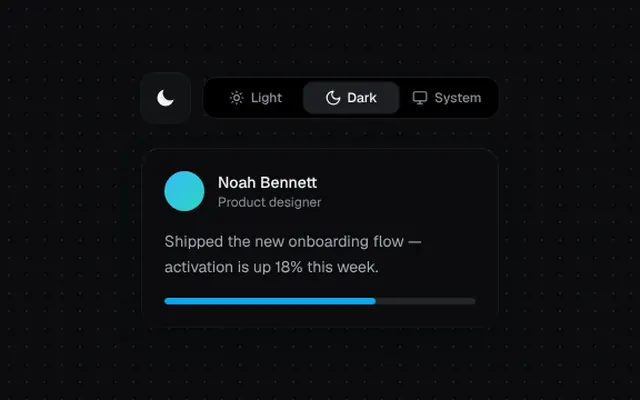
A sun-to-moon morphing toggle and a three-way segmented control with a sliding pill.
Installation
01
Install with the shadcn CLI. The NiceUI theme comes along the first time.
$ npx shadcn@latest add https://niceui.dev/r/components-theme-toggle.json02
Or copy the source below. Dependencies: lucide-react.
Source
components/niceui/ui/motion/ThemeToggle.tsx
import { useId, useState, type CSSProperties } from 'react';
import { Monitor, Moon, Sun } from 'lucide-react';
import { cn } from '@/lib/cn';

export type ThemeMode = 'light' | 'dark' | 'system';

/** A sun that morphs into a moon: rays retract, a mask circle slides in to carve the crescent. */
export function SunMoonToggle({ dark, onChange, className }: { dark: boolean; onChange: (dark: boolean) => void; className?: string }) {
  const id = useId();
  const ease = 'cubic-bezier(0.34,1.56,0.64,1)';
  return (
    <button
      onClick={() => onChange(!dark)}
      aria-label={dark ? 'Switch to light theme' : 'Switch to dark theme'}
      className={cn(
        'focus-ring flex h-11 w-11 items-center justify-center rounded-xl shadow-hairline transition-colors duration-500 active:scale-90',
        dark ? 'bg-ink-850 text-ink-50 hover:bg-ink-800' : 'bg-amber-400/10 text-amber-300 hover:bg-amber-400/15',
        className,
      )}
    >
      <svg viewBox="0 0 24 24" className="h-5 w-5 overflow-visible" fill="none" stroke="currentColor" strokeWidth={2} strokeLinecap="round">
        <mask id={id}>
          <rect x="0" y="0" width="24" height="24" fill="white" />
          <circle r="9" fill="black" style={{ transition: `transform 600ms ${ease}`, transform: dark ? 'translate(17px, 7px)' : 'translate(30px, -6px)' }} />
        </mask>
        <circle
          cx="12"
          cy="12"
          r={dark ? 9 : 5}
          fill="currentColor"
          stroke="none"
          mask={`url(#${id})`}
          style={{ r: dark ? 9 : 5, transition: `r 600ms ${ease}` } as CSSProperties}
        />
        <g
          style={{
            transformOrigin: '12px 12px',
            transition: `transform 600ms ${ease}, opacity 300ms`,
            transform: dark ? 'rotate(-90deg) scale(0.4)' : 'rotate(0deg) scale(1)',
            opacity: dark ? 0 : 1,
          }}
        >
          {Array.from({ length: 8 }, (_, i) => {
            const a = (i * Math.PI) / 4;
            return <line key={i} x1={12 + Math.cos(a) * 8} y1={12 + Math.sin(a) * 8} x2={12 + Math.cos(a) * 10.5} y2={12 + Math.sin(a) * 10.5} />;
          })}
        </g>
      </svg>
    </button>
  );
}

const MODES: Array<{ id: ThemeMode; icon: typeof Sun; label: string }> = [
  { id: 'light', icon: Sun, label: 'Light' },
  { id: 'dark', icon: Moon, label: 'Dark' },
  { id: 'system', icon: Monitor, label: 'System' },
];

export function ThemeSegmented({ value, onChange }: { value: ThemeMode; onChange: (m: ThemeMode) => void }) {
  const idx = MODES.findIndex((m) => m.id === value);
  return (
    <div role="radiogroup" className="relative grid grid-cols-3 rounded-xl bg-ink-950 p-1 shadow-hairline">
      <span
        className="absolute inset-y-1 left-1 w-[calc((100%-8px)/3)] rounded-lg bg-ink-800 shadow-hairline transition-transform duration-500 ease-spring"
        style={{ transform: `translateX(${idx * 100}%)` }}
      />
      {MODES.map((m) => (
        <button
          key={m.id}
          role="radio"
          aria-checked={value === m.id}
          onClick={() => onChange(m.id)}
          className={cn(
            'focus-ring relative z-10 flex items-center justify-center gap-1.5 rounded-lg px-3 py-1.5 text-xs font-medium transition-colors duration-300',
            value === m.id ? 'text-ink-50' : 'text-ink-400 hover:text-ink-200',
          )}
        >
          <m.icon className={cn('h-3.5 w-3.5 transition-transform duration-500 ease-spring', value === m.id && 'rotate-[360deg] scale-110')} />
          {m.label}
        </button>
      ))}
    </div>
  );
}

function PreviewCard({ light }: { light: boolean }) {
  return (
    <div
      className={cn(
        'w-full max-w-xs rounded-2xl p-5 transition-all duration-700 ease-smooth',
        light ? 'bg-white text-ink-900 shadow-[0_12px_40px_-12px_rgba(0,0,0,0.5)]' : 'bg-ink-900 text-ink-50 shadow-card',
      )}
    >
      <div className="flex items-center gap-3">
        <span className="h-9 w-9 rounded-full bg-gradient-to-br from-brand-400 to-teal-400" />
        <div>
          <p className="text-sm font-medium">Noah Bennett</p>
          <p className={cn('text-xs transition-colors duration-700', light ? 'text-ink-500' : 'text-ink-400')}>Product designer</p>
        </div>
      </div>
      <p className={cn('mt-4 text-sm leading-relaxed transition-colors duration-700', light ? 'text-ink-600' : 'text-ink-300')}>
        Shipped the new onboarding flow — activation is up 18% this week.
      </p>
      <div className={cn('mt-4 h-1.5 overflow-hidden rounded-full transition-colors duration-700', light ? 'bg-ink-100' : 'bg-white/10')}>
        <div className="h-full w-[68%] rounded-full bg-brand-500" />
      </div>
    </div>
  );
}

export function ThemeToggleDemo() {
  const [mode, setMode] = useState<ThemeMode>('dark');
  const systemDark = typeof window !== 'undefined' && window.matchMedia('(prefers-color-scheme: dark)').matches;
  const dark = mode === 'dark' || (mode === 'system' && systemDark);
  return (
    <div className="mx-auto flex w-full max-w-md flex-col items-center gap-6">
      <div className="flex items-center gap-3">
        <SunMoonToggle dark={dark} onChange={(d) => setMode(d ? 'dark' : 'light')} />
        <ThemeSegmented value={mode} onChange={setMode} />
      </div>
      <PreviewCard light={!dark} />
    </div>
  );
}