File Card New
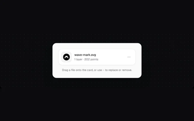
The current asset: a thumbnail tile, name and meta, a menu to replace or remove it, and a drop state when a file is dragged over.
Installation
01
Install with the shadcn CLI. The NiceUI theme comes along the first time.
$ npx shadcn@latest add https://niceui.dev/r/design-file-card.json02
Or copy the source below (2 files). Dependencies: lucide-react.
Source
components/niceui/design/FileCard.tsx
import { useEffect, useRef, useState } from 'react';
import { FileImage, MoreHorizontal, RefreshCw, Trash2, Upload } from 'lucide-react';
import { cn } from '@/lib/cn';
import { LightFrame, focusRing } from './shared';

export type FileCardProps = {
  name: string;
  meta: string;
  thumbnail?: string;
  onReplace?: (file?: File) => void;
  onRemove?: () => void;
};

/** The current asset: thumbnail tile, name and meta, a menu, and a drop target to replace it. */
export function FileCard({ name, meta, thumbnail, onReplace, onRemove }: FileCardProps) {
  const [menu, setMenu] = useState(false);
  const [over, setOver] = useState(false);
  const ref = useRef<HTMLDivElement>(null);
  useEffect(() => {
    if (!menu) return;
    const close = (e: PointerEvent) => !ref.current?.contains(e.target as Node) && setMenu(false);
    window.addEventListener('pointerdown', close);
    return () => window.removeEventListener('pointerdown', close);
  }, [menu]);
  return (
    <div
      ref={ref}
      onDragOver={(e) => (e.preventDefault(), setOver(true))}
      onDragLeave={() => setOver(false)}
      onDrop={(e) => {
        e.preventDefault();
        setOver(false);
        onReplace?.(e.dataTransfer.files[0]);
      }}
      className={cn('relative flex items-center gap-3 rounded-2xl border bg-white p-3 shadow-[0_1px_2px_rgba(0,0,0,0.04)] transition-all', over ? 'border-zinc-900 border-dashed bg-zinc-50' : 'border-zinc-200/80')}
    >
      <div className="grid h-11 w-11 shrink-0 place-items-center overflow-hidden rounded-xl bg-zinc-100 ring-1 ring-inset ring-zinc-200">
        {thumbnail ? <img src={thumbnail} alt="" className="h-full w-full object-contain p-1.5" /> : <FileImage className="h-5 w-5 text-zinc-400" />}
      </div>
      <div className="min-w-0 flex-1">
        <p className="truncate text-[13px] font-medium text-zinc-900">{over ? 'Drop to replace' : name}</p>
        <p className="truncate text-[12px] text-zinc-500">{over ? 'Your settings are kept' : meta}</p>
      </div>
      <button onClick={() => setMenu((m) => !m)} aria-label="File options" aria-expanded={menu} className={cn('grid h-8 w-8 place-items-center rounded-lg text-zinc-400 transition-colors hover:bg-zinc-100 hover:text-zinc-800', focusRing)}>
        <MoreHorizontal className="h-4 w-4" />
      </button>
      {menu && (
        <div role="menu" className="absolute right-2 top-[calc(100%+6px)] z-20 w-44 rounded-xl border border-zinc-200 bg-white p-1 shadow-[0_16px_40px_-12px_rgba(0,0,0,0.2)] animate-scale-in">
          <button role="menuitem" onClick={() => (setMenu(false), onReplace?.())} className="flex w-full items-center gap-2 rounded-lg px-2.5 py-2 text-[13px] text-zinc-700 hover:bg-zinc-100">
            <RefreshCw className="h-3.5 w-3.5" /> Replace image…
          </button>
          <button role="menuitem" onClick={() => (setMenu(false), onRemove?.())} className="flex w-full items-center gap-2 rounded-lg px-2.5 py-2 text-[13px] text-rose-600 hover:bg-rose-50">
            <Trash2 className="h-3.5 w-3.5" /> Remove
          </button>
        </div>
      )}
    </div>
  );
}

const MARK = `data:image/svg+xml;utf8,${encodeURIComponent('<svg xmlns="http://www.w3.org/2000/svg" viewBox="0 0 40 40"><circle cx="20" cy="20" r="18" fill="#0b0b0c"/><path d="M11 25c5-8 13-8 18 0M14 19c4-5 8-5 12 0" stroke="#fff" stroke-width="3" fill="none" stroke-linecap="round"/></svg>')}`;

export function FileCardDemo() {
  const files = [
    { name: 'wave-mark.svg', meta: '1 layer · 202 points', thumb: MARK },
    { name: 'studio-logo.png', meta: '3 layers · 1,284 points', thumb: undefined },
  ];
  const [i, setI] = useState(0);
  const [gone, setGone] = useState(false);
  return (
    <LightFrame className="mx-auto max-w-[380px] space-y-3">
      {gone ? (
        <button onClick={() => setGone(false)} className={cn('flex w-full flex-col items-center gap-2 rounded-2xl border border-dashed border-zinc-300 bg-white px-4 py-6 text-[13px] text-zinc-500 hover:border-zinc-400 hover:text-zinc-800', focusRing)}>
          <Upload className="h-5 w-5" /> Drop an image, or click to bring one back
        </button>
      ) : (
        <FileCard name={files[i].name} meta={files[i].meta} thumbnail={files[i].thumb} onReplace={() => setI((x) => (x + 1) % files.length)} onRemove={() => setGone(true)} />
      )}
      <p className="text-center text-[12px] text-zinc-500">Drag a file onto the card, or use ··· to replace or remove.</p>
    </LightFrame>
  );
}
components/niceui/design/shared.tsx
import type { ReactNode } from 'react';
import { cn } from '@/lib/cn';

/** A light surface for demos, since the doc stage itself is dark. */
export function LightFrame({ children, className, bare }: { children: ReactNode; className?: string; bare?: boolean }) {
  return (
    <div className={cn('w-full rounded-2xl font-sans', bare ? 'overflow-hidden bg-[#f4f4f5]' : 'bg-[#fafafa] p-4 sm:p-6', ' text-[13px] text-zinc-800 shadow-[0_1px_0_rgba(255,255,255,0.8)_inset,0_30px_60px_-30px_rgba(0,0,0,0.5)] ring-1 ring-zinc-200', className)}>
      {children}
    </div>
  );
}

export function Panel({ children, className }: { children: ReactNode; className?: string }) {
  return <div className={cn('rounded-2xl border border-zinc-200/80 bg-white p-4 shadow-[0_1px_2px_rgba(0,0,0,0.04)]', className)}>{children}</div>;
}

export function SectionHead({ title, meta }: { title: string; meta?: string }) {
  return (
    <div className="mb-3 flex items-baseline justify-between gap-3">
      <h4 className="text-[13px] font-semibold text-zinc-900">{title}</h4>
      {meta && <span className="truncate text-[12px] text-zinc-500">{meta}</span>}
    </div>
  );
}

export const focusRing = 'outline-none focus-visible:ring-2 focus-visible:ring-zinc-900/20 focus-visible:ring-offset-1';