Segmented Pills New
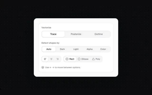
A soft track with a white pill that glides to the active option. Works with text, icons or both, and the arrow keys move between options.
Installation
01
Install with the shadcn CLI. The NiceUI theme comes along the first time.
$ npx shadcn@latest add https://niceui.dev/r/design-segmented-pills.json02
Or copy the source below (2 files). Dependencies: lucide-react.
Source
components/niceui/design/SegmentedPills.tsx
import { useLayoutEffect, useRef, useState, type ReactNode } from 'react';
import { AlignCenter, AlignLeft, AlignRight, Circle, Layers, Square, Triangle } from 'lucide-react';
import { cn } from '@/lib/cn';
import { LightFrame, Panel, focusRing } from './shared';

export type PillOption = { value: string; label?: string; icon?: ReactNode };

export type SegmentedPillsProps = {
  options: PillOption[];
  value: string;
  onChange: (v: string) => void;
  size?: 'sm' | 'md';
  full?: boolean;
  label?: string;
  className?: string;
};

/** A soft track with a white pill that slides to the active option. */
export function SegmentedPills({ options, value, onChange, size = 'md', full, label, className }: SegmentedPillsProps) {
  const ref = useRef<HTMLDivElement>(null);
  const [pill, setPill] = useState({ left: 0, width: 0 });
  useLayoutEffect(() => {
    const el = ref.current?.querySelector<HTMLButtonElement>(`[data-v="${CSS.escape(value)}"]`);
    if (el) setPill({ left: el.offsetLeft, width: el.offsetWidth });
  }, [value, options.length, size, full]);
  const move = (dir: number) => {
    const i = options.findIndex((o) => o.value === value);
    const next = options[(i + dir + options.length) % options.length];
    onChange(next.value);
    ref.current?.querySelector<HTMLButtonElement>(`[data-v="${CSS.escape(next.value)}"]`)?.focus();
  };
  return (
    <div
      ref={ref}
      role="radiogroup"
      aria-label={label}
      className={cn('relative flex rounded-xl bg-zinc-100 p-[3px] ring-1 ring-inset ring-zinc-200/70', full ? 'w-full' : 'w-fit', className)}
    >
      <span className="pointer-events-none absolute inset-y-[3px] rounded-[9px] bg-white shadow-[0_1px_2px_rgba(0,0,0,0.08),0_0_0_1px_rgba(0,0,0,0.04)] transition-all duration-300 ease-smooth" style={{ left: pill.left, width: pill.width }} />
      {options.map((o) => {
        const on = o.value === value;
        return (
          <button
            key={o.value}
            data-v={o.value}
            role="radio"
            aria-checked={on}
            aria-label={o.label ? undefined : o.value}
            tabIndex={on ? 0 : -1}
            onClick={() => onChange(o.value)}
            onKeyDown={(e) => {
              if (e.key === 'ArrowRight' || e.key === 'ArrowDown') (e.preventDefault(), move(1));
              if (e.key === 'ArrowLeft' || e.key === 'ArrowUp') (e.preventDefault(), move(-1));
            }}
            className={cn(
              'relative z-10 flex items-center justify-center gap-1.5 whitespace-nowrap rounded-[9px] font-medium transition-colors',
              focusRing,
              size === 'sm' ? 'h-7 px-2 text-[12px] sm:px-2.5' : 'h-8 px-2 text-[13px] sm:px-3.5',
              full && 'min-w-0 flex-1 overflow-hidden text-ellipsis',
              on ? 'text-zinc-900' : 'text-zinc-500 hover:text-zinc-800',
            )}
          >
            {o.icon}
            {o.label}
          </button>
        );
      })}
    </div>
  );
}

export function SegmentedPillsDemo() {
  const [mode, setMode] = useState('trace');
  const [source, setSource] = useState('auto');
  const [align, setAlign] = useState('left');
  const [shape, setShape] = useState('square');
  return (
    <LightFrame className="mx-auto max-w-[460px]">
      <Panel className="space-y-5">
        <div className="space-y-2">
          <p className="text-[12px] font-medium text-zinc-500">Vectorize</p>
          <SegmentedPills full label="Vectorize mode" value={mode} onChange={setMode} options={[{ value: 'trace', label: 'Trace' }, { value: 'posterize', label: 'Posterize' }, { value: 'outline', label: 'Outline' }]} />
        </div>
        <div className="space-y-2">
          <p className="text-[12px] font-medium text-zinc-500">Detect shapes by</p>
          <SegmentedPills full size="sm" label="Detect shapes by" value={source} onChange={setSource} options={['auto', 'dark', 'light', 'alpha', 'color'].map((v) => ({ value: v, label: v[0].toUpperCase() + v.slice(1) }))} />
        </div>
        <div className="flex flex-wrap items-center gap-3">
          <SegmentedPills size="sm" label="Text alignment" value={align} onChange={setAlign} options={[{ value: 'left', icon: <AlignLeft className="h-3.5 w-3.5" /> }, { value: 'center', icon: <AlignCenter className="h-3.5 w-3.5" /> }, { value: 'right', icon: <AlignRight className="h-3.5 w-3.5" /> }]} />
          <SegmentedPills size="sm" label="Shape" value={shape} onChange={setShape} options={[{ value: 'square', icon: <Square className="h-3.5 w-3.5" />, label: 'Rect' }, { value: 'circle', icon: <Circle className="h-3.5 w-3.5" />, label: 'Ellipse' }, { value: 'tri', icon: <Triangle className="h-3.5 w-3.5" />, label: 'Poly' }]} />
        </div>
        <p className="flex items-center gap-1.5 text-[12px] text-zinc-500">
          <Layers className="h-3.5 w-3.5" /> Use ← → to move between options.
        </p>
      </Panel>
    </LightFrame>
  );
}
components/niceui/design/shared.tsx
import type { ReactNode } from 'react';
import { cn } from '@/lib/cn';

/** A light surface for demos, since the doc stage itself is dark. */
export function LightFrame({ children, className, bare }: { children: ReactNode; className?: string; bare?: boolean }) {
  return (
    <div className={cn('w-full rounded-2xl font-sans', bare ? 'overflow-hidden bg-[#f4f4f5]' : 'bg-[#fafafa] p-4 sm:p-6', ' text-[13px] text-zinc-800 shadow-[0_1px_0_rgba(255,255,255,0.8)_inset,0_30px_60px_-30px_rgba(0,0,0,0.5)] ring-1 ring-zinc-200', className)}>
      {children}
    </div>
  );
}

export function Panel({ children, className }: { children: ReactNode; className?: string }) {
  return <div className={cn('rounded-2xl border border-zinc-200/80 bg-white p-4 shadow-[0_1px_2px_rgba(0,0,0,0.04)]', className)}>{children}</div>;
}

export function SectionHead({ title, meta }: { title: string; meta?: string }) {
  return (
    <div className="mb-3 flex items-baseline justify-between gap-3">
      <h4 className="text-[13px] font-semibold text-zinc-900">{title}</h4>
      {meta && <span className="truncate text-[12px] text-zinc-500">{meta}</span>}
    </div>
  );
}

export const focusRing = 'outline-none focus-visible:ring-2 focus-visible:ring-zinc-900/20 focus-visible:ring-offset-1';