Unit Input New
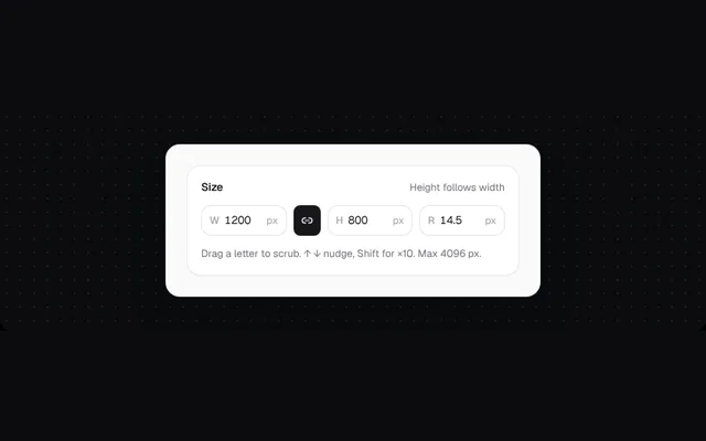
Compact number fields with a prefix letter and a unit. Drag the letter to scrub, ↑ ↓ to nudge, and out-of-range values turn red. The demo locks the aspect ratio between W and H.
Installation
01
Install with the shadcn CLI. The NiceUI theme comes along the first time.
$ npx shadcn@latest add https://niceui.dev/r/design-unit-input.json02
Or copy the source below (2 files). Dependencies: lucide-react.
Source
components/niceui/design/UnitInput.tsx
import { useRef, useState } from 'react';
import { Link2, Unlink2 } from 'lucide-react';
import { cn } from '@/lib/cn';
import { LightFrame, Panel, SectionHead, focusRing } from './shared';

export type UnitInputProps = {
  prefix: string;
  value: number;
  onChange: (v: number) => void;
  unit?: string;
  min?: number;
  max?: number;
  step?: number;
  label?: string;
};

/** A compact number field: drag the prefix letter to scrub, type to set, out-of-range values flag red. */
export function UnitInput({ prefix, value, onChange, unit = 'px', min = 0, max = 9999, step = 1, label }: UnitInputProps) {
  const [draft, setDraft] = useState<string | null>(null);
  const start = useRef<{ x: number; v: number } | null>(null);
  const shown = draft ?? String(Math.round(value * 10) / 10);
  const n = parseFloat(shown);
  const invalid = Number.isNaN(n) || n < min || n > max;
  const commit = () => {
    if (draft !== null && !invalid) onChange(n);
    setDraft(null);
  };
  return (
    <label className={cn('flex h-9 min-w-0 items-center gap-1.5 rounded-xl bg-white px-2.5 ring-1 ring-inset transition-shadow focus-within:ring-zinc-400', invalid ? 'ring-rose-300 bg-rose-50/40' : 'ring-zinc-200')}>
      <span
        title="Drag to scrub"
        onPointerDown={(e) => {
          (e.currentTarget as HTMLElement).setPointerCapture(e.pointerId);
          start.current = { x: e.clientX, v: value };
        }}
        onPointerMove={(e) => {
          if (!start.current) return;
          const v = start.current.v + Math.round((e.clientX - start.current.x) / 2) * step;
          onChange(Math.min(max, Math.max(min, v)));
        }}
        onPointerUp={() => (start.current = null)}
        className="cursor-ew-resize select-none text-[12px] font-medium text-zinc-400 hover:text-zinc-700"
      >
        {prefix}
      </span>
      <input
        aria-label={label ?? prefix}
        inputMode="decimal"
        value={shown}
        onChange={(e) => setDraft(e.target.value)}
        onBlur={commit}
        onKeyDown={(e) => {
          if (e.key === 'Enter') (e.currentTarget as HTMLInputElement).blur();
          if (e.key === 'ArrowUp' || e.key === 'ArrowDown') {
            e.preventDefault();
            const d = (e.key === 'ArrowUp' ? 1 : -1) * step * (e.shiftKey ? 10 : 1);
            onChange(Math.min(max, Math.max(min, value + d)));
            setDraft(null);
          }
        }}
        className="w-0 min-w-0 flex-1 bg-transparent text-[13px] tabular-nums text-zinc-900 outline-none"
      />
      <span className="text-[12px] text-zinc-400">{unit}</span>
    </label>
  );
}

export function UnitInputDemo() {
  const [w, setW] = useState(1200);
  const [h, setH] = useState(800);
  const [d, setD] = useState(14.5);
  const [lock, setLock] = useState(true);
  const ratio = useRef(1200 / 800);
  const setWidth = (v: number) => {
    setW(v);
    if (lock) setH(Math.round(v / ratio.current));
  };
  const setHeight = (v: number) => {
    setH(v);
    if (lock) setW(Math.round(v * ratio.current));
  };
  return (
    <LightFrame className="mx-auto max-w-[440px]">
      <Panel>
        <SectionHead title="Size" meta={lock ? 'Height follows width' : 'Free resize'} />
        <div className="grid grid-cols-[minmax(0,1fr)_auto_minmax(0,1fr)] items-center gap-2 sm:grid-cols-[minmax(0,1fr)_auto_minmax(0,1fr)_minmax(0,1fr)]">
          <UnitInput prefix="W" label="Width" value={w} onChange={setWidth} max={4096} />
          <button
            onClick={() => {
              ratio.current = w / h;
              setLock((l) => !l);
            }}
            aria-pressed={lock}
            aria-label={lock ? 'Unlock aspect ratio' : 'Lock aspect ratio'}
            className={cn('grid h-9 w-8 place-items-center rounded-lg transition-colors', focusRing, lock ? 'bg-zinc-900 text-white' : 'text-zinc-400 hover:bg-zinc-100 hover:text-zinc-800')}
          >
            {lock ? <Link2 className="h-3.5 w-3.5" /> : <Unlink2 className="h-3.5 w-3.5" />}
          </button>
          <UnitInput prefix="H" label="Height" value={h} onChange={setHeight} max={4096} />
          <div className="col-span-3 sm:col-span-1">
            <UnitInput prefix="R" label="Corner radius" value={d} onChange={setD} step={0.5} max={64} />
          </div>
        </div>
        <p className="mt-3 text-[12px] text-zinc-500">Drag a letter to scrub. ↑ ↓ nudge, Shift for ×10. Max 4096 px.</p>
      </Panel>
    </LightFrame>
  );
}
components/niceui/design/shared.tsx
import type { ReactNode } from 'react';
import { cn } from '@/lib/cn';

/** A light surface for demos, since the doc stage itself is dark. */
export function LightFrame({ children, className, bare }: { children: ReactNode; className?: string; bare?: boolean }) {
  return (
    <div className={cn('w-full rounded-2xl font-sans', bare ? 'overflow-hidden bg-[#f4f4f5]' : 'bg-[#fafafa] p-4 sm:p-6', ' text-[13px] text-zinc-800 shadow-[0_1px_0_rgba(255,255,255,0.8)_inset,0_30px_60px_-30px_rgba(0,0,0,0.5)] ring-1 ring-zinc-200', className)}>
      {children}
    </div>
  );
}

export function Panel({ children, className }: { children: ReactNode; className?: string }) {
  return <div className={cn('rounded-2xl border border-zinc-200/80 bg-white p-4 shadow-[0_1px_2px_rgba(0,0,0,0.04)]', className)}>{children}</div>;
}

export function SectionHead({ title, meta }: { title: string; meta?: string }) {
  return (
    <div className="mb-3 flex items-baseline justify-between gap-3">
      <h4 className="text-[13px] font-semibold text-zinc-900">{title}</h4>
      {meta && <span className="truncate text-[12px] text-zinc-500">{meta}</span>}
    </div>
  );
}

export const focusRing = 'outline-none focus-visible:ring-2 focus-visible:ring-zinc-900/20 focus-visible:ring-offset-1';