Reviews New
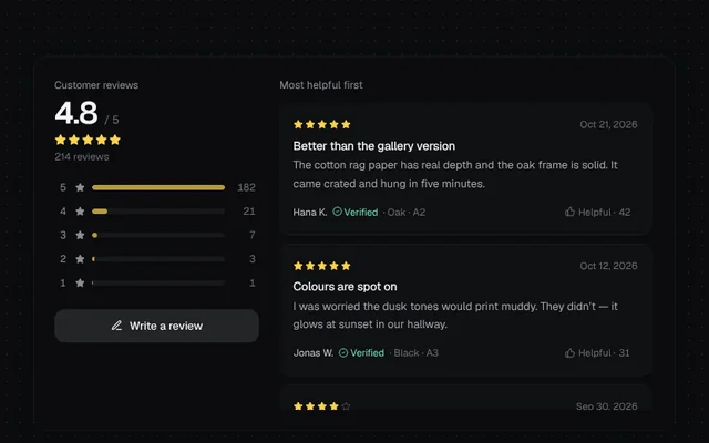
A reviews section with an average rating, distribution bars that filter by stars, helpful votes and a write-a-review dialog with star input.
Installation
01
Install with the shadcn CLI. The NiceUI theme comes along the first time.
$ npx shadcn@latest add https://niceui.dev/r/commerce-product-reviews.json02
Or copy the source below. Dependencies: lucide-react.
Source
components/niceui/commerce/Reviews.tsx
import { useEffect, useRef, useState } from 'react';
import { BadgeCheck, PenLine, Star, ThumbsUp, X } from 'lucide-react';
import { cn } from '@/lib/cn';

export type Review = { id: number; name: string; rating: number; title: string; body: string; date: string; helpful: number; verified: boolean; variant: string };

const SEED: Review[] = [
  { id: 1, name: 'Hana K.', rating: 5, title: 'Better than the gallery version', body: 'The cotton rag paper has real depth and the oak frame is solid. It came crated and hung in five minutes.', date: 'Oct 21, 2026', helpful: 42, verified: true, variant: 'Oak · A2' },
  { id: 2, name: 'Jonas W.', rating: 5, title: 'Colours are spot on', body: 'I was worried the dusk tones would print muddy. They didn’t — it glows at sunset in our hallway.', date: 'Oct 12, 2026', helpful: 31, verified: true, variant: 'Black · A3' },
  { id: 3, name: 'Priya R.', rating: 4, title: 'Beautiful, slow shipping', body: 'Gorgeous print. Took eight days instead of five, but support kept me posted the whole way.', date: 'Sep 30, 2026', helpful: 18, verified: true, variant: 'White · A3' },
  { id: 4, name: 'Tomás L.', rating: 5, title: 'Second one I’ve bought', body: 'Bought Low Tide last year, now this one for the bedroom. Same quality, same lovely packaging.', date: 'Sep 18, 2026', helpful: 12, verified: false, variant: 'Oak · A4' },
  { id: 5, name: 'Ines K.', rating: 3, title: 'Frame had a small mark', body: 'The print is lovely but the frame corner had a scuff. Replacement frame arrived in two days.', date: 'Sep 2, 2026', helpful: 9, verified: true, variant: 'Black · A2' },
  { id: 6, name: 'Leo P.', rating: 4, title: 'Smaller than I pictured', body: 'Check the size guide — A4 is intimate. Quality is excellent though, and the mount is crisp.', date: 'Aug 27, 2026', helpful: 7, verified: true, variant: 'Oak · A4' },
];

const DIST = [182, 21, 7, 3, 1];

function Stars({ value, size = 'h-3.5 w-3.5' }: { value: number; size?: string }) {
  return (
    <span className="flex items-center gap-0.5" aria-label={`${value} out of 5 stars`}>
      {[1, 2, 3, 4, 5].map((i) => (
        <Star key={i} className={cn(size, i <= Math.round(value) ? 'fill-amber-300 text-amber-300' : 'text-ink-600')} />
      ))}
    </span>
  );
}

export function Reviews({ className }: { className?: string }) {
  const [reviews, setReviews] = useState(SEED);
  const [filter, setFilter] = useState<number | null>(null);
  const [voted, setVoted] = useState<Set<number>>(new Set());
  const [writing, setWriting] = useState(false);
  const total = DIST.reduce((a, b) => a + b, 0) + (reviews.length - SEED.length);
  const avg = (DIST.reduce((s, n, i) => s + n * (5 - i), 0) + reviews.slice(SEED.length).reduce((s, r) => s + r.rating, 0)) / total;
  const shown = filter ? reviews.filter((r) => r.rating === filter) : reviews;

  return (
    <div className={cn('relative w-full overflow-hidden rounded-2xl bg-ink-900 shadow-card', className)}>
      <div className="grid gap-6 p-5 sm:p-6 md:grid-cols-[minmax(0,240px)_minmax(0,1fr)]">
        <div className="min-w-0">
          <p className="text-[12px] text-ink-400">Customer reviews</p>
          <p className="mt-1 flex items-baseline gap-2">
            <span className="text-4xl font-semibold tabular-nums tracking-tight text-ink-50">{avg.toFixed(1)}</span>
            <span className="text-[13px] text-ink-500">/ 5</span>
          </p>
          <div className="mt-1"><Stars value={avg} /></div>
          <p className="mt-1 text-[12px] text-ink-500">{total} reviews</p>
          <ul className="mt-4 space-y-1.5">
            {DIST.map((n, i) => {
              const stars = 5 - i;
              const on = filter === stars;
              return (
                <li key={stars}>
                  <button
                    onClick={() => setFilter(on ? null : stars)}
                    aria-pressed={on}
                    className={cn('focus-ring group flex w-full items-center gap-2 rounded-md px-1 py-0.5 text-[12px] transition-colors', on ? 'bg-white/5 text-ink-50' : 'text-ink-400 hover:text-ink-100')}
                  >
                    <span className="w-3 tabular-nums">{stars}</span>
                    <Star className="h-3 w-3 fill-current" />
                    <span className="h-1.5 flex-1 overflow-hidden rounded-full bg-white/5">
                      <span className={cn('block h-full rounded-full transition-all duration-700', on ? 'bg-amber-300' : 'bg-amber-300/70')} style={{ width: `${(n / DIST[0]) * 100}%` }} />
                    </span>
                    <span className="w-7 text-right font-mono tabular-nums text-ink-500">{n}</span>
                  </button>
                </li>
              );
            })}
          </ul>
          <button onClick={() => setWriting(true)} className="focus-ring mt-5 flex w-full items-center justify-center gap-2 rounded-xl bg-white/10 py-2.5 text-[13px] font-medium text-ink-50 hover:bg-white/15">
            <PenLine className="h-3.5 w-3.5" /> Write a review
          </button>
        </div>

        <div className="min-w-0">
          <div className="mb-3 flex items-center justify-between">
            <p className="text-[12.5px] text-ink-400">{filter ? `${shown.length} ${filter}-star reviews` : 'Most helpful first'}</p>
            {filter && (
              <button onClick={() => setFilter(null)} className="focus-ring flex items-center gap-1 rounded-full bg-white/5 px-2 py-0.5 text-[11.5px] text-ink-300 hover:text-ink-50">
                {filter}★ <X className="h-3 w-3" />
              </button>
            )}
          </div>
          <ul className="max-h-[360px] space-y-3 overflow-y-auto pr-1 [scrollbar-width:thin]">
            {shown.map((r) => {
              const on = voted.has(r.id);
              return (
                <li key={r.id} className="rounded-xl bg-white/[0.02] p-4 shadow-hairline animate-fade-in">
                  <div className="flex items-center justify-between gap-3">
                    <Stars value={r.rating} size="h-3 w-3" />
                    <span className="text-[11.5px] text-ink-500">{r.date}</span>
                  </div>
                  <h4 className="mt-2 text-[14px] font-medium text-ink-50">{r.title}</h4>
                  <p className="mt-1 text-[13px] leading-relaxed text-ink-300">{r.body}</p>
                  <div className="mt-3 flex flex-wrap items-center justify-between gap-2 text-[11.5px] text-ink-500">
                    <span className="flex items-center gap-1.5">
                      <span className="text-ink-200">{r.name}</span>
                      {r.verified && <span className="flex items-center gap-0.5 text-emerald-300"><BadgeCheck className="h-3 w-3" /> Verified</span>}
                      <span>· {r.variant}</span>
                    </span>
                    <button
                      onClick={() => setVoted((s) => { const n = new Set(s); if (n.has(r.id)) n.delete(r.id); else n.add(r.id); return n; })}
                      aria-pressed={on}
                      className={cn('focus-ring flex items-center gap-1 rounded-full px-2 py-0.5 transition-colors', on ? 'bg-brand-500/15 text-brand-300' : 'hover:bg-white/5 hover:text-ink-200')}
                    >
                      <ThumbsUp className={cn('h-3 w-3 transition-transform', on && 'scale-110')} /> Helpful · <span className="tabular-nums">{r.helpful + (on ? 1 : 0)}</span>
                    </button>
                  </div>
                </li>
              );
            })}
          </ul>
        </div>
      </div>

      {writing && <WriteReview onClose={() => setWriting(false)} onSubmit={(r) => (setReviews((all) => [r, ...all]), setFilter(null), setWriting(false))} />}
    </div>
  );
}

function WriteReview({ onClose, onSubmit }: { onClose: () => void; onSubmit: (r: Review) => void }) {
  const [rating, setRating] = useState(0);
  const [hover, setHover] = useState(0);
  const [title, setTitle] = useState('');
  const [body, setBody] = useState('');
  const first = useRef<HTMLButtonElement>(null);
  useEffect(() => {
    first.current?.focus();
    const onKey = (e: KeyboardEvent) => e.key === 'Escape' && onClose();
    window.addEventListener('keydown', onKey);
    return () => window.removeEventListener('keydown', onKey);
  }, [onClose]);
  const shown = hover || rating;
  const labels = ['', 'Poor', 'Fair', 'Good', 'Great', 'Excellent'];
  const ready = rating > 0 && title.trim() && body.trim().length >= 10;

  return (
    <div className="absolute inset-0 z-10 grid place-items-center bg-black/60 p-4 backdrop-blur-sm animate-fade-in" onClick={onClose}>
      <div role="dialog" aria-modal="true" aria-label="Write a review" onClick={(e) => e.stopPropagation()} className="w-full max-w-md rounded-2xl bg-ink-850 p-5 shadow-pop animate-scale-in">
        <div className="flex items-center justify-between">
          <h4 className="text-[15px] font-medium text-ink-50">Write a review</h4>
          <button onClick={onClose} aria-label="Close" className="focus-ring grid h-7 w-7 place-items-center rounded-lg text-ink-400 hover:bg-white/5"><X className="h-4 w-4" /></button>
        </div>
        <div className="mt-4 flex items-center gap-3">
          <div className="flex gap-1" role="radiogroup" aria-label="Rating" onMouseLeave={() => setHover(0)}>
            {[1, 2, 3, 4, 5].map((i) => (
              <button
                key={i}
                ref={i === 1 ? first : undefined}
                role="radio"
                aria-checked={rating === i}
                aria-label={`${i} star${i > 1 ? 's' : ''}`}
                onMouseEnter={() => setHover(i)}
                onClick={() => setRating(i)}
                onKeyDown={(e) => {
                  if (e.key === 'ArrowRight') setRating((r) => Math.min(5, r + 1));
                  if (e.key === 'ArrowLeft') setRating((r) => Math.max(1, r - 1));
                }}
                className="focus-ring rounded transition-transform hover:scale-110 active:scale-95"
              >
                <Star className={cn('h-7 w-7 transition-colors', i <= shown ? 'fill-amber-300 text-amber-300' : 'text-ink-600')} />
              </button>
            ))}
          </div>
          <span className="text-[13px] text-ink-300">{labels[shown]}</span>
        </div>
        <input value={title} onChange={(e) => setTitle(e.target.value)} placeholder="Sum it up" aria-label="Title" className="focus-ring mt-4 h-10 w-full rounded-lg border border-white/10 bg-ink-950/60 px-3 text-[13.5px] text-ink-50 outline-none placeholder:text-ink-600 focus:border-brand-400/60" />
        <textarea value={body} onChange={(e) => setBody(e.target.value)} placeholder="What did you like? How does it look on your wall?" aria-label="Review" rows={4} className="focus-ring mt-3 w-full resize-none rounded-lg border border-white/10 bg-ink-950/60 px-3 py-2.5 text-[13.5px] text-ink-50 outline-none placeholder:text-ink-600 focus:border-brand-400/60" />
        <button
          disabled={!ready}
          onClick={() => onSubmit({ id: Date.now(), name: 'You', rating, title, body, date: 'Just now', helpful: 0, verified: true, variant: 'Oak · A3' })}
          className="focus-ring mt-4 h-10 w-full rounded-xl bg-brand-400 text-[13px] font-medium text-ink-950 transition-all hover:bg-brand-300 disabled:opacity-40"
        >
          Post review
        </button>
      </div>
    </div>
  );
}

export function ReviewsDemo() {
  return (
    <div className="w-full max-w-4xl">
      <Reviews />
    </div>
  );
}