Border Beam New
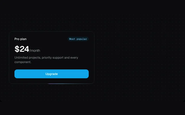
A short beam of light that travels around a card border, drawn with a conic gradient.
Installation
01
Install with the shadcn CLI. The NiceUI theme comes along the first time.
$ npx shadcn@latest add https://niceui.dev/r/effects-border-beam.json02
Or copy the source below. Dependencies: none.
Source
components/niceui/effects/BorderBeam.tsx
import type { ReactNode } from 'react';
import { cn } from '@/lib/cn';

const css = `
@property --nui-beam { syntax: '<angle>'; inherits: false; initial-value: 0deg; }
@keyframes nui-beam { to { --nui-beam: 360deg; } }
@media (prefers-reduced-motion: reduce) { .nui-beam { animation: none !important; } }
`;

export type BorderBeamProps = { duration?: number; colorFrom?: string; colorTo?: string; children?: ReactNode; className?: string };

/** A short beam of light that travels around a card's border. */
export function BorderBeam({ duration = 6, colorFrom = '#7dd3fc', colorTo = '#a78bfa', children, className }: BorderBeamProps) {
  return (
    <div className={cn('relative rounded-2xl bg-ink-900 p-px', className)}>
      <style>{css}</style>
      <div
        aria-hidden
        className="nui-beam pointer-events-none absolute inset-0 rounded-2xl"
        style={{
          background: `conic-gradient(from var(--nui-beam), transparent 0deg, transparent 290deg, ${colorFrom} 330deg, ${colorTo} 355deg, transparent 360deg)`,
          animation: `nui-beam ${duration}s linear infinite`,
        }}
      />
      <div className="absolute inset-0 rounded-2xl border border-white/10" aria-hidden />
      <div className="relative rounded-[15px] bg-ink-900">{children}</div>
    </div>
  );
}

export function BorderBeamDemo() {
  return (
    <BorderBeam className="w-full max-w-sm">
      <div className="p-6">
        <div className="flex items-center justify-between">
          <span className="text-sm font-medium text-ink-100">Pro plan</span>
          <span className="rounded-full bg-brand-500/10 px-2 py-0.5 font-mono text-[11px] text-brand-300">Most popular</span>
        </div>
        <p className="mt-4 text-4xl font-semibold tracking-tight text-white">
          $24<span className="text-base font-normal text-ink-400">/month</span>
        </p>
        <p className="mt-2 text-sm text-ink-400">Unlimited projects, priority support and every component.</p>
        <button className="focus-ring mt-6 w-full rounded-xl bg-brand-500 py-2.5 text-sm font-medium text-white transition-colors hover:bg-brand-400">Upgrade</button>
      </div>
    </BorderBeam>
  );
}