Shiny Button New
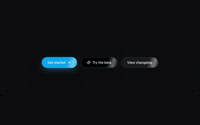
A pill button with a soft light sweep, in solid, outline and glass variants.
Installation
01
Install with the shadcn CLI. The NiceUI theme comes along the first time.
$ npx shadcn@latest add https://niceui.dev/r/effects-shiny-button.json02
Or copy the source below. Dependencies: lucide-react.
Source
components/niceui/effects/ShinyButton.tsx
import type { ButtonHTMLAttributes } from 'react';
import { ArrowRight, Sparkles } from 'lucide-react';
import { cn } from '@/lib/cn';

const css = `@keyframes nui-shine{0%{transform:translateX(-120%) skewX(-20deg)}60%,100%{transform:translateX(220%) skewX(-20deg)}}
@media (prefers-reduced-motion:reduce){.nui-shine{animation:none!important;opacity:0}}`;

export type ShinyButtonProps = ButtonHTMLAttributes<HTMLButtonElement> & { variant?: 'solid' | 'outline' | 'glass' };

/** A pill button with a soft light sweep that passes every few seconds. */
export function ShinyButton({ variant = 'solid', className, children, ...rest }: ShinyButtonProps) {
  return (
    <button
      {...rest}
      className={cn(
        'focus-ring group relative inline-flex h-11 items-center gap-2 overflow-hidden rounded-full px-6 text-sm font-medium transition-all active:scale-[0.97]',
        variant === 'solid' && 'bg-brand-500 text-white shadow-glow hover:bg-brand-400',
        variant === 'outline' && 'border border-brand-400/40 bg-ink-950 text-brand-100 hover:border-brand-300/70',
        variant === 'glass' && 'border border-white/10 bg-white/[0.06] text-ink-50 backdrop-blur hover:bg-white/10',
        className,
      )}
    >
      <style>{css}</style>
      <span aria-hidden className="nui-shine pointer-events-none absolute inset-y-0 left-0 w-1/3 bg-gradient-to-r from-transparent via-white/40 to-transparent [animation:nui-shine_3.2s_ease-in-out_infinite]" />
      <span className="relative flex items-center gap-2">{children}</span>
    </button>
  );
}

export function ShinyButtonDemo() {
  return (
    <div className="flex flex-wrap items-center justify-center gap-4">
      <ShinyButton>
        Get started <ArrowRight className="h-4 w-4 transition-transform group-hover:translate-x-0.5" />
      </ShinyButton>
      <ShinyButton variant="outline">
        <Sparkles className="h-4 w-4" /> Try the beta
      </ShinyButton>
      <ShinyButton variant="glass">View changelog</ShinyButton>
    </div>
  );
}