Reel Grid New
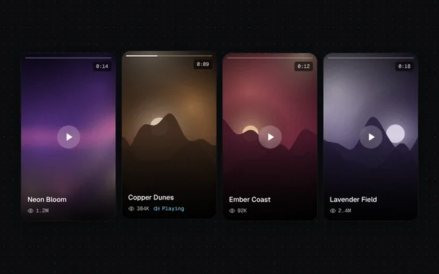
Vertical 9:16 reels that play a slow pan with a progress bar on hover or focus, with view and duration badges.
Installation
01
Install with the shadcn CLI. The NiceUI theme comes along the first time.
$ npx shadcn@latest add https://niceui.dev/r/gallery-reel-grid.json02
Or copy the source below (2 files). Dependencies: lucide-react.
Source
components/niceui/gallery/ReelGrid.tsx
import { useEffect, useMemo, useState } from 'react';
import { Eye, Play, Volume2 } from 'lucide-react';
import { cn } from '@/lib/cn';
import { ARTWORKS, artwork } from './art';

export type Reel = { id: number; title: string; image: string; views: string; duration: number };

function ReelCard({ reel, active, onActivate }: { reel: Reel; active: boolean; onActivate: (on: boolean) => void }) {
  const [p, setP] = useState(0);
  useEffect(() => {
    if (!active) return setP(0);
    if (window.matchMedia('(prefers-reduced-motion: reduce)').matches) return setP(0.5);
    let raf = 0;
    const start = performance.now();
    const tick = (now: number) => {
      setP(((now - start) / 1000 / reel.duration) % 1);
      raf = requestAnimationFrame(tick);
    };
    raf = requestAnimationFrame(tick);
    return () => cancelAnimationFrame(raf);
  }, [active, reel.duration]);

  return (
    <button
      onMouseEnter={() => onActivate(true)}
      onMouseLeave={() => onActivate(false)}
      onFocus={() => onActivate(true)}
      onBlur={() => onActivate(false)}
      onClick={() => onActivate(!active)}
      className={cn('focus-ring group relative aspect-[9/16] w-full overflow-hidden rounded-2xl bg-black text-left shadow-card transition-transform duration-500 ease-smooth', active && '-translate-y-1')}
      aria-label={`${reel.title}, ${reel.views} views`}
    >
      <img src={reel.image} alt="" className="absolute inset-0 h-full w-full object-cover" style={{ transform: `scale(${1.08 + p * 0.18}) translateY(${-p * 6}%)` }} />
      <div className="absolute inset-0 bg-gradient-to-t from-black/85 via-black/10 to-black/30" />
      <div className="absolute inset-x-2 top-2 flex gap-1">
        <span className="h-0.5 flex-1 overflow-hidden rounded bg-white/25"><span className="block h-full bg-white" style={{ width: `${p * 100}%` }} /></span>
      </div>
      <span className="absolute right-2 top-4 rounded bg-black/55 px-1.5 py-0.5 font-mono text-[9.5px] text-white/85 backdrop-blur">0:{String(reel.duration).padStart(2, '0')}</span>
      <span className={cn('absolute left-1/2 top-1/2 grid h-11 w-11 -translate-x-1/2 -translate-y-1/2 place-items-center rounded-full bg-white/20 text-white backdrop-blur transition-all duration-300', active ? 'scale-75 opacity-0' : 'opacity-100')}>
        <Play className="ml-0.5 h-4 w-4 fill-current" />
      </span>
      <div className="absolute inset-x-3 bottom-3">
        <p className="text-[13px] font-medium leading-snug text-white">{reel.title}</p>
        <p className="mt-1 flex items-center gap-2 font-mono text-[10px] text-white/70">
          <span className="flex items-center gap-1"><Eye className="h-3 w-3" />{reel.views}</span>
          {active && <span className="flex items-center gap-1 text-brand-300"><Volume2 className="h-3 w-3" />Playing</span>}
        </p>
      </div>
    </button>
  );
}

export function ReelGrid({ reels, className }: { reels: Reel[]; className?: string }) {
  const [active, setActive] = useState<number | null>(reels[1]?.id ?? null);
  return (
    <div className={cn('grid w-full grid-cols-2 gap-3 sm:grid-cols-4', className)}>
      {reels.map((r) => (
        <ReelCard key={r.id} reel={r} active={active === r.id} onActivate={(on) => setActive((a) => (on ? r.id : a === r.id ? null : a))} />
      ))}
    </div>
  );
}

export function ReelGridDemo() {
  const reels = useMemo(() => [1, 3, 6, 8].map((id, i) => ({ id, title: ARTWORKS[id].title, image: artwork(id, 360, 640), views: ['1.2M', '384K', '92K', '2.4M'][i], duration: [14, 9, 12, 18][i] })), []);
  return <ReelGrid reels={reels} />;
}
components/niceui/gallery/art.ts
/*
 * Procedural artwork for the gallery demos: soft landscapes and abstract mesh
 * gradients with film grain, rendered once to data URLs. Swap `src` for real
 * photos in your app — every gallery component just takes image URLs.
 */

export type Artwork = { id: number; title: string; artist: string; place: string; year: number; tone: 'warm' | 'cool' | 'dusk' | 'mono' };

const PALETTES: string[][] = [
  ['#0b1d3a', '#1f4e79', '#f2a65a', '#f7d9a8'],
  ['#120c26', '#4b2a77', '#e66b9d', '#ffd1b3'],
  ['#06222b', '#0f5f6b', '#7fd1c7', '#e8f6f1'],
  ['#1b1410', '#5b3a26', '#d98c4a', '#f6e1c3'],
  ['#0e0f13', '#2b2f3a', '#8a93a6', '#e6e8ee'],
  ['#0a1a12', '#1f5134', '#9cc98a', '#f1f7da'],
  ['#1a0f14', '#6b1f3a', '#ef6f5e', '#ffd8a8'],
  ['#071426', '#123f73', '#5aa9e6', '#d6ecff'],
  ['#191325', '#3b2d5c', '#b39ddb', '#f3e9ff'],
  ['#201608', '#6e4a12', '#e0b34a', '#fff1c4'],
  ['#0b1216', '#29424f', '#6fa3b8', '#f0e6d2'],
  ['#170b0b', '#4a1414', '#c84b31', '#f5c26b'],
];

export const ARTWORKS: Artwork[] = [
  { id: 0, title: 'Low Tide, Dawn', artist: 'Mira Okafor', place: 'Comporta', year: 2025, tone: 'warm' },
  { id: 1, title: 'Neon Bloom', artist: 'Ilya Varga', place: 'Kyoto', year: 2024, tone: 'dusk' },
  { id: 2, title: 'Glass Lagoon', artist: 'Sana Iqbal', place: 'Faroe Islands', year: 2025, tone: 'cool' },
  { id: 3, title: 'Copper Dunes', artist: 'Teo Marchetti', place: 'Merzouga', year: 2023, tone: 'warm' },
  { id: 4, title: 'Fog Study No. 4', artist: 'Lena Brandt', place: 'Dolomites', year: 2024, tone: 'mono' },
  { id: 5, title: 'Green Hour', artist: 'Ravi Menon', place: 'Munnar', year: 2025, tone: 'cool' },
  { id: 6, title: 'Ember Coast', artist: 'Noor Haddad', place: 'Big Sur', year: 2024, tone: 'warm' },
  { id: 7, title: 'Blue Hour Harbour', artist: 'Jonas Weber', place: 'Bergen', year: 2025, tone: 'cool' },
  { id: 8, title: 'Lavender Field', artist: 'Camille Roy', place: 'Valensole', year: 2023, tone: 'dusk' },
  { id: 9, title: 'Golden Ridge', artist: 'Aiko Tanaka', place: 'Hokkaido', year: 2025, tone: 'warm' },
  { id: 10, title: 'Salt Flats', artist: 'Diego Alvarez', place: 'Uyuni', year: 2024, tone: 'mono' },
  { id: 11, title: 'Red Canyon', artist: 'Hana Kobayashi', place: 'Arizona', year: 2025, tone: 'warm' },
];

let seedState = 1;
const rand = () => {
  seedState = (seedState * 1664525 + 1013904223) >>> 0;
  return seedState / 4294967296;
};

const cache = new Map<string, string>();

/** A deterministic artwork as a data URL. `kind` picks a landscape or an abstract mesh. */
export function artwork(id: number, w = 960, h = 640, kind: 'landscape' | 'mesh' = id % 3 === 1 ? 'mesh' : 'landscape'): string {
  const key = `${id}-${w}-${h}-${kind}`;
  const hit = cache.get(key);
  if (hit) return hit;
  if (typeof document === 'undefined') return '';
  const c = document.createElement('canvas');
  c.width = w;
  c.height = h;
  const g = c.getContext('2d');
  if (!g) return '';
  seedState = (id + 1) * 9973;
  const [deep, mid, hot, light] = PALETTES[id % PALETTES.length];

  const sky = g.createLinearGradient(0, 0, 0, h);
  sky.addColorStop(0, deep);
  sky.addColorStop(0.55, mid);
  sky.addColorStop(1, kind === 'mesh' ? deep : hot);
  g.fillStyle = sky;
  g.fillRect(0, 0, w, h);

  // soft light blobs
  const blobs = kind === 'mesh' ? 6 : 3;
  for (let i = 0; i < blobs; i++) {
    const x = rand() * w;
    const y = rand() * h * (kind === 'mesh' ? 1 : 0.6);
    const r = (0.25 + rand() * 0.45) * Math.max(w, h);
    const rg = g.createRadialGradient(x, y, 0, x, y, r);
    rg.addColorStop(0, [hot, light, mid][i % 3] + 'cc');
    rg.addColorStop(1, 'transparent');
    g.globalCompositeOperation = 'screen';
    g.fillStyle = rg;
    g.fillRect(0, 0, w, h);
  }
  g.globalCompositeOperation = 'source-over';

  if (kind === 'landscape') {
    // sun
    const sx = (0.25 + rand() * 0.5) * w;
    const sy = h * (0.38 + rand() * 0.12);
    const sr = Math.min(w, h) * (0.07 + rand() * 0.05);
    const glow = g.createRadialGradient(sx, sy, 0, sx, sy, sr * 5);
    glow.addColorStop(0, light + 'aa');
    glow.addColorStop(1, 'transparent');
    g.fillStyle = glow;
    g.fillRect(0, 0, w, h);
    g.fillStyle = light;
    g.beginPath();
    g.arc(sx, sy, sr, 0, Math.PI * 2);
    g.fill();
    // ridges, back to front
    for (let layer = 0; layer < 4; layer++) {
      const base = h * (0.5 + layer * 0.12);
      const amp = h * (0.12 - layer * 0.02);
      const f1 = 1.5 + rand() * 2;
      const f2 = 4 + rand() * 4;
      const ph = rand() * 10;
      g.beginPath();
      g.moveTo(0, h);
      for (let x = 0; x <= w; x += 4) {
        const u = x / w;
        const y = base - amp * (0.6 * Math.sin(u * f1 * Math.PI + ph) + 0.3 * Math.sin(u * f2 * Math.PI + ph * 2) + 0.1 * Math.sin(u * 23 + ph));
        g.lineTo(x, y);
      }
      g.lineTo(w, h);
      g.closePath();
      const t = layer / 3;
      const lg = g.createLinearGradient(0, base - amp, 0, h);
      lg.addColorStop(0, mix(mid, deep, 0.25 + t * 0.6));
      lg.addColorStop(1, mix(deep, '#000000', t * 0.5));
      g.fillStyle = lg;
      g.globalAlpha = 0.92;
      g.fill();
      g.globalAlpha = 1;
    }
  } else {
    // flowing ribbons
    for (let i = 0; i < 3; i++) {
      g.beginPath();
      const y0 = h * (0.2 + rand() * 0.6);
      g.moveTo(-50, y0);
      g.bezierCurveTo(w * 0.3, y0 - h * (rand() - 0.5), w * 0.7, y0 + h * (rand() - 0.5), w + 50, y0 + h * (rand() - 0.5) * 0.6);
      g.lineWidth = Math.min(w, h) * (0.08 + rand() * 0.12);
      g.strokeStyle = [light, hot, mid][i] + '55';
      g.filter = `blur(${Math.round(Math.min(w, h) * 0.04)}px)`;
      g.stroke();
      g.filter = 'none';
    }
  }

  // vignette
  const vg = g.createRadialGradient(w / 2, h / 2, Math.min(w, h) * 0.3, w / 2, h / 2, Math.max(w, h) * 0.75);
  vg.addColorStop(0, 'transparent');
  vg.addColorStop(1, 'rgba(0,0,0,0.45)');
  g.fillStyle = vg;
  g.fillRect(0, 0, w, h);

  // film grain
  const img = g.getImageData(0, 0, w, h);
  const d = img.data;
  for (let i = 0; i < d.length; i += 4) {
    const n = (rand() - 0.5) * 18;
    d[i] += n;
    d[i + 1] += n;
    d[i + 2] += n;
  }
  g.putImageData(img, 0, 0);

  const url = c.toDataURL('image/jpeg', 0.86);
  cache.set(key, url);
  return url;
}

function mix(a: string, b: string, t: number) {
  const pa = parseInt(a.slice(1), 16);
  const pb = parseInt(b.slice(1), 16);
  const ch = (s: number) => Math.round(((pa >> s) & 255) * (1 - t) + ((pb >> s) & 255) * t);
  return `rgb(${ch(16)},${ch(8)},${ch(0)})`;
}