SaaS Landing Page New
A premium SaaS product landing page with hero, features, pricing, testimonials and dither footer.
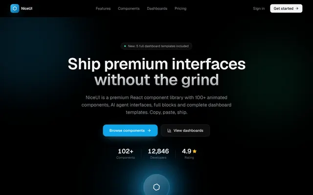
Installation
01
Install with the shadcn CLI. The NiceUI theme comes along the first time.
$ npx shadcn@latest add https://niceui.dev/r/landing-saas-landing.json02
Or copy the source below (2 files). Dependencies: lucide-react.
Source
components/niceui/pages/landing/LandingPageSaaS.tsx
import { type ReactNode, useEffect, useRef, useState } from 'react';
import {
  ArrowRight,
  ArrowUpRight,
  BarChart3,
  Bot,
  Check,
  ChevronRight,
  Hexagon,
  Layers,
  Menu,
  Quote,
  Sparkles,
  Star,
  Terminal,
  TrendingUp,
  Users,
  X,
  Zap,
} from 'lucide-react';
import { cn } from '@/lib/cn';

type PageProps = { onNavigate?: (to: string) => void };

function useCountUp(target: number, duration = 1600) {
  const [val, setVal] = useState(0);
  const ref = useRef<number>(0);
  useEffect(() => {
    let raf = 0;
    const start = performance.now();
    const loop = (now: number) => {
      const t = Math.min(1, (now - start) / duration);
      const eased = 1 - Math.pow(1 - t, 4);
      ref.current = target * eased;
      setVal(ref.current);
      if (t < 1) raf = requestAnimationFrame(loop);
    };
    raf = requestAnimationFrame(loop);
    return () => cancelAnimationFrame(raf);
  }, [target, duration]);
  return val;
}

function Nav({ onNavigate }: PageProps) {
  const [scrolled, setScrolled] = useState(false);
  const [menuOpen, setMenuOpen] = useState(false);
  const go = (to: string) => { onNavigate?.(to); setMenuOpen(false); };

  useEffect(() => {
    const onScroll = () => setScrolled(window.scrollY > 20);
    const main = document.querySelector('main');
    main?.addEventListener('scroll', onScroll);
    return () => main?.removeEventListener('scroll', onScroll);
  }, []);

  const links = [
    ['Features', '/intro/openui'],
    ['Components', '/components/button'],
    ['Dashboards', '/examples/analytics'],
    ['Pricing', '/intro/guides'],
  ];

  return (
    <header className={cn(
      'sticky top-0 z-50 transition-all duration-300',
      scrolled ? 'border-b border-white/5 bg-ink-950/80 backdrop-blur-xl' : 'border-b border-transparent',
    )}>
      <div className="mx-auto flex h-16 max-w-6xl items-center justify-between px-6">
        <button onClick={() => go('/intro/home')} className="focus-ring flex items-center gap-2">
          <span className="flex h-8 w-8 items-center justify-center rounded-lg bg-gradient-to-br from-brand-400 to-brand-700 shadow-glow">
            <Hexagon className="h-4 w-4 text-white" strokeWidth={2.5} />
          </span>
          <span className="text-sm font-semibold tracking-tight text-ink-50">NiceUI</span>
        </button>
        <nav className="hidden items-center gap-1 md:flex">
          {links.map(([label, to]) => (
            <button key={label} onClick={() => go(to)} className="focus-ring rounded-lg px-3 py-1.5 text-sm text-ink-400 transition-colors hover:text-ink-50">
              {label}
            </button>
          ))}
        </nav>
        <div className="flex items-center gap-2">
          <button onClick={() => go('/intro/guides')} className="hidden rounded-lg px-3 py-1.5 text-sm text-ink-400 transition-colors hover:text-ink-50 sm:block">Sign in</button>
          <button onClick={() => go('/components/button')} className="focus-ring group flex items-center gap-1.5 rounded-lg bg-ink-50 px-3.5 py-1.5 text-sm font-medium text-ink-950 transition-all hover:bg-white active:scale-[0.97]">
            Get started
            <ArrowRight className="h-3.5 w-3.5 transition-transform group-hover:translate-x-0.5" />
          </button>
          <button onClick={() => setMenuOpen(o => !o)} className="focus-ring flex h-9 w-9 items-center justify-center rounded-lg text-ink-300 md:hidden">
            {menuOpen ? <X className="h-5 w-5" /> : <Menu className="h-5 w-5" />}
          </button>
        </div>
      </div>
      {menuOpen && (
        <div className="animate-fade-down border-t border-white/5 bg-ink-950 px-6 py-4 md:hidden">
          {links.map(([label, to]) => (
            <button key={label} onClick={() => go(to)} className="block w-full py-2 text-left text-sm text-ink-300 hover:text-ink-50">{label}</button>
          ))}
        </div>
      )}
    </header>
  );
}

function GradientMesh() {
  return (
    <div className="pointer-events-none absolute inset-0 overflow-hidden">
      <div className="absolute -left-20 -top-20 h-96 w-96 animate-blob rounded-full bg-brand-500/15 blur-3xl" />
      <div className="absolute right-0 top-20 h-80 w-80 animate-blob rounded-full bg-emerald-500/10 blur-3xl" style={{ animationDelay: '4s' }} />
      <div className="absolute bottom-0 left-1/3 h-72 w-72 animate-blob rounded-full bg-sky-500/10 blur-3xl" style={{ animationDelay: '8s' }} />
    </div>
  );
}

function HeroOrb() {
  const [t, setT] = useState(0);
  useEffect(() => {
    let raf = 0;
    const start = performance.now();
    const loop = (now: number) => { setT((now - start) / 1000); raf = requestAnimationFrame(loop); };
    raf = requestAnimationFrame(loop);
    return () => cancelAnimationFrame(raf);
  }, []);
  const s = (o: number) => 1 + Math.sin(t * 1.5 + o) * 0.08;
  return (
    <div className="relative flex items-center justify-center">
      {[{ sz: 200, d: 0, op: 0.2 }, { sz: 150, d: 1, op: 0.3 }, { sz: 110, d: 2, op: 0.45 }].map((l, i) => (
        <div key={i} className="absolute rounded-full bg-gradient-to-br from-brand-400 to-brand-700 blur-2xl"
          style={{ width: l.sz, height: l.sz, opacity: l.op, transform: `scale(${s(l.d)})`, transition: 'transform 80ms linear' }} />
      ))}
      <div className="relative flex h-24 w-24 items-center justify-center rounded-full bg-gradient-to-br from-brand-300 to-brand-700 shadow-glow">
        <div className="absolute inset-0 rounded-full bg-ink-950/40 backdrop-blur-sm" />
        <Hexagon className="relative h-7 w-7 text-white animate-spin-slow" strokeWidth={2} />
      </div>
      <div className="absolute h-28 w-28 animate-pulse-ring rounded-full border border-brand-400/30" />
    </div>
  );
}

function Section({ children, className }: { children: ReactNode; className?: string }) {
  return <section className={cn('relative px-6 py-16 sm:py-20', className)}><div className="mx-auto max-w-6xl">{children}</div></section>;
}

const features = [
  { icon: Sparkles, title: '100+ animated components', desc: 'Buttons, inputs, modals, drawers, loaders — every primitive you need, pre-animated.' },
  { icon: Bot, title: 'AI agent interfaces', desc: 'Voice orbs, streaming responses, tool approvals, chat apps and copilot sidebars.' },
  { icon: BarChart3, title: 'Full dashboard templates', desc: 'Analytics, finance, DevOps, commerce and AI ops — production-ready screens.' },
  { icon: Terminal, title: 'Command palette', desc: 'Cmd+K fuzzy search with grouped results and keyboard navigation built in.' },
  { icon: Layers, title: 'Copy-paste blocks', desc: 'OTP inputs, file uploads, prediction markets, swaps and 20+ ready-made blocks.' },
  { icon: Zap, title: 'Zero runtime deps', desc: 'Only lucide-react for icons. All animation is CSS transforms and keyframes.' },
];

const tiers = [
  { name: 'Free', price: '$0', period: 'forever', desc: 'For personal projects and evaluation.', features: ['All components', 'Community support', 'MIT licensed', 'No attribution'], cta: 'Download', highlight: false },
  { name: 'Pro', price: '$49', period: '/mo', desc: 'For freelancers and small teams.', features: ['Everything in Free', 'Premium templates', 'Priority support', 'Early access', 'Figma file included'], cta: 'Start Pro trial', highlight: true },
  { name: 'Team', price: '$199', period: '/mo', desc: 'For teams shipping at scale.', features: ['Everything in Pro', '5 seats included', 'Custom themes', 'SLA guarantee', 'Onboarding session'], cta: 'Contact sales', highlight: false },
];

const testimonials = [
  { name: 'Maya Chen', role: 'Design Lead, Cobalt', text: 'NiceUI replaced our entire component pipeline. What took a sprint now takes an afternoon.', rating: 5 },
  { name: 'Marcus Reid', role: 'Founder, Voltage', text: 'The animations alone are worth it. Our users think we hired a motion design team.', rating: 5 },
  { name: 'Sara Okafor', role: 'Staff Eng, Meridian', text: 'Copy-paste, TypeScript, zero deps. This is how all component libraries should work.', rating: 5 },
];

export function LandingPageSaaS({ onNavigate }: PageProps) {
  const go = (to: string) => onNavigate?.(to);
  const users = Math.floor(useCountUp(12847));
  const components = Math.floor(useCountUp(103));

  return (
    <div className="min-h-full bg-ink-950">
      <Nav onNavigate={onNavigate} />

      {/* Hero */}
      <section className="relative overflow-hidden px-6 pb-20 pt-16 sm:pt-24">
        <GradientMesh />
        <div className="relative mx-auto max-w-4xl text-center">
          <div className="mb-6 inline-flex animate-fade-up items-center gap-2 rounded-full border border-white/10 bg-white/5 px-3 py-1 text-xs text-ink-300 backdrop-blur">
            <span className="flex h-1.5 w-1.5 rounded-full bg-emerald-400" />
            <span>New: 5 full dashboard templates included</span>
          </div>
          <h1 className="animate-fade-up text-4xl font-semibold leading-[1.1] text-ink-50 sm:text-6xl" style={{ animationDelay: '60ms' }}>
            Ship premium interfaces
            <br />
            <span className="text-gradient">without the grind</span>
          </h1>
          <p className="mx-auto mt-6 max-w-xl animate-fade-up text-base text-ink-400 sm:text-lg" style={{ animationDelay: '120ms' }}>
            NiceUI is a premium React component library with 100+ animated components, AI agent interfaces, full blocks and complete dashboard templates. Copy, paste, ship.
          </p>
          <div className="mt-8 flex animate-fade-up flex-wrap items-center justify-center gap-3" style={{ animationDelay: '180ms' }}>
            <button onClick={() => go('/components/button')} className="focus-ring group flex items-center gap-2 rounded-xl bg-brand-500 px-6 py-3 text-sm font-medium text-white shadow-glow transition-all hover:bg-brand-400 active:scale-[0.97]">
              Browse components
              <ArrowRight className="h-4 w-4 transition-transform group-hover:translate-x-0.5" />
            </button>
            <button onClick={() => go('/examples/analytics')} className="focus-ring flex items-center gap-2 rounded-xl border border-white/10 bg-white/5 px-6 py-3 text-sm font-medium text-ink-100 backdrop-blur transition-all hover:bg-white/10 active:scale-[0.97]">
              <BarChart3 className="h-4 w-4" /> View dashboards
            </button>
          </div>
          <div className="mt-10 flex animate-fade-up items-center justify-center gap-6" style={{ animationDelay: '240ms' }}>
            <div className="text-center">
              <div className="text-2xl font-semibold tabular-nums text-ink-50">{components.toLocaleString()}+</div>
              <div className="text-xs text-ink-500">Components</div>
            </div>
            <div className="h-8 w-px bg-white/10" />
            <div className="text-center">
              <div className="text-2xl font-semibold tabular-nums text-ink-50">{users.toLocaleString()}</div>
              <div className="text-xs text-ink-500">Developers</div>
            </div>
            <div className="h-8 w-px bg-white/10" />
            <div className="text-center">
              <div className="flex items-center gap-1 text-2xl font-semibold text-ink-50">
                4.9 <Star className="h-4 w-4 fill-amber-400 text-amber-400" />
              </div>
              <div className="text-xs text-ink-500">Rating</div>
            </div>
          </div>
        </div>
        <div className="mt-14 flex animate-fade-up justify-center" style={{ animationDelay: '300ms' }}>
          <HeroOrb />
        </div>
      </section>

      {/* Logos / social proof */}
      <Section className="py-12">
        <p className="text-center text-xs uppercase tracking-wider text-ink-500">Trusted by teams at</p>
        <div className="mt-6 flex flex-wrap items-center justify-center gap-x-10 gap-y-4 opacity-50">
          {['Cobalt', 'Voltage', 'Meridian', 'Helix', 'Northwind', 'Apex Labs'].map((name) => (
            <span key={name} className="text-sm font-semibold tracking-tight text-ink-300">{name}</span>
          ))}
        </div>
      </Section>

      {/* Features */}
      <Section>
        <div className="text-center">
          <h2 className="text-3xl font-semibold text-ink-50 sm:text-4xl">Everything you need to ship</h2>
          <p className="mx-auto mt-3 max-w-lg text-ink-400">From a single button to a full analytics dashboard — NiceUI covers the entire spectrum.</p>
        </div>
        <div className="mt-12 grid gap-5 sm:grid-cols-2 lg:grid-cols-3">
          {features.map((f, i) => (
            <div key={f.title} className="group surface p-6 transition-all hover:shadow-pop animate-fade-up" style={{ animationDelay: `${i * 60}ms` }}>
              <div className="mb-4 flex h-11 w-11 items-center justify-center rounded-xl bg-brand-500/10 transition-colors group-hover:bg-brand-500/20">
                <f.icon className="h-5 w-5 text-brand-400" />
              </div>
              <h3 className="font-medium text-ink-50">{f.title}</h3>
              <p className="mt-2 text-sm text-ink-400">{f.desc}</p>
            </div>
          ))}
        </div>
      </Section>

      {/* Showcase split */}
      <Section>
        <div className="grid items-center gap-12 lg:grid-cols-2">
          <div>
            <div className="mb-4 inline-flex items-center gap-2 rounded-full bg-brand-500/10 px-3 py-1 text-xs text-brand-300">
              <Sparkles className="h-3.5 w-3.5" /> AI-ready
            </div>
            <h2 className="text-3xl font-semibold text-ink-50">Build AI products users trust</h2>
            <p className="mt-4 text-ink-400">
              Streaming responses, tool approvals, voice orbs, agent timelines and a full chat app. Every pattern you need to build an AI interface that feels trustworthy and responsive.
            </p>
            <ul className="mt-6 space-y-3">
              {['Word-by-word streaming with caret', 'Tool call approval cards', 'Live agent activity timeline', 'Citations with source previews'].map((item) => (
                <li key={item} className="flex items-center gap-2 text-sm text-ink-300">
                  <span className="flex h-5 w-5 items-center justify-center rounded-full bg-emerald-500/15">
                    <Check className="h-3 w-3 text-emerald-400" />
                  </span>
                  {item}
                </li>
              ))}
            </ul>
            <button onClick={() => go('/ai/voice-orb')} className="focus-ring group mt-6 flex items-center gap-1.5 text-sm font-medium text-brand-400 transition-colors hover:text-brand-300">
              Explore AI components
              <ArrowRight className="h-4 w-4 transition-transform group-hover:translate-x-0.5" />
            </button>
          </div>
          <div className="surface p-6">
            <div className="space-y-3">
              {[
                { icon: Bot, label: 'Agent is thinking…', state: 'streaming', color: 'text-brand-400' },
                { icon: Terminal, label: 'Tool: search_web("react components")', state: 'approved', color: 'text-emerald-400' },
                { icon: Sparkles, label: 'Writing response…', state: 'done', color: 'text-ink-400' },
              ].map((s, i) => (
                <div key={i} className="flex items-center gap-3 rounded-xl bg-ink-850 p-3.5 shadow-hairline animate-fade-up" style={{ animationDelay: `${i * 80}ms` }}>
                  <s.icon className={cn('h-4 w-4', s.color)} />
                  <span className="flex-1 text-sm text-ink-300">{s.label}</span>
                  <span className={cn('text-xs', s.color)}>{s.state}</span>
                </div>
              ))}
            </div>
            <div className="mt-4 rounded-xl bg-ink-850 p-4 shadow-hairline">
              <div className="flex items-center gap-2">
                <div className="flex h-7 w-7 items-center justify-center rounded-lg bg-gradient-to-br from-brand-400 to-brand-700">
                  <Sparkles className="h-3.5 w-3.5 text-white" />
                </div>
                <span className="text-sm font-medium text-ink-100">NiceUI Assistant</span>
              </div>
              <p className="mt-2 text-sm text-ink-400">
                Based on your schema, I recommend creating a <span className="text-brand-300">user_settings</span> table with RLS policies scoped to <span className="font-mono text-xs text-brand-300">auth.uid()</span>.
              </p>
              <div className="mt-3 flex items-center gap-1.5">
                <span className="h-1.5 w-1.5 animate-pulse rounded-full bg-brand-400" />
                <span className="text-xs text-ink-500">streaming…</span>
              </div>
            </div>
          </div>
        </div>
      </Section>

      {/* Pricing */}
      <Section>
        <div className="text-center">
          <h2 className="text-3xl font-semibold text-ink-50 sm:text-4xl">Simple, honest pricing</h2>
          <p className="mx-auto mt-3 max-w-lg text-ink-400">Start free. Upgrade when you need more. Cancel anytime.</p>
        </div>
        <div className="mt-12 grid gap-5 lg:grid-cols-3">
          {tiers.map((tier, i) => (
            <div key={tier.name} className={cn(
              'relative rounded-2xl p-6 transition-all animate-fade-up',
              tier.highlight ? 'bg-ink-900 shadow-pop ring-1 ring-brand-500/30' : 'bg-ink-900 shadow-card',
            )} style={{ animationDelay: `${i * 60}ms` }}>
              {tier.highlight && (
                <span className="absolute -top-3 left-1/2 -translate-x-1/2 rounded-full bg-brand-500 px-3 py-1 text-xs font-medium text-white shadow-glow">
                  Most popular
                </span>
              )}
              <h3 className="text-lg font-medium text-ink-50">{tier.name}</h3>
              <p className="mt-1 text-sm text-ink-400">{tier.desc}</p>
              <div className="mt-4 flex items-baseline gap-1">
                <span className="text-3xl font-semibold text-ink-50">{tier.price}</span>
                <span className="text-sm text-ink-500">{tier.period}</span>
              </div>
              <ul className="mt-5 space-y-2.5">
                {tier.features.map((f) => (
                  <li key={f} className="flex items-center gap-2 text-sm text-ink-300">
                    <Check className="h-4 w-4 text-emerald-400" />
                    {f}
                  </li>
                ))}
              </ul>
              <button onClick={() => go('/intro/guides')} className={cn(
                'focus-ring mt-6 flex h-11 w-full items-center justify-center gap-2 rounded-xl text-sm font-medium transition-all active:scale-[0.97]',
                tier.highlight ? 'bg-brand-500 text-white shadow-glow hover:bg-brand-400' : 'border border-white/10 bg-white/5 text-ink-100 hover:bg-white/10',
              )}>
                {tier.cta}
                <ArrowRight className="h-4 w-4" />
              </button>
            </div>
          ))}
        </div>
      </Section>

      {/* Testimonials */}
      <Section>
        <div className="text-center">
          <h2 className="text-3xl font-semibold text-ink-50 sm:text-4xl">Loved by developers</h2>
        </div>
        <div className="mt-12 grid gap-5 sm:grid-cols-3">
          {testimonials.map((t, i) => (
            <div key={t.name} className="surface p-6 animate-fade-up" style={{ animationDelay: `${i * 60}ms` }}>
              <Quote className="h-6 w-6 text-brand-400/40" />
              <p className="mt-3 text-sm leading-relaxed text-ink-300">{t.text}</p>
              <div className="mt-4 flex items-center gap-1">
                {Array.from({ length: t.rating }).map((_, j) => (
                  <Star key={j} className="h-3.5 w-3.5 fill-amber-400 text-amber-400" />
                ))}
              </div>
              <div className="mt-4 flex items-center gap-3 border-t border-white/5 pt-4">
                <div className="flex h-9 w-9 items-center justify-center rounded-full bg-gradient-to-br from-brand-400 to-brand-700 text-xs font-medium text-white">
                  {t.name.split(' ').map(n => n[0]).join('')}
                </div>
                <div>
                  <div className="text-sm font-medium text-ink-100">{t.name}</div>
                  <div className="text-xs text-ink-500">{t.role}</div>
                </div>
              </div>
            </div>
          ))}
        </div>
      </Section>

      {/* Final CTA */}
      <Section>
        <div className="surface relative overflow-hidden p-10 text-center sm:p-16">
          <div className="pointer-events-none absolute inset-0 grid-bg opacity-30" />
          <div className="pointer-events-none absolute -top-20 left-1/2 h-60 w-60 -translate-x-1/2 rounded-full bg-brand-500/15 blur-3xl" />
          <div className="relative">
            <TrendingUp className="mx-auto mb-4 h-8 w-8 text-brand-400" />
            <h2 className="text-3xl font-semibold text-ink-50 sm:text-4xl">Ready to build something premium?</h2>
            <p className="mx-auto mt-3 max-w-md text-ink-400">Join 12,000+ developers shipping faster with NiceUI.</p>
            <div className="mt-8 flex flex-wrap items-center justify-center gap-3">
              <button onClick={() => go('/components/button')} className="focus-ring group flex items-center gap-2 rounded-xl bg-brand-500 px-6 py-3 text-sm font-medium text-white shadow-glow transition-all hover:bg-brand-400 active:scale-[0.97]">
                Get started free
                <ArrowRight className="h-4 w-4 transition-transform group-hover:translate-x-0.5" />
              </button>
              <button onClick={() => go('/intro/guides')} className="focus-ring flex items-center gap-2 rounded-xl border border-white/10 bg-white/5 px-6 py-3 text-sm font-medium text-ink-100 backdrop-blur transition-all hover:bg-white/10 active:scale-[0.97]">
                Read the docs
              </button>
            </div>
          </div>
        </div>
      </Section>

      {/* Footer with dither dots */}
      <DitherDotsFooter onNavigate={onNavigate} />
    </div>
  );
}

// Inline footer import to avoid circular deps
import { DitherDotFooter as DitherDotsFooter } from '@/components/niceui/blocks/DitherFooters';
components/niceui/blocks/DitherFooters.tsx
import { type ReactNode } from 'react';
import { ArrowUpRight, Github, Twitter, Linkedin, Hexagon, Mail } from 'lucide-react';
import { cn } from '@/lib/cn';

type FooterProps = { onNavigate?: (to: string) => void };

const cols = [
  { title: 'Product', links: ['Components', 'Dashboards', 'AI Agents', 'Blocks', 'Pricing'] },
  { title: 'Resources', links: ['Documentation', 'Guides', 'Motion Guide', 'Changelog', 'Blog'] },
  { title: 'Company', links: ['About', 'Careers', 'Contact', 'Press kit', 'Partners'] },
  { title: 'Legal', links: ['Privacy', 'Terms', 'License', 'Security', 'Status'] },
];

function Logo() {
  return (
    <span className="flex items-center gap-2">
      <span className="flex h-8 w-8 items-center justify-center rounded-lg bg-gradient-to-br from-brand-400 to-brand-700 shadow-glow">
        <Hexagon className="h-4 w-4 text-white" strokeWidth={2.5} />
      </span>
      <span className="text-sm font-semibold tracking-tight text-ink-50">NiceUI</span>
    </span>
  );
}

function Socials() {
  return (
    <div className="flex items-center gap-2">
      {[Github, Twitter, Linkedin, Mail].map((Icon, i) => (
        <a
          key={i}
          href="#"
          className="flex h-9 w-9 items-center justify-center rounded-lg border border-white/5 bg-white/[0.02] text-ink-400 transition-all hover:bg-white/5 hover:text-ink-50 active:scale-95"
        >
          <Icon className="h-[18px] w-[18px]" />
        </a>
      ))}
    </div>
  );
}

export function DitherDotFooter({ onNavigate }: FooterProps) {
  const go = (label: string) => {
    const map: Record<string, string> = {
      Components: '/components/button',
      Dashboards: '/examples/analytics',
      'AI Agents': '/ai/voice-orb',
      Blocks: '/blocks/morphing-search',
      Documentation: '/intro/guides',
      Guides: '/intro/guides',
      'Motion Guide': '/intro/motion-guides',
      Pricing: '/intro/openui',
    };
    onNavigate?.(map[label] ?? '/intro/home');
  };

  return (
    <footer className="relative overflow-hidden border-t border-white/5 bg-ink-950">
      <div className="dither-dots absolute inset-0 opacity-60" />
      <div className="pointer-events-none absolute -top-px left-1/2 h-px w-2/3 -translate-x-1/2 bg-gradient-to-r from-transparent via-brand-500/40 to-transparent" />

      {/* CTA strip */}
      <div className="relative border-b border-white/5">
        <div className="mx-auto flex max-w-6xl flex-col items-center justify-between gap-6 px-6 py-12 sm:flex-row">
          <div>
            <h2 className="text-2xl font-semibold text-ink-50">Start building today</h2>
            <p className="mt-1.5 text-sm text-ink-400">100+ premium components. Copy, paste, ship.</p>
          </div>
          <button
            onClick={() => go('Components')}
            className="focus-ring group flex items-center gap-2 rounded-xl bg-brand-500 px-5 py-2.5 text-sm font-medium text-white shadow-glow transition-all hover:bg-brand-400 active:scale-[0.97]"
          >
            Get started free
            <ArrowUpRight className="h-4 w-4 transition-transform group-hover:translate-x-0.5 group-hover:-translate-y-0.5" />
          </button>
        </div>
      </div>

      {/* Links */}
      <div className="relative mx-auto max-w-6xl px-6 py-14">
        <div className="grid grid-cols-2 gap-8 sm:grid-cols-3 lg:grid-cols-6">
          <div className="col-span-2 space-y-4">
            <Logo />
            <p className="max-w-xs text-sm text-ink-400">
              The premium animated component library for React. Built for developers who care about craft.
            </p>
            <Socials />
          </div>
          {cols.map((col) => (
            <div key={col.title}>
              <h3 className="text-xs font-medium uppercase tracking-wider text-ink-500">{col.title}</h3>
              <ul className="mt-3 space-y-2">
                {col.links.map((link) => (
                  <li key={link}>
                    <button
                      onClick={() => go(link)}
                      className="text-sm text-ink-400 transition-colors hover:text-ink-100"
                    >
                      {link}
                    </button>
                  </li>
                ))}
              </ul>
            </div>
          ))}
        </div>
      </div>

      {/* Bottom bar */}
      <div className="relative border-t border-white/5">
        <div className="mx-auto flex max-w-6xl flex-col items-center justify-between gap-3 px-6 py-5 sm:flex-row">
          <p className="text-xs text-ink-500">© 2026 NiceUI Inc. All rights reserved.</p>
          <div className="flex items-center gap-4 text-xs text-ink-500">
            <span className="flex items-center gap-1.5">
              <span className="h-1.5 w-1.5 animate-pulse rounded-full bg-emerald-400" />
              All systems operational
            </span>
            <span className="font-mono">v2.4.0</span>
          </div>
        </div>
      </div>
    </footer>
  );
}

export function DitherGridFooter({ onNavigate }: FooterProps) {
  const go = (label: string) => {
    const map: Record<string, string> = {
      Components: '/components/button',
      Dashboards: '/examples/analytics',
      'AI Agents': '/ai/voice-orb',
      Blocks: '/blocks/morphing-search',
      Documentation: '/intro/guides',
      Guides: '/intro/guides',
    };
    onNavigate?.(map[label] ?? '/intro/home');
  };

  return (
    <footer className="relative overflow-hidden border-t border-white/5 bg-ink-950">
      <div className="dither-grid absolute inset-0 opacity-50" />
      <div
        className="pointer-events-none absolute inset-x-0 top-0 h-40 opacity-30"
        style={{ background: 'radial-gradient(ellipse at 50% 0%, rgba(56,189,248,0.15), transparent 70%)' }}
      />

      <div className="relative mx-auto max-w-6xl px-6">
        {/* Big brand + newsletter */}
        <div className="grid gap-10 py-16 lg:grid-cols-[1fr_1.2fr]">
          <div className="space-y-5">
            <Logo />
            <p className="max-w-sm text-sm text-ink-400">
              Premium animated React components, AI agent interfaces, blocks and full dashboard templates.
            </p>
            <div className="flex max-w-sm items-center gap-2">
              <div className="flex h-10 flex-1 items-center gap-2 rounded-xl border border-white/8 bg-white/[0.03] px-3 transition-colors focus-within:border-brand-500/40">
                <Mail className="h-4 w-4 text-ink-500" />
                <input
                  type="email"
                  placeholder="you@company.com"
                  className="h-full flex-1 bg-transparent text-sm text-ink-50 outline-none placeholder:text-ink-500"
                />
              </div>
              <button className="focus-ring flex h-10 shrink-0 items-center rounded-xl bg-ink-50 px-4 text-sm font-medium text-ink-950 transition-all hover:bg-white active:scale-[0.97]">
                Subscribe
              </button>
            </div>
          </div>

          <div className="grid grid-cols-2 gap-8 sm:grid-cols-4">
            {cols.map((col) => (
              <div key={col.title}>
                <h3 className="text-xs font-medium uppercase tracking-wider text-ink-500">{col.title}</h3>
                <ul className="mt-3 space-y-2.5">
                  {col.links.map((link) => (
                    <li key={link}>
                      <button
                        onClick={() => go(link)}
                        className="group flex items-center gap-1 text-sm text-ink-400 transition-colors hover:text-ink-100"
                      >
                        {link}
                        <ArrowUpRight className="h-3 w-3 opacity-0 transition-all group-hover:translate-x-0.5 group-hover:opacity-100" />
                      </button>
                    </li>
                  ))}
                </ul>
              </div>
            ))}
          </div>
        </div>
      </div>

      {/* Giant brand text */}
      <div className="relative overflow-hidden border-t border-white/5">
        <div className="select-none px-6 py-8 text-center">
          <span className="bg-gradient-to-b from-white/[0.07] to-transparent bg-clip-text text-[clamp(3rem,12vw,9rem)] font-semibold leading-none tracking-tighter text-transparent">
            NiceUI
          </span>
        </div>
      </div>

      <div className="relative border-t border-white/5">
        <div className="mx-auto flex max-w-6xl flex-col items-center justify-between gap-3 px-6 py-5 sm:flex-row">
          <p className="text-xs text-ink-500">© 2026 NiceUI Inc. MIT Licensed.</p>
          <Socials />
        </div>
      </div>
    </footer>
  );
}

export function DitherDiagonalFooter({ onNavigate }: FooterProps) {
  const go = (label: string) => {
    const map: Record<string, string> = {
      Components: '/components/button',
      Dashboards: '/examples/analytics',
      'AI Agents': '/ai/voice-orb',
      Blocks: '/blocks/morphing-search',
      Documentation: '/intro/guides',
    };
    onNavigate?.(map[label] ?? '/intro/home');
  };

  const features = ['Zero runtime deps', 'TypeScript native', 'MIT licensed', '100+ components'];

  return (
    <footer className="relative overflow-hidden border-t border-white/5 bg-ink-950">
      <div className="dither-diagonal absolute inset-0 opacity-70" />

      <div className="relative mx-auto max-w-5xl px-6 py-16">
        <div className="flex flex-col items-center text-center">
          <Logo />
          <p className="mt-5 max-w-md text-sm text-ink-400">
            Crafted with obsessive attention to detail. Every transition, every shadow, every pixel — intentional.
          </p>
          <div className="mt-6 flex flex-wrap items-center justify-center gap-x-6 gap-y-2">
            {features.map((f) => (
              <span key={f} className="flex items-center gap-1.5 text-xs text-ink-500">
                <span className="h-1 w-1 rounded-full bg-brand-400" />
                {f}
              </span>
            ))}
          </div>
        </div>

        <div className="mt-14 grid grid-cols-2 gap-8 sm:grid-cols-4">
          {cols.slice(0, 4).map((col) => (
            <div key={col.title}>
              <h3 className="text-xs font-medium uppercase tracking-wider text-ink-500">{col.title}</h3>
              <ul className="mt-3 space-y-2">
                {col.links.slice(0, 4).map((link) => (
                  <li key={link}>
                    <button
                      onClick={() => go(link)}
                      className="text-sm text-ink-400 transition-colors hover:text-ink-100"
                    >
                      {link}
                    </button>
                  </li>
                ))}
              </ul>
            </div>
          ))}
        </div>
      </div>

      <div className="relative border-t border-white/5">
        <div className="mx-auto flex max-w-5xl flex-col items-center justify-between gap-3 px-6 py-5 sm:flex-row">
          <p className="text-xs text-ink-500">© 2026 NiceUI Inc.</p>
          <div className="flex items-center gap-4 text-xs text-ink-500">
            <a href="#" className="transition-colors hover:text-ink-300">Privacy</a>
            <a href="#" className="transition-colors hover:text-ink-300">Terms</a>
            <span className="flex items-center gap-1.5">
              <span className="h-1.5 w-1.5 animate-pulse rounded-full bg-emerald-400" />
              Operational
            </span>
          </div>
          <Socials />
        </div>
      </div>
    </footer>
  );
}