Badge Maker New
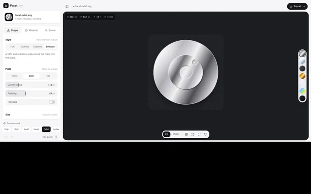
A light 2D design tool for metallic badges and icons: an inspector with Shape, Material and Scene tabs, a dark canvas with a finish rail and view toolbar, undo and redo, and SVG, PNG and CSS export.
Installation
01
Install with the shadcn CLI. The NiceUI theme comes along the first time.
$ npx shadcn@latest add https://niceui.dev/r/apps-badge-maker.json02
Or copy the source below (4 files). Dependencies: lucide-react.
Source
components/niceui/pages/apps/facet/FacetApp.tsx
import { useCallback, useEffect, useRef, useState } from 'react';
import { Check, ChevronUp, Code2, Download, Expand, FileImage, Grid3x3, ImageIcon, Lock, Maximize, Minimize, Palette, PanelLeft, Redo2, RotateCcw, Shapes, SlidersHorizontal, Sparkles, Sun, Undo2, X } from 'lucide-react';
import { cn } from '@/lib/cn';
import { Badge, DEFAULTS, FINISHES, type Settings } from './Badge';
import { FieldSlider, Section, Segmented, ToggleRow, UnitInput } from './controls';
import { MARKS, nodeCount } from './marks';

type Tab = 'shape' | 'material' | 'scene';

/** Settings with undo/redo. Rapid changes to the same field (slider drags) collapse into one step. */
function useHistory(initial: Settings) {
  const [state, setState] = useState({ past: [] as Settings[], now: initial, future: [] as Settings[] });
  const last = useRef({ key: '', at: 0 });
  const set = useCallback((patch: Partial<Settings>) => {
    const key = Object.keys(patch).join(',');
    const now = performance.now();
    const merge = key === last.current.key && now - last.current.at < 600;
    last.current = { key, at: now };
    setState((h) => ({ past: merge ? h.past : [...h.past.slice(-49), h.now], now: { ...h.now, ...patch }, future: [] }));
  }, []);
  const undo = () => setState((h) => (h.past.length ? { past: h.past.slice(0, -1), now: h.past[h.past.length - 1], future: [h.now, ...h.future] } : h));
  const redo = () => setState((h) => (h.future.length ? { past: [...h.past, h.now], now: h.future[0], future: h.future.slice(1) } : h));
  const reset = () => setState((h) => ({ past: [...h.past, h.now], now: DEFAULTS, future: [] }));
  return { s: state.now, set, undo, redo, reset, canUndo: state.past.length > 0, canRedo: state.future.length > 0 };
}

const checker = 'repeating-conic-gradient(#2a2b30 0% 25%, #222327 0% 50%) 0 0 / 22px 22px';

export function FacetApp() {
  const { s, set, undo, redo, reset, canUndo, canRedo } = useHistory(DEFAULTS);
  const [tab, setTab] = useState<Tab>('shape');
  const [panel, setPanel] = useState(true);
  const [sheet, setSheet] = useState(false);
  const [zoom, setZoom] = useState<'fit' | '100'>('fit');
  const [grid, setGrid] = useState(false);
  const [full, setFull] = useState(false);
  const [exportOpen, setExportOpen] = useState(false);
  const [toast, setToast] = useState('');
  const svgRef = useRef<SVGSVGElement>(null);
  const root = useRef<HTMLDivElement>(null);

  const notify = (msg: string) => {
    setToast(msg);
    window.setTimeout(() => setToast(''), 1800);
  };

  useEffect(() => {
    const el = root.current;
    if (!el) return;
    const onKey = (e: KeyboardEvent) => {
      const mod = e.metaKey || e.ctrlKey;
      if (!mod) return;
      const k = e.key.toLowerCase();
      if (k === 'b') (e.preventDefault(), setPanel((p) => !p));
      else if (k === 'z' && e.shiftKey) (e.preventDefault(), redo());
      else if (k === 'z') (e.preventDefault(), undo());
      else if (k === 'e') (e.preventDefault(), setExportOpen((o) => !o));
    };
    el.addEventListener('keydown', onKey);
    return () => el.removeEventListener('keydown', onKey);
  });

  const svgText = () => {
    const node = svgRef.current?.cloneNode(true) as SVGSVGElement | undefined;
    if (!node) return '';
    node.setAttribute('width', String(s.width));
    node.setAttribute('height', String(s.height));
    return '<?xml version="1.0" encoding="UTF-8"?>\n' + new XMLSerializer().serializeToString(node);
  };
  const save = (blob: Blob, name: string) => {
    const a = document.createElement('a');
    a.href = URL.createObjectURL(blob);
    a.download = name;
    a.click();
    window.setTimeout(() => URL.revokeObjectURL(a.href), 1000);
  };
  const fileBase = `facet-${s.mark === 'letter' ? (s.letter || 'f').toLowerCase() : s.mark}`;
  const exportSvg = () => {
    save(new Blob([svgText()], { type: 'image/svg+xml' }), `${fileBase}.svg`);
    notify('SVG saved');
  };
  const exportPng = () => {
    const img = new Image();
    img.onload = () => {
      const c = document.createElement('canvas');
      c.width = s.width * 2;
      c.height = s.height * 2;
      c.getContext('2d')?.drawImage(img, 0, 0, c.width, c.height);
      c.toBlob((b) => b && (save(b, `${fileBase}@2x.png`), notify('PNG saved at 2×')), 'image/png');
    };
    img.src = 'data:image/svg+xml;charset=utf-8,' + encodeURIComponent(svgText());
  };
  const copyCss = async () => {
    const css = `background-image: url("data:image/svg+xml,${encodeURIComponent(svgText().replace(/^<\?xml[^>]*>\n/, ''))}");`;
    try {
      await navigator.clipboard.writeText(css);
      notify('CSS copied');
    } catch {
      notify('Copy not allowed here');
    }
  };

  const mark = MARKS.find((m) => m.id === s.mark)!;
  const fin = FINISHES.find((f) => f.id === s.finish)!;
  const nodes = mark.d ? nodeCount(mark.d) : 0;

  const inspector = (
    <>
      <div className="flex shrink-0 items-center gap-3 rounded-2xl border border-zinc-200/80 bg-white p-3 shadow-[0_1px_2px_rgba(0,0,0,0.04)]">
        <div className="grid h-11 w-11 shrink-0 place-items-center overflow-hidden rounded-xl bg-zinc-900">
          <Badge s={{ ...s, width: 44, height: 44, shadow: 0, glow: 0, backdrop: 'transparent' }} />
        </div>
        <div className="min-w-0">
          <p className="truncate text-[13px] font-medium text-zinc-900">{fileBase}.svg</p>
          <p className="text-[12px] text-zinc-500">
            1 mark · {mark.d ? `${nodes} nodes` : 'glyph'} · {fin.label}
          </p>
        </div>
      </div>

      <div className="mt-3 flex min-h-0 flex-1 flex-col rounded-2xl border border-zinc-200/80 bg-white shadow-[0_1px_2px_rgba(0,0,0,0.04)]">
        <div role="tablist" aria-label="Inspector" className="flex shrink-0 gap-1 border-b border-zinc-100 p-1.5">
          {(
            [
              ['shape', 'Shape', Shapes],
              ['material', 'Material', Palette],
              ['scene', 'Scene', Sun],
            ] as const
          ).map(([id, label, Icon]) => (
            <button
              key={id}
              role="tab"
              aria-selected={tab === id}
              onClick={() => setTab(id)}
              className={cn('flex flex-1 items-center justify-center gap-1.5 rounded-xl py-2 text-[13px] transition-colors', tab === id ? 'bg-zinc-100 font-medium text-zinc-900' : 'text-zinc-500 hover:text-zinc-800')}
            >
              <Icon className="h-3.5 w-3.5" /> {label}
            </button>
          ))}
        </div>
        <div className="min-h-0 flex-1 space-y-4 overflow-y-auto px-4 pb-4 pt-3 [scrollbar-width:thin]">
          {tab === 'shape' && (
            <>
              <Section title="Style" hint="How the mark is built">
                <Segmented
                  label="Style"
                  value={s.style}
                  onChange={(style) => set({ style })}
                  options={[
                    { id: 'flat', label: 'Flat' },
                    { id: 'outline', label: 'Outline' },
                    { id: 'stacked', label: 'Stacked' },
                    { id: 'emboss', label: 'Emboss' },
                  ]}
                />
                <p className="text-[12.5px] leading-relaxed text-zinc-500">
                  {s.style === 'flat' && 'One clean fill. Best for small sizes and app icons.'}
                  {s.style === 'outline' && 'A single stroke with rounded joins, like line icons.'}
                  {s.style === 'stacked' && 'Layered copies give the mark a paper-cut depth.'}
                  {s.style === 'emboss' && 'A light and a shadow edge press the mark into the plate.'}
                </p>
              </Section>
              <Section title="Plate" hint={s.plate === 'none' ? 'Mark only' : 'Mark on a base'}>
                <Segmented
                  label="Plate"
                  value={s.plate}
                  onChange={(plate) => set({ plate })}
                  options={[
                    { id: 'none', label: 'None' },
                    { id: 'circle', label: 'Coin' },
                    { id: 'squircle', label: 'Tile' },
                  ]}
                />
                <FieldSlider label="Corner radius" value={s.radius} min={0} max={16} step={0.5} unit="px" onChange={(radius) => set({ radius })} onReset={() => set({ radius: DEFAULTS.radius })} />
                {s.style === 'outline' && <FieldSlider label="Stroke" value={s.stroke} min={1} max={24} unit="px" onChange={(stroke) => set({ stroke })} />}
                <FieldSlider label="Padding" value={s.padding} min={16} max={140} unit="px" onChange={(padding) => set({ padding })} />
                <ToggleRow label="Fill holes" checked={s.fillHoles} onChange={(fillHoles) => set({ fillHoles })} />
              </Section>
              <Section title="Size" hint="Export in pixels">
                <div className="grid grid-cols-2 gap-2">
                  <UnitInput prefix="W" value={s.width} unit="px" onChange={(width) => set({ width, height: width })} />
                  <UnitInput prefix="H" value={s.height} unit="px" onChange={(height) => set({ height, width: height })} />
                </div>
              </Section>
            </>
          )}
          {tab === 'material' && (
            <>
              <Section title="Finish" hint={fin.label}>
                <div className="grid grid-cols-4 gap-2">
                  {FINISHES.map((f) => (
                    <button key={f.id} onClick={() => set({ finish: f.id })} aria-pressed={s.finish === f.id} className={cn('flex flex-col items-center gap-1.5 rounded-xl p-2 text-[11px] transition-colors', s.finish === f.id ? 'bg-zinc-100 text-zinc-900' : 'text-zinc-500 hover:bg-zinc-50')}>
                      <span className={cn('h-8 w-8 rounded-full shadow-[inset_0_1px_1px_rgba(255,255,255,0.6),0_1px_3px_rgba(0,0,0,0.25)] ring-2', s.finish === f.id ? 'ring-zinc-900' : 'ring-transparent')} style={{ background: f.css }} />
                      {f.label}
                    </button>
                  ))}
                </div>
              </Section>
              <Section title="Light">
                <FieldSlider label="Gradient angle" value={s.angle} min={0} max={360} unit="°" onChange={(angle) => set({ angle })} onReset={() => set({ angle: DEFAULTS.angle })} />
                <FieldSlider label="Gloss" value={s.gloss} min={0} max={1} step={0.05} onChange={(gloss) => set({ gloss })} />
                <ToggleRow label="Film grain" checked={s.grain} onChange={(grain) => set({ grain })} />
              </Section>
            </>
          )}
          {tab === 'scene' && (
            <>
              <Section title="Background" hint="Included in exports">
                <Segmented
                  label="Background"
                  value={s.backdrop}
                  onChange={(backdrop) => set({ backdrop })}
                  options={[
                    { id: 'transparent', label: 'None' },
                    { id: 'solid', label: 'Solid' },
                    { id: 'gradient', label: 'Gradient' },
                  ]}
                />
                <div className="flex flex-wrap gap-2">
                  {['#0ea5e9', '#8b5cf6', '#f97316', '#10b981', '#f43f5e', '#18181b'].map((c) => (
                    <button key={c} onClick={() => set({ backdropColor: c })} aria-label={`Colour ${c}`} className={cn('h-7 w-7 rounded-full ring-2 ring-offset-2 transition-transform active:scale-90', s.backdropColor === c ? 'ring-zinc-900' : 'ring-transparent')} style={{ background: c }} />
                  ))}
                </div>
              </Section>
              <Section title="Effects">
                <FieldSlider label="Shadow" value={s.shadow} min={0} max={1} step={0.05} onChange={(shadow) => set({ shadow })} />
                <FieldSlider label="Glow" value={s.glow} min={0} max={1} step={0.05} onChange={(glow) => set({ glow })} />
                <FieldSlider label="Rotation" value={s.rotation} min={-45} max={45} unit="°" onChange={(rotation) => set({ rotation })} onReset={() => set({ rotation: 0 })} />
              </Section>
            </>
          )}
        </div>
      </div>

      <div className="mt-3 shrink-0">
        <p className="mb-2 flex items-center gap-1.5 px-1 text-[12px] text-zinc-500">
          <Sparkles className="h-3.5 w-3.5" /> Sample mark
        </p>
        <div className="flex flex-wrap gap-1.5">
          {MARKS.map((m) => (
            <button key={m.id} onClick={() => set({ mark: m.id })} aria-pressed={s.mark === m.id} className={cn('flex-1 rounded-lg px-1.5 py-1.5 text-[12px] transition-colors', s.mark === m.id ? 'bg-zinc-900 text-white' : 'bg-white text-zinc-600 ring-1 ring-zinc-200 hover:text-zinc-900')}>
              {m.label}
            </button>
          ))}
          {s.mark === 'letter' && (
            <input value={s.letter} maxLength={2} onChange={(e) => set({ letter: e.target.value })} aria-label="Letter" className="h-[30px] w-12 rounded-lg border border-zinc-200 bg-white text-center text-[13px] font-semibold uppercase outline-none focus:border-zinc-400" />
          )}
        </div>
      </div>
    </>
  );

  return (
    <div ref={root} data-fill tabIndex={-1} className="relative flex h-[720px] w-full overflow-hidden bg-[#f6f6f7] font-sans text-zinc-900 antialiased outline-none sm:h-[760px]">
      {/* inspector */}
      <aside className={cn('hidden shrink-0 flex-col p-3 transition-[width,opacity] duration-300 md:flex', panel ? 'w-[336px] opacity-100' : 'w-0 overflow-hidden p-0 opacity-0')} aria-label="Inspector">
        <div className="mb-3 flex shrink-0 items-center gap-2 px-1.5 pt-1">
          <span className="grid h-7 w-7 place-items-center rounded-lg bg-zinc-900 text-white">
            <Shapes className="h-3.5 w-3.5" />
          </span>
          <span className="text-[15px] font-semibold tracking-[-0.02em]">Facet</span>
          <span className="text-[12px] text-zinc-400">v1.0</span>
        </div>
        {inspector}
        <div className="mt-3 flex shrink-0 items-center justify-between px-1 text-[12px] text-zinc-500">
          <div className="flex gap-1">
            <button onClick={undo} disabled={!canUndo} aria-label="Undo" className="grid h-7 w-7 place-items-center rounded-lg hover:bg-zinc-200/60 disabled:opacity-30"><Undo2 className="h-3.5 w-3.5" /></button>
            <button onClick={redo} disabled={!canRedo} aria-label="Redo" className="grid h-7 w-7 place-items-center rounded-lg hover:bg-zinc-200/60 disabled:opacity-30"><Redo2 className="h-3.5 w-3.5" /></button>
          </div>
          <button onClick={() => setPanel(false)} className="flex items-center gap-2 rounded-lg px-2 py-1 hover:bg-zinc-200/60">
            Hide panel <kbd className="rounded border border-zinc-300 bg-white px-1 font-mono text-[10px] text-zinc-500">⌘B</kbd>
          </button>
        </div>
      </aside>

      {/* workspace */}
      <div className="flex min-w-0 flex-1 flex-col p-2 md:pl-0 md:pr-3 md:pt-3">
        <header className="flex h-11 shrink-0 items-center gap-2 px-1.5">
          <button onClick={() => (window.matchMedia('(min-width: 768px)').matches ? setPanel((p) => !p) : setSheet(true))} aria-label="Toggle panel" className="grid h-8 w-8 place-items-center rounded-lg text-zinc-500 hover:bg-zinc-200/60 hover:text-zinc-900">
            <PanelLeft className="h-4 w-4" />
          </button>
          <span className="h-5 w-px bg-zinc-200" />
          <span className="flex min-w-0 items-center gap-1.5 text-[13px] text-zinc-600">
            <span className="h-1.5 w-1.5 shrink-0 rounded-full bg-sky-500" />
            <span className="truncate">{fileBase}.svg</span>
          </span>
          <button onClick={() => setSheet(true)} className="ml-1 flex items-center gap-1 rounded-lg px-2 py-1 text-[12.5px] text-zinc-600 ring-1 ring-zinc-200 md:hidden">
            <SlidersHorizontal className="h-3.5 w-3.5" /> Edit
          </button>
          <div className="relative ml-auto">
            <button onClick={() => setExportOpen((o) => !o)} aria-expanded={exportOpen} className="flex h-9 items-center gap-2 rounded-full bg-zinc-900 pl-3.5 pr-3 text-[13px] font-medium text-white shadow-[0_1px_2px_rgba(0,0,0,0.3)] transition-colors hover:bg-zinc-800">
              <Download className="h-3.5 w-3.5" /> Export <ChevronUp className={cn('h-3.5 w-3.5 transition-transform', !exportOpen && 'rotate-180')} />
            </button>
            {exportOpen && (
              <div className="absolute right-0 top-[calc(100%+8px)] z-30 w-[300px] max-w-[calc(100vw-24px)] rounded-2xl border border-zinc-200 bg-white/95 p-1.5 shadow-[0_24px_60px_-16px_rgba(0,0,0,0.35)] backdrop-blur animate-scale-in">
                <div className="flex items-center justify-between px-2.5 py-2 text-[12.5px]">
                  <span className="font-medium">Export</span>
                  <span className="font-mono text-[11.5px] text-zinc-400">{s.width} × {s.height} px</span>
                </div>
                {(
                  [
                    [FileImage, 'SVG file', 'Editable vector for web and print', exportSvg, '⌘E'],
                    [ImageIcon, 'PNG image', `${s.width * 2} px, 2×, transparent`, exportPng, ''],
                    [Code2, 'CSS background', 'Data URI for any stylesheet', copyCss, ''],
                  ] as const
                ).map(([Icon, title, sub, fn, kbd]) => (
                  <button key={title} onClick={() => (fn(), setExportOpen(false))} className="group flex w-full items-center gap-3 rounded-xl px-2.5 py-2 text-left transition-colors hover:bg-zinc-100">
                    <span className="grid h-9 w-9 shrink-0 place-items-center rounded-lg bg-white text-zinc-700 ring-1 ring-zinc-200">
                      <Icon className="h-4 w-4" />
                    </span>
                    <span className="min-w-0 flex-1">
                      <span className="block text-[13px] font-medium text-zinc-900">{title}</span>
                      <span className="block truncate text-[12px] text-zinc-500">{sub}</span>
                    </span>
                    {kbd ? <kbd className="rounded border border-zinc-200 bg-white px-1.5 font-mono text-[10px] text-zinc-500">{kbd}</kbd> : <Download className="h-3.5 w-3.5 text-zinc-300 transition-colors group-hover:text-zinc-600" />}
                  </button>
                ))}
                <p className="mt-1 flex items-center gap-1.5 border-t border-zinc-100 px-2.5 pb-1.5 pt-2.5 text-[11.5px] text-zinc-500">
                  <Lock className="h-3 w-3" /> Made in your browser, never uploaded.
                </p>
              </div>
            )}
          </div>
        </header>

        {/* canvas */}
        <div className={cn('relative mt-1.5 min-h-0 flex-1 overflow-hidden rounded-[22px] bg-[#1c1d21] shadow-[inset_0_0_0_1px_rgba(255,255,255,0.04)]', full && 'absolute inset-2 z-20 mt-0')}>
          {grid && <div aria-hidden className="pointer-events-none absolute inset-0" style={{ backgroundImage: 'linear-gradient(rgba(255,255,255,0.05) 1px, transparent 1px), linear-gradient(90deg, rgba(255,255,255,0.05) 1px, transparent 1px)', backgroundSize: '32px 32px' }} />}
          <div className="absolute left-3 top-3 z-10 flex max-w-[calc(100%-80px)] items-center gap-0.5 overflow-hidden rounded-xl bg-black/40 p-1 font-mono text-[11px] text-white/60 ring-1 ring-white/10 backdrop-blur">
            {[
              ['W', s.width, 'px'],
              ['H', s.height, 'px'],
              ['R', s.rotation, '°'],
            ].map(([k, v, u]) => (
              <span key={k as string} className="whitespace-nowrap rounded-lg px-2 py-1">
                {k} <b className="font-medium text-white">{v}</b> {u}
              </span>
            ))}
            <span className="hidden whitespace-nowrap rounded-lg px-2 py-1 sm:inline">{mark.d ? `${nodes} nodes` : 'glyph'}</span>
          </div>

          <div className="absolute inset-0 grid place-items-center p-10 pb-20">
            <div className={cn('relative grid place-items-center transition-all duration-500 ease-smooth', zoom === 'fit' ? 'h-full max-h-[460px] w-full max-w-[460px]' : '')} style={zoom === '100' ? { width: Math.min(s.width, 900), height: Math.min(s.height, 900) } : undefined}>
              {s.backdrop === 'transparent' && <div aria-hidden className="absolute inset-[6%] rounded-3xl opacity-60" style={{ background: checker }} />}
              <Badge ref={svgRef} s={s} className="relative h-full w-full drop-shadow-none" />
            </div>
          </div>

          {/* finish rail */}
          <div className="absolute right-3 top-1/2 z-10 flex -translate-y-1/2 flex-col gap-2 rounded-full bg-white/90 p-1.5 shadow-lg ring-1 ring-black/5 backdrop-blur" role="radiogroup" aria-label="Finish">
            {FINISHES.map((f) => (
              <button key={f.id} role="radio" aria-checked={s.finish === f.id} aria-label={f.label} title={f.label} onClick={() => set({ finish: f.id })} className={cn('h-7 w-7 rounded-full shadow-[inset_0_1px_1px_rgba(255,255,255,0.7),0_1px_2px_rgba(0,0,0,0.3)] ring-2 ring-offset-1 transition-transform hover:scale-110 sm:h-8 sm:w-8', s.finish === f.id ? 'ring-zinc-900' : 'ring-transparent')} style={{ background: f.css }} />
            ))}
          </div>

          {/* view toolbar */}
          <div className="absolute bottom-3 left-1/2 z-10 flex -translate-x-1/2 items-center gap-0.5 rounded-2xl bg-white/95 p-1 text-[12.5px] shadow-xl ring-1 ring-black/5 backdrop-blur">
            {(['fit', '100'] as const).map((z) => (
              <button key={z} onClick={() => setZoom(z)} className={cn('rounded-xl px-3 py-1.5 transition-colors', zoom === z ? 'bg-zinc-900 text-white' : 'text-zinc-600 hover:text-zinc-900')}>
                {z === 'fit' ? 'Fit' : '100%'}
              </button>
            ))}
            <span className="mx-1 h-5 w-px bg-zinc-200" />
            <button onClick={() => setGrid((g) => !g)} aria-pressed={grid} aria-label="Grid" className={cn('grid h-8 w-8 place-items-center rounded-xl', grid ? 'bg-zinc-100 text-zinc-900' : 'text-zinc-500 hover:text-zinc-900')}><Grid3x3 className="h-4 w-4" /></button>
            <button onClick={() => set({ backdrop: s.backdrop === 'transparent' ? 'gradient' : 'transparent' })} aria-label="Toggle background" className="grid h-8 w-8 place-items-center rounded-xl text-zinc-500 hover:text-zinc-900"><Expand className="h-4 w-4" /></button>
            <button onClick={() => setFull((f) => !f)} aria-label={full ? 'Exit full view' : 'Full view'} className="grid h-8 w-8 place-items-center rounded-xl text-zinc-500 hover:text-zinc-900">{full ? <Minimize className="h-4 w-4" /> : <Maximize className="h-4 w-4" />}</button>
            <button onClick={reset} aria-label="Reset all" className="grid h-8 w-8 place-items-center rounded-xl text-zinc-500 hover:text-zinc-900"><RotateCcw className="h-4 w-4" /></button>
          </div>
        </div>
      </div>

      {/* phone: inspector as a bottom sheet */}
      {sheet && (
        <div className="absolute inset-0 z-40 flex flex-col justify-end bg-black/30 md:hidden" onClick={() => setSheet(false)}>
          <div className="flex h-[78%] flex-col rounded-t-3xl bg-[#f6f6f7] p-3 shadow-2xl animate-slide-in-up" onClick={(e) => e.stopPropagation()}>
            <div className="mb-2 flex shrink-0 items-center justify-between px-1">
              <span className="text-[14px] font-semibold">Edit badge</span>
              <button onClick={() => setSheet(false)} aria-label="Close" className="grid h-8 w-8 place-items-center rounded-full bg-white ring-1 ring-zinc-200"><X className="h-4 w-4" /></button>
            </div>
            {inspector}
          </div>
        </div>
      )}

      {toast && (
        <div role="status" className="absolute bottom-20 left-1/2 z-50 flex -translate-x-1/2 items-center gap-2 rounded-full bg-zinc-900 px-3.5 py-2 text-[12.5px] text-white shadow-lg animate-fade-up">
          <Check className="h-3.5 w-3.5 text-emerald-400" /> {toast}
        </div>
      )}
    </div>
  );
}
components/niceui/pages/apps/facet/Badge.tsx
import { forwardRef, useId } from 'react';
import { MARKS, type MarkId } from './marks';

export type Style = 'flat' | 'outline' | 'stacked' | 'emboss';
export type Plate = 'none' | 'circle' | 'squircle';
export type FinishId = 'chrome' | 'glass' | 'matte' | 'gold' | 'pearl' | 'holo' | 'ink';
export type Backdrop = 'transparent' | 'solid' | 'gradient';

export type Settings = {
  mark: MarkId;
  letter: string;
  style: Style;
  plate: Plate;
  radius: number;
  stroke: number;
  padding: number;
  width: number;
  height: number;
  fillHoles: boolean;
  finish: FinishId;
  angle: number;
  gloss: number;
  grain: boolean;
  backdrop: Backdrop;
  backdropColor: string;
  shadow: number;
  glow: number;
  rotation: number;
};

export const FINISHES: { id: FinishId; label: string; stops: string[]; css: string }[] = [
  { id: 'chrome', label: 'Chrome', stops: ['#fafafa', '#a1a1aa', '#f4f4f5', '#3f3f46', '#e4e4e7'], css: 'linear-gradient(135deg,#fafafa,#a1a1aa 30%,#f4f4f5 50%,#3f3f46 75%,#e4e4e7)' },
  { id: 'glass', label: 'Glass', stops: ['#ffffffcc', '#e0f2fe66', '#ffffff22', '#bae6fd55', '#ffffffaa'], css: 'linear-gradient(135deg,#ffffff,#e0f2fe 40%,#94a3b8 70%,#ffffff)' },
  { id: 'matte', label: 'Matte', stops: ['#3f3f46', '#27272a', '#18181b'], css: 'linear-gradient(135deg,#52525b,#18181b)' },
  { id: 'gold', label: 'Gold', stops: ['#fef3c7', '#d97706', '#fde68a', '#78350f', '#fcd34d'], css: 'linear-gradient(135deg,#fef3c7,#d97706 30%,#fde68a 50%,#78350f 75%,#fcd34d)' },
  { id: 'pearl', label: 'Pearl', stops: ['#ffffff', '#fce7f3', '#e0f2fe', '#ede9fe', '#ffffff'], css: 'linear-gradient(135deg,#ffffff,#fce7f3 30%,#e0f2fe 55%,#ede9fe 80%,#ffffff)' },
  { id: 'holo', label: 'Holographic', stops: ['#f0abfc', '#93c5fd', '#86efac', '#fde047', '#f9a8d4'], css: 'linear-gradient(135deg,#f0abfc,#93c5fd 30%,#86efac 55%,#fde047 75%,#f9a8d4)' },
  { id: 'ink', label: 'Ink', stops: ['#18181b', '#09090b'], css: 'linear-gradient(135deg,#27272a,#09090b)' },
];

export const DEFAULTS: Settings = {
  mark: 'orbit',
  letter: 'F',
  style: 'emboss',
  plate: 'circle',
  radius: 4,
  stroke: 6,
  padding: 64,
  width: 512,
  height: 512,
  fillHoles: false,
  finish: 'chrome',
  angle: 35,
  gloss: 0.55,
  grain: true,
  backdrop: 'transparent',
  backdropColor: '#0ea5e9',
  shadow: 0.5,
  glow: 0,
  rotation: -8,
};

const S = 512;

/** Renders the badge as a standalone SVG — the same markup is exported. */
export const Badge = forwardRef<SVGSVGElement, { s: Settings; className?: string }>(function Badge({ s, className }, ref) {
  const uid = useId().replace(/:/g, '');
  const id = (n: string) => `${uid}-${n}`;
  const finish = FINISHES.find((f) => f.id === s.finish) ?? FINISHES[0];
  const mark = MARKS.find((m) => m.id === s.mark) ?? MARKS[0];
  const box = S - s.padding * 2;
  const plated = s.plate !== 'none';
  const markBox = plated ? box * 0.58 : box;
  const scale = markBox / 100;
  const off = (S - markBox) / 2;
  const fillRule = mark.holes && !s.fillHoles ? 'evenodd' : 'nonzero';

  const shape = (props: Record<string, unknown> = {}) =>
    mark.id === 'letter' ? (
      <text x="50" y="54" textAnchor="middle" dominantBaseline="central" fontSize="92" fontWeight={700} fontFamily="Geist, Inter, system-ui, sans-serif" letterSpacing="-4" {...props}>
        {(s.letter || 'F').slice(0, 2)}
      </text>
    ) : (
      <path d={mark.d} fillRule={fillRule} {...props} />
    );

  const plateShape = (props: Record<string, unknown> = {}) =>
    s.plate === 'circle' ? (
      <circle cx={S / 2} cy={S / 2} r={box / 2} {...props} />
    ) : (
      <rect x={s.padding} y={s.padding} width={box} height={box} rx={box * 0.28} {...props} />
    );

  const paint = `url(#${id('fin')})`;
  const inv = `url(#${id('inv')})`;
  const round = s.style !== 'outline' && s.radius > 0 ? { stroke: plated ? inv : paint, strokeWidth: (s.radius * 2) / scale, strokeLinejoin: 'round' as const } : {};
  const markPaint = plated ? inv : paint;
  const markLayer = () => {
    const g = (k: string, dx: number, dy: number, fill: string, extra: Record<string, unknown> = {}) => (
      <g key={k} transform={`translate(${off + dx} ${off + dy}) scale(${scale})`}>{shape({ fill, ...extra })}</g>
    );
    if (s.style === 'outline') return g('o', 0, 0, 'none', { stroke: markPaint, strokeWidth: Math.max(1.5, s.stroke) / scale, strokeLinejoin: 'round' });
    if (s.style === 'stacked')
      return (
        <>
          {[6, 5, 4, 3, 2, 1].map((i) => g('s' + i, i * 3, i * 3, `rgba(0,0,0,${0.14 + i * 0.04})`, round.stroke ? { ...round, stroke: `rgba(0,0,0,${0.14 + i * 0.04})` } : {}))}
          {g('t', 0, 0, markPaint, round)}
        </>
      );
    if (s.style === 'emboss')
      return (
        <>
          {g('d', 3, 4, 'rgba(0,0,0,0.45)', round.stroke ? { ...round, stroke: 'rgba(0,0,0,0.45)' } : {})}
          {g('l', -2, -2.5, 'rgba(255,255,255,0.7)', round.stroke ? { ...round, stroke: 'rgba(255,255,255,0.7)' } : {})}
          {g('t', 0, 0, markPaint, round)}
        </>
      );
    return g('f', 0, 0, markPaint, round);
  };

  const rot = `rotate(${s.angle} 0.5 0.5)`;
  return (
    <svg ref={ref} xmlns="http://www.w3.org/2000/svg" viewBox={`0 0 ${S} ${S}`} width={s.width} height={s.height} className={className} role="img" aria-label="Badge preview">
      <defs>
        <linearGradient id={id('fin')} gradientTransform={rot}>
          {finish.stops.map((c, i) => (
            <stop key={i} offset={i / (finish.stops.length - 1)} stopColor={c} />
          ))}
        </linearGradient>
        <linearGradient id={id('inv')} gradientTransform={`rotate(${s.angle + 180} 0.5 0.5)`}>
          {finish.stops.map((c, i) => (
            <stop key={i} offset={i / (finish.stops.length - 1)} stopColor={c} />
          ))}
        </linearGradient>
        <radialGradient id={id('gloss')} cx="0.32" cy="0.22" r="0.65">
          <stop offset="0" stopColor="#fff" stopOpacity="0.95" />
          <stop offset="0.45" stopColor="#fff" stopOpacity="0.18" />
          <stop offset="1" stopColor="#fff" stopOpacity="0" />
        </radialGradient>
        <linearGradient id={id('bg')} x1="0" y1="0" x2="1" y2="1">
          <stop offset="0" stopColor={s.backdropColor} />
          <stop offset="1" stopColor="#0b0c0e" />
        </linearGradient>
        <clipPath id={id('clip')}>{plated ? plateShape() : <g transform={`translate(${off} ${off}) scale(${scale})`}>{shape()}</g>}</clipPath>
        <filter id={id('fx')} x="-30%" y="-30%" width="160%" height="160%">
          {s.glow > 0 && <feDropShadow dx="0" dy="0" stdDeviation={10 + s.glow * 24} floodColor={s.backdropColor} floodOpacity={s.glow} />}
          {s.shadow > 0 && <feDropShadow dx="0" dy={8 + s.shadow * 18} stdDeviation={8 + s.shadow * 16} floodColor="#000" floodOpacity={0.15 + s.shadow * 0.4} />}
        </filter>
        <filter id={id('grain')}>
          <feTurbulence type="fractalNoise" baseFrequency="0.9" numOctaves="2" stitchTiles="stitch" />
          <feColorMatrix type="saturate" values="0" />
        </filter>
      </defs>
      {s.backdrop === 'solid' && <rect width={S} height={S} fill={s.backdropColor} />}
      {s.backdrop === 'gradient' && <rect width={S} height={S} fill={`url(#${id('bg')})`} />}
      <g transform={`rotate(${s.rotation} ${S / 2} ${S / 2})`} filter={s.shadow > 0 || s.glow > 0 ? `url(#${id('fx')})` : undefined}>
        {plated && (
          <>
            {plateShape({ fill: paint, opacity: s.finish === 'glass' ? 0.85 : 1 })}
            {plateShape({ fill: 'none', stroke: 'rgba(255,255,255,0.55)', strokeWidth: 3 })}
          </>
        )}
        {markLayer()}
        <g clipPath={`url(#${id('clip')})`}>
          {s.gloss > 0 && <rect width={S} height={S} fill={`url(#${id('gloss')})`} opacity={s.gloss} />}
          {s.grain && <rect width={S} height={S} filter={`url(#${id('grain')})`} opacity="0.16" style={{ mixBlendMode: 'overlay' }} />}
        </g>
      </g>
    </svg>
  );
});
components/niceui/pages/apps/facet/marks.ts
/* Sample marks, drawn in a 100 × 100 box. Swap in any SVG path of your own. */

export type MarkId = 'star' | 'bolt' | 'leaf' | 'heart' | 'orbit' | 'letter';

const star = (() => {
  const pts: string[] = [];
  for (let i = 0; i < 10; i++) {
    const r = i % 2 ? 21 : 46;
    const a = (Math.PI / 5) * i - Math.PI / 2;
    pts.push(`${(50 + Math.cos(a) * r).toFixed(2)} ${(54 + Math.sin(a) * r).toFixed(2)}`);
  }
  return `M${pts.join(' L')} Z`;
})();

export const MARKS: { id: MarkId; label: string; d?: string; holes?: boolean }[] = [
  { id: 'star', label: 'Star', d: star },
  { id: 'bolt', label: 'Bolt', d: 'M60 4 L16 58 H46 L38 96 L84 40 H54 Z' },
  { id: 'leaf', label: 'Leaf', d: 'M90 8 C44 8 10 32 10 66 C10 80 18 90 18 90 C26 74 40 62 58 52 C42 66 30 80 24 94 C66 98 92 64 90 8 Z' },
  { id: 'heart', label: 'Heart', d: 'M50 90 C20 70 6 54 6 35 C6 20 17 10 30 10 C39 10 46 15 50 22 C54 15 61 10 70 10 C83 10 94 20 94 35 C94 54 80 70 50 90 Z' },
  {
    id: 'orbit',
    label: 'Orbit',
    holes: true,
    d: 'M50 6 A44 44 0 1 1 49.99 6 Z M50 30 A20 20 0 1 0 50.01 30 Z M78 18 A9 9 0 1 1 77.99 18 Z',
  },
  { id: 'letter', label: 'Letter' },
];

/** Rough node count for the measure bar. */
export const nodeCount = (d?: string) => (d ? (d.match(/[MLHVCSQTAZ]/gi) || []).length : 0);
components/niceui/pages/apps/facet/controls.tsx
import { useRef, type ReactNode } from 'react';
import { RotateCcw } from 'lucide-react';
import { cn } from '@/lib/cn';

export function Segmented<T extends string>({ value, options, onChange, label }: { value: T; options: { id: T; label: string }[]; onChange: (v: T) => void; label: string }) {
  return (
    <div role="radiogroup" aria-label={label} className="flex rounded-xl bg-zinc-100 p-1">
      {options.map((o) => (
        <button
          key={o.id}
          role="radio"
          aria-checked={value === o.id}
          onClick={() => onChange(o.id)}
          className={cn(
            'flex-1 rounded-lg px-2 py-1.5 text-[12.5px] transition-all focus-visible:outline-none focus-visible:ring-2 focus-visible:ring-sky-500/50',
            value === o.id ? 'bg-white font-medium text-zinc-900 shadow-[0_1px_2px_rgba(0,0,0,0.08),0_0_0_1px_rgba(0,0,0,0.04)]' : 'text-zinc-500 hover:text-zinc-800',
          )}
        >
          {o.label}
        </button>
      ))}
    </div>
  );
}

/** A slider whose label and value sit inside the track, like a pro tool. */
export function FieldSlider({ label, value, min, max, step = 1, unit = '', onChange, onReset }: { label: string; value: number; min: number; max: number; step?: number; unit?: string; onChange: (v: number) => void; onReset?: () => void }) {
  const track = useRef<HTMLDivElement>(null);
  const pct = ((value - min) / (max - min)) * 100;
  const set = (clientX: number) => {
    const r = track.current!.getBoundingClientRect();
    const v = min + Math.min(1, Math.max(0, (clientX - r.left) / r.width)) * (max - min);
    onChange(Math.round(v / step) * step);
  };
  const decimals = step < 1 ? (step < 0.1 ? 2 : 1) : 0;
  return (
    <div
      ref={track}
      role="slider"
      tabIndex={0}
      aria-label={label}
      aria-valuemin={min}
      aria-valuemax={max}
      aria-valuenow={value}
      onPointerDown={(e) => {
        (e.currentTarget as HTMLElement).setPointerCapture(e.pointerId);
        set(e.clientX);
      }}
      onPointerMove={(e) => e.buttons === 1 && set(e.clientX)}
      onKeyDown={(e) => {
        if (e.key === 'ArrowRight' || e.key === 'ArrowUp') onChange(Math.min(max, +(value + step).toFixed(3)));
        if (e.key === 'ArrowLeft' || e.key === 'ArrowDown') onChange(Math.max(min, +(value - step).toFixed(3)));
      }}
      className="group relative flex h-9 cursor-ew-resize touch-none select-none items-center overflow-hidden rounded-lg bg-zinc-100 px-3 text-[12.5px] focus-visible:outline-none focus-visible:ring-2 focus-visible:ring-sky-500/50"
    >
      <span className="absolute inset-y-0 left-0 bg-zinc-200/90 transition-[width] duration-75" style={{ width: `${pct}%` }} />
      <span className="absolute inset-y-2 w-[2px] rounded-full bg-zinc-800 opacity-70" style={{ left: `calc(${pct}% - 1px)` }} />
      <span className="relative flex-1 text-zinc-600">{label}</span>
      {onReset && (
        <button
          onPointerDown={(e) => e.stopPropagation()}
          onClick={onReset}
          aria-label={`Reset ${label}`}
          className="relative mr-2 grid h-5 w-5 place-items-center rounded text-zinc-400 opacity-0 transition-opacity hover:text-zinc-800 group-hover:opacity-100"
        >
          <RotateCcw className="h-3 w-3" />
        </button>
      )}
      <span className="relative font-mono text-[12px] tabular-nums text-zinc-900">
        {value.toFixed(decimals)}
        <span className="ml-0.5 text-zinc-400">{unit}</span>
      </span>
    </div>
  );
}

export function ToggleRow({ label, checked, onChange }: { label: string; checked: boolean; onChange: (v: boolean) => void }) {
  return (
    <label className="flex h-9 cursor-pointer items-center justify-between rounded-lg bg-zinc-100 px-3 text-[12.5px] text-zinc-600">
      {label}
      <button
        role="switch"
        aria-checked={checked}
        aria-label={label}
        onClick={() => onChange(!checked)}
        className={cn('relative h-[18px] w-8 rounded-full transition-colors focus-visible:outline-none focus-visible:ring-2 focus-visible:ring-sky-500/50', checked ? 'bg-zinc-900' : 'bg-zinc-300')}
      >
        <span className={cn('absolute top-[2px] h-[14px] w-[14px] rounded-full bg-white shadow transition-all', checked ? 'left-[16px]' : 'left-[2px]')} />
      </button>
    </label>
  );
}

export function UnitInput({ prefix, value, unit, onChange }: { prefix: string; value: number; unit: string; onChange: (v: number) => void }) {
  return (
    <label className="flex h-9 min-w-0 items-center gap-1.5 rounded-lg border border-zinc-200 bg-white px-2.5 text-[12.5px] focus-within:border-zinc-400">
      <span className="text-zinc-400">{prefix}</span>
      <input
        inputMode="numeric"
        value={value}
        onChange={(e) => {
          const n = parseInt(e.target.value.replace(/\D/g, ''), 10);
          if (!Number.isNaN(n)) onChange(Math.min(2048, n));
        }}
        aria-label={prefix === 'W' ? 'Width' : 'Height'}
        className="w-full min-w-0 bg-transparent font-mono tabular-nums text-zinc-900 outline-none"
      />
      <span className="text-zinc-400">{unit}</span>
    </label>
  );
}

export function Section({ title, hint, children }: { title: string; hint?: string; children: ReactNode }) {
  return (
    <section className="space-y-2.5 border-b border-zinc-100 pb-5 pt-1 last:border-0">
      <div className="flex items-baseline justify-between">
        <h3 className="text-[13px] font-semibold text-zinc-900">{title}</h3>
        {hint && <span className="text-[11.5px] text-zinc-400">{hint}</span>}
      </div>
      {children}
    </section>
  );
}