Tool Approval
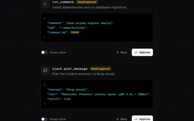
A human-in-the-loop card that shows tool arguments and morphs into its resolved state.
Installation
01
Install with the shadcn CLI. The NiceUI theme comes along the first time.
$ npx shadcn@latest add https://niceui.dev/r/ai-tool-approval.json02
Or copy the source below. Dependencies: lucide-react.
Source
components/niceui/ai/ToolApproval.tsx
import { useEffect, useState, type ReactNode } from 'react';
import { Check, CheckCircle2, Loader2, MessageSquare, ShieldCheck, Terminal, X, XCircle } from 'lucide-react';
import { cn } from '@/lib/cn';

export type ApprovalState = 'pending' | 'running' | 'approved' | 'denied';

export type ToolApprovalProps = {
  tool: string;
  description: string;
  icon?: ReactNode;
  args: Record<string, unknown>;
  onDecision?: (approved: boolean, alwaysAllow: boolean) => void;
  className?: string;
};

function JsonView({ value }: { value: Record<string, unknown> }) {
  const lines = JSON.stringify(value, null, 2).split('\n');
  return (
    <pre className="overflow-x-auto rounded-lg bg-ink-950 p-3 font-mono text-[12px] leading-5 shadow-hairline">
      {lines.map((line, i) => {
        const m = line.match(/^(\s*)"([^"]+)":\s(.*)$/);
        if (!m) return <div key={i} className="text-ink-500">{line}</div>;
        const val = m[3];
        const cls = val.startsWith('"') ? 'text-emerald-300' : /^[\d.-]/.test(val) ? 'text-amber-300' : /^(true|false|null)/.test(val) ? 'text-rose-300' : 'text-ink-500';
        return (
          <div key={i} className="whitespace-pre">
            {m[1]}
            <span className="text-sky-300">"{m[2]}"</span>
            <span className="text-ink-500">: </span>
            <span className={cls}>{val}</span>
          </div>
        );
      })}
    </pre>
  );
}

export function ToolApproval({ tool, description, icon, args, onDecision, className }: ToolApprovalProps) {
  const [state, setState] = useState<ApprovalState>('pending');
  const [always, setAlways] = useState(false);

  useEffect(() => {
    if (state !== 'running') return;
    const t = window.setTimeout(() => setState('approved'), 1300);
    return () => window.clearTimeout(t);
  }, [state]);

  const decide = (ok: boolean) => {
    setState(ok ? 'running' : 'denied');
    onDecision?.(ok, always);
  };
  const resolved = state !== 'pending';

  return (
    <div
      className={cn(
        'w-full overflow-hidden rounded-2xl bg-ink-900 shadow-card transition-all duration-500',
        state === 'pending' && 'shadow-[0_0_0_1px_rgba(245,158,11,0.25),0_8px_24px_-8px_rgba(0,0,0,0.5)]',
        state === 'denied' && 'opacity-70',
        className,
      )}
    >
      <div className="flex items-start gap-3 p-4">
        <span className="flex h-9 w-9 shrink-0 items-center justify-center rounded-xl bg-white/5 text-ink-200 shadow-hairline">{icon ?? <Terminal className="h-4 w-4" />}</span>
        <div className="min-w-0 flex-1">
          <div className="flex flex-wrap items-center gap-2">
            <span className="font-mono text-sm text-ink-50">{tool}</span>
            {state === 'pending' && <span className="rounded-full bg-amber-500/15 px-2 py-0.5 text-[11px] font-medium text-amber-300">Needs approval</span>}
          </div>
          <p className="mt-0.5 text-sm text-ink-400">{description}</p>
        </div>
      </div>
      <div className="px-4">
        <JsonView value={args} />
      </div>
      <div className="relative mt-4 h-14 border-t border-white/5">
        <div
          className={cn(
            'absolute inset-0 flex items-center justify-between gap-3 px-4 transition-all duration-300 ease-smooth',
            resolved ? 'pointer-events-none -translate-y-2 opacity-0' : 'opacity-100',
          )}
        >
          <label className="flex cursor-pointer select-none items-center gap-2 text-xs text-ink-400">
            <button
              type="button"
              role="switch"
              aria-checked={always}
              onClick={() => setAlways((a) => !a)}
              className={cn('focus-ring relative h-4 w-7 rounded-full transition-colors duration-300', always ? 'bg-brand-500' : 'bg-ink-700')}
            >
              <span className={cn('absolute left-0.5 top-0.5 h-3 w-3 rounded-full bg-white shadow transition-transform duration-300 ease-spring', always && 'translate-x-3')} />
            </button>
            Always allow
          </label>
          <div className="flex gap-2">
            <button
              onClick={() => decide(false)}
              className="focus-ring flex h-8 items-center gap-1.5 rounded-lg px-3 text-xs font-medium text-ink-300 shadow-hairline transition-all hover:bg-rose-500/10 hover:text-rose-300 active:scale-95"
            >
              <X className="h-3.5 w-3.5" /> Deny
            </button>
            <button
              onClick={() => decide(true)}
              className="focus-ring flex h-8 items-center gap-1.5 rounded-lg bg-ink-50 px-3 text-xs font-medium text-ink-950 transition-all hover:bg-white active:scale-95"
            >
              <Check className="h-3.5 w-3.5" /> Approve
            </button>
          </div>
        </div>
        <div
          className={cn(
            'absolute inset-0 flex items-center gap-2 px-4 text-sm transition-all duration-500 ease-spring',
            resolved ? 'translate-y-0 opacity-100' : 'pointer-events-none translate-y-3 opacity-0',
          )}
        >
          {state === 'running' && (
            <span className="flex items-center gap-2 text-ink-300">
              <Loader2 className="h-4 w-4 animate-spin text-brand-400" /> <span className="shimmer-text">Running {tool}…</span>
            </span>
          )}
          {state === 'approved' && (
            <span className="flex animate-scale-in items-center gap-2 text-emerald-300">
              <CheckCircle2 className="h-4 w-4" /> Approved · completed in 1.3s
            </span>
          )}
          {state === 'denied' && (
            <span className="flex animate-scale-in items-center gap-2 text-rose-300">
              <XCircle className="h-4 w-4" /> Denied · the agent will try another approach
            </span>
          )}
          {always && state !== 'denied' && (
            <span className="ml-auto flex items-center gap-1 text-xs text-ink-500">
              <ShieldCheck className="h-3.5 w-3.5" /> Always allowed
            </span>
          )}
          {(state === 'approved' || state === 'denied') && !always && (
            <button onClick={() => setState('pending')} className="focus-ring ml-auto rounded-md px-2 py-1 text-xs text-ink-500 transition-colors hover:text-ink-200">
              Undo
            </button>
          )}
        </div>
      </div>
    </div>
  );
}

export function ToolApprovalDemo() {
  return (
    <div className="mx-auto flex w-full max-w-lg flex-col gap-4">
      <ToolApproval
        tool="run_command"
        description="Install dependencies and run database migrations."
        args={{ command: 'pnpm prisma migrate deploy', cwd: '~/apps/billing', timeout_ms: 60000 }}
      />
      <ToolApproval
        tool="slack.post_message"
        icon={<MessageSquare className="h-4 w-4" />}
        description="Post the incident summary to #eng-oncall."
        args={{ channel: '#eng-oncall', text: 'Resolved: checkout latency spike (p95 4.2s → 320ms)', notify: true }}
      />
    </div>
  );
}