Expandable Action Bar
A floating bar that springs up from the bottom when list items are selected, showing a live count and bulk actions.
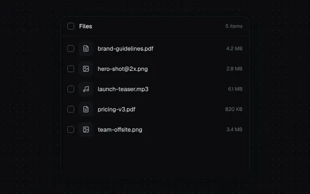
Installation
01
Install with the shadcn CLI. The NiceUI theme comes along the first time.
$ npx shadcn@latest add https://niceui.dev/r/blocks-action-bar.json02
Or copy the source below (2 files). Dependencies: lucide-react.
Source
components/niceui/blocks/ActionBar.tsx
import { useState, type ComponentType, type ReactNode } from 'react';
import { Archive, Check, Download, FileText, Image, Music, Share2, Trash2, X } from 'lucide-react';
import { cn } from '@/lib/cn';
import { useEscape, usePresence } from '@/components/niceui/ui/motion/hooks';

export type BarAction = { id: string; label: string; icon: ComponentType<{ className?: string }>; danger?: boolean; onClick: () => void };

export type ActionBarProps = { count: number; actions: BarAction[]; onClear: () => void; label?: (n: number) => ReactNode };

export function ActionBar({ count, actions, onClear, label = (n) => `${n} selected` }: ActionBarProps) {
  const open = count > 0;
  const { mounted, visible } = usePresence(open, 300);
  useEscape(open, onClear);
  if (!mounted) return null;
  return (
    <div
      className={cn(
        'absolute inset-x-0 bottom-4 z-20 mx-auto flex w-fit items-center gap-1 rounded-2xl bg-ink-800/95 p-1.5 shadow-pop backdrop-blur-xl transition-all duration-300 ease-spring',
        visible ? 'translate-y-0 scale-100 opacity-100' : 'translate-y-6 scale-95 opacity-0',
      )}
    >
      <button aria-label="Clear selection" onClick={onClear} className="focus-ring flex h-8 w-8 items-center justify-center rounded-lg text-ink-400 transition-colors hover:bg-white/5 hover:text-ink-100">
        <X className="h-4 w-4" />
      </button>
      <span key={count} className="min-w-[88px] animate-fade-in px-1 text-sm font-medium tabular-nums text-ink-100">{label(count)}</span>
      <span className="mx-1 h-5 w-px bg-white/10" />
      {actions.map((a, i) => (
        <button
          key={a.id}
          onClick={a.onClick}
          style={{ animationDelay: `${60 + i * 40}ms` }}
          className={cn(
            'focus-ring flex animate-fade-up items-center gap-1.5 rounded-lg px-2.5 py-1.5 text-xs font-medium transition-all active:scale-95',
            a.danger ? 'text-rose-300 hover:bg-rose-500/10' : 'text-ink-200 hover:bg-white/5 hover:text-ink-50',
          )}
        >
          <a.icon className="h-3.5 w-3.5" />
          <span className="hidden sm:inline">{a.label}</span>
        </button>
      ))}
    </div>
  );
}

type FileRow = { id: number; name: string; size: string; icon: ComponentType<{ className?: string }> };
const FILES: FileRow[] = [
  { id: 1, name: 'brand-guidelines.pdf', size: '4.2 MB', icon: FileText },
  { id: 2, name: 'hero-shot@2x.png', size: '2.8 MB', icon: Image },
  { id: 3, name: 'launch-teaser.mp3', size: '6.1 MB', icon: Music },
  { id: 4, name: 'pricing-v3.pdf', size: '820 KB', icon: FileText },
  { id: 5, name: 'team-offsite.png', size: '3.4 MB', icon: Image },
];

export function ActionBarDemo() {
  const [files, setFiles] = useState(FILES);
  const [selected, setSelected] = useState<number[]>([]);
  const [removing, setRemoving] = useState<number[]>([]);
  const [toast, setToast] = useState<string | null>(null);

  const toggle = (id: number) => setSelected((s) => (s.includes(id) ? s.filter((x) => x !== id) : [...s, id]));
  const notify = (msg: string) => { setToast(msg); window.setTimeout(() => setToast(null), 1600); };
  const remove = (verb: string) => {
    const ids = selected;
    setRemoving(ids);
    setSelected([]);
    notify(`${ids.length} ${ids.length === 1 ? 'file' : 'files'} ${verb}`);
    window.setTimeout(() => { setFiles((f) => f.filter((x) => !ids.includes(x.id))); setRemoving([]); }, 320);
  };
  const all = files.length > 0 && selected.length === files.length;

  return (
    <div className="relative mx-auto h-[380px] w-full max-w-md overflow-hidden rounded-2xl bg-ink-900 shadow-card">
      <div className="flex items-center justify-between border-b border-white/5 px-4 py-3">
        <button onClick={() => setSelected(all ? [] : files.map((f) => f.id))} className="flex items-center gap-3 text-sm font-medium text-ink-100">
          <span className={cn('flex h-4 w-4 items-center justify-center rounded border transition-all', all ? 'border-brand-500 bg-brand-500' : 'border-ink-600')}>{all && <Check className="h-3 w-3 text-white" />}</span>
          Files
        </button>
        <span className="text-xs text-ink-500">{files.length} items</span>
      </div>
      <div className="p-1.5">
        {files.map((f) => {
          const on = selected.includes(f.id);
          const out = removing.includes(f.id);
          return (
            <div key={f.id} className={cn('grid transition-all duration-300 ease-smooth', out ? 'grid-rows-[0fr] -translate-x-4 opacity-0' : 'grid-rows-[1fr]')}>
              <div className="overflow-hidden">
              <button onClick={() => toggle(f.id)} className={cn('flex w-full items-center gap-3 rounded-xl px-2.5 py-2 text-left transition-colors', on ? 'bg-brand-500/10' : 'hover:bg-white/[0.03]')}>
                <span className={cn('flex h-4 w-4 shrink-0 items-center justify-center rounded border transition-all duration-200', on ? 'scale-100 border-brand-500 bg-brand-500' : 'border-ink-600')}>
                  <Check className={cn('h-3 w-3 text-white transition-transform duration-200 ease-spring', on ? 'scale-100' : 'scale-0')} />
                </span>
                <span className="flex h-8 w-8 items-center justify-center rounded-lg bg-ink-850 text-ink-300 shadow-hairline"><f.icon className="h-4 w-4" /></span>
                <span className="flex-1 truncate text-sm text-ink-100">{f.name}</span>
                <span className="text-xs text-ink-500">{f.size}</span>
              </button>
              </div>
            </div>
          );
        })}
        {files.length === 0 && (
          <button onClick={() => setFiles(FILES)} className="mx-auto mt-16 block animate-fade-in rounded-full bg-ink-850 px-3.5 py-1.5 text-xs text-ink-300 shadow-hairline hover:text-ink-50">Restore files</button>
        )}
      </div>
      {toast && <div className="absolute inset-x-0 top-14 mx-auto w-fit animate-fade-down rounded-full bg-ink-800 px-3 py-1.5 text-xs text-ink-100 shadow-pop">{toast}</div>}
      <ActionBar
        count={selected.length}
        onClear={() => setSelected([])}
        actions={[
          { id: 'share', label: 'Share', icon: Share2, onClick: () => notify('Share link copied') },
          { id: 'dl', label: 'Download', icon: Download, onClick: () => notify('Download started') },
          { id: 'archive', label: 'Archive', icon: Archive, onClick: () => remove('archived') },
          { id: 'delete', label: 'Delete', icon: Trash2, danger: true, onClick: () => remove('deleted') },
        ]}
      />
    </div>
  );
}
components/niceui/ui/motion/hooks.ts
import { useEffect, useState, type ReactNode, type RefObject } from 'react';
import { createPortal } from 'react-dom';

/**
 * Keeps an element mounted while it animates out.
 * `mounted` controls rendering, `visible` drives the enter/exit classes.
 */
export function usePresence(open: boolean, exitMs = 220) {
  const [mounted, setMounted] = useState(open);
  const [visible, setVisible] = useState(open);

  useEffect(() => {
    if (open) {
      setMounted(true);
      let inner = 0;
      const outer = requestAnimationFrame(() => {
        inner = requestAnimationFrame(() => setVisible(true));
      });
      return () => {
        cancelAnimationFrame(outer);
        cancelAnimationFrame(inner);
      };
    }
    setVisible(false);
    const t = window.setTimeout(() => setMounted(false), exitMs);
    return () => window.clearTimeout(t);
  }, [open, exitMs]);

  return { mounted, visible };
}

/** Calls `handler` when Escape is pressed while `active`. */
export function useEscape(active: boolean, handler: () => void) {
  useEffect(() => {
    if (!active) return;
    const onKey = (e: KeyboardEvent) => {
      if (e.key === 'Escape') handler();
    };
    window.addEventListener('keydown', onKey);
    return () => window.removeEventListener('keydown', onKey);
  }, [active, handler]);
}

/** Calls `handler` on pointerdown outside every provided ref while `active`. */
export function useClickOutside(
  refs: Array<RefObject<HTMLElement>>,
  active: boolean,
  handler: () => void,
) {
  useEffect(() => {
    if (!active) return;
    const onDown = (e: PointerEvent) => {
      const target = e.target as Node;
      if (refs.some((r) => r.current?.contains(target))) return;
      handler();
    };
    document.addEventListener('pointerdown', onDown);
    return () => document.removeEventListener('pointerdown', onDown);
    // eslint-disable-next-line react-hooks/exhaustive-deps
  }, [active, handler]);
}

/**
 * Renders overlays into document.body so `position: fixed` is relative to the
 * viewport even when an ancestor has a transform (e.g. entrance animations).
 */
export function Portal({ children }: { children: ReactNode }) {
  if (typeof document === 'undefined') return null;
  return createPortal(children, document.body);
}