Expandable Tabs
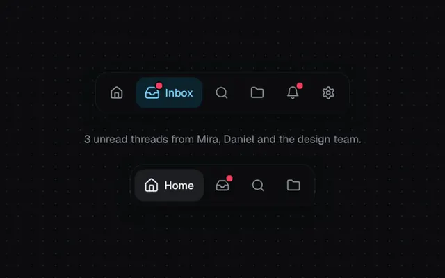
Compact icon tabs where the active one stretches open to show its label.
Installation
01
Install with the shadcn CLI. The NiceUI theme comes along the first time.
$ npx shadcn@latest add https://niceui.dev/r/blocks-expandable-tabs.json02
Or copy the source below. Dependencies: lucide-react.
Source
components/niceui/blocks/ExpandableTabs.tsx
import { useState, type ComponentType } from 'react';
import { Bell, Folder, Home, Inbox, Search, Settings } from 'lucide-react';
import { cn } from '@/lib/cn';

export type ExpandableTab = { id: string; label: string; icon: ComponentType<{ className?: string }>; badge?: number };

export type ExpandableTabsProps = {
  tabs: ExpandableTab[];
  value: string | null;
  onChange: (id: string | null) => void;
  tone?: 'brand' | 'neutral';
};

export function ExpandableTabs({ tabs, value, onChange, tone = 'brand' }: ExpandableTabsProps) {
  return (
    <div role="tablist" className="flex items-center gap-1 rounded-2xl bg-ink-900 p-1.5 shadow-card">
      {tabs.map((t) => {
        const on = value === t.id;
        return (
          <button
            key={t.id}
            role="tab"
            aria-selected={on}
            aria-label={t.label}
            onClick={() => onChange(on ? null : t.id)}
            className={cn(
              'focus-ring group relative flex h-10 items-center rounded-xl px-3 text-sm font-medium transition-all duration-500 ease-spring active:scale-95',
              on
                ? tone === 'brand' ? 'bg-brand-500/15 text-brand-300' : 'bg-ink-800 text-ink-50 shadow-hairline'
                : 'text-ink-400 hover:bg-white/[0.04] hover:text-ink-100',
            )}
          >
            <span className="relative">
              <t.icon className={cn('h-[18px] w-[18px] transition-transform duration-500 ease-spring', on && 'scale-110')} />
              {t.badge ? <span className="absolute -right-1 -top-1 h-2 w-2 rounded-full bg-rose-500 ring-2 ring-ink-900" /> : null}
            </span>
            <span className={cn('grid transition-[grid-template-columns] duration-500 ease-spring', on ? 'grid-cols-[1fr]' : 'grid-cols-[0fr]')}>
              <span className="overflow-hidden">
                <span className={cn('block whitespace-nowrap pl-2 transition-all duration-300', on ? 'translate-x-0 opacity-100 blur-0 delay-75' : '-translate-x-1 opacity-0 blur-[2px]')}>
                  {t.label}
                </span>
              </span>
            </span>
          </button>
        );
      })}
    </div>
  );
}

const TABS: ExpandableTab[] = [
  { id: 'home', label: 'Home', icon: Home },
  { id: 'inbox', label: 'Inbox', icon: Inbox, badge: 3 },
  { id: 'search', label: 'Search', icon: Search },
  { id: 'projects', label: 'Projects', icon: Folder },
  { id: 'alerts', label: 'Notifications', icon: Bell, badge: 1 },
  { id: 'settings', label: 'Settings', icon: Settings },
];

const COPY: Record<string, string> = {
  home: 'Your workspace at a glance — 4 updates since yesterday.',
  inbox: '3 unread threads from Mira, Daniel and the design team.',
  search: 'Search across 1,284 docs, issues and people.',
  projects: '12 active projects · 2 due this week.',
  alerts: 'Deploy succeeded on lumen-ui/production.',
  settings: 'Manage profile, billing and integrations.',
};

export function ExpandableTabsDemo() {
  const [value, setValue] = useState<string | null>('inbox');
  const [neutral, setNeutral] = useState<string | null>('home');
  return (
    <div className="flex flex-col items-center gap-6">
      <ExpandableTabs tabs={TABS} value={value} onChange={setValue} />
      <p key={value ?? 'none'} className="h-5 animate-fade-up text-sm text-ink-400">{value ? COPY[value] : 'Click a tab to expand it'}</p>
      <ExpandableTabs tabs={TABS.slice(0, 4)} value={neutral} onChange={setNeutral} tone="neutral" />
    </div>
  );
}