Action Swap
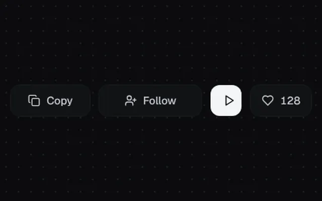
Icon and label swaps for stateful actions: copy, follow, play and like with a particle burst.
Installation
01
Install with the shadcn CLI. The NiceUI theme comes along the first time.
$ npx shadcn@latest add https://niceui.dev/r/components-action-swap.json02
Or copy the source below. Dependencies: lucide-react.
Source
components/niceui/ui/motion/ActionSwap.tsx
import { useEffect, useRef, useState, type ComponentType } from 'react';
import { Check, Copy, Heart, Pause, Play, UserPlus, Users } from 'lucide-react';
import { cn } from '@/lib/cn';

type Face = { icon: ComponentType<{ className?: string }>; label?: string };

export type ActionSwapProps = {
  active: boolean;
  onToggle: () => void;
  idle: Face;
  done: Face;
  className?: string;
  activeClassName?: string;
  idleClassName?: string;
};

/** Cross-swaps two icon/label faces with blur + scale + vertical slide. Both faces share one grid cell so width never jumps. */
export function ActionSwap({ active, onToggle, idle, done, className, activeClassName, idleClassName }: ActionSwapProps) {
  const face = (f: Face, on: boolean, dir: 1 | -1) => (
    <span
      aria-hidden={!on}
      className={cn(
        'col-start-1 row-start-1 flex items-center justify-center gap-2 transition-all duration-300 ease-spring',
        on ? 'translate-y-0 scale-100 opacity-100 blur-0' : cn('scale-50 opacity-0 blur-[4px]', dir === 1 ? 'translate-y-3' : '-translate-y-3'),
      )}
    >
      <f.icon className="h-4 w-4" />
      {f.label && <span>{f.label}</span>}
    </span>
  );
  return (
    <button
      onClick={onToggle}
      aria-pressed={active}
      className={cn(
        'focus-ring grid h-10 items-center overflow-hidden rounded-xl px-4 text-sm font-medium transition-all duration-300 active:scale-[0.95]',
        active
          ? activeClassName ?? 'bg-ink-800 text-ink-50 shadow-hairline'
          : idleClassName ?? 'bg-ink-850 text-ink-200 shadow-hairline hover:bg-ink-800',
        className,
      )}
    >
      {face(idle, !active, -1)}
      {face(done, active, 1)}
    </button>
  );
}

export function CopyButton({ text }: { text: string }) {
  const [copied, setCopied] = useState(false);
  const timer = useRef<number>();
  useEffect(() => () => window.clearTimeout(timer.current), []);
  return (
    <ActionSwap
      active={copied}
      onToggle={() => {
        navigator.clipboard?.writeText(text).catch(() => undefined);
        setCopied(true);
        window.clearTimeout(timer.current);
        timer.current = window.setTimeout(() => setCopied(false), 1600);
      }}
      idle={{ icon: Copy, label: 'Copy' }}
      done={{ icon: Check, label: 'Copied' }}
      activeClassName="bg-emerald-500/10 text-emerald-300 shadow-[inset_0_0_0_1px_rgba(16,185,129,0.3)]"
    />
  );
}

const PARTICLES = 10;

/** Heart with a burst of particles + ring on like. */
export function LikeButton({ count = 128 }: { count?: number }) {
  const [liked, setLiked] = useState(false);
  const [burst, setBurst] = useState(0);
  return (
    <button
      onClick={() => {
        setLiked((l) => !l);
        if (!liked) setBurst((b) => b + 1);
      }}
      aria-pressed={liked}
      className={cn(
        'focus-ring flex h-10 items-center gap-2 rounded-xl px-3.5 text-sm font-medium shadow-hairline transition-all duration-300 active:scale-[0.95]',
        liked ? 'bg-rose-500/10 text-rose-300' : 'bg-ink-850 text-ink-200 hover:bg-ink-800',
      )}
    >
      <span className="relative flex h-4 w-4 items-center justify-center">
        <style>{'@keyframes like-burst{0%{transform:rotate(var(--a)) translateY(0) scale(1);opacity:1}100%{transform:rotate(var(--a)) translateY(-16px) scale(0);opacity:0}}@keyframes like-ring{0%{transform:scale(.2);opacity:.8}100%{transform:scale(2.4);opacity:0}}'}</style>
        {burst > 0 && liked && (
          <span key={burst} className="pointer-events-none absolute inset-0">
            <span className="absolute inset-0 rounded-full border-2 border-rose-400" style={{ animation: 'like-ring 500ms ease-out both' }} />
            {Array.from({ length: PARTICLES }, (_, i) => (
              <span
                key={i}
                className={cn('absolute left-1/2 top-1/2 -ml-[2px] -mt-[2px] h-1 w-1 rounded-full', i % 2 ? 'bg-amber-300' : 'bg-rose-400')}
                style={{ ['--a' as string]: `${(360 / PARTICLES) * i}deg`, animation: 'like-burst 600ms cubic-bezier(0.16,1,0.3,1) both' }}
              />
            ))}
          </span>
        )}
        <Heart className={cn('h-4 w-4 transition-all duration-500 ease-spring', liked ? 'scale-110 fill-rose-400 text-rose-400' : 'scale-100')} />
      </span>
      <span className="relative h-5 overflow-hidden tabular-nums">
        <span className={cn('flex flex-col transition-transform duration-500 ease-spring', liked && '-translate-y-5')}>
          <span className="h-5 leading-5">{count}</span>
          <span className="h-5 leading-5">{count + 1}</span>
        </span>
      </span>
    </button>
  );
}

export function ActionSwapDemo() {
  const [following, setFollowing] = useState(false);
  const [playing, setPlaying] = useState(false);
  return (
    <div className="flex flex-wrap items-center justify-center gap-3">
      <CopyButton text="npx lumen add action-swap" />
      <ActionSwap
        active={following}
        onToggle={() => setFollowing((f) => !f)}
        idle={{ icon: UserPlus, label: 'Follow' }}
        done={{ icon: Users, label: 'Following' }}
        className="min-w-[132px]"
        activeClassName="bg-ink-800 text-ink-50 shadow-hairline"
      />
      <ActionSwap
        active={playing}
        onToggle={() => setPlaying((p) => !p)}
        idle={{ icon: Play }}
        done={{ icon: Pause }}
        className="w-10 rounded-full px-0"
        idleClassName="bg-ink-50 text-ink-950 hover:bg-white"
        activeClassName="bg-brand-500 text-white shadow-glow"
      />
      <LikeButton />
    </div>
  );
}