Adaptive Stepper
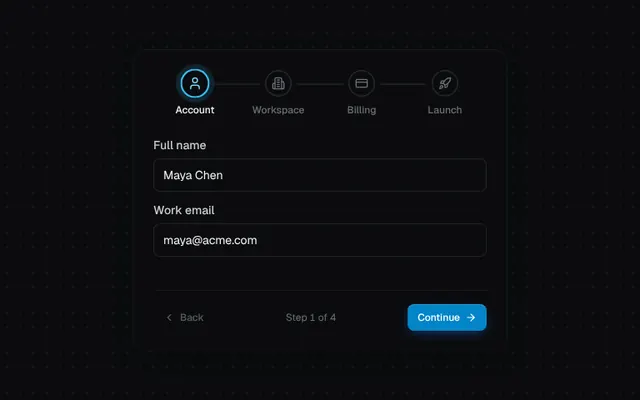
A multi-step flow with filling connectors, check-morphing step nodes and direction-aware sliding content.
Installation
01
Install with the shadcn CLI. The NiceUI theme comes along the first time.
$ npx shadcn@latest add https://niceui.dev/r/components-stepper.json02
Or copy the source below (4 files). Dependencies: lucide-react.
Source
components/niceui/ui/core/Stepper.tsx
import { useState, type ReactNode } from 'react';
import { ArrowRight, Building2, Check, ChevronLeft, CreditCard, Rocket, User } from 'lucide-react';
import { cn } from '@/lib/cn';
import { Button } from './Button';
import { Input } from './Input';
import { animateOnce } from './utils';

export type Step = { id: string; label: string; icon?: ReactNode };

export type StepperProps = { steps: Step[]; current: number; onStepClick?: (index: number) => void };

export function Stepper({ steps, current, onStepClick }: StepperProps) {
  return (
    <ol className="flex w-full items-start">
      {steps.map((s, i) => {
        const done = i < current;
        const active = i === current;
        return (
          <li key={s.id} className="relative flex flex-1 flex-col items-center">
            {i < steps.length - 1 && (
              <span className="absolute left-[calc(50%+22px)] right-[calc(-50%+22px)] top-4 h-0.5 overflow-hidden rounded-full bg-ink-800">
                <span
                  className="block h-full origin-left bg-brand-500 transition-transform duration-500 ease-smooth"
                  style={{ transform: `scaleX(${done ? 1 : 0})` }}
                />
              </span>
            )}
            <button
              type="button"
              disabled={!onStepClick || i > current}
              onClick={() => onStepClick?.(i)}
              aria-current={active ? 'step' : undefined}
              className={cn(
                'focus-ring relative z-10 flex h-8 w-8 items-center justify-center rounded-full text-xs font-medium transition-all duration-500 ease-spring [&_svg]:h-4 [&_svg]:w-4',
                done && 'bg-brand-500 text-white',
                active && 'scale-110 bg-ink-900 text-brand-300 shadow-[inset_0_0_0_2px_#38bdf8,0_0_0_5px_rgba(56,189,248,0.15)]',
                !done && !active && 'bg-ink-900 text-ink-500 shadow-[inset_0_0_0_1.5px_rgba(255,255,255,0.12)]',
              )}
            >
              {done ? <Check className="animate-scale-in" strokeWidth={3} /> : s.icon ?? i + 1}
            </button>
            <span className={cn('mt-2 text-xs font-medium transition-colors duration-300', active ? 'text-ink-50' : done ? 'text-ink-300' : 'text-ink-500')}>
              {s.label}
            </span>
          </li>
        );
      })}
    </ol>
  );
}

const STEPS: Step[] = [
  { id: 'account', label: 'Account', icon: <User /> },
  { id: 'team', label: 'Workspace', icon: <Building2 /> },
  { id: 'billing', label: 'Billing', icon: <CreditCard /> },
  { id: 'launch', label: 'Launch', icon: <Rocket /> },
];

function Panel({ step }: { step: number }) {
  if (step === 0)
    return (
      <div className="space-y-3">
        <Input label="Full name" defaultValue="Maya Chen" />
        <Input label="Work email" defaultValue="maya@acme.com" />
      </div>
    );
  if (step === 1)
    return (
      <div className="space-y-3">
        <Input label="Workspace name" defaultValue="Acme Inc." />
        <Input label="URL" defaultValue="acme" rightSlot={<span className="text-xs text-ink-500">.lumen.dev</span>} />
      </div>
    );
  if (step === 2)
    return (
      <div className="space-y-3">
        <Input label="Card number" defaultValue="4242 4242 4242 4242" leftIcon={<CreditCard />} />
        <div className="grid grid-cols-2 gap-3">
          <Input label="Expiry" defaultValue="09 / 29" />
          <Input label="CVC" defaultValue="123" />
        </div>
      </div>
    );
  return (
    <div className="flex flex-col items-center py-6 text-center">
      <span className="flex h-12 w-12 animate-scale-in items-center justify-center rounded-full bg-emerald-500/15 text-emerald-300">
        <Check className="h-6 w-6" strokeWidth={2.5} />
      </span>
      <p className="mt-3 font-medium text-ink-50">You’re all set</p>
      <p className="mt-1 text-sm text-ink-400">acme.lumen.dev is ready for your first deploy.</p>
    </div>
  );
}

export function StepperDemo() {
  const [step, setStep] = useState(0);
  const [dir, setDir] = useState(1);
  const go = (n: number) => {
    setDir(n > step ? 1 : -1);
    setStep(n);
  };
  const last = step === STEPS.length - 1;

  return (
    <div className="mx-auto w-full max-w-md rounded-2xl bg-ink-900 p-6 shadow-card">
      <Stepper steps={STEPS} current={step} onStepClick={go} />
      <div className="relative mt-6 min-h-[168px] overflow-hidden">
        <div
          key={step}
          ref={(el) =>
            animateOnce(
              el,
              [
                { opacity: 0, transform: `translateX(${dir * 40}px)` },
                { opacity: 1, transform: 'translateX(0)' },
              ],
              { duration: 450, easing: 'cubic-bezier(0.16,1,0.3,1)' },
            )
          }
        >
          <Panel step={step} />
        </div>
      </div>
      <div className="mt-4 flex items-center justify-between border-t border-white/5 pt-4">
        <Button variant="ghost" size="sm" leftIcon={<ChevronLeft />} disabled={step === 0} onClick={() => go(step - 1)}>
          Back
        </Button>
        <span className="text-xs tabular-nums text-ink-500">
          Step {step + 1} of {STEPS.length}
        </span>
        {last ? (
          <Button size="sm" variant="secondary" onClick={() => go(0)}>
            Start over
          </Button>
        ) : (
          <Button size="sm" rightIcon={<ArrowRight />} onClick={() => go(step + 1)}>
            {step === STEPS.length - 2 ? 'Finish' : 'Continue'}
          </Button>
        )}
      </div>
    </div>
  );
}
components/niceui/ui/core/Button.tsx
import { useState, type ButtonHTMLAttributes, type PointerEvent, type ReactNode } from 'react';
import { ArrowRight, Check, Download, Loader2, Plus, Rocket, Trash2 } from 'lucide-react';
import { cn } from '@/lib/cn';

export type ButtonVariant = 'primary' | 'secondary' | 'ghost' | 'outline' | 'danger';
export type ButtonSize = 'sm' | 'md' | 'lg';

export type ButtonProps = ButtonHTMLAttributes<HTMLButtonElement> & {
  variant?: ButtonVariant;
  size?: ButtonSize;
  loading?: boolean;
  leftIcon?: ReactNode;
  rightIcon?: ReactNode;
};

const VARIANTS: Record<ButtonVariant, string> = {
  primary:
    'bg-brand-600 text-white shadow-[inset_0_1px_0_rgba(255,255,255,0.18),0_1px_2px_rgba(0,0,0,0.4),0_4px_14px_-4px_rgba(27,119,245,0.6)] hover:bg-brand-500',
  secondary: 'bg-ink-800 text-ink-50 shadow-hairline hover:bg-ink-700',
  ghost: 'text-ink-300 hover:bg-white/5 hover:text-ink-50',
  outline: 'text-ink-100 ring-1 ring-inset ring-white/10 hover:bg-white/[0.03] hover:ring-white/20',
  danger: 'bg-rose-500/10 text-rose-300 ring-1 ring-inset ring-rose-500/25 hover:bg-rose-500/15 hover:text-rose-200',
};

const SIZES: Record<ButtonSize, string> = {
  sm: 'h-8 gap-1.5 rounded-lg px-3 text-xs [&_svg]:h-3.5 [&_svg]:w-3.5',
  md: 'h-9 gap-2 rounded-lg px-4 text-sm [&_svg]:h-4 [&_svg]:w-4',
  lg: 'h-11 gap-2 rounded-xl px-5 text-sm [&_svg]:h-4 [&_svg]:w-4',
};

type Ripple = { id: number; x: number; y: number; size: number };

export function Button({
  variant = 'primary',
  size = 'md',
  loading = false,
  leftIcon,
  rightIcon,
  className,
  children,
  disabled,
  onPointerDown,
  type = 'button',
  ...rest
}: ButtonProps) {
  const [ripples, setRipples] = useState<Ripple[]>([]);

  const handlePointerDown = (e: PointerEvent<HTMLButtonElement>) => {
    onPointerDown?.(e);
    const rect = e.currentTarget.getBoundingClientRect();
    const size = Math.max(rect.width, rect.height) * 2.2;
    const id = Date.now() + Math.random();
    setRipples((r) => [...r, { id, x: e.clientX - rect.left, y: e.clientY - rect.top, size }]);
    window.setTimeout(() => setRipples((r) => r.filter((x) => x.id !== id)), 650);
  };

  return (
    <button
      type={type}
      disabled={disabled || loading}
      aria-busy={loading || undefined}
      onPointerDown={handlePointerDown}
      className={cn(
        'focus-ring relative inline-flex select-none items-center justify-center overflow-hidden whitespace-nowrap font-medium transition-all duration-200 ease-smooth active:scale-[0.97] disabled:pointer-events-none disabled:opacity-50',
        VARIANTS[variant],
        SIZES[size],
        className,
      )}
      {...rest}
    >
      {ripples.map((r) => (
        <span
          key={r.id}
          aria-hidden
          ref={(el) => {
            if (el && !el.dataset.played) {
              el.dataset.played = '1';
              el.animate(
                [
                  { transform: 'translate(-50%,-50%) scale(0)', opacity: 0.35 },
                  { transform: 'translate(-50%,-50%) scale(1)', opacity: 0 },
                ],
                { duration: 600, easing: 'cubic-bezier(0.16,1,0.3,1)', fill: 'forwards' },
              );
            }
          }}
          className={cn('pointer-events-none absolute rounded-full', variant === 'primary' ? 'bg-white/40' : 'bg-white/20')}
          style={{ left: r.x, top: r.y, width: r.size, height: r.size, transform: 'translate(-50%,-50%) scale(0)' }}
        />
      ))}
      {loading ? <Loader2 className="animate-spin" /> : leftIcon}
      {children && <span className="relative">{children}</span>}
      {rightIcon && !loading && <span className="relative inline-flex">{rightIcon}</span>}
    </button>
  );
}

function Row({ label, children }: { label: string; children: ReactNode }) {
  return (
    <div className="flex flex-col gap-3 sm:flex-row sm:items-center">
      <span className="w-20 shrink-0 text-xs font-medium uppercase tracking-wider text-ink-500">{label}</span>
      <div className="flex flex-wrap items-center gap-2.5">{children}</div>
    </div>
  );
}

export function ButtonDemo() {
  const [state, setState] = useState<'idle' | 'loading' | 'done'>('idle');

  const deploy = () => {
    if (state !== 'idle') return;
    setState('loading');
    window.setTimeout(() => setState('done'), 1600);
    window.setTimeout(() => setState('idle'), 3400);
  };

  return (
    <div className="mx-auto flex w-full max-w-xl flex-col gap-6">
      <Row label="Variants">
        <Button>Primary</Button>
        <Button variant="secondary">Secondary</Button>
        <Button variant="outline">Outline</Button>
        <Button variant="ghost">Ghost</Button>
        <Button variant="danger">Danger</Button>
      </Row>
      <Row label="Sizes">
        <Button size="sm">Small</Button>
        <Button size="md">Medium</Button>
        <Button size="lg">Large</Button>
      </Row>
      <Row label="Icons">
        <Button variant="secondary" leftIcon={<Plus />}>New project</Button>
        <Button variant="outline" leftIcon={<Download />}>Export</Button>
        <Button variant="ghost" rightIcon={<ArrowRight />}>Continue</Button>
        <Button variant="danger" leftIcon={<Trash2 />} aria-label="Delete" />
      </Row>
      <Row label="Loading">
        <Button
          onClick={deploy}
          loading={state === 'loading'}
          leftIcon={state === 'done' ? <Check className="animate-scale-in" /> : <Rocket />}
          className={cn('min-w-[148px]', state === 'done' && '!bg-emerald-600')}
        >
          {state === 'loading' ? 'Deploying…' : state === 'done' ? 'Deployed' : 'Deploy to prod'}
        </Button>
        <Button variant="secondary" loading>
          Saving
        </Button>
      </Row>
    </div>
  );
}
components/niceui/ui/core/Input.tsx
import { useEffect, useId, useRef, useState, type FormEvent, type InputHTMLAttributes, type ReactNode } from 'react';
import { AlertCircle, Eye, EyeOff, Lock, Mail, Search, User } from 'lucide-react';
import { cn } from '@/lib/cn';
import { Button } from './Button';

export type InputProps = InputHTMLAttributes<HTMLInputElement> & {
  label?: string;
  hint?: string;
  error?: string;
  leftIcon?: ReactNode;
  /** Element rendered inside the field on the right (e.g. a shortcut). */
  rightSlot?: ReactNode;
};

export function Input({ label, hint, error, leftIcon, rightSlot, className, type = 'text', id, ...rest }: InputProps) {
  const autoId = useId();
  const inputId = id ?? autoId;
  const [show, setShow] = useState(false);
  const [shake, setShake] = useState(0);
  const fieldRef = useRef<HTMLDivElement>(null);
  const isPassword = type === 'password';

  useEffect(() => {
    if (error) setShake((n) => n + 1);
  }, [error]);

  useEffect(() => {
    if (!shake || !fieldRef.current) return;
    fieldRef.current.animate(
      [0, -6, 6, -4, 4, -2, 0].map((x) => ({ transform: `translateX(${x}px)` })),
      { duration: 420, easing: 'ease-out' },
    );
  }, [shake]);

  const describedBy = error ? `${inputId}-error` : hint ? `${inputId}-hint` : undefined;

  return (
    <div className={cn('w-full', className)}>
      {label && (
        <label htmlFor={inputId} className="mb-1.5 block text-sm font-medium text-ink-200">
          {label}
        </label>
      )}
      <div
        ref={fieldRef}
        className={cn(
          'group relative flex h-10 items-center rounded-lg bg-ink-900 ring-1 ring-inset transition-all duration-200',
          error
            ? 'ring-rose-500/60 focus-within:ring-rose-400 focus-within:shadow-[0_0_0_4px_rgba(244,63,94,0.15)]'
            : 'ring-white/10 hover:ring-white/20 focus-within:ring-brand-500 focus-within:shadow-[0_0_0_4px_rgba(56,189,248,0.15)]',
        )}
      >
        {leftIcon && (
          <span
            className={cn(
              'pointer-events-none pl-3 transition-colors [&_svg]:h-4 [&_svg]:w-4',
              error ? 'text-rose-400' : 'text-ink-500 group-focus-within:text-brand-300',
            )}
          >
            {leftIcon}
          </span>
        )}
        <input
          id={inputId}
          type={isPassword && show ? 'text' : type}
          aria-invalid={!!error || undefined}
          aria-describedby={describedBy}
          className="h-full w-full min-w-0 bg-transparent px-3 text-sm text-ink-50 outline-none placeholder:text-ink-500 disabled:cursor-not-allowed disabled:opacity-50"
          {...rest}
        />
        {isPassword && (
          <button
            type="button"
            onClick={() => setShow((s) => !s)}
            aria-label={show ? 'Hide password' : 'Show password'}
            className="focus-ring relative mr-1.5 flex h-7 w-7 shrink-0 items-center justify-center rounded-md text-ink-400 transition hover:bg-white/5 hover:text-ink-100 active:scale-90"
          >
            <Eye className={cn('absolute h-4 w-4 transition-all duration-300 ease-spring', show ? 'rotate-90 scale-50 opacity-0' : 'opacity-100')} />
            <EyeOff className={cn('absolute h-4 w-4 transition-all duration-300 ease-spring', show ? 'opacity-100' : '-rotate-90 scale-50 opacity-0')} />
          </button>
        )}
        {rightSlot && <span className="mr-2 shrink-0">{rightSlot}</span>}
      </div>
      {error ? (
        <p id={`${inputId}-error`} key={error} className="mt-1.5 flex animate-fade-down items-center gap-1.5 text-xs text-rose-300">
          <AlertCircle className="h-3.5 w-3.5" /> {error}
        </p>
      ) : (
        hint && (
          <p id={`${inputId}-hint`} className="mt-1.5 text-xs text-ink-400">
            {hint}
          </p>
        )
      )}
    </div>
  );
}

export function InputDemo() {
  const [email, setEmail] = useState('');
  const [password, setPassword] = useState('');
  const [errors, setErrors] = useState<{ email?: string; password?: string }>({});
  const [done, setDone] = useState(false);

  const submit = (e: FormEvent) => {
    e.preventDefault();
    const next: typeof errors = {};
    if (!/^[^\s@]+@[^\s@]+\.[^\s@]+$/.test(email)) next.email = 'Enter a valid email address';
    if (password.length < 8) next.password = 'Use at least 8 characters';
    setErrors({});
    requestAnimationFrame(() => setErrors(next));
    setDone(Object.keys(next).length === 0);
  };

  return (
    <div className="mx-auto grid w-full max-w-2xl gap-6 md:grid-cols-[1fr_1fr]">
      <form onSubmit={submit} noValidate className="space-y-4 rounded-2xl bg-ink-900 p-5 shadow-card">
        <div>
          <p className="text-sm font-medium text-ink-50">Create account</p>
          <p className="text-xs text-ink-400">Submit empty to see the error shake.</p>
        </div>
        <Input
          label="Email"
          type="email"
          placeholder="you@company.com"
          leftIcon={<Mail />}
          value={email}
          error={errors.email}
          onChange={(e) => {
            setEmail(e.target.value);
            setErrors((s) => ({ ...s, email: undefined }));
          }}
        />
        <Input
          label="Password"
          type="password"
          placeholder="••••••••"
          leftIcon={<Lock />}
          hint="8+ characters, one number."
          value={password}
          error={errors.password}
          onChange={(e) => {
            setPassword(e.target.value);
            setErrors((s) => ({ ...s, password: undefined }));
          }}
        />
        <Button type="submit" className={cn('w-full', done && '!bg-emerald-600')}>
          {done ? 'Account created' : 'Sign up'}
        </Button>
      </form>
      <div className="flex flex-col justify-center gap-4">
        <Input
          placeholder="Search docs…"
          leftIcon={<Search />}
          aria-label="Search"
          rightSlot={<kbd className="rounded bg-white/5 px-1.5 py-0.5 font-mono text-[10px] text-ink-400 shadow-hairline">⌘K</kbd>}
        />
        <Input label="Username" defaultValue="maya" leftIcon={<User />} hint="lumen.dev/maya" />
        <Input label="Disabled" defaultValue="acme-prod" disabled />
      </div>
    </div>
  );
}
components/niceui/ui/core/utils.ts
/**
 * Plays a Web Animation the first time an element mounts. Safe to call from
 * inline ref callbacks (which React re-invokes on every render).
 */
export function animateOnce(el: HTMLElement | null, keyframes: Keyframe[], options: KeyframeAnimationOptions) {
  if (!el || el.dataset.played) return;
  el.dataset.played = '1';
  el.animate(keyframes, options);
}

export const clamp = (v: number, min: number, max: number) => Math.min(max, Math.max(min, v));