Animated Alert
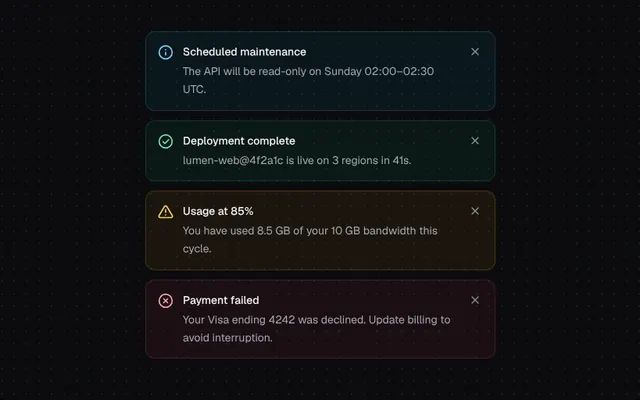
Status alerts with stroke-drawn icons and a smooth collapse when dismissed.
Installation
01
Install with the shadcn CLI. The NiceUI theme comes along the first time.
$ npx shadcn@latest add https://niceui.dev/r/components-animated-alert.json02
Or copy the source below. Dependencies: lucide-react.
Source
components/niceui/ui/motion/Alert.tsx
import { useState, type ReactNode } from 'react';
import { RefreshCw, X } from 'lucide-react';
import { cn } from '@/lib/cn';

type Variant = 'info' | 'success' | 'warning' | 'error';

const STYLES: Record<Variant, { wrap: string; icon: string; ring: string }> = {
  info: { wrap: 'bg-brand-500/[0.07]', icon: 'text-brand-300', ring: 'shadow-[inset_0_0_0_1px_rgba(56,189,248,0.22)]' },
  success: { wrap: 'bg-emerald-500/[0.07]', icon: 'text-emerald-300', ring: 'shadow-[inset_0_0_0_1px_rgba(16,185,129,0.22)]' },
  warning: { wrap: 'bg-amber-500/[0.07]', icon: 'text-amber-300', ring: 'shadow-[inset_0_0_0_1px_rgba(245,158,11,0.22)]' },
  error: { wrap: 'bg-rose-500/[0.07]', icon: 'text-rose-300', ring: 'shadow-[inset_0_0_0_1px_rgba(244,63,94,0.22)]' },
};

/** Stroke-drawn status icon: circle draws first, then the glyph. */
function DrawIcon({ variant }: { variant: Variant }) {
  const path = (d: string, delay: number, len = 24) => (
    <path
      d={d}
      pathLength={len}
      strokeDasharray={len}
      className="[animation:alert-draw_520ms_cubic-bezier(0.16,1,0.3,1)_both]"
      style={{ animationDelay: `${delay}ms`, strokeDashoffset: len }}
    />
  );
  return (
    <svg viewBox="0 0 24 24" fill="none" stroke="currentColor" strokeWidth={2} strokeLinecap="round" strokeLinejoin="round" className="h-5 w-5">
      <style>{'@keyframes alert-draw{to{stroke-dashoffset:0}}'}</style>
      {variant === 'warning'
        ? path('M10.3 3.9 1.8 18a2 2 0 0 0 1.7 3h17a2 2 0 0 0 1.7-3L13.7 3.9a2 2 0 0 0-3.4 0Z', 60, 60)
        : path('M12 2a10 10 0 1 1 0 20a10 10 0 1 1 0-20', 60, 64)}
      {variant === 'success' && path('m8 12.5 2.8 2.8L16.5 9.5', 380)}
      {variant === 'error' && (
        <>
          {path('m15 9-6 6', 380)}
          {path('m9 9 6 6', 460)}
        </>
      )}
      {variant === 'info' && (
        <>
          {path('M12 16v-4', 380)}
          {path('M12 8h.01', 470)}
        </>
      )}
      {variant === 'warning' && (
        <>
          {path('M12 9v4', 380)}
          {path('M12 17h.01', 470)}
        </>
      )}
    </svg>
  );
}

export type AnimatedAlertProps = {
  variant?: Variant;
  title: string;
  children?: ReactNode;
  dismissible?: boolean;
  onDismiss?: () => void;
  action?: ReactNode;
  className?: string;
};

export function AnimatedAlert({ variant = 'info', title, children, dismissible = true, onDismiss, action, className }: AnimatedAlertProps) {
  const [closing, setClosing] = useState(false);
  const s = STYLES[variant];

  const dismiss = () => {
    setClosing(true);
    window.setTimeout(() => onDismiss?.(), 380);
  };

  return (
    <div
      className={cn(
        'grid transition-[grid-template-rows,opacity,margin] duration-[380ms] ease-smooth',
        closing ? 'grid-rows-[0fr] opacity-0' : 'grid-rows-[1fr] opacity-100',
      )}
    >
      <div className="min-h-0 overflow-hidden">
        <div
          role="alert"
          className={cn(
            'flex animate-fade-up gap-3 rounded-xl [animation-fill-mode:backwards] p-4 transition-transform duration-300 ease-smooth',
            s.wrap,
            s.ring,
            closing && 'scale-[0.97] -translate-y-1',
            className,
          )}
        >
          <span className={cn('mt-px shrink-0', s.icon)}>
            <DrawIcon variant={variant} />
          </span>
          <div className="min-w-0 flex-1">
            <p className="text-sm font-medium text-ink-50">{title}</p>
            {children && <div className="mt-1 text-sm leading-relaxed text-ink-300">{children}</div>}
            {action && <div className="mt-3">{action}</div>}
          </div>
          {dismissible && (
            <button
              onClick={dismiss}
              aria-label="Dismiss"
              className="focus-ring -m-1 flex h-7 w-7 shrink-0 items-center justify-center rounded-md text-ink-400 transition-colors hover:bg-white/5 hover:text-ink-100 active:scale-90"
            >
              <X className="h-4 w-4" />
            </button>
          )}
        </div>
      </div>
    </div>
  );
}

const SAMPLE: Array<{ id: number; variant: Variant; title: string; body: string }> = [
  { id: 1, variant: 'info', title: 'Scheduled maintenance', body: 'The API will be read-only on Sunday 02:00–02:30 UTC.' },
  { id: 2, variant: 'success', title: 'Deployment complete', body: 'lumen-web@4f2a1c is live on 3 regions in 41s.' },
  { id: 3, variant: 'warning', title: 'Usage at 85%', body: 'You have used 8.5 GB of your 10 GB bandwidth this cycle.' },
  { id: 4, variant: 'error', title: 'Payment failed', body: 'Your Visa ending 4242 was declined. Update billing to avoid interruption.' },
];

export function AnimatedAlertDemo() {
  const [items, setItems] = useState(SAMPLE);
  const [gen, setGen] = useState(0);
  return (
    <div className="mx-auto flex w-full max-w-md flex-col">
      <div key={gen} className="flex flex-col">
        {items.map((a, i) => (
          <div key={a.id} style={{ animationDelay: `${i * 70}ms` }} className="animate-fade-up">
            <AnimatedAlert
              variant={a.variant}
              title={a.title}
              onDismiss={() => setItems((prev) => prev.filter((p) => p.id !== a.id))}
              className="mb-3"
            >
              {a.body}
            </AnimatedAlert>
          </div>
        ))}
      </div>
      {items.length < SAMPLE.length && (
        <button
          onClick={() => {
            setItems(SAMPLE);
            setGen((g) => g + 1);
          }}
          className="focus-ring mx-auto mt-1 flex animate-fade-in items-center gap-2 rounded-lg bg-ink-850 px-3 py-1.5 text-xs font-medium text-ink-200 shadow-hairline transition hover:bg-ink-800 active:scale-[0.97]"
        >
          <RefreshCw className="h-3.5 w-3.5" /> Restore alerts
        </button>
      )}
    </div>
  );
}