Animated Badge
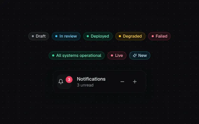
Status badges in five tones with pulsing live dots, a rolling counter and a shimmering “New” tag.
Installation
01
Install with the shadcn CLI. The NiceUI theme comes along the first time.
$ npx shadcn@latest add https://niceui.dev/r/components-animated-badge.json02
Or copy the source below. Dependencies: lucide-react.
Source
components/niceui/ui/core/Badge.tsx
import { useLayoutEffect, useRef, useState, type ReactNode } from 'react';
import { Bell, Minus, Plus, Sparkles } from 'lucide-react';
import { cn } from '@/lib/cn';

export type BadgeTone = 'neutral' | 'brand' | 'success' | 'warning' | 'error';

const TONES: Record<BadgeTone, { badge: string; dot: string }> = {
  neutral: { badge: 'bg-white/5 text-ink-200 ring-white/10', dot: 'bg-ink-400' },
  brand: { badge: 'bg-brand-500/10 text-brand-300 ring-brand-500/25', dot: 'bg-brand-400' },
  success: { badge: 'bg-emerald-500/10 text-emerald-300 ring-emerald-500/25', dot: 'bg-emerald-400' },
  warning: { badge: 'bg-amber-500/10 text-amber-300 ring-amber-500/25', dot: 'bg-amber-400' },
  error: { badge: 'bg-rose-500/10 text-rose-300 ring-rose-500/25', dot: 'bg-rose-400' },
};

export type BadgeProps = {
  children: ReactNode;
  tone?: BadgeTone;
  dot?: boolean;
  pulse?: boolean;
  className?: string;
};

export function Badge({ children, tone = 'neutral', dot = false, pulse = false, className }: BadgeProps) {
  const t = TONES[tone];
  return (
    <span
      className={cn(
        'inline-flex h-6 items-center gap-1.5 whitespace-nowrap rounded-full px-2.5 text-xs font-medium ring-1 ring-inset',
        t.badge,
        className,
      )}
    >
      {(dot || pulse) && (
        <span className="relative flex h-1.5 w-1.5">
          {pulse && <span className={cn('absolute inset-0 animate-pulse-ring rounded-full', t.dot)} />}
          <span className={cn('relative h-1.5 w-1.5 rounded-full', t.dot)} />
        </span>
      )}
      {children}
    </span>
  );
}

function once(el: HTMLElement | null) {
  if (!el || el.dataset.played) return null;
  el.dataset.played = '1';
  return el;
}

/** Numeric badge that rolls the digits vertically when the count changes. */
export function CountBadge({ count, max = 99, className }: { count: number; max?: number; className?: string }) {
  const prev = useRef(count);
  const [anim, setAnim] = useState<{ from: number; dir: 1 | -1; key: number } | null>(null);

  useLayoutEffect(() => {
    if (prev.current === count) return;
    setAnim({ from: prev.current, dir: count > prev.current ? 1 : -1, key: Date.now() });
    prev.current = count;
    const t = window.setTimeout(() => setAnim(null), 400);
    return () => window.clearTimeout(t);
  }, [count]);

  const fmt = (n: number) => (n > max ? `${max}+` : String(n));
  if (count <= 0) return null;

  return (
    <span
      className={cn(
        'relative inline-flex h-5 min-w-[20px] animate-scale-in items-center justify-center overflow-hidden rounded-full bg-rose-500 px-1.5 text-[11px] font-semibold tabular-nums text-white shadow-[0_0_0_2px_#131316]',
        className,
      )}
    >
      {anim && (
        <span
          key={`o${anim.key}`}
          className="absolute"
          ref={(el) =>
            once(el)?.animate([{ transform: 'translateY(0)', opacity: 1 }, { transform: `translateY(${-anim.dir * 100}%)`, opacity: 0 }], {
              duration: 320,
              easing: 'cubic-bezier(0.16,1,0.3,1)',
              fill: 'forwards',
            })
          }
        >
          {fmt(anim.from)}
        </span>
      )}
      <span
        key={`n${anim?.key ?? 0}`}
        ref={(el) =>
          anim &&
          once(el)?.animate([{ transform: `translateY(${anim.dir * 100}%)`, opacity: 0 }, { transform: 'translateY(0)', opacity: 1 }], {
            duration: 380,
            easing: 'cubic-bezier(0.34,1.56,0.64,1)',
          })
        }
      >
        {fmt(count)}
      </span>
    </span>
  );
}

export function ShimmerBadge({ children = 'New', className }: { children?: ReactNode; className?: string }) {
  return (
    <span
      className={cn(
        'relative inline-flex h-6 items-center gap-1 overflow-hidden rounded-full bg-brand-500/10 px-2.5 text-xs font-medium text-brand-200 ring-1 ring-inset ring-brand-400/30',
        className,
      )}
    >
      <Sparkles className="h-3 w-3" />
      {children}
      <span
        aria-hidden
        className="absolute inset-0 animate-shimmer bg-[linear-gradient(110deg,transparent_35%,rgba(255,255,255,0.22)_50%,transparent_65%)] bg-[length:200%_100%]"
      />
    </span>
  );
}

export function AnimatedBadgeDemo() {
  const [count, setCount] = useState(3);
  const tones: BadgeTone[] = ['neutral', 'brand', 'success', 'warning', 'error'];
  const labels = ['Draft', 'In review', 'Deployed', 'Degraded', 'Failed'];

  return (
    <div className="mx-auto flex w-full max-w-lg flex-col items-center gap-8">
      <div className="flex flex-wrap justify-center gap-2">
        {tones.map((tone, i) => (
          <span key={tone} className="animate-fade-up" style={{ animationDelay: `${i * 50}ms` }}>
            <Badge tone={tone} dot>
              {labels[i]}
            </Badge>
          </span>
        ))}
      </div>
      <div className="flex flex-wrap items-center justify-center gap-2">
        <Badge tone="success" pulse>
          All systems operational
        </Badge>
        <Badge tone="error" pulse>
          Live
        </Badge>
        <ShimmerBadge />
      </div>
      <div className="flex items-center gap-4 rounded-2xl bg-ink-900 p-3 pr-4 shadow-card">
        <div className="relative flex h-10 w-10 items-center justify-center rounded-xl bg-ink-850 text-ink-200 shadow-hairline">
          <Bell className="h-4 w-4" />
          <CountBadge count={count} className="absolute -right-1.5 -top-1.5" />
        </div>
        <div className="text-sm">
          <p className="font-medium text-ink-100">Notifications</p>
          <p className="text-xs text-ink-400">{count === 0 ? 'You’re all caught up' : `${count} unread`}</p>
        </div>
        <div className="ml-4 flex gap-1">
          {[
            { icon: Minus, fn: () => setCount((c) => Math.max(0, c - 1)), label: 'Decrease' },
            { icon: Plus, fn: () => setCount((c) => c + 1), label: 'Increase' },
          ].map(({ icon: Icon, fn, label }) => (
            <button
              key={label}
              onClick={fn}
              aria-label={label}
              className="focus-ring flex h-8 w-8 items-center justify-center rounded-lg text-ink-300 transition hover:bg-white/5 hover:text-ink-50 active:scale-90"
            >
              <Icon className="h-4 w-4" />
            </button>
          ))}
        </div>
      </div>
    </div>
  );
}