Animated Color Selector
Swatch picker where the selected color expands into a pill with a check and its name.
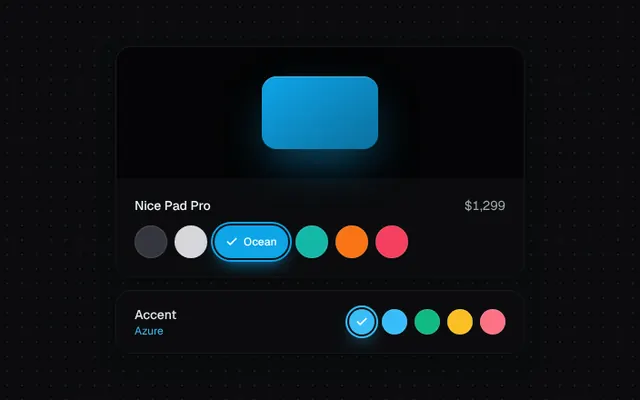
Installation
01
Install with the shadcn CLI. The NiceUI theme comes along the first time.
$ npx shadcn@latest add https://niceui.dev/r/components-animated-color-selector.json02
Or copy the source below. Dependencies: lucide-react.
Source
components/niceui/ui/core/ColorSelector.tsx
import { useState } from 'react';
import { Check } from 'lucide-react';
import { cn } from '@/lib/cn';

export type ColorOption = { value: string; name: string; hex: string; light?: boolean };

export type ColorSelectorProps = {
  colors: ColorOption[];
  value: string;
  onChange: (value: string) => void;
  /** Show the color name inside the expanded swatch. */
  showName?: boolean;
  size?: 'sm' | 'md';
};

export function ColorSelector({ colors, value, onChange, showName = true, size = 'md' }: ColorSelectorProps) {
  const h = size === 'sm' ? 'h-7' : 'h-9';
  const w = size === 'sm' ? 'w-7' : 'w-9';

  return (
    <div role="radiogroup" className="flex flex-wrap items-center gap-2">
      {colors.map((c, i) => {
        const sel = c.value === value;
        return (
          <button
            key={c.value}
            role="radio"
            aria-checked={sel}
            aria-label={c.name}
            onClick={() => onChange(c.value)}
            className={cn(
              'focus-ring group relative flex animate-scale-in items-center justify-center overflow-hidden rounded-full transition-all duration-500 ease-spring active:scale-95',
              h,
              sel ? cn('gap-1.5 px-3', showName ? 'w-auto' : w) : cn(w, 'hover:scale-110'),
              c.light ? 'text-ink-950' : 'text-white',
            )}
            style={{
              background: c.hex,
              animationDelay: `${i * 40}ms`,
              boxShadow: sel
                ? `0 0 0 2px #131316, 0 0 0 4px ${c.hex}, 0 8px 20px -6px ${c.hex}`
                : 'inset 0 0 0 1px rgba(255,255,255,0.12)',
            }}
          >
            <Check
              strokeWidth={3}
              className={cn('h-3.5 w-3.5 shrink-0 transition-all duration-500 ease-spring', sel ? 'scale-100 opacity-100' : 'scale-0 opacity-0 -ml-3.5')}
            />
            {showName && (
              <span
                className={cn(
                  'overflow-hidden whitespace-nowrap text-xs font-medium transition-all duration-500 ease-spring',
                  sel ? 'max-w-[120px] opacity-100' : 'max-w-0 opacity-0',
                )}
              >
                {c.name}
              </span>
            )}
          </button>
        );
      })}
    </div>
  );
}

const FINISHES: ColorOption[] = [
  { value: 'graphite', name: 'Graphite', hex: '#36363e' },
  { value: 'silver', name: 'Silver', hex: '#d6d6db', light: true },
  { value: 'ocean', name: 'Ocean', hex: '#0ea5e9' },
  { value: 'lagoon', name: 'Lagoon', hex: '#14b8a6' },
  { value: 'sunset', name: 'Sunset', hex: '#f97316' },
  { value: 'rose', name: 'Rose', hex: '#f43f5e' },
];

const ACCENTS: ColorOption[] = [
  { value: 'azure', name: 'Azure', hex: '#38bdf8' },
  { value: 'sky', name: 'Sky', hex: '#38bdf8' },
  { value: 'emerald', name: 'Emerald', hex: '#10b981' },
  { value: 'amber', name: 'Amber', hex: '#fbbf24', light: true },
  { value: 'rose', name: 'Rose', hex: '#fb7185' },
];

export function ColorSelectorDemo() {
  const [finish, setFinish] = useState('ocean');
  const [accent, setAccent] = useState('azure');
  const f = FINISHES.find((x) => x.value === finish)!;
  const a = ACCENTS.find((x) => x.value === accent)!;

  return (
    <div className="mx-auto w-full max-w-md space-y-4">
      <div className="overflow-hidden rounded-2xl bg-ink-900 shadow-card">
        <div className="relative flex h-36 items-center justify-center bg-ink-950/60">
          <div
            className="h-20 w-32 rounded-2xl transition-all duration-700 ease-smooth"
            style={{
              background: `linear-gradient(145deg, ${f.hex}, ${f.hex}aa)`,
              boxShadow: `0 20px 50px -12px ${f.hex}88, inset 0 1px 0 rgba(255,255,255,0.25)`,
            }}
          />
        </div>
        <div className="space-y-3 p-5">
          <div className="flex items-baseline justify-between">
            <p className="text-sm font-medium text-ink-50">Nice Pad Pro</p>
            <p className="text-sm tabular-nums text-ink-300">$1,299</p>
          </div>
          <ColorSelector colors={FINISHES} value={finish} onChange={setFinish} />
        </div>
      </div>
      <div className="flex items-center justify-between rounded-2xl bg-ink-900 px-5 py-4 shadow-card">
        <div>
          <p className="text-sm font-medium text-ink-100">Accent</p>
          <p className="text-xs text-ink-400 transition-colors" style={{ color: a.hex }}>
            {a.name}
          </p>
        </div>
        <ColorSelector size="sm" showName={false} colors={ACCENTS} value={accent} onChange={setAccent} />
      </div>
    </div>
  );
}