Animated Collapsible
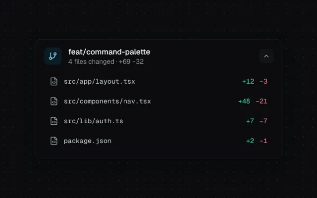
A disclosure panel with grid-based height animation and blurred content reveal.
Installation
01
Install with the shadcn CLI. The NiceUI theme comes along the first time.
$ npx shadcn@latest add https://niceui.dev/r/components-collapsible.json02
Or copy the source below. Dependencies: lucide-react.
Source
components/niceui/ui/motion/Collapsible.tsx
import { useId, useState, type ReactNode } from 'react';
import { ChevronDown, FileCode, GitBranch } from 'lucide-react';
import { cn } from '@/lib/cn';

export type CollapsibleProps = {
  trigger: ReactNode;
  children: ReactNode;
  defaultOpen?: boolean;
  open?: boolean;
  onOpenChange?: (open: boolean) => void;
  className?: string;
};

export function Collapsible({ trigger, children, defaultOpen = false, open: controlled, onOpenChange, className }: CollapsibleProps) {
  const [inner, setInner] = useState(defaultOpen);
  const open = controlled ?? inner;
  const id = useId();
  const toggle = () => {
    setInner(!open);
    onOpenChange?.(!open);
  };

  return (
    <div className={cn('rounded-xl bg-ink-900 shadow-card', className)}>
      <button
        onClick={toggle}
        aria-expanded={open}
        aria-controls={id}
        className="focus-ring group flex w-full items-center justify-between gap-3 rounded-xl px-4 py-3 text-left transition-colors hover:bg-white/[0.02]"
      >
        <span className="min-w-0 flex-1">{trigger}</span>
        <span
          className={cn(
            'flex h-6 w-6 items-center justify-center rounded-md bg-ink-850 text-ink-400 shadow-hairline transition-all duration-500 ease-spring group-hover:text-ink-100',
            open && 'rotate-180 text-ink-100',
          )}
        >
          <ChevronDown className="h-3.5 w-3.5" />
        </span>
      </button>
      <div
        id={id}
        className={cn(
          'grid transition-[grid-template-rows] duration-500 ease-smooth',
          open ? 'grid-rows-[1fr]' : 'grid-rows-[0fr]',
        )}
      >
        <div className="min-h-0 overflow-hidden">
          <div
            className={cn(
              'px-4 pb-4 transition-all duration-500 ease-smooth',
              open ? 'translate-y-0 opacity-100 blur-0' : '-translate-y-2 opacity-0 blur-[2px]',
            )}
          >
            {children}
          </div>
        </div>
      </div>
    </div>
  );
}

const FILES = [
  { name: 'src/app/layout.tsx', add: 12, del: 3 },
  { name: 'src/components/nav.tsx', add: 48, del: 21 },
  { name: 'src/lib/auth.ts', add: 7, del: 7 },
  { name: 'package.json', add: 2, del: 1 },
];

export function CollapsibleDemo() {
  const [open, setOpen] = useState(true);
  return (
    <div className="mx-auto w-full max-w-md">
      <Collapsible
        open={open}
        onOpenChange={setOpen}
        trigger={
          <div className="flex items-center gap-3">
            <span className="flex h-8 w-8 items-center justify-center rounded-lg bg-brand-500/10 text-brand-300">
              <GitBranch className="h-4 w-4" />
            </span>
            <div className="min-w-0">
              <p className="truncate text-sm font-medium text-ink-50">feat/command-palette</p>
              <p className="text-xs text-ink-400">4 files changed · +69 −32</p>
            </div>
          </div>
        }
      >
        <ul className="space-y-1">
          {FILES.map((f, i) => (
            <li
              key={f.name}
              style={{ transitionDelay: open ? `${80 + i * 50}ms` : '0ms' }}
              className={cn(
                'flex items-center gap-2.5 rounded-lg px-2.5 py-2 text-sm transition-all duration-500 ease-smooth hover:bg-white/[0.03]',
                open ? 'translate-x-0 opacity-100' : '-translate-x-2 opacity-0',
              )}
            >
              <FileCode className="h-4 w-4 shrink-0 text-ink-400" />
              <span className="flex-1 truncate font-mono text-xs text-ink-200">{f.name}</span>
              <span className="font-mono text-xs text-emerald-400">+{f.add}</span>
              <span className="font-mono text-xs text-rose-400">−{f.del}</span>
            </li>
          ))}
        </ul>
      </Collapsible>
    </div>
  );
}