Morphing Modal New
Cards that FLIP-morph from their grid position into a centered modal and back.
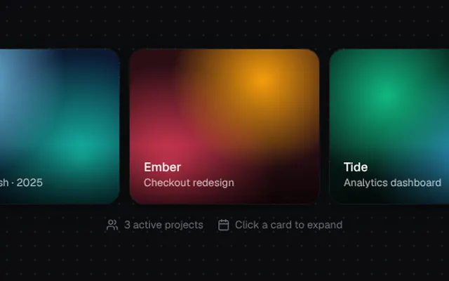
Installation
01
Install with the shadcn CLI. The NiceUI theme comes along the first time.
$ npx shadcn@latest add https://niceui.dev/r/components-morphing-modal.json02
Or copy the source below (2 files). Dependencies: lucide-react.
Source
components/niceui/ui/motion/MorphingModal.tsx
import { useCallback, useRef, useState, type CSSProperties } from 'react';
import { ArrowUpRight, Calendar, Users, X } from 'lucide-react';
import { cn } from '@/lib/cn';
import { Portal, useEscape } from './hooks';

export type MorphItem = {
  id: string;
  title: string;
  subtitle: string;
  gradient: string;
  body: string;
  meta: { label: string; value: string }[];
};

type Rect = { left: number; top: number; width: number; height: number };

const toRect = (r: DOMRect): Rect => ({ left: r.left, top: r.top, width: r.width, height: r.height });

/** FLIP-style morph: a card grows from its measured position into a centered modal and back. */
export function MorphingModal({ items, duration = 520 }: { items: MorphItem[]; duration?: number }) {
  const refs = useRef<Record<string, HTMLButtonElement | null>>({});
  const [active, setActive] = useState<MorphItem | null>(null);
  const [from, setFrom] = useState<Rect | null>(null);
  const [expanded, setExpanded] = useState(false);

  const open = (item: MorphItem) => {
    const el = refs.current[item.id];
    if (!el) return;
    setFrom(toRect(el.getBoundingClientRect()));
    setActive(item);
    setExpanded(false);
    requestAnimationFrame(() => requestAnimationFrame(() => setExpanded(true)));
  };

  const close = useCallback(() => {
    if (!active) return;
    const el = refs.current[active.id];
    if (el) setFrom(toRect(el.getBoundingClientRect()));
    setExpanded(false);
    window.setTimeout(() => setActive(null), duration);
  }, [active, duration]);
  useEscape(!!active, close);

  const target = (): Rect => {
    const width = Math.min(560, window.innerWidth - 32);
    const height = Math.min(480, window.innerHeight - 48);
    return { width, height, left: (window.innerWidth - width) / 2, top: (window.innerHeight - height) / 2 };
  };

  const r = expanded ? target() : from;
  const ease = `${duration}ms cubic-bezier(0.32, 0.72, 0, 1)`;
  const morphStyle: CSSProperties | undefined = r
    ? { ...r, borderRadius: expanded ? 24 : 16, transition: ['left', 'top', 'width', 'height', 'border-radius'].map((p) => `${p} ${ease}`).join(', ') }
    : undefined;

  return (
    <>
      <div className="grid grid-cols-1 gap-3 sm:grid-cols-3">
        {items.map((item) => (
          <button
            key={item.id}
            ref={(el) => (refs.current[item.id] = el)}
            onClick={() => open(item)}
            className={cn(
              'focus-ring group relative h-44 overflow-hidden rounded-2xl text-left shadow-card transition-all duration-300 ease-smooth hover:-translate-y-1 hover:shadow-pop active:scale-[0.98]',
              active?.id === item.id && 'opacity-0',
            )}
          >
            <div className="absolute inset-0 transition-transform duration-700 ease-smooth group-hover:scale-110" style={{ background: item.gradient }} />
            <div className="absolute inset-x-0 bottom-0 bg-gradient-to-t from-black/70 to-transparent p-4">
              <p className="text-sm font-medium text-white">{item.title}</p>
              <p className="text-xs text-white/70">{item.subtitle}</p>
            </div>
          </button>
        ))}
      </div>

      {active && (
        <Portal>
        <div className="fixed inset-0 z-[100]">
          <div
            onClick={close}
            className={cn('absolute inset-0 bg-ink-950/70 backdrop-blur-sm transition-opacity duration-500', expanded ? 'opacity-100' : 'opacity-0')}
          />
          <div role="dialog" aria-modal style={morphStyle} className="absolute overflow-hidden bg-ink-900 shadow-pop">
            <div className="relative h-44 transition-[height] duration-500" style={{ background: active.gradient, height: expanded ? 200 : '100%' }}>
              <div className="absolute inset-x-0 bottom-0 bg-gradient-to-t from-black/70 to-transparent p-5">
                <p className={cn('font-medium text-white transition-all duration-500', expanded ? 'text-2xl' : 'text-sm')}>{active.title}</p>
                <p className="text-xs text-white/70">{active.subtitle}</p>
              </div>
              <button
                onClick={close}
                aria-label="Close"
                className={cn(
                  'focus-ring absolute right-4 top-4 flex h-8 w-8 items-center justify-center rounded-full bg-black/40 text-white backdrop-blur transition-all duration-300 hover:bg-black/60',
                  expanded ? 'scale-100 opacity-100 delay-200' : 'scale-50 opacity-0',
                )}
              >
                <X className="h-4 w-4" />
              </button>
            </div>
            <div className={cn('space-y-5 p-6 transition-all duration-500', expanded ? 'translate-y-0 opacity-100 delay-150' : 'translate-y-4 opacity-0 duration-150')}>
              <p className="text-sm leading-relaxed text-ink-300">{active.body}</p>
              <div className="grid grid-cols-3 gap-3">
                {active.meta.map((m) => (
                  <div key={m.label} className="rounded-xl bg-ink-850 p-3 shadow-hairline">
                    <p className="text-[11px] uppercase tracking-wide text-ink-500">{m.label}</p>
                    <p className="mt-1 text-sm font-medium text-ink-100">{m.value}</p>
                  </div>
                ))}
              </div>
              <button className="focus-ring flex w-full items-center justify-center gap-2 rounded-xl bg-ink-50 py-2.5 text-sm font-medium text-ink-950 transition hover:bg-white active:scale-[0.98]">
                Open project <ArrowUpRight className="h-4 w-4" />
              </button>
            </div>
          </div>
        </div>
        </Portal>
      )}
    </>
  );
}

const ITEMS: MorphItem[] = [
  {
    id: 'aurora',
    title: 'Aurora',
    subtitle: 'Brand refresh · 2025',
    gradient: 'radial-gradient(circle at 20% 20%, #7dd3fc 0%, transparent 50%), radial-gradient(circle at 80% 70%, #14b8a6 0%, transparent 55%), #0b1a33',
    body: 'A complete rework of the Aurora identity: new wordmark, motion language and a component library shared across web, iOS and Android.',
    meta: [{ label: 'Team', value: '6 people' }, { label: 'Status', value: 'In review' }, { label: 'Due', value: 'Mar 14' }],
  },
  {
    id: 'ember',
    title: 'Ember',
    subtitle: 'Checkout redesign',
    gradient: 'radial-gradient(circle at 70% 20%, #f59e0b 0%, transparent 50%), radial-gradient(circle at 20% 80%, #f43f5e 0%, transparent 55%), #2a0f14',
    body: 'Reduce checkout to a single page with Apple Pay first. Early A/B results show an 11.4% lift in completed orders.',
    meta: [{ label: 'Team', value: '4 people' }, { label: 'Status', value: 'Shipping' }, { label: 'Lift', value: '+11.4%' }],
  },
  {
    id: 'tide',
    title: 'Tide',
    subtitle: 'Analytics dashboard',
    gradient: 'radial-gradient(circle at 30% 30%, #10b981 0%, transparent 50%), radial-gradient(circle at 80% 80%, #38bdf8 0%, transparent 55%), #071f1a',
    body: 'Real-time metrics for 40k merchants. Streaming charts, saved views and anomaly alerts powered by the new events pipeline.',
    meta: [{ label: 'Team', value: '9 people' }, { label: 'Status', value: 'Beta' }, { label: 'Users', value: '1,280' }],
  },
];

export function MorphingModalDemo() {
  return (
    <div className="mx-auto w-full max-w-2xl">
      <MorphingModal items={ITEMS} />
      <div className="mt-4 flex items-center justify-center gap-4 text-xs text-ink-500">
        <span className="flex items-center gap-1.5"><Users className="h-3.5 w-3.5" /> 3 active projects</span>
        <span className="flex items-center gap-1.5"><Calendar className="h-3.5 w-3.5" /> Click a card to expand</span>
      </div>
    </div>
  );
}
components/niceui/ui/motion/hooks.ts
import { useEffect, useState, type ReactNode, type RefObject } from 'react';
import { createPortal } from 'react-dom';

/**
 * Keeps an element mounted while it animates out.
 * `mounted` controls rendering, `visible` drives the enter/exit classes.
 */
export function usePresence(open: boolean, exitMs = 220) {
  const [mounted, setMounted] = useState(open);
  const [visible, setVisible] = useState(open);

  useEffect(() => {
    if (open) {
      setMounted(true);
      let inner = 0;
      const outer = requestAnimationFrame(() => {
        inner = requestAnimationFrame(() => setVisible(true));
      });
      return () => {
        cancelAnimationFrame(outer);
        cancelAnimationFrame(inner);
      };
    }
    setVisible(false);
    const t = window.setTimeout(() => setMounted(false), exitMs);
    return () => window.clearTimeout(t);
  }, [open, exitMs]);

  return { mounted, visible };
}

/** Calls `handler` when Escape is pressed while `active`. */
export function useEscape(active: boolean, handler: () => void) {
  useEffect(() => {
    if (!active) return;
    const onKey = (e: KeyboardEvent) => {
      if (e.key === 'Escape') handler();
    };
    window.addEventListener('keydown', onKey);
    return () => window.removeEventListener('keydown', onKey);
  }, [active, handler]);
}

/** Calls `handler` on pointerdown outside every provided ref while `active`. */
export function useClickOutside(
  refs: Array<RefObject<HTMLElement>>,
  active: boolean,
  handler: () => void,
) {
  useEffect(() => {
    if (!active) return;
    const onDown = (e: PointerEvent) => {
      const target = e.target as Node;
      if (refs.some((r) => r.current?.contains(target))) return;
      handler();
    };
    document.addEventListener('pointerdown', onDown);
    return () => document.removeEventListener('pointerdown', onDown);
    // eslint-disable-next-line react-hooks/exhaustive-deps
  }, [active, handler]);
}

/**
 * Renders overlays into document.body so `position: fixed` is relative to the
 * viewport even when an ancestor has a transform (e.g. entrance animations).
 */
export function Portal({ children }: { children: ReactNode }) {
  if (typeof document === 'undefined') return null;
  return createPortal(children, document.body);
}