Multi Select
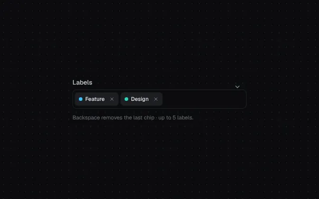
Pick several values as chips that pop in and collapse out when removed. Backspace removes the last chip.
Installation
01
Install with the shadcn CLI. The NiceUI theme comes along the first time.
$ npx shadcn@latest add https://niceui.dev/r/components-multi-select.json02
Or copy the source below (2 files). Dependencies: lucide-react.
Source
components/niceui/ui/core/MultiSelect.tsx
import { useCallback, useRef, useState, type KeyboardEvent } from 'react';
import { Check, ChevronDown, X } from 'lucide-react';
import { cn } from '@/lib/cn';
import { useClickOutside, useEscape, usePresence } from '@/components/niceui/ui/motion/hooks';

export type MultiOption = { value: string; label: string; color?: string };

export type MultiSelectProps = {
  options: MultiOption[];
  value: string[];
  onChange: (value: string[]) => void;
  placeholder?: string;
  label?: string;
  max?: number;
};

export function MultiSelect({ options, value, onChange, placeholder = 'Add…', label, max }: MultiSelectProps) {
  const [open, setOpen] = useState(false);
  const [query, setQuery] = useState('');
  const [active, setActive] = useState(0);
  const [leaving, setLeaving] = useState<string[]>([]);
  const root = useRef<HTMLDivElement>(null);
  const input = useRef<HTMLInputElement>(null);
  const { mounted, visible } = usePresence(open, 160);
  const close = useCallback(() => setOpen(false), []);
  useEscape(open, close);
  useClickOutside([root], open, close);

  const filtered = options.filter((o) => o.label.toLowerCase().includes(query.trim().toLowerCase()));
  const full = max !== undefined && value.length >= max;

  const latest = useRef(value);
  latest.current = value;

  const remove = (v: string) => {
    if (leaving.includes(v)) return;
    setLeaving((l) => [...l, v]);
    window.setTimeout(() => {
      setLeaving((l) => l.filter((x) => x !== v));
      const next = latest.current.filter((x) => x !== v);
      latest.current = next;
      onChange(next);
    }, 180);
  };

  const toggle = (v: string) => {
    if (value.includes(v)) remove(v);
    else if (!full) onChange([...value, v]);
    setQuery('');
    input.current?.focus();
  };

  const onKey = (e: KeyboardEvent<HTMLInputElement>) => {
    if (e.key === 'Backspace' && !query && value.length) remove(value[value.length - 1]);
    else if (e.key === 'ArrowDown') {
      e.preventDefault();
      setOpen(true);
      setActive((a) => Math.min(a + 1, filtered.length - 1));
    } else if (e.key === 'ArrowUp') {
      e.preventDefault();
      setActive((a) => Math.max(a - 1, 0));
    } else if (e.key === 'Enter' && filtered[active]) {
      e.preventDefault();
      toggle(filtered[active].value);
    }
  };

  return (
    <div ref={root} className="relative w-full">
      {label && <p className="mb-1.5 text-sm font-medium text-ink-200">{label}</p>}
      <div
        onClick={() => {
          setOpen(true);
          input.current?.focus();
        }}
        className={cn(
          'flex min-h-[42px] cursor-text flex-wrap items-center gap-1.5 rounded-lg bg-ink-900 py-1.5 pl-1.5 pr-9 ring-1 ring-inset transition-all',
          open ? 'ring-brand-500 shadow-[0_0_0_4px_rgba(56,189,248,0.15)]' : 'ring-white/10 hover:ring-white/20',
        )}
      >
        {value.map((v) => {
          const o = options.find((x) => x.value === v);
          if (!o) return null;
          const out = leaving.includes(v);
          return (
            <span
              key={v}
              className={cn(
                'inline-flex h-7 max-w-[160px] origin-left animate-scale-in items-center gap-1.5 overflow-hidden whitespace-nowrap rounded-md bg-ink-800 pl-2 pr-1 text-xs font-medium text-ink-100 shadow-hairline transition-all duration-200 ease-smooth',
                out && '!max-w-0 scale-75 !px-0 opacity-0',
              )}
            >
              <span className="h-2 w-2 shrink-0 rounded-full" style={{ background: o.color ?? '#8a8a96' }} />
              {o.label}
              <button
                type="button"
                aria-label={`Remove ${o.label}`}
                onClick={(e) => {
                  e.stopPropagation();
                  remove(v);
                }}
                className="flex h-5 w-5 items-center justify-center rounded text-ink-400 transition hover:bg-white/10 hover:text-ink-50"
              >
                <X className="h-3 w-3" />
              </button>
            </span>
          );
        })}
        <input
          ref={input}
          value={query}
          onChange={(e) => {
            setQuery(e.target.value);
            setActive(0);
            setOpen(true);
          }}
          onFocus={() => setOpen(true)}
          onKeyDown={onKey}
          placeholder={value.length ? '' : placeholder}
          className="h-7 min-w-[80px] flex-1 bg-transparent px-1.5 text-sm text-ink-50 outline-none placeholder:text-ink-500"
        />
        <ChevronDown
          className={cn('absolute right-3 top-3 h-4 w-4 text-ink-400 transition-transform duration-300 ease-spring', open && 'rotate-180')}
        />
      </div>
      {mounted && (
        <ul
          role="listbox"
          aria-multiselectable
          className={cn(
            'absolute left-0 right-0 top-full z-40 mt-2 max-h-56 origin-top overflow-auto rounded-xl bg-ink-850 p-1 shadow-pop',
            visible ? 'scale-100 opacity-100 transition-all duration-300 ease-spring' : 'scale-95 opacity-0 transition-all duration-150',
          )}
        >
          {filtered.map((o, i) => {
            const sel = value.includes(o.value);
            const disabled = !sel && full;
            return (
              <li
                key={o.value}
                role="option"
                aria-selected={sel}
                aria-disabled={disabled}
                onPointerMove={() => setActive(i)}
                onClick={() => !disabled && toggle(o.value)}
                className={cn(
                  'flex cursor-pointer items-center gap-2.5 rounded-lg px-2.5 py-2 text-sm transition-colors',
                  i === active ? 'bg-white/[0.06] text-ink-50' : 'text-ink-300',
                  disabled && 'cursor-not-allowed opacity-40',
                )}
              >
                <span
                  className={cn(
                    'flex h-4 w-4 items-center justify-center rounded transition-all duration-200',
                    sel ? 'bg-brand-500 text-white' : 'ring-1 ring-inset ring-white/20',
                  )}
                >
                  <Check className={cn('h-3 w-3 transition-transform duration-300 ease-spring', sel ? 'scale-100' : 'scale-0')} strokeWidth={3} />
                </span>
                <span className="h-2 w-2 rounded-full" style={{ background: o.color ?? '#8a8a96' }} />
                <span className="flex-1">{o.label}</span>
              </li>
            );
          })}
          {filtered.length === 0 && <li className="px-3 py-5 text-center text-sm text-ink-400">No labels match</li>}
        </ul>
      )}
    </div>
  );
}

const LABELS: MultiOption[] = [
  { value: 'bug', label: 'Bug', color: '#fb7185' },
  { value: 'feature', label: 'Feature', color: '#38bdf8' },
  { value: 'design', label: 'Design', color: '#2dd4bf' },
  { value: 'perf', label: 'Performance', color: '#fbbf24' },
  { value: 'docs', label: 'Documentation', color: '#38bdf8' },
  { value: 'infra', label: 'Infrastructure', color: '#34d399' },
  { value: 'security', label: 'Security', color: '#f97316' },
];

export function MultiSelectDemo() {
  const [value, setValue] = useState(['feature', 'design']);
  return (
    <div className="mx-auto w-full max-w-sm self-start">
      <MultiSelect label="Labels" options={LABELS} value={value} onChange={setValue} placeholder="Add labels…" max={5} />
      <p className="mt-3 text-xs text-ink-500">Backspace removes the last chip · up to 5 labels.</p>
    </div>
  );
}
components/niceui/ui/motion/hooks.ts
import { useEffect, useState, type ReactNode, type RefObject } from 'react';
import { createPortal } from 'react-dom';

/**
 * Keeps an element mounted while it animates out.
 * `mounted` controls rendering, `visible` drives the enter/exit classes.
 */
export function usePresence(open: boolean, exitMs = 220) {
  const [mounted, setMounted] = useState(open);
  const [visible, setVisible] = useState(open);

  useEffect(() => {
    if (open) {
      setMounted(true);
      let inner = 0;
      const outer = requestAnimationFrame(() => {
        inner = requestAnimationFrame(() => setVisible(true));
      });
      return () => {
        cancelAnimationFrame(outer);
        cancelAnimationFrame(inner);
      };
    }
    setVisible(false);
    const t = window.setTimeout(() => setMounted(false), exitMs);
    return () => window.clearTimeout(t);
  }, [open, exitMs]);

  return { mounted, visible };
}

/** Calls `handler` when Escape is pressed while `active`. */
export function useEscape(active: boolean, handler: () => void) {
  useEffect(() => {
    if (!active) return;
    const onKey = (e: KeyboardEvent) => {
      if (e.key === 'Escape') handler();
    };
    window.addEventListener('keydown', onKey);
    return () => window.removeEventListener('keydown', onKey);
  }, [active, handler]);
}

/** Calls `handler` on pointerdown outside every provided ref while `active`. */
export function useClickOutside(
  refs: Array<RefObject<HTMLElement>>,
  active: boolean,
  handler: () => void,
) {
  useEffect(() => {
    if (!active) return;
    const onDown = (e: PointerEvent) => {
      const target = e.target as Node;
      if (refs.some((r) => r.current?.contains(target))) return;
      handler();
    };
    document.addEventListener('pointerdown', onDown);
    return () => document.removeEventListener('pointerdown', onDown);
    // eslint-disable-next-line react-hooks/exhaustive-deps
  }, [active, handler]);
}

/**
 * Renders overlays into document.body so `position: fixed` is relative to the
 * viewport even when an ancestor has a transform (e.g. entrance animations).
 */
export function Portal({ children }: { children: ReactNode }) {
  if (typeof document === 'undefined') return null;
  return createPortal(children, document.body);
}