Radio Group
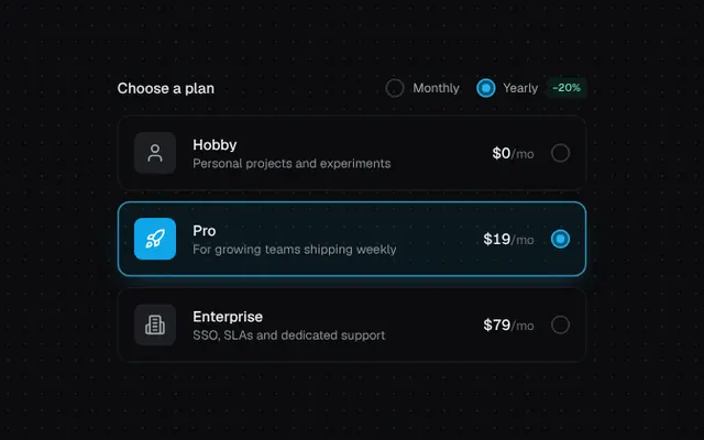
Card-style radio options with a springy dot, ring pulse and roving keyboard focus.
Installation
01
Install with the shadcn CLI. The NiceUI theme comes along the first time.
$ npx shadcn@latest add https://niceui.dev/r/components-radio-group.json02
Or copy the source below. Dependencies: lucide-react.
Source
components/niceui/ui/core/RadioGroup.tsx
import { useRef, useState, type KeyboardEvent, type ReactNode } from 'react';
import { Building2, Rocket, User } from 'lucide-react';
import { cn } from '@/lib/cn';

export type RadioOption = { value: string; label: string; description?: string; meta?: ReactNode; icon?: ReactNode };

export type RadioGroupProps = {
  options: RadioOption[];
  value: string;
  onChange: (value: string) => void;
  label?: string;
  className?: string;
};

export function RadioDot({ checked }: { checked: boolean }) {
  return (
    <span
      className={cn(
        'relative flex h-[18px] w-[18px] shrink-0 items-center justify-center rounded-full transition-all duration-300',
        checked ? 'bg-brand-500/15 shadow-[inset_0_0_0_1.5px_#38bdf8]' : 'shadow-[inset_0_0_0_1.5px_rgba(255,255,255,0.2)]',
      )}
    >
      <span
        className={cn(
          'h-2 w-2 rounded-full bg-brand-400 transition-transform duration-500 ease-spring',
          checked ? 'scale-100' : 'scale-0',
        )}
      />
      {checked && <span className="absolute inset-0 animate-pulse-ring rounded-full bg-brand-500/40 [animation-iteration-count:1]" />}
    </span>
  );
}

export function RadioGroup({ options, value, onChange, label, className }: RadioGroupProps) {
  const refs = useRef<Array<HTMLButtonElement | null>>([]);

  const onKey = (e: KeyboardEvent, i: number) => {
    const delta = e.key === 'ArrowDown' || e.key === 'ArrowRight' ? 1 : e.key === 'ArrowUp' || e.key === 'ArrowLeft' ? -1 : 0;
    if (!delta) return;
    e.preventDefault();
    const next = (i + delta + options.length) % options.length;
    onChange(options[next].value);
    refs.current[next]?.focus();
  };

  return (
    <div role="radiogroup" aria-label={label} className={cn('grid gap-2.5', className)}>
      {options.map((o, i) => {
        const checked = o.value === value;
        return (
          <button
            key={o.value}
            ref={(el) => (refs.current[i] = el)}
            type="button"
            role="radio"
            aria-checked={checked}
            tabIndex={checked ? 0 : -1}
            onClick={() => onChange(o.value)}
            onKeyDown={(e) => onKey(e, i)}
            className={cn(
              'focus-ring group relative flex w-full animate-fade-up items-center gap-4 rounded-xl p-4 text-left transition-all duration-300 ease-smooth active:scale-[0.99]',
              checked
                ? 'bg-brand-500/[0.07] shadow-[inset_0_0_0_1.5px_rgba(56,189,248,0.7),0_8px_24px_-12px_rgba(56,189,248,0.5)]'
                : 'bg-ink-900 shadow-[inset_0_0_0_1px_rgba(255,255,255,0.07)] hover:bg-ink-850 hover:shadow-[inset_0_0_0_1px_rgba(255,255,255,0.14)]',
            )}
            style={{ animationDelay: `${i * 60}ms` }}
          >
            {o.icon && (
              <span
                className={cn(
                  'flex h-10 w-10 shrink-0 items-center justify-center rounded-lg transition-colors duration-300 [&_svg]:h-5 [&_svg]:w-5',
                  checked ? 'bg-brand-500 text-white' : 'bg-ink-800 text-ink-300 group-hover:text-ink-100',
                )}
              >
                {o.icon}
              </span>
            )}
            <span className="min-w-0 flex-1">
              <span className="block text-sm font-medium text-ink-50">{o.label}</span>
              {o.description && <span className="block text-xs text-ink-400">{o.description}</span>}
            </span>
            {o.meta && <span className="text-right text-sm">{o.meta}</span>}
            <RadioDot checked={checked} />
          </button>
        );
      })}
    </div>
  );
}

const PLANS = [
  { value: 'hobby', label: 'Hobby', description: 'Personal projects and experiments', price: 0, icon: <User /> },
  { value: 'pro', label: 'Pro', description: 'For growing teams shipping weekly', price: 24, icon: <Rocket /> },
  { value: 'enterprise', label: 'Enterprise', description: 'SSO, SLAs and dedicated support', price: 99, icon: <Building2 /> },
];

export function RadioGroupDemo() {
  const [plan, setPlan] = useState('pro');
  const [cycle, setCycle] = useState<'monthly' | 'yearly'>('yearly');
  const price = (p: number) => (cycle === 'yearly' ? Math.round(p * 0.8) : p);

  return (
    <div className="mx-auto w-full max-w-md">
      <div className="mb-4 flex items-center justify-between">
        <p className="text-sm font-medium text-ink-100">Choose a plan</p>
        <div className="flex gap-4">
          {(['monthly', 'yearly'] as const).map((c) => (
            <button key={c} onClick={() => setCycle(c)} className="focus-ring flex items-center gap-2 rounded text-xs capitalize text-ink-300">
              <RadioDot checked={cycle === c} />
              {c}
              {c === 'yearly' && <span className="rounded bg-emerald-500/10 px-1.5 py-0.5 text-[10px] font-medium text-emerald-300">−20%</span>}
            </button>
          ))}
        </div>
      </div>
      <RadioGroup
        label="Plan"
        value={plan}
        onChange={setPlan}
        options={PLANS.map((p) => ({
          ...p,
          meta: (
            <span className="tabular-nums">
              <span className="font-medium text-ink-50">${price(p.price)}</span>
              <span className="text-xs text-ink-500">/mo</span>
            </span>
          ),
        }))}
      />
    </div>
  );
}