Range Slider
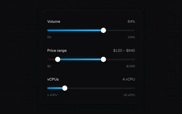
Single or dual-thumb slider with pointer dragging, stepping, keyboard support and a value tooltip.
Installation
01
Install with the shadcn CLI. The NiceUI theme comes along the first time.
$ npx shadcn@latest add https://niceui.dev/r/components-range-slider.json02
Or copy the source below (2 files). Dependencies: none.
Source
components/niceui/ui/core/RangeSlider.tsx
import { useRef, useState, type KeyboardEvent, type PointerEvent } from 'react';
import { cn } from '@/lib/cn';
import { clamp } from './utils';

type Value = number | [number, number];

export type RangeSliderProps<V extends Value> = {
  value: V;
  onChange: (value: V) => void;
  min?: number;
  max?: number;
  step?: number;
  format?: (n: number) => string;
  label?: string;
};

export function RangeSlider<V extends Value>({ value, onChange, min = 0, max = 100, step = 1, format = String, label }: RangeSliderProps<V>) {
  const track = useRef<HTMLDivElement>(null);
  const [drag, setDrag] = useState<number | null>(null);
  const dual = Array.isArray(value);
  const vals: number[] = dual ? (value as [number, number]) : [value as number];
  const pct = (v: number) => ((v - min) / (max - min)) * 100;

  const snap = (v: number) => clamp(Math.round((v - min) / step) * step + min, min, max);

  const update = (i: number, raw: number) => {
    const v = snap(raw);
    if (!dual) return onChange(v as V);
    const next: [number, number] = [vals[0], vals[1]];
    next[i] = i === 0 ? Math.min(v, vals[1]) : Math.max(v, vals[0]);
    onChange(next as V);
  };

  const fromPointer = (e: PointerEvent) => {
    const r = track.current!.getBoundingClientRect();
    return min + clamp((e.clientX - r.left) / r.width, 0, 1) * (max - min);
  };

  const onDown = (e: PointerEvent<HTMLDivElement>) => {
    e.preventDefault();
    const v = fromPointer(e);
    const d0 = Math.abs(v - vals[0]);
    const d1 = dual ? Math.abs(v - vals[1]) : Infinity;
    const i = !dual || d0 < d1 || (d0 === d1 && v < vals[0]) ? 0 : 1;
    e.currentTarget.setPointerCapture(e.pointerId);
    setDrag(i);
    update(i, v);
    (e.currentTarget.querySelector(`[data-thumb="${i}"]`) as HTMLElement | null)?.focus();
  };

  const onKey = (e: KeyboardEvent, i: number) => {
    const big = (max - min) / 10;
    const map: Record<string, number> = { ArrowRight: step, ArrowUp: step, ArrowLeft: -step, ArrowDown: -step, PageUp: big, PageDown: -big };
    if (e.key === 'Home') update(i, min);
    else if (e.key === 'End') update(i, max);
    else if (map[e.key] !== undefined) update(i, vals[i] + map[e.key]);
    else return;
    e.preventDefault();
  };

  const lo = dual ? pct(vals[0]) : 0;
  const hi = pct(dual ? vals[1] : vals[0]);

  return (
    <div className="w-full select-none">
      {label && (
        <div className="mb-3 flex items-center justify-between text-sm">
          <span className="font-medium text-ink-200">{label}</span>
          <span className="tabular-nums text-ink-400">{vals.map(format).join(' – ')}</span>
        </div>
      )}
      <div
        ref={track}
        onPointerDown={onDown}
        onPointerMove={(e) => drag !== null && update(drag, fromPointer(e))}
        onPointerUp={() => setDrag(null)}
        onPointerCancel={() => setDrag(null)}
        className="relative flex h-6 cursor-pointer touch-none items-center"
      >
        <div className="h-1.5 w-full rounded-full bg-ink-800 shadow-[inset_0_1px_2px_rgba(0,0,0,0.5)]" />
        <div
          className={cn(
            'absolute h-1.5 rounded-full bg-gradient-to-r from-brand-600 to-brand-400 shadow-[0_0_12px_-2px_rgba(56,189,248,0.7)]',
            drag === null && 'transition-all duration-300 ease-smooth',
          )}
          style={{ left: `${lo}%`, width: `${hi - lo}%` }}
        />
        {vals.map((v, i) => (
          <div
            key={i}
            data-thumb={i}
            role="slider"
            tabIndex={0}
            aria-valuemin={min}
            aria-valuemax={max}
            aria-valuenow={v}
            aria-valuetext={format(v)}
            aria-label={dual ? (i === 0 ? 'Minimum' : 'Maximum') : label}
            onKeyDown={(e) => onKey(e, i)}
            className={cn('group absolute -translate-x-1/2 outline-none', drag === null && 'transition-[left] duration-300 ease-smooth')}
            style={{ left: `${pct(v)}%`, zIndex: drag === i ? 2 : 1 }}
          >
            <span
              className={cn(
                'pointer-events-none absolute bottom-full left-1/2 mb-3 -translate-x-1/2 whitespace-nowrap rounded-md bg-ink-50 px-2 py-1 text-xs font-medium tabular-nums text-ink-950 shadow-pop transition-all duration-300 ease-spring',
                drag === i ? 'translate-y-0 scale-100 opacity-100' : 'translate-y-1 scale-75 opacity-0 group-hover:translate-y-0 group-hover:scale-100 group-hover:opacity-100 group-focus-visible:translate-y-0 group-focus-visible:scale-100 group-focus-visible:opacity-100',
              )}
            >
              {format(v)}
              <span className="absolute left-1/2 top-full -mt-1 h-2 w-2 -translate-x-1/2 rotate-45 bg-ink-50" />
            </span>
            <span
              className={cn(
                'block h-5 w-5 rounded-full bg-white shadow-[0_0_0_1px_rgba(0,0,0,0.2),0_2px_6px_rgba(0,0,0,0.5)] transition-transform duration-200 ease-spring group-hover:scale-110 group-focus-visible:ring-4 group-focus-visible:ring-brand-500/40',
                drag === i && 'scale-125 ring-4 ring-brand-500/30',
              )}
            />
          </div>
        ))}
      </div>
      <div className="mt-1.5 flex justify-between text-[11px] tabular-nums text-ink-500">
        <span>{format(min)}</span>
        <span>{format(max)}</span>
      </div>
    </div>
  );
}

export function RangeSliderDemo() {
  const [volume, setVolume] = useState(64);
  const [price, setPrice] = useState<[number, number]>([120, 640]);
  const [cpu, setCpu] = useState(4);

  return (
    <div className="mx-auto w-full max-w-sm space-y-8 rounded-2xl bg-ink-900 p-6 pt-8 shadow-card">
      <RangeSlider label="Volume" value={volume} onChange={setVolume} format={(n) => `${n}%`} />
      <RangeSlider label="Price range" value={price} onChange={setPrice} min={0} max={1000} step={10} format={(n) => `$${n}`} />
      <RangeSlider label="vCPUs" value={cpu} onChange={setCpu} min={1} max={16} format={(n) => `${n} vCPU`} />
    </div>
  );
}
components/niceui/ui/core/utils.ts
/**
 * Plays a Web Animation the first time an element mounts. Safe to call from
 * inline ref callbacks (which React re-invokes on every render).
 */
export function animateOnce(el: HTMLElement | null, keyframes: Keyframe[], options: KeyframeAnimationOptions) {
  if (!el || el.dataset.played) return;
  el.dataset.played = '1';
  el.animate(keyframes, options);
}

export const clamp = (v: number, min: number, max: number) => Math.min(max, Math.max(min, v));