Shader Background New
A canvas-rendered animated gradient mesh with film grain, perfect behind hero sections.
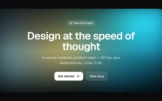
Installation
01
Install with the shadcn CLI. The NiceUI theme comes along the first time.
$ npx shadcn@latest add https://niceui.dev/r/components-shader-background.json02
Or copy the source below. Dependencies: lucide-react.
Source
components/niceui/ui/motion/ShaderBackground.tsx
import { useEffect, useRef, type ReactNode } from 'react';
import { ArrowRight, Sparkles } from 'lucide-react';
import { cn } from '@/lib/cn';

export type ShaderBackgroundProps = {
  colors?: string[];
  speed?: number;
  /** Background base color under the blobs. */
  base?: string;
  grain?: boolean;
  className?: string;
  children?: ReactNode;
};

const NOISE =
  "url(\"data:image/svg+xml,%3Csvg xmlns='http://www.w3.org/2000/svg' width='160' height='160'%3E%3Cfilter id='n'%3E%3CfeTurbulence type='fractalNoise' baseFrequency='0.9' numOctaves='2' stitchTiles='stitch'/%3E%3C/filter%3E%3Crect width='100%25' height='100%25' filter='url(%23n)' opacity='0.5'/%3E%3C/svg%3E\")";

const PALETTE = ['#0ea5e9', '#2dd4bf', '#7dd3fc', '#f59e0b', '#0ea5e9'];

/**
 * Animated gradient mesh. Radial blobs travel on Lissajous paths on a tiny canvas
 * that is upscaled + blurred by CSS, which is cheap and looks like a fragment shader.
 */
export function ShaderBackground({
  colors = PALETTE,
  speed = 1,
  base = '#0a0a0c',
  grain = true,
  className,
  children,
}: ShaderBackgroundProps) {
  const canvas = useRef<HTMLCanvasElement>(null);

  useEffect(() => {
    const c = canvas.current;
    const ctx = c?.getContext('2d');
    if (!c || !ctx) return;
    const W = (c.width = 192);
    const H = (c.height = 108);
    const reduce = window.matchMedia('(prefers-reduced-motion: reduce)').matches;
    const blobs = colors.map((color, i) => ({
      color,
      fx: 0.13 + i * 0.047,
      fy: 0.11 + i * 0.039,
      px: i * 1.7,
      py: i * 2.3,
      r: 0.45 + (i % 3) * 0.12,
    }));
    let raf = 0;
    const start = performance.now();
    const draw = (now: number) => {
      const t = ((now - start) / 1000) * speed;
      ctx.globalCompositeOperation = 'source-over';
      ctx.fillStyle = base;
      ctx.fillRect(0, 0, W, H);
      ctx.globalCompositeOperation = 'lighter';
      for (const b of blobs) {
        const x = W * (0.5 + 0.42 * Math.sin(t * b.fx * 2 + b.px));
        const y = H * (0.5 + 0.42 * Math.cos(t * b.fy * 2 + b.py));
        const r = W * b.r * (0.9 + 0.1 * Math.sin(t * 0.7 + b.px));
        const g = ctx.createRadialGradient(x, y, 0, x, y, r);
        g.addColorStop(0, `${b.color}aa`);
        g.addColorStop(0.5, `${b.color}33`);
        g.addColorStop(1, `${b.color}00`);
        ctx.fillStyle = g;
        ctx.fillRect(0, 0, W, H);
      }
      if (!reduce) raf = requestAnimationFrame(draw);
    };
    raf = requestAnimationFrame(draw);
    return () => cancelAnimationFrame(raf);
  }, [colors, speed, base]);

  return (
    <div className={cn('relative isolate overflow-hidden', className)} style={{ background: base }}>
      <canvas ref={canvas} className="absolute inset-0 -z-10 h-full w-full scale-110 blur-2xl" aria-hidden />
      {grain && <div className="pointer-events-none absolute inset-0 -z-10 opacity-[0.18] mix-blend-overlay" style={{ backgroundImage: NOISE }} />}
      <div className="pointer-events-none absolute inset-0 -z-10 bg-gradient-to-b from-transparent via-transparent to-ink-950/70" />
      {children}
    </div>
  );
}

export function ShaderBackgroundDemo() {
  return (
    <ShaderBackground colors={PALETTE} className="mx-auto flex h-[380px] w-full max-w-4xl items-center justify-center rounded-3xl shadow-card">
      <div className="px-6 text-center">
        <span className="inline-flex animate-fade-down items-center gap-1.5 rounded-full bg-white/10 px-3 py-1 text-xs font-medium text-white shadow-[inset_0_0_0_1px_rgba(255,255,255,0.15)] backdrop-blur">
          <Sparkles className="h-3.5 w-3.5" /> Nice 2.0 is here
        </span>
        <h2 className="mx-auto mt-5 max-w-lg animate-fade-up text-4xl font-semibold tracking-tight text-white [animation-delay:80ms] sm:text-5xl">
          Design at the speed of thought
        </h2>
        <p className="mx-auto mt-4 max-w-md animate-fade-up text-base text-white/75 [animation-delay:160ms]">
          A canvas-rendered gradient mesh — 60 fps, zero dependencies, under 2 kB.
        </p>
        <div className="mt-7 flex animate-fade-up items-center justify-center gap-3 [animation-delay:240ms]">
          <button className="focus-ring group flex items-center gap-2 rounded-xl bg-white px-4 py-2.5 text-sm font-medium text-ink-950 transition hover:bg-ink-100 active:scale-[0.97]">
            Get started <ArrowRight className="h-4 w-4 transition-transform group-hover:translate-x-0.5" />
          </button>
          <button className="focus-ring rounded-xl bg-white/10 px-4 py-2.5 text-sm font-medium text-white shadow-[inset_0_0_0_1px_rgba(255,255,255,0.15)] backdrop-blur transition hover:bg-white/15 active:scale-[0.97]">
            View docs
          </button>
        </div>
      </div>
    </ShaderBackground>
  );
}