Shared Layout Background
A single highlight that glides between hovered nav or menu items.
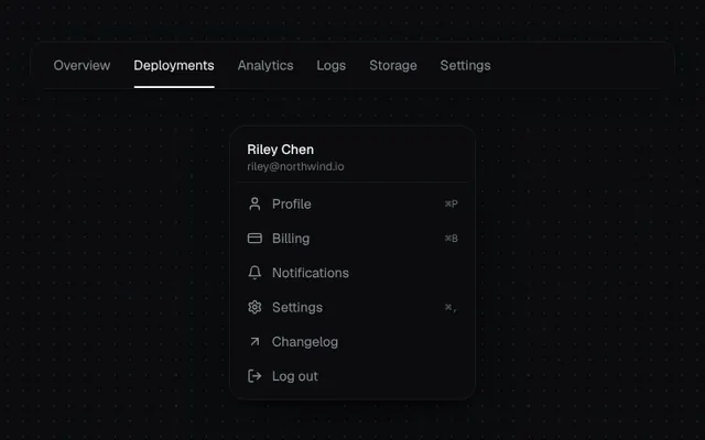
Installation
01
Install with the shadcn CLI. The NiceUI theme comes along the first time.
$ npx shadcn@latest add https://niceui.dev/r/components-shared-layout-background.json02
Or copy the source below. Dependencies: lucide-react.
Source
components/niceui/ui/motion/SharedLayoutBackground.tsx
import { useRef, useState, type ComponentType } from 'react';
import { ArrowUpRight, Bell, CreditCard, LogOut, Settings, User } from 'lucide-react';
import { cn } from '@/lib/cn';

type Box = { left: number; top: number; width: number; height: number };

export type SharedHighlightItem = { id: string; label: string; icon?: ComponentType<{ className?: string }>; hint?: string };

export type SharedLayoutBackgroundProps = {
  items: SharedHighlightItem[];
  orientation?: 'horizontal' | 'vertical';
  activeId?: string;
  onSelect?: (id: string) => void;
  className?: string;
};

/** A single highlight element glides between hovered items (Vercel-style nav hover). */
export function SharedLayoutBackground({ items, orientation = 'horizontal', activeId, onSelect, className }: SharedLayoutBackgroundProps) {
  const refs = useRef<Record<string, HTMLButtonElement | null>>({});
  const [box, setBox] = useState<Box | null>(null);
  const [visible, setVisible] = useState(false);
  const [instant, setInstant] = useState(true);

  const moveTo = (id: string) => {
    const el = refs.current[id];
    if (!el) return;
    setBox({ left: el.offsetLeft, top: el.offsetTop, width: el.offsetWidth, height: el.offsetHeight });
    setInstant(!visible);
    setVisible(true);
  };

  const vertical = orientation === 'vertical';

  return (
    <div onMouseLeave={() => setVisible(false)} className={cn('relative', vertical ? 'flex flex-col' : 'flex items-center', className)}>
      <span
        aria-hidden
        className={cn(
          'pointer-events-none absolute rounded-lg bg-white/[0.07] shadow-hairline',
          visible ? 'opacity-100' : 'opacity-0',
        )}
        style={{
          ...(box ?? { left: 0, top: 0, width: 0, height: 0 }),
          // when appearing, jump into place; only glide while already visible
          transition: !instant
            ? 'left 320ms cubic-bezier(0.32,0.72,0,1), top 320ms cubic-bezier(0.32,0.72,0,1), width 320ms cubic-bezier(0.32,0.72,0,1), height 320ms cubic-bezier(0.32,0.72,0,1), opacity 150ms'
            : 'opacity 200ms',
        }}
      />
      {items.map((item) => (
        <button
          key={item.id}
          ref={(el) => (refs.current[item.id] = el)}
          onMouseEnter={() => moveTo(item.id)}
          onFocus={() => moveTo(item.id)}
          onBlur={() => setVisible(false)}
          onClick={() => onSelect?.(item.id)}
          className={cn(
            'relative z-10 flex items-center gap-2.5 rounded-lg text-sm outline-none transition-colors duration-200',
            vertical ? 'w-full px-3 py-2 text-left' : 'px-3 py-1.5',
            activeId === item.id ? 'text-ink-50' : 'text-ink-400 hover:text-ink-50 focus-visible:text-ink-50',
          )}
        >
          {item.icon && <item.icon className="h-4 w-4 shrink-0" />}
          <span className="flex-1">{item.label}</span>
          {item.hint && <span className="font-mono text-[11px] text-ink-500">{item.hint}</span>}
          {activeId === item.id && !vertical && <span className="absolute inset-x-3 -bottom-2 h-0.5 rounded-full bg-ink-50" />}
        </button>
      ))}
    </div>
  );
}

const NAV: SharedHighlightItem[] = [
  { id: 'overview', label: 'Overview' },
  { id: 'deployments', label: 'Deployments' },
  { id: 'analytics', label: 'Analytics' },
  { id: 'logs', label: 'Logs' },
  { id: 'storage', label: 'Storage' },
  { id: 'settings', label: 'Settings' },
];

const MENU: SharedHighlightItem[] = [
  { id: 'profile', label: 'Profile', icon: User, hint: '⌘P' },
  { id: 'billing', label: 'Billing', icon: CreditCard, hint: '⌘B' },
  { id: 'notifications', label: 'Notifications', icon: Bell },
  { id: 'settings', label: 'Settings', icon: Settings, hint: '⌘,' },
  { id: 'changelog', label: 'Changelog', icon: ArrowUpRight },
  { id: 'logout', label: 'Log out', icon: LogOut },
];

export function SharedLayoutBackgroundDemo() {
  const [tab, setTab] = useState('deployments');
  return (
    <div className="mx-auto flex w-full max-w-2xl flex-col items-center gap-10">
      <div className="w-full overflow-x-auto rounded-2xl bg-ink-900 px-3 pb-2 pt-2 shadow-card">
        <SharedLayoutBackground items={NAV} activeId={tab} onSelect={setTab} className="w-max" />
      </div>
      <div className="w-64 rounded-2xl bg-ink-900 p-1.5 shadow-pop">
        <div className="px-3 pb-2 pt-2">
          <p className="text-sm font-medium text-ink-50">Riley Chen</p>
          <p className="text-xs text-ink-500">riley@northwind.io</p>
        </div>
        <div className="mb-1 h-px bg-white/5" />
        <SharedLayoutBackground items={MENU} orientation="vertical" />
      </div>
    </div>
  );
}