View Toolbar New
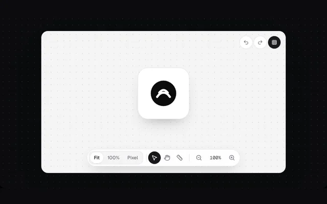
A floating pill toolbar for the canvas: a Fit / 100% / Pixel segment, tool buttons with tooltips and shortcuts, and zoom controls.
Installation
01
Install with the shadcn CLI. The NiceUI theme comes along the first time.
$ npx shadcn@latest add https://niceui.dev/r/design-view-switcher.json02
Or copy the source below (3 files). Dependencies: lucide-react.
Source
components/niceui/design/ViewSwitcher.tsx
import { useState, type ReactNode } from 'react';
import { Grid3x3, Hand, MousePointer2, Redo2, Ruler, Undo2, ZoomIn, ZoomOut } from 'lucide-react';
import { cn } from '@/lib/cn';
import { LightFrame, focusRing } from './shared';
import { SegmentedPills } from './SegmentedPills';

function ToolButton({ label, kbd, active, onClick, children }: { label: string; kbd?: string; active?: boolean; onClick?: () => void; children: ReactNode }) {
  return (
    <span className="group relative">
      <button
        aria-label={label}
        aria-pressed={active}
        onClick={onClick}
        className={cn('grid h-8 w-8 place-items-center rounded-full transition-colors', focusRing, active ? 'bg-zinc-900 text-white' : 'text-zinc-500 hover:bg-zinc-100 hover:text-zinc-900')}
      >
        {children}
      </button>
      <span className="pointer-events-none absolute bottom-[calc(100%+8px)] left-1/2 z-20 -translate-x-1/2 translate-y-1 whitespace-nowrap rounded-lg bg-zinc-900 px-2 py-1 text-[11.5px] text-white opacity-0 shadow-lg transition-all group-hover:translate-y-0 group-hover:opacity-100 group-focus-within:translate-y-0 group-focus-within:opacity-100">
        {label}
        {kbd && <span className="ml-1.5 text-zinc-400">{kbd}</span>}
      </span>
    </span>
  );
}

export type ViewSwitcherProps = {
  view: string;
  onView: (v: string) => void;
  tool: string;
  onTool: (t: string) => void;
  zoom: number;
  onZoom: (z: number) => void;
};

/** A floating pill toolbar: view mode segment, a divider, then tool and zoom buttons with tooltips. */
export function ViewSwitcher({ view, onView, tool, onTool, zoom, onZoom }: ViewSwitcherProps) {
  return (
    <div className="flex max-w-full items-center gap-1 overflow-x-auto rounded-full border border-zinc-200/80 bg-white/90 p-1 shadow-[0_12px_32px_-12px_rgba(0,0,0,0.25)] backdrop-blur [scrollbar-width:none]">
      <SegmentedPills
        size="sm"
        label="Canvas view"
        value={view}
        onChange={onView}
        className="rounded-full [&>button]:rounded-full [&>span]:rounded-full"
        options={[{ value: 'fit', label: 'Fit' }, { value: '100', label: '100%' }, { value: 'pixel', label: 'Pixel' }]}
      />
      <span className="hidden items-center sm:flex">
      <span className="mx-1 h-5 w-px shrink-0 bg-zinc-200" />
      <ToolButton label="Select" kbd="V" active={tool === 'select'} onClick={() => onTool('select')}>
        <MousePointer2 className="h-4 w-4" />
      </ToolButton>
      <ToolButton label="Pan" kbd="H" active={tool === 'hand'} onClick={() => onTool('hand')}>
        <Hand className="h-4 w-4" />
      </ToolButton>
      <ToolButton label="Measure" kbd="M" active={tool === 'ruler'} onClick={() => onTool('ruler')}>
        <Ruler className="h-4 w-4" />
      </ToolButton>
      </span>
      <span className="mx-1 h-5 w-px shrink-0 bg-zinc-200" />
      <ToolButton label="Zoom out" kbd="−" onClick={() => onZoom(Math.max(25, zoom - 25))}>
        <ZoomOut className="h-4 w-4" />
      </ToolButton>
      <span className="w-11 shrink-0 text-center font-mono text-[12px] tabular-nums text-zinc-700">{zoom}%</span>
      <ToolButton label="Zoom in" kbd="+" onClick={() => onZoom(Math.min(400, zoom + 25))}>
        <ZoomIn className="h-4 w-4" />
      </ToolButton>
    </div>
  );
}

export function ViewSwitcherDemo() {
  const [view, setView] = useState('fit');
  const [tool, setTool] = useState('select');
  const [zoom, setZoom] = useState(100);
  const [grid, setGrid] = useState(true);
  const scale = zoom / 100;
  return (
    <LightFrame className="mx-auto max-w-[620px]" bare>
      <div className="relative h-[360px] overflow-hidden rounded-2xl bg-[#f4f4f5]">
        {grid && <div className="absolute inset-0 opacity-70" style={{ backgroundImage: 'radial-gradient(#d4d4d8 1px, transparent 1px)', backgroundSize: `${16 * scale}px ${16 * scale}px` }} />}
        <div className={cn('absolute left-1/2 top-[44%] -translate-x-1/2 -translate-y-1/2 transition-transform duration-300 ease-smooth', tool === 'hand' && 'cursor-grab')} style={{ transform: `translate(-50%,-50%) scale(${view === 'fit' ? 0.9 : view === 'pixel' ? scale * 1.6 : scale})` }}>
          <div className={cn('relative grid h-36 w-36 place-items-center rounded-[28px] bg-white shadow-[0_20px_40px_-20px_rgba(0,0,0,0.35)] ring-1 ring-zinc-200', view === 'pixel' && '[image-rendering:pixelated]')}>
            <svg viewBox="0 0 40 40" className="h-20 w-20">
              <circle cx="20" cy="20" r="18" fill="#0b0b0c" />
              <path d="M11 25c5-8 13-8 18 0M14 19c4-5 8-5 12 0" stroke="#fff" strokeWidth="3" fill="none" strokeLinecap="round" />
            </svg>
            {tool === 'ruler' && (
              <span className="absolute -bottom-6 left-0 right-0 flex items-center gap-1 text-[10px] text-rose-500">
                <span className="h-px flex-1 bg-rose-400" /> 144 px <span className="h-px flex-1 bg-rose-400" />
              </span>
            )}
          </div>
        </div>
        <div className="absolute right-3 top-3 flex gap-1">
          <button aria-label="Undo" className={cn('grid h-8 w-8 place-items-center rounded-full bg-white text-zinc-500 shadow-sm ring-1 ring-zinc-200 hover:text-zinc-900', focusRing)}>
            <Undo2 className="h-3.5 w-3.5" />
          </button>
          <button aria-label="Redo" className={cn('grid h-8 w-8 place-items-center rounded-full bg-white text-zinc-500 shadow-sm ring-1 ring-zinc-200 hover:text-zinc-900', focusRing)}>
            <Redo2 className="h-3.5 w-3.5" />
          </button>
          <button aria-label="Toggle grid" aria-pressed={grid} onClick={() => setGrid((g) => !g)} className={cn('grid h-8 w-8 place-items-center rounded-full shadow-sm ring-1 ring-zinc-200', focusRing, grid ? 'bg-zinc-900 text-white' : 'bg-white text-zinc-500')}>
            <Grid3x3 className="h-3.5 w-3.5" />
          </button>
        </div>
        <div className="absolute inset-x-3 bottom-4 flex justify-center">
          <ViewSwitcher view={view} onView={setView} tool={tool} onTool={setTool} zoom={zoom} onZoom={setZoom} />
        </div>
      </div>
    </LightFrame>
  );
}
components/niceui/design/shared.tsx
import type { ReactNode } from 'react';
import { cn } from '@/lib/cn';

/** A light surface for demos, since the doc stage itself is dark. */
export function LightFrame({ children, className, bare }: { children: ReactNode; className?: string; bare?: boolean }) {
  return (
    <div className={cn('w-full rounded-2xl font-sans', bare ? 'overflow-hidden bg-[#f4f4f5]' : 'bg-[#fafafa] p-4 sm:p-6', ' text-[13px] text-zinc-800 shadow-[0_1px_0_rgba(255,255,255,0.8)_inset,0_30px_60px_-30px_rgba(0,0,0,0.5)] ring-1 ring-zinc-200', className)}>
      {children}
    </div>
  );
}

export function Panel({ children, className }: { children: ReactNode; className?: string }) {
  return <div className={cn('rounded-2xl border border-zinc-200/80 bg-white p-4 shadow-[0_1px_2px_rgba(0,0,0,0.04)]', className)}>{children}</div>;
}

export function SectionHead({ title, meta }: { title: string; meta?: string }) {
  return (
    <div className="mb-3 flex items-baseline justify-between gap-3">
      <h4 className="text-[13px] font-semibold text-zinc-900">{title}</h4>
      {meta && <span className="truncate text-[12px] text-zinc-500">{meta}</span>}
    </div>
  );
}

export const focusRing = 'outline-none focus-visible:ring-2 focus-visible:ring-zinc-900/20 focus-visible:ring-offset-1';
components/niceui/design/SegmentedPills.tsx
import { useLayoutEffect, useRef, useState, type ReactNode } from 'react';
import { AlignCenter, AlignLeft, AlignRight, Circle, Layers, Square, Triangle } from 'lucide-react';
import { cn } from '@/lib/cn';
import { LightFrame, Panel, focusRing } from './shared';

export type PillOption = { value: string; label?: string; icon?: ReactNode };

export type SegmentedPillsProps = {
  options: PillOption[];
  value: string;
  onChange: (v: string) => void;
  size?: 'sm' | 'md';
  full?: boolean;
  label?: string;
  className?: string;
};

/** A soft track with a white pill that slides to the active option. */
export function SegmentedPills({ options, value, onChange, size = 'md', full, label, className }: SegmentedPillsProps) {
  const ref = useRef<HTMLDivElement>(null);
  const [pill, setPill] = useState({ left: 0, width: 0 });
  useLayoutEffect(() => {
    const el = ref.current?.querySelector<HTMLButtonElement>(`[data-v="${CSS.escape(value)}"]`);
    if (el) setPill({ left: el.offsetLeft, width: el.offsetWidth });
  }, [value, options.length, size, full]);
  const move = (dir: number) => {
    const i = options.findIndex((o) => o.value === value);
    const next = options[(i + dir + options.length) % options.length];
    onChange(next.value);
    ref.current?.querySelector<HTMLButtonElement>(`[data-v="${CSS.escape(next.value)}"]`)?.focus();
  };
  return (
    <div
      ref={ref}
      role="radiogroup"
      aria-label={label}
      className={cn('relative flex rounded-xl bg-zinc-100 p-[3px] ring-1 ring-inset ring-zinc-200/70', full ? 'w-full' : 'w-fit', className)}
    >
      <span className="pointer-events-none absolute inset-y-[3px] rounded-[9px] bg-white shadow-[0_1px_2px_rgba(0,0,0,0.08),0_0_0_1px_rgba(0,0,0,0.04)] transition-all duration-300 ease-smooth" style={{ left: pill.left, width: pill.width }} />
      {options.map((o) => {
        const on = o.value === value;
        return (
          <button
            key={o.value}
            data-v={o.value}
            role="radio"
            aria-checked={on}
            aria-label={o.label ? undefined : o.value}
            tabIndex={on ? 0 : -1}
            onClick={() => onChange(o.value)}
            onKeyDown={(e) => {
              if (e.key === 'ArrowRight' || e.key === 'ArrowDown') (e.preventDefault(), move(1));
              if (e.key === 'ArrowLeft' || e.key === 'ArrowUp') (e.preventDefault(), move(-1));
            }}
            className={cn(
              'relative z-10 flex items-center justify-center gap-1.5 whitespace-nowrap rounded-[9px] font-medium transition-colors',
              focusRing,
              size === 'sm' ? 'h-7 px-2 text-[12px] sm:px-2.5' : 'h-8 px-2 text-[13px] sm:px-3.5',
              full && 'min-w-0 flex-1 overflow-hidden text-ellipsis',
              on ? 'text-zinc-900' : 'text-zinc-500 hover:text-zinc-800',
            )}
          >
            {o.icon}
            {o.label}
          </button>
        );
      })}
    </div>
  );
}

export function SegmentedPillsDemo() {
  const [mode, setMode] = useState('trace');
  const [source, setSource] = useState('auto');
  const [align, setAlign] = useState('left');
  const [shape, setShape] = useState('square');
  return (
    <LightFrame className="mx-auto max-w-[460px]">
      <Panel className="space-y-5">
        <div className="space-y-2">
          <p className="text-[12px] font-medium text-zinc-500">Vectorize</p>
          <SegmentedPills full label="Vectorize mode" value={mode} onChange={setMode} options={[{ value: 'trace', label: 'Trace' }, { value: 'posterize', label: 'Posterize' }, { value: 'outline', label: 'Outline' }]} />
        </div>
        <div className="space-y-2">
          <p className="text-[12px] font-medium text-zinc-500">Detect shapes by</p>
          <SegmentedPills full size="sm" label="Detect shapes by" value={source} onChange={setSource} options={['auto', 'dark', 'light', 'alpha', 'color'].map((v) => ({ value: v, label: v[0].toUpperCase() + v.slice(1) }))} />
        </div>
        <div className="flex flex-wrap items-center gap-3">
          <SegmentedPills size="sm" label="Text alignment" value={align} onChange={setAlign} options={[{ value: 'left', icon: <AlignLeft className="h-3.5 w-3.5" /> }, { value: 'center', icon: <AlignCenter className="h-3.5 w-3.5" /> }, { value: 'right', icon: <AlignRight className="h-3.5 w-3.5" /> }]} />
          <SegmentedPills size="sm" label="Shape" value={shape} onChange={setShape} options={[{ value: 'square', icon: <Square className="h-3.5 w-3.5" />, label: 'Rect' }, { value: 'circle', icon: <Circle className="h-3.5 w-3.5" />, label: 'Ellipse' }, { value: 'tri', icon: <Triangle className="h-3.5 w-3.5" />, label: 'Poly' }]} />
        </div>
        <p className="flex items-center gap-1.5 text-[12px] text-zinc-500">
          <Layers className="h-3.5 w-3.5" /> Use ← → to move between options.
        </p>
      </Panel>
    </LightFrame>
  );
}