Swatch Rail New
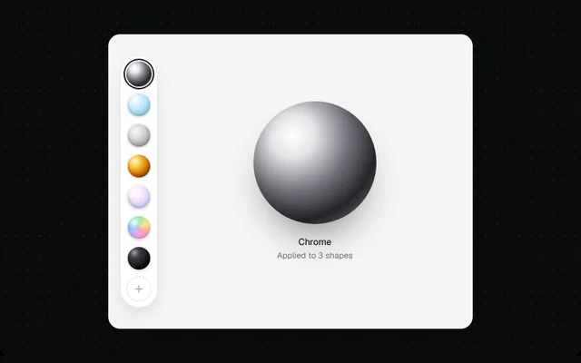
A rail of material spheres (chrome, glass, clay, gold, pearl, holographic, ink) drawn with CSS gradients, with a selected ring, tooltips and arrow-key navigation.
Installation
01
Install with the shadcn CLI. The NiceUI theme comes along the first time.
$ npx shadcn@latest add https://niceui.dev/r/design-swatch-rail.json02
Or copy the source below (2 files). Dependencies: lucide-react.
Source
components/niceui/design/SwatchRail.tsx
import { useState } from 'react';
import { Plus } from 'lucide-react';
import { cn } from '@/lib/cn';
import { LightFrame, focusRing } from './shared';

export type Swatch = { id: string; name: string; background: string };

export const MATERIAL_SWATCHES: Swatch[] = [
  { id: 'chrome', name: 'Chrome', background: 'radial-gradient(circle at 32% 28%, #ffffff 0%, #e4e4e7 18%, #71717a 46%, #27272a 70%, #a1a1aa 100%)' },
  { id: 'glass', name: 'Frosted glass', background: 'radial-gradient(circle at 30% 26%, #ffffff 0%, rgba(224,242,254,0.95) 22%, rgba(125,211,252,0.65) 55%, rgba(14,116,144,0.55) 100%)' },
  { id: 'matte', name: 'Matte clay', background: 'radial-gradient(circle at 34% 30%, #fafaf9 0%, #d6d3d1 40%, #a8a29e 75%, #78716c 100%)' },
  { id: 'gold', name: 'Brushed gold', background: 'radial-gradient(circle at 32% 28%, #fffbeb 0%, #fcd34d 22%, #d97706 55%, #78350f 85%, #f59e0b 100%)' },
  { id: 'pearl', name: 'Pearl', background: 'radial-gradient(circle at 30% 26%, #ffffff 0%, #fdf2f8 25%, #e9d5ff 55%, #c7d2fe 80%, #a5b4fc 100%)' },
  { id: 'holo', name: 'Holographic', background: 'radial-gradient(circle at 30% 26%, #ffffff 0%, transparent 30%), conic-gradient(from 200deg, #f0abfc, #93c5fd, #6ee7b7, #fde68a, #fca5a5, #f0abfc)' },
  { id: 'ink', name: 'Gloss ink', background: 'radial-gradient(circle at 30% 26%, #a1a1aa 0%, #3f3f46 22%, #09090b 70%)' },
];

export type SwatchRailProps = { swatches?: Swatch[]; value: string; onChange: (id: string) => void; orientation?: 'vertical' | 'horizontal' };

/** A rail of material spheres with a selected ring, tooltips and arrow-key navigation. */
export function SwatchRail({ swatches = MATERIAL_SWATCHES, value, onChange, orientation = 'vertical' }: SwatchRailProps) {
  const vertical = orientation === 'vertical';
  return (
    <div role="radiogroup" aria-label="Material" className={cn('flex gap-2 rounded-full border border-zinc-200/80 bg-white p-2 shadow-[0_12px_28px_-14px_rgba(0,0,0,0.3)]', vertical ? 'flex-col' : 'flex-row')}>
      {swatches.map((s, i) => {
        const on = s.id === value;
        return (
          <span key={s.id} className="group relative">
            <button
              role="radio"
              aria-checked={on}
              aria-label={s.name}
              tabIndex={on ? 0 : -1}
              onClick={() => onChange(s.id)}
              onKeyDown={(e) => {
                const fwd = vertical ? 'ArrowDown' : 'ArrowRight';
                const back = vertical ? 'ArrowUp' : 'ArrowLeft';
                const dir = e.key === fwd ? 1 : e.key === back ? -1 : 0;
                if (!dir) return;
                e.preventDefault();
                const next = swatches[(i + dir + swatches.length) % swatches.length];
                onChange(next.id);
                (e.currentTarget.closest('[role=radiogroup]')?.querySelectorAll('button')[(i + dir + swatches.length) % swatches.length] as HTMLButtonElement | undefined)?.focus();
              }}
              className={cn('block h-9 w-9 rounded-full ring-offset-2 transition-all duration-200', focusRing, on ? 'scale-100 ring-2 ring-zinc-900' : 'scale-90 ring-0 hover:scale-100')}
            >
              <span className="block h-full w-full rounded-full shadow-[inset_0_-3px_6px_rgba(0,0,0,0.18),0_2px_4px_rgba(0,0,0,0.15)]" style={{ background: s.background }} />
            </button>
            <span className={cn('pointer-events-none absolute z-20 whitespace-nowrap rounded-lg bg-zinc-900 px-2 py-1 text-[11.5px] text-white opacity-0 transition-opacity group-hover:opacity-100', vertical ? 'left-[calc(100%+12px)] top-1/2 -translate-y-1/2' : 'bottom-[calc(100%+10px)] left-1/2 -translate-x-1/2')}>
              {s.name}
            </span>
          </span>
        );
      })}
      <button aria-label="Add material" className={cn('grid h-9 w-9 place-items-center rounded-full border border-dashed border-zinc-300 text-zinc-400 hover:border-zinc-400 hover:text-zinc-700', focusRing)}>
        <Plus className="h-4 w-4" />
      </button>
    </div>
  );
}

export function SwatchRailDemo() {
  const [m, setM] = useState('chrome');
  const sw = MATERIAL_SWATCHES.find((s) => s.id === m)!;
  return (
    <LightFrame className="mx-auto max-w-[520px]" bare>
      <div className="relative flex h-[420px] items-center overflow-hidden rounded-2xl bg-[#f4f4f5] pl-4">
        <SwatchRail value={m} onChange={setM} />
        <div className="flex flex-1 flex-col items-center justify-center gap-4">
          <div key={m} className="h-36 w-36 rounded-full shadow-[inset_0_-10px_24px_rgba(0,0,0,0.2),0_30px_50px_-20px_rgba(0,0,0,0.45)] animate-scale-in sm:h-44 sm:w-44" style={{ background: sw.background }} />
          <div className="text-center">
            <p className="text-[13px] font-medium text-zinc-900">{sw.name}</p>
            <p className="text-[12px] text-zinc-500">Applied to 3 shapes</p>
          </div>
        </div>
      </div>
    </LightFrame>
  );
}
components/niceui/design/shared.tsx
import type { ReactNode } from 'react';
import { cn } from '@/lib/cn';

/** A light surface for demos, since the doc stage itself is dark. */
export function LightFrame({ children, className, bare }: { children: ReactNode; className?: string; bare?: boolean }) {
  return (
    <div className={cn('w-full rounded-2xl font-sans', bare ? 'overflow-hidden bg-[#f4f4f5]' : 'bg-[#fafafa] p-4 sm:p-6', ' text-[13px] text-zinc-800 shadow-[0_1px_0_rgba(255,255,255,0.8)_inset,0_30px_60px_-30px_rgba(0,0,0,0.5)] ring-1 ring-zinc-200', className)}>
      {children}
    </div>
  );
}

export function Panel({ children, className }: { children: ReactNode; className?: string }) {
  return <div className={cn('rounded-2xl border border-zinc-200/80 bg-white p-4 shadow-[0_1px_2px_rgba(0,0,0,0.04)]', className)}>{children}</div>;
}

export function SectionHead({ title, meta }: { title: string; meta?: string }) {
  return (
    <div className="mb-3 flex items-baseline justify-between gap-3">
      <h4 className="text-[13px] font-semibold text-zinc-900">{title}</h4>
      {meta && <span className="truncate text-[12px] text-zinc-500">{meta}</span>}
    </div>
  );
}

export const focusRing = 'outline-none focus-visible:ring-2 focus-visible:ring-zinc-900/20 focus-visible:ring-offset-1';