Coverflow Carousel New
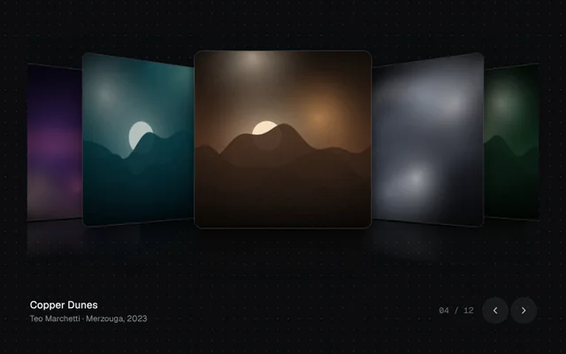
A 3D coverflow with side covers that turn away, mirrored reflections, drag or swipe with inertia, arrow keys and captions.
Installation
01
Install with the shadcn CLI. The NiceUI theme comes along the first time.
$ npx shadcn@latest add https://niceui.dev/r/gallery-coverflow-carousel.json02
Or copy the source below (2 files). Dependencies: lucide-react.
Source
components/niceui/gallery/CoverflowCarousel.tsx
import { useEffect, useMemo, useRef, useState, type KeyboardEvent, type PointerEvent } from 'react';
import { ChevronLeft, ChevronRight } from 'lucide-react';
import { cn } from '@/lib/cn';
import { ARTWORKS, artwork, type Artwork } from './art';

export type CoverflowCarouselProps = {
  items?: Artwork[];
  /** Image URL for an item. Defaults to the procedural demo artwork. */
  src?: (item: Artwork) => string;
  initial?: number;
  className?: string;
};

const clamp = (v: number, a: number, b: number) => Math.min(b, Math.max(a, v));

/** 3D coverflow: side covers rotate away, drag or swipe with inertia, arrow keys to step. */
export function CoverflowCarousel({ items = ARTWORKS, src = (a) => artwork(a.id, 640, 640), initial = 3, className }: CoverflowCarouselProps) {
  const [pos, setPos] = useState(initial);
  const [dragging, setDragging] = useState(false);
  const [width, setWidth] = useState(800);
  const wrap = useRef<HTMLDivElement>(null);
  const drag = useRef({ x: 0, start: 0, t: 0, v: 0, moved: false });
  const last = items.length - 1;
  const urls = useMemo(() => items.map(src), [items, src]);

  useEffect(() => {
    const el = wrap.current;
    if (!el) return;
    const ro = new ResizeObserver(([e]) => setWidth(e.contentRect.width));
    ro.observe(el);
    return () => ro.disconnect();
  }, []);

  const size = Math.round(clamp(width * 0.36, 150, 260));
  const gap = size * 0.52;
  const active = Math.round(pos);

  const go = (i: number) => setPos(clamp(i, 0, last));

  const onDown = (e: PointerEvent) => {
    (e.currentTarget as HTMLElement).setPointerCapture(e.pointerId);
    drag.current = { x: e.clientX, start: pos, t: performance.now(), v: 0, moved: false };
    setDragging(true);
  };
  const onMove = (e: PointerEvent) => {
    if (!dragging) return;
    const dx = e.clientX - drag.current.x;
    if (Math.abs(dx) > 4) drag.current.moved = true;
    const now = performance.now();
    const next = clamp(drag.current.start - dx / gap, -0.4, last + 0.4);
    drag.current.v = (next - pos) / Math.max(1, now - drag.current.t);
    drag.current.t = now;
    setPos(next);
  };
  const onUp = () => {
    if (!dragging) return;
    setDragging(false);
    go(Math.round(pos + drag.current.v * 180));
  };
  const onKey = (e: KeyboardEvent) => {
    if (e.key === 'ArrowRight') (e.preventDefault(), go(active + 1));
    if (e.key === 'ArrowLeft') (e.preventDefault(), go(active - 1));
  };

  const cur = items[clamp(active, 0, last)];

  return (
    <div className={cn('w-full select-none', className)}>
      <div
        ref={wrap}
        role="region"
        aria-roledescription="carousel"
        aria-label="Coverflow gallery"
        tabIndex={0}
        onKeyDown={onKey}
        onPointerDown={onDown}
        onPointerMove={onMove}
        onPointerUp={onUp}
        onPointerCancel={onUp}
        className="focus-ring relative cursor-grab touch-pan-y overflow-hidden rounded-2xl active:cursor-grabbing"
        style={{ height: size * 1.48, perspective: 1100 }}
      >
        <div className="absolute inset-x-0 top-[8%] h-full" style={{ transformStyle: 'preserve-3d' }}>
          {items.map((it, i) => {
            const o = i - pos;
            const ao = Math.abs(o);
            if (ao > 4.5) return null;
            const side = clamp(o, -1, 1);
            const x = o * gap + side * size * 0.32;
            return (
              <button
                key={it.id}
                type="button"
                tabIndex={-1}
                aria-label={`${it.title}, ${it.artist}`}
                onClick={() => !drag.current.moved && go(i)}
                className={cn('absolute left-1/2 top-0', dragging ? '' : 'transition-transform duration-500 ease-smooth')}
                style={{
                  width: size,
                  marginLeft: -size / 2,
                  zIndex: 100 - Math.round(ao * 10),
                  transform: `translateX(${x}px) translateZ(${-ao * size * 0.45}px) rotateY(${-side * 52}deg)`,
                }}
              >
                <span className="relative block overflow-hidden rounded-xl shadow-pop ring-1 ring-white/10" style={{ height: size }}>
                  <img src={urls[i]} alt="" draggable={false} className="h-full w-full object-cover" />
                  <span className="absolute inset-0 bg-ink-950 transition-opacity duration-500" style={{ opacity: Math.min(0.55, ao * 0.22) }} />
                </span>
                {/* reflection */}
                <span className="pointer-events-none relative mt-1 block overflow-hidden rounded-xl opacity-30 [mask-image:linear-gradient(to_bottom,black,transparent_55%)]" style={{ height: size * 0.45 }}>
                  <img src={urls[i]} alt="" draggable={false} className="h-[222%] w-full -scale-y-100 object-cover object-bottom" />
                </span>
              </button>
            );
          })}
        </div>
      </div>
      <div className="mt-2 flex items-center justify-between gap-4 px-1">
        <div key={cur.id} className="min-w-0 animate-fade-up">
          <p className="truncate text-[15px] font-medium text-ink-50">{cur.title}</p>
          <p className="truncate text-xs text-ink-400">
            {cur.artist} · {cur.place}, {cur.year}
          </p>
        </div>
        <div className="flex shrink-0 items-center gap-1.5">
          <span className="mr-2 font-mono text-xs tabular-nums text-ink-500">
            {String(active + 1).padStart(2, '0')} / {String(items.length).padStart(2, '0')}
          </span>
          <button onClick={() => go(active - 1)} disabled={active === 0} aria-label="Previous" className="focus-ring grid h-9 w-9 place-items-center rounded-full bg-white/5 text-ink-200 ring-1 ring-white/10 transition hover:bg-white/10 disabled:opacity-30">
            <ChevronLeft className="h-4 w-4" />
          </button>
          <button onClick={() => go(active + 1)} disabled={active === last} aria-label="Next" className="focus-ring grid h-9 w-9 place-items-center rounded-full bg-white/5 text-ink-200 ring-1 ring-white/10 transition hover:bg-white/10 disabled:opacity-30">
            <ChevronRight className="h-4 w-4" />
          </button>
        </div>
      </div>
    </div>
  );
}

export function CoverflowCarouselDemo() {
  return (
    <div className="mx-auto w-full max-w-3xl">
      <CoverflowCarousel />
    </div>
  );
}
components/niceui/gallery/art.ts
/*
 * Procedural artwork for the gallery demos: soft landscapes and abstract mesh
 * gradients with film grain, rendered once to data URLs. Swap `src` for real
 * photos in your app — every gallery component just takes image URLs.
 */

export type Artwork = { id: number; title: string; artist: string; place: string; year: number; tone: 'warm' | 'cool' | 'dusk' | 'mono' };

const PALETTES: string[][] = [
  ['#0b1d3a', '#1f4e79', '#f2a65a', '#f7d9a8'],
  ['#120c26', '#4b2a77', '#e66b9d', '#ffd1b3'],
  ['#06222b', '#0f5f6b', '#7fd1c7', '#e8f6f1'],
  ['#1b1410', '#5b3a26', '#d98c4a', '#f6e1c3'],
  ['#0e0f13', '#2b2f3a', '#8a93a6', '#e6e8ee'],
  ['#0a1a12', '#1f5134', '#9cc98a', '#f1f7da'],
  ['#1a0f14', '#6b1f3a', '#ef6f5e', '#ffd8a8'],
  ['#071426', '#123f73', '#5aa9e6', '#d6ecff'],
  ['#191325', '#3b2d5c', '#b39ddb', '#f3e9ff'],
  ['#201608', '#6e4a12', '#e0b34a', '#fff1c4'],
  ['#0b1216', '#29424f', '#6fa3b8', '#f0e6d2'],
  ['#170b0b', '#4a1414', '#c84b31', '#f5c26b'],
];

export const ARTWORKS: Artwork[] = [
  { id: 0, title: 'Low Tide, Dawn', artist: 'Mira Okafor', place: 'Comporta', year: 2025, tone: 'warm' },
  { id: 1, title: 'Neon Bloom', artist: 'Ilya Varga', place: 'Kyoto', year: 2024, tone: 'dusk' },
  { id: 2, title: 'Glass Lagoon', artist: 'Sana Iqbal', place: 'Faroe Islands', year: 2025, tone: 'cool' },
  { id: 3, title: 'Copper Dunes', artist: 'Teo Marchetti', place: 'Merzouga', year: 2023, tone: 'warm' },
  { id: 4, title: 'Fog Study No. 4', artist: 'Lena Brandt', place: 'Dolomites', year: 2024, tone: 'mono' },
  { id: 5, title: 'Green Hour', artist: 'Ravi Menon', place: 'Munnar', year: 2025, tone: 'cool' },
  { id: 6, title: 'Ember Coast', artist: 'Noor Haddad', place: 'Big Sur', year: 2024, tone: 'warm' },
  { id: 7, title: 'Blue Hour Harbour', artist: 'Jonas Weber', place: 'Bergen', year: 2025, tone: 'cool' },
  { id: 8, title: 'Lavender Field', artist: 'Camille Roy', place: 'Valensole', year: 2023, tone: 'dusk' },
  { id: 9, title: 'Golden Ridge', artist: 'Aiko Tanaka', place: 'Hokkaido', year: 2025, tone: 'warm' },
  { id: 10, title: 'Salt Flats', artist: 'Diego Alvarez', place: 'Uyuni', year: 2024, tone: 'mono' },
  { id: 11, title: 'Red Canyon', artist: 'Hana Kobayashi', place: 'Arizona', year: 2025, tone: 'warm' },
];

let seedState = 1;
const rand = () => {
  seedState = (seedState * 1664525 + 1013904223) >>> 0;
  return seedState / 4294967296;
};

const cache = new Map<string, string>();

/** A deterministic artwork as a data URL. `kind` picks a landscape or an abstract mesh. */
export function artwork(id: number, w = 960, h = 640, kind: 'landscape' | 'mesh' = id % 3 === 1 ? 'mesh' : 'landscape'): string {
  const key = `${id}-${w}-${h}-${kind}`;
  const hit = cache.get(key);
  if (hit) return hit;
  if (typeof document === 'undefined') return '';
  const c = document.createElement('canvas');
  c.width = w;
  c.height = h;
  const g = c.getContext('2d');
  if (!g) return '';
  seedState = (id + 1) * 9973;
  const [deep, mid, hot, light] = PALETTES[id % PALETTES.length];

  const sky = g.createLinearGradient(0, 0, 0, h);
  sky.addColorStop(0, deep);
  sky.addColorStop(0.55, mid);
  sky.addColorStop(1, kind === 'mesh' ? deep : hot);
  g.fillStyle = sky;
  g.fillRect(0, 0, w, h);

  // soft light blobs
  const blobs = kind === 'mesh' ? 6 : 3;
  for (let i = 0; i < blobs; i++) {
    const x = rand() * w;
    const y = rand() * h * (kind === 'mesh' ? 1 : 0.6);
    const r = (0.25 + rand() * 0.45) * Math.max(w, h);
    const rg = g.createRadialGradient(x, y, 0, x, y, r);
    rg.addColorStop(0, [hot, light, mid][i % 3] + 'cc');
    rg.addColorStop(1, 'transparent');
    g.globalCompositeOperation = 'screen';
    g.fillStyle = rg;
    g.fillRect(0, 0, w, h);
  }
  g.globalCompositeOperation = 'source-over';

  if (kind === 'landscape') {
    // sun
    const sx = (0.25 + rand() * 0.5) * w;
    const sy = h * (0.38 + rand() * 0.12);
    const sr = Math.min(w, h) * (0.07 + rand() * 0.05);
    const glow = g.createRadialGradient(sx, sy, 0, sx, sy, sr * 5);
    glow.addColorStop(0, light + 'aa');
    glow.addColorStop(1, 'transparent');
    g.fillStyle = glow;
    g.fillRect(0, 0, w, h);
    g.fillStyle = light;
    g.beginPath();
    g.arc(sx, sy, sr, 0, Math.PI * 2);
    g.fill();
    // ridges, back to front
    for (let layer = 0; layer < 4; layer++) {
      const base = h * (0.5 + layer * 0.12);
      const amp = h * (0.12 - layer * 0.02);
      const f1 = 1.5 + rand() * 2;
      const f2 = 4 + rand() * 4;
      const ph = rand() * 10;
      g.beginPath();
      g.moveTo(0, h);
      for (let x = 0; x <= w; x += 4) {
        const u = x / w;
        const y = base - amp * (0.6 * Math.sin(u * f1 * Math.PI + ph) + 0.3 * Math.sin(u * f2 * Math.PI + ph * 2) + 0.1 * Math.sin(u * 23 + ph));
        g.lineTo(x, y);
      }
      g.lineTo(w, h);
      g.closePath();
      const t = layer / 3;
      const lg = g.createLinearGradient(0, base - amp, 0, h);
      lg.addColorStop(0, mix(mid, deep, 0.25 + t * 0.6));
      lg.addColorStop(1, mix(deep, '#000000', t * 0.5));
      g.fillStyle = lg;
      g.globalAlpha = 0.92;
      g.fill();
      g.globalAlpha = 1;
    }
  } else {
    // flowing ribbons
    for (let i = 0; i < 3; i++) {
      g.beginPath();
      const y0 = h * (0.2 + rand() * 0.6);
      g.moveTo(-50, y0);
      g.bezierCurveTo(w * 0.3, y0 - h * (rand() - 0.5), w * 0.7, y0 + h * (rand() - 0.5), w + 50, y0 + h * (rand() - 0.5) * 0.6);
      g.lineWidth = Math.min(w, h) * (0.08 + rand() * 0.12);
      g.strokeStyle = [light, hot, mid][i] + '55';
      g.filter = `blur(${Math.round(Math.min(w, h) * 0.04)}px)`;
      g.stroke();
      g.filter = 'none';
    }
  }

  // vignette
  const vg = g.createRadialGradient(w / 2, h / 2, Math.min(w, h) * 0.3, w / 2, h / 2, Math.max(w, h) * 0.75);
  vg.addColorStop(0, 'transparent');
  vg.addColorStop(1, 'rgba(0,0,0,0.45)');
  g.fillStyle = vg;
  g.fillRect(0, 0, w, h);

  // film grain
  const img = g.getImageData(0, 0, w, h);
  const d = img.data;
  for (let i = 0; i < d.length; i += 4) {
    const n = (rand() - 0.5) * 18;
    d[i] += n;
    d[i + 1] += n;
    d[i + 2] += n;
  }
  g.putImageData(img, 0, 0);

  const url = c.toDataURL('image/jpeg', 0.86);
  cache.set(key, url);
  return url;
}

function mix(a: string, b: string, t: number) {
  const pa = parseInt(a.slice(1), 16);
  const pb = parseInt(b.slice(1), 16);
  const ch = (s: number) => Math.round(((pa >> s) & 255) * (1 - t) + ((pb >> s) & 255) * t);
  return `rgb(${ch(16)},${ch(8)},${ch(0)})`;
}